
Dive into the details of blending design and data with custom Power BI themes.
At the intersection of design and data, crafting Power BI themes emerges as a crucial skill for effective and impactful reports that provide a clear and consistent experience. Through thoughtful design choices in color, font, and layout, we can elevate our report development strategy.
Let’s dive into the details of Power BI theme creation and unlock the potential to make our reports informative, impactful, and remembered. Keep reading to explore the blend of design and data, where every detail in our report is under our control.
Throughout this post we will be creating a Power BI theme file and a Power BI report to test our theme, both the file and report are available at the end of the post. Here is what we will explore.
- Introduction to Power BI Themes
- The Anatomy of a Power BI Theme
- Step-by-Step Guide to Creating Our First Power BI Theme
- Advanced Customization
- Implementing Custom Themes in Power BI Reports
- Creating a Template Report to Test Our Theme
Introduction to Power BI Themes
Have you ever stared at one of your Power BI reports and thought, “This could look so much better”? Well, you are not alone. Power BI themes and templates help us turn bland data visualizations into eye-catching reports that keep everyone engaged.
Themes in Power BI focus on the colors, fonts, and visual styles that give our reports a consistent look. Imagine having a signature style that runs through all your reports – that is what themes can help us do. They ensure that every chart, visual, or table aligns with our brand or a project’s aesthetic, making our report both informational and visually appealing.
No matter your Power BI role or skill level furthering our understanding of Power BI themes can significantly impact the quality of reports we create. So, let’s dive in and explore how we can create our own Power BI custom theme. Ready to transform our reports from meh to magnificent?
The Anatomy of a Power BI Theme
Let’s dive into some details and take a peek under the hood of a Power BI theme. If you have ever opened a JSON and immediately closed, again, you are not alone. But once you get the hang of it, it becomes more and more like reading a recipe of the visual aspects of our Power BI report.
Remember, as complex as the Power BI theme file may seem at its core it is structured text used to define properties like colors, fonts, and visual styles in a way Power BI can understand and apply across our reports.
Key Elements to Customize
Theme Colors:
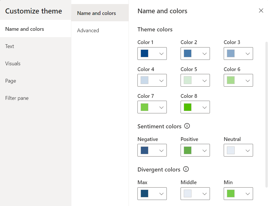
These colors are the heart of our theme. The theme colors determine the colors that represent data in our report visuals. When customizing our theme through Power BI Desktop or setting colors of a visual element we will see Color 1 – Color 8 listed, however the list of theme colors in our theme file can have as many colors as we require for automatically assigning colors in our visualizations.
In the theme color section is also where we find our sentiment and divergent colors as well. Sentiment colors are those used in visuals such as the KPI visual to indicate positive, negative, or neutral results. While the divergent colors are used in conditional formatting to show where a data point falls in a range and we define the colors for the maximum, middle, minimum, and null values.
Structural Colors:
While theme colors focus on the data visualizations, structural colors deal with the non-data components of our report, such as the background, label colors, and axis gridline colors. These colors help to enhance the overall aesthetic of our reports.
Structural colors can be found in the Advanced subsection of the Name and Colors tab in the Customize theme dialog box.

We can find all the details on what each color class formats in the table at the link below.

Use Report Themes in Power BI Desktop – Set Structural Colors
Learn more about: What each structural color formats in our Power BI reports
Text Classes:
Next, we can specify the font styles for different types of text within our report including defining the font size, color, and font family for things such as titles, headers, and labels.
Within our Power BI theme there are 4 primary classes out of a total of 12 that need to be set. Each of the four primary classes can be found under the Text section of the Customize theme dialog box. The 4 primary classes are the general class which covers most text within each of our visuals, the title class to format the main title and axis titles, the cards and KPIs class to format the callout values in card and KPIs visuals, and the tab headers class to format the tab headers in the key influencers visual.

The other text classes are secondary classes and derive their properties from the primary class they are associated with. For example, a secondary class may select a lighter shade of the font color, or a percentage larger or smaller font size based on the primary class properties.
For details on what each class formats view the table at the link below.
Use Report Themes in Power BI Desktop – Set Formatted Text Defaults
Learn more about: Power BI Theme Text Classes
Visual Styles:
To define and fine-tune the appearance of various visuals with detailed and granular control we can add or update the visual styles section of our Power BI theme JSON file.
The Power BI Customize theme dialog box offers a start into setting and modify visual styles. On the Visuals tab we will see options to set background, border, header and tooltip colors. It also provides options to set the colors or our report wallpaper and page background on the Page tab, and set the appearance of the filter pane on the Filter pane tab.

The visuals styles offer us the ability to get granular and ensure every visual matches the aesthetics of our report. However, with this comes a lot of details to work through, we will explore just some of the basics later in this post when customizing the Power BI Theme file.
By focusing on these components, the blueprint for crafting a Power BI theme begins to come together. Helping us create reports that resonate with our brand and elevates user experience by creating a clear and consistent Power BI appearance. As we get more comfortable with the nuances and details of what goes into a Power BI theme, we become better equipped to create a theme that brings our reports to life.
Step-by-Step Guide to Creating Our First Power BI Theme
Creating a custom Power BI theme might initially seem like an unattainable task and we may not even know where to start. The good news is that starting from scratch is not necessary. Let’s make the creation of our theme as smooth as possible by leveraging some handy tools and resources to get us started.
Starting Point: Customize Theme in Power BI Desktop
Starting to create our first Power BI theme does not mean we have to start from scratch. In fact, diving headfirst into a blank JSON file might not be the best way to start. Power BI offers a more user-friendly entry point through the Customize theme dialog box. As we saw in the previous section this user-friendly interface lets us adjust and set many of the core elements of our theme.
The beauty of starting here is not only its simplicity, but also the fact that Power BI allows us to save our adjustments as a JSON file. This file can serve as a great starting point for further customization, giving us a solid foundation to customize and build upon.
First, we will start by selecting a built-in theme that is close to what we want our end result to look like. If none of the built-in themes are close, don’t overlook the resources available right from the Theme dropdown menu in Power BI Desktop. Near the bottom we can find a link to the Theme gallery.

This is also where we find the Customize current theme option to get started crafting our Power BI Theme.
Selecting the Customize current theme will open the Customize theme dialog box where we are able to make adjustments to the current theme, and then we can save the theme as a JSON file for further customizations.
For those looking to tailor their theme further, there are numerous online theme generators that might be helpful. These can range from free basic tools to paid for advanced tools.
Crafting Our Theme
We will be creating a light color theme with the core theme colors ranging from blue to green, similar to the one applied to the report seen in the post below.

Design Meets Data: A Guide to Building Interactive Power BI Report Navigation
From Sketch to Screen: Bringing your Power BI report navigation to life for an enhanced user experience.
Theme Name and Colors
First, from the View ribbon we start by selecting the Theme drop down. From here we will start with the built-in Accessible Tidal theme. Once we select the built-in theme to apply it to the report, we navigate back to the Theme dropdown and select Customize current theme near the bottom.

Then we start our customizations on the Name and color tab of the Customize theme dialog box. We set our theme colors, with colors 1-4 ranging from a dark blue to a light blue (#064789, #4478A9, #89A9CA, #CADAEA) and colors 5-8 ranging from a light green to dark green (#D5EBD6, #A9DC8F, #7DCE47, #51BF00). Next, we set the sentiment colors and divergent colors using blue and green as the end points and gray for the midpoint.

Then we hit apply and see how the selected theme colors are reflected in our report. On the left and the bar chart across the top we can see the 8 theme colors. The waterfall chart shows the sentiment colors with green representing an increase and the blue a decrease. Lastly, the divergent colors are utilized in the bottom right bar chart where the bar’s color is based on there percent difference from the average monthly sales values.

After setting the theme, sentiment, and divergent colors we can go back to the Customize theme dialog box and navigate to the Name and colors Advanced section to set our 1st-4th level element colors and our background element colors.

These color elements may not be as straightforward or as easy to identify compared to our core theme colors. Let’s explore some examples of each element.
Here are some of our report elements that are set by the first-, second-, third-, and fourth-level elements color of our customized theme.

And then here are some of our report elements that are set by the background and secondary background colors of our customized theme.

After we have set all of our theme and structural colors, we save our customizations and check in on our Power BI theme JSON file. To save our theme navigate to the Theme dropdown in Power BI and select Save current theme near the bottom. In this file we can see our theme colors listed in the dataColors array, followed by the color elements we set in the advanced section, and then our divergent and sentiment colors.
{
    "name": "Blue Green Light Theme",
    "$schema": "https://raw.githubusercontent.com/microsoft/powerbi-desktop-samples/main/Report%20Theme%20JSON%20Schema/reportThemeSchema-2.126.json",
    "dataColors": [
        "#064789",
        "#4478A9",
        "#89A9CA",
        "#CADAEA",
        "#D5EBD6",
        "#A9DC8F",
        "#7DCE47",
        "#51BF00"
    ],
    "firstLevelElements": "#0A2B43",
    "secondLevelElements": "#064789",
    "thirdLevelElements": "#E5E9ED",
    "fourthLevelElements": "#C0C7CD",
    "background": "#F1F9FF",
    "secondaryBackground": "#96AEC7",
    "tableAccent": "#4E9466",
    "maximum": "#184E77",
    "center": "#E6ECF4",
    "minimum": "#76CC48",
    "bad": "#345A88",
    "neutral": "#E6ECF4",
    "good": "#65AD49"

}
We can also see a remanent of the built-in theme we selected to start building our custom Power BI theme: tableAccent. We can see this color in our matrix visual, and it is used to set the grid border color.
Let’s use this to complete our first customization of our Power BI theme by editing the theme JSON file and loading the updated theme in Power BI Desktop. To do this, we first update the tableAccent property of the JSON file to the following and save the changes.
"tableAccent": "#51BF00"
Then back in our Power BI report, within the Theme dropdown we select Browse for themes and select our updated Power BI theme JSON file. Power BI will validate our theme file, and once applied we see a dialog box informing us the file was successfully added. And just like that we updated our Power BI custom theme by editing the JSON file.

Now that our theme colors are set, let’s move onto setting our text classes.
Theme Text Classes
In the Customize Theme dialog box we will now shift our focus to the Text tab to set the font styles for various text elements. Within Power BI Desktop we can set the general text, title text, card and KPIs, and tab headers.
Let’s add some more elements to our previous report so we can explore and see more of our theme components in action. Here are some examples of what the different text classes format.

For the theme we are building here is how we will set our text classes:
- General – Font family: Segoe UI, Font size: 10, Font color: a dark blue (#053567)
- Title – Font family: Segoe UI Semibold, Font size: 12, Font color: a dark blue (#053567)
- Cards and KPIs – Font family: Segoe UI, Font size: 26, Font color: our theme color #1 (#064789)
- Tab headers – Font family: Segoe UI Semibold: Font size 12, Font color: a dark blue (#053567)
Here is the updated report with our text classes defined in our Power BI theme.

Now we can save the report theme to update the Power BI theme JSON file and check in on the new text classes sections that has been added to it. To save our theme navigate to the Theme dropdown in Power BI and select Save current theme near the bottom.
    "textClasses": {
        "label": {
            "color": "#053567",
            "fontFace": "'Segoe UI', wf_segoe-ui_normal, helvetica, arial, sans-serif",
            "fontSize": 10
        },
        "callout": {
            "color": "#064789",
            "fontFace": "'Segoe UI', wf_segoe-ui_normal, helvetica, arial, sans-serif",
            "fontSize": 26
        },
        "title": {
            "color": "#053567",
            "fontFace": "'Segoe UI Semibold', wf_segoe-ui_semibold, helvetica, arial, sans-serif",
            "fontSize": 12
        },
        "header": {
            "color": "#053567",
            "fontFace": "'Segoe UI Semibold', wf_segoe-ui_semibold, helvetica, arial, sans-serif",
            "fontSize": 12
        }
    }
Visual Styles
Let’s continue working through the Customize Theme dialog box and move to the Visuals tab. The Visuals tab allows us to customize the appearance of charts, graphs, and other data visualization components. On this tab we can set the background, border, header, and tooltip property of our visualizations.
Our visual background will be set to a light blue (#F6FAFE).

Then we will move to the next section to turn on and set our visual boarder color to the same dark blue color we used for our text classes (#053567) with a radius of 5.

Next, the header of our visualizations. We will use the same background color as we did in the Background section. For the border and icon color, we will set them to the same color we used in the Border section.

Lastly, we finish up with formatting our Tooltips by setting the label text color and value text color to the same dark blue we have been using for our text elements and the same light blue for the background that we used for the other Visual sections.

Then let’s hit apply and check our report page we are creating to see the different aspects of our theme.

We can also see these updates reflected in the addition of the "visualStyles" property to our Power BI theme file. Before we take a look at the details of our "visualStyles", lets first examine an example of the section.

The visualName and cardName sections are used to specify a visual and card name. Currently, the styleName is always an asterisk ("*").
The propertyName is a formatting option (e.g. color), and the propertyValue is the value used for that formatting option.
For the visualName and cardName we can use an asterisk in quotes ("*") when we want the specified setting to apply to all visuals that have the specific property. When we use "*" for both the visual and card name we can think of this as setting a global setting similar to how our text classes font family and font size is applied across all visuals.
Below is our updated Power BI JSON theme file where we can see the "*" used for the visual and card name, meaning these settings are applied to all our visuals that have the property.
"visualStyles": {
        "*": {
            "*": {
                "background": [
                    {
                        "color": { "solid": { "color": "#F6FAFE" } }
                    }
                ],
                "border": [
                    {
                        "color": { "solid": { "color": "#053567" } },
                        "show": true,
                        "radius": 5
                    }
                ],
                "visualHeader": [
                    {
                        "background": { "solid": { "color": "#F6FAFE" } },
                        "foreground": { "solid": { "color": "#053567" } },
                        "border": { "solid": { "color": "#053567" } }
                    }
                ],
                "visualTooltip": [
                    {
                        "titleFontColor": { "solid": { "color": "#053567" } },
                        "valueFontColor": { "solid": { "color": "#053567" } },
                        "background": { "solid": { "color": "#F6FAFE" } }
                    }
                ],
                "visualHeaderTooltip": [
                    {
                        "titleFontColor": { "solid": { "color": "#053567" } },
                        "background": { "solid": { "color": "#F6FAFE" }}
                    }
                ]
            }
        }
    }
To wrap up our starting point of our customized theme we will move onto the Page and Filter pane tabs of the Customize theme dialog box.
On the page tab we set the wallpaper color to a light blue gray (#F1F4F7) and the page background a slightly lighter shade (#F6FAFE).
On the Filter pane tab, we set the background color to the same color used for the page background, the font and icon color a dark blue similar to our other font and icon colors (#0A2B43), and the same for checkbox and apply color (#053567). The available color background color is set to the same color used for a visual background (#F1F9FF), and the font and icon is set to the same dark blue used in the Filter pane section (#0A2B43). The applied filter card background is set to a gray color (#E5E9ED), and the font and icon color set to the same dark blue (#0A2B43) used in the other filter pane sections.
The Result

And then the final Power BI theme file.
{
    "name": "Blue Green Light Theme",
    "$schema": "https://raw.githubusercontent.com/microsoft/powerbi-desktop-samples/main/Report%20Theme%20JSON%20Schema/reportThemeSchema-2.126.json",
    "dataColors": [
        "#064789",
        "#4478A9",
        "#89A9CA",
        "#CADAEA",
        "#D5EBD6",
        "#A9DC8F",
        "#7DCE47",
        "#51BF00"
    ],
    "firstLevelElements": "#0A2B43",
    "secondLevelElements": "#064789",
    "thirdLevelElements": "#E5E9ED",
    "fourthLevelElements": "#C0C7CD",
    "background": "#F1F9FF",
    "secondaryBackground": "#96AEC7",
    "tableAccent": "#51BF00",
    "maximum": "#184E77",
    "center": "#E6ECF4",
    "minimum": "#76CC48",
    "bad": "#345A88",
    "neutral": "#E6ECF4",
    "good": "#65AD49",
    "textClasses": {
        "label": {
            "color": "#053567",
            "fontFace": "'Segoe UI', wf_segoe-ui_normal, helvetica, arial, sans-serif",
            "fontSize": 10
        },
        "callout": {
            "color": "#064789",
            "fontFace": "'Segoe UI', wf_segoe-ui_normal, helvetica, arial, sans-serif",
            "fontSize": 26
        },
        "title": {
            "color": "#053567",
            "fontFace": "'Segoe UI Semibold', wf_segoe-ui_semibold, helvetica, arial, sans-serif",
            "fontSize": 12
        },
        "header": {
            "color": "#053567",
            "fontFace": "'Segoe UI Semibold', wf_segoe-ui_semibold, helvetica, arial, sans-serif",
            "fontSize": 12
        }
    },
    "visualStyles": {
        "*": {
            "*": {
                "background": [
                    {
                        "color": { "solid": { "color": "#F6FAFE" } }
                    }
                ],
                "border": [
                    {
                        "color": { "solid": { "color": "#053567" } },
                        "show": true,
                        "radius": 5
                    }
                ],
                "visualHeader": [
                    {
                        "background": { "solid": { "color": "#F6FAFE" } },
                        "foreground": { "solid": { "color": "#053567" } },
                        "border": { "solid": { "color": "#053567" } }
                    }
                ],
                "visualTooltip": [
                    {
                        "titleFontColor": { "solid": { "color": "#053567" } },
                        "valueFontColor": { "solid": { "color": "#053567" } },
                        "background": { "solid": { "color": "#F6FAFE" } }
                    }
                ],
                "visualHeaderTooltip": [
                    {
                        "titleFontColor": { "solid": { "color": "#053567" } },
                        "background": { "solid": { "color": "#F6FAFE" }}
                    }
                ],
                "outspacePane": [
                    {
                        "backgroundColor": { "solid": { "color": "#F6FAFE" } },
                        "checkboxAndApplyColor": { "solid": { "color": "#053567" } }
                    }
                ],
                "filterCard": [
                    {
                        "$id": "Applied",
                        "foregroundColor": { "solid": { "color": "#0A2B43" } }
                    },
                    {
                        "$id": "Available",
                        "foregroundColor": { "solid": { "color": "#0A2B43" } }
                    }
                ]
            }
        },
        "page": {
            "*": {
                "outspace": [
                    {
                        "color": { "solid": { "color": "#F1F4F7" } }
                    }
                ],
                "background": [
                    {
                        "transparency": 0
                    }
                ]
            }
        }
    }
}
This resulting theme servers as a great starting point for further customizations and we can edit it directly to add more detailed and granular control of our theme. We will begin to make these granular updates in the next section.
By using the Customize theme dialog box, we streamline the initial steps of theme creation, making it an accessible and less intimidating process. This hands-on approach not only simplifies the creation of our custom theme but also provides a visual and interactive way to see our theme come to life in real-time.
With this foundation set, we are now ready to explore the full potential of our theme by venturing into editing our theme JSON file for more advanced customizations.
Advanced Customization
Once we get the hang of creating, updating, and applying custom themes in Power BI, we might encounter scenarios that require a deeper dive into customizations.
Customize Report Theme JSON File
When we are editing our theme JSON file, we can add the properties we want to add additional formatting to. That is, in our theme file we only have to specify the formatting options that we want to change, any setting that is not specified will revert to the default settings of our theme.
After making our edits we can import our file and Power BI will validate that it can successfully be applied, if there are properties that cannot be validated Power BI will show us a message that the theme file is not valid. The schema used to check our file is updated and available to download here. This report schema can also help us identify properties that we have available to style within our theme file.
To start the journey into advanced customization through editing the JSON file we will focus on our table and matrix visuals, slicers, and the new card visual.
Here is what our default table and matrix visuals look like when our theme is applied.

We will start by updating the formatting of our table visual by adding the tableEx property to our theme file. We will then apply a dark blue fill to our column headers with a light-colored font, set the primary and secondary background colors, and set the totals formatting to match the headers.
Here is the JSON element added to the visualStyles section of our theme file.
"tableEx": {
    "*": {
        "columnHeaders": [
            {
                "fontColor": { "solid": { "color": "#F6FAFE" }},
                "backColor": { "solid": { "color": "#053567" }},
                "wordWrap": false
            }
        ],
        "values": [
            {
                "fontColorPrimary": { "solid": { "color": "#053567"}},
                "backColorPrimary": { "solid": { "color": "#F1F9FF"}},
                "fontColorSecondary": { "solid": { "color": "#053567"}},
                "backColorSecondary": { "solid": { "color": "#DFE9F0"}}
            }
        ],
        "total": [
            {
                "totals": true,
                "fontColor": { "solid": { "color": "#F6FAFE" }},
                "backColor": { "solid": { "color": "#053567" }}
            }
        ],
        "grid": [
            {
                "outlineWeight": 2
            }
        ]
    }
}
And here is the update to our table visuals.

Now if we look at background (backcolor) of our columnHeaders we can see that it is hard set to the color value #053567. And depending on our requirements this may work, but it might be preferred (or beneficial) to define this color value in a more dynamic way. The color property can also be defined using expr and reference a theme color (e.g. theme colors 1-8).
Let’s see how this works by updating the backcolor property using a color 25% darker than Color #1 we defined previously in our theme.
"columnHeaders": [
    {
        "fontColor": { "solid": { "color": "#F6FAFE" }},
        "backColor": {
            "solid": {
                "color": {
                    "expr": {
                        "ThemeDataColor": {
                            "ColorId": 2,
                            "Percent": -0.25
                        }
                    }
                }
            }
        },
        "wordWrap": false
    }
]
The benefit of defining the header background color this way is if we change our primary theme colors our table column header background will update automatically to a darker shade of our Color #1 in our theme. We can do the same with the font color.
Next, we turn our focus to the matrix visual by adding the pivotTable section to our theme file and we will style it similar to our table visual. Here is the pivotTable section added to our theme file.
"pivotTable": {
    "*": {
        "columnHeaders": [
            {
                "fontColor": { "solid": { "color": "#F6FAFE" }},
                "backColor": {
                    "solid": {
                        "color": {
                            "expr": {
                                "ThemeDataColor": {
                                    "ColorId": 2,
                                    "Percent": -0.25
                                }
                            }
                        }
                    }
                },
                "wordWrap": false
            }
        ],
        "values": [
            {
                "fontColorPrimary": {
                    "solid": {
                        "color": {
                            "expr": {
                                "ThemeDataColor": {
                                    "ColorId": 2,
                                    "Percent": -0.25
                                }
                            }
                        }
                    }
                },
                "backColorPrimary": { "solid": { "color": "#F1F9FF"}},
                "fontColorSecondary": {
                    "solid": {
                        "color": {
                            "expr": {
                                "ThemeDataColor": {
                                    "ColorId": 2,
                                    "Percent": -0.25
                                }
                            }
                        }
                    }
                },
                "backColorSecondary": { "solid": { "color": "#DFE9F0"}}
            }
        ],
        "rowTotal": [
            {
                "fontColor": { "solid": { "color": "#F6FAFE" }},
                "backColor": {
                    "solid": {
                        "color": {
                            "expr": {
                                "ThemeDataColor": {
                                    "ColorId": 2,
                                    "Percent": -0.25
                                }
                            }
                        }
                    }
                },
                "applyToHeaders": true
            }
        ],
        "columnTotal": [
            {
                "fontColor": { "solid": { "color": "#F6FAFE" }},
                "backColor": {
                    "solid": {
                        "color": {
                            "expr": {
                                "ThemeDataColor": {
                                    "ColorId": 2,
                                    "Percent": -0.25
                                }
                            }
                        }
                    }
                },
                "bold": false,
                "applyToHeaders": false
            }
        ],
        "grid": [
            {
                "outlineWeight": 2
            }
        ]
    }
}
And then the final results for our table and matrix visual.

Next, we will make some updates to our default slicers. By default, our slicer inherits the same background color and outline as all are other visuals. Since we have the slicers sectioned off in a header we are going to format them slightly differently. We will remove the background and visual boarder for these elements.
Here are our initial slicers for product, region, and year/quarter.

We can add a slicer property to our theme file and then specify we want to set the background transparency to 100% and set the show property of the border to false.
"slicer": {
    "*": {
        "background": [
            {
                "transparency": 100
            }
        ],
        "border": [
            {
                "show": false
            }
        ]
    }
}
After updating our theme file with these updates and applying them to our report we can see the updated formatting of our slicers.

Now we will shift our focus to the Card (new) visual, specifically we will format the reference label portion of this visualization. By default, the background and divider are gray, we will bring these colors more in line with our theme by setting the background color to a lighter green and the divider to Color #8 of our theme colors. To format this visual we add a cardVisual section to our theme file with the referenceLabel style name specify the backgroundColor and divider properties that we want to format. Here is the cardVisual section added to our theme file.
"cardVisual": {
    "*": {
        "referenceLabel": [
            {
                "backgroundColor": {
                    "solid": {
                        "color": {
                            "expr": {
                                "ThemeDataColor": {
                                    "ColorId": 6,
                                    "Percent": 0.65
                                }
                            }
                        }
                    }
                },
                "$id": "default"
            }
        ],
        "divider": [
            {
                "dividerColor": {
                    "solid": {
                        "color": {
                            "expr": {
                                "ThemeDataColor": {
                                    "ColorId": 8,
                                    "Percent": 0
                                }
                            }
                        }
                    }
                },
                "dividerWidth": 2,
                "$id": "default"
            }
        ]
    }
}
And then here are the changes to the visualization.

Formatting our table, matrix, slicer, and card (new) visualizations is just the start of the options available to us once we are familiar with customizing our theme file. Piece by piece we can add to this file to continue to fine-tune our theme.
Checkout the final theme file and report at the end to see all the customization made including formatting our visual titles, subtitles, dividers and much more.
Implementing Custom Themes in Power BI Reports
After pouring over the details and meticulously updating our custom theme for our Power BI reports, it is time to bring it to life. Implementing our custom theme helps transform our report from the standard look to something uniquely ours.
How to Apply Our Custom Theme to a Report
First, we must have our report open in Power BI Desktop. Then we can go the View tab, and we will find the Theme dropdown menu. In the Theme menu we scroll to the bottom and select Browse for themes. In the file explorer navigate to our custom theme JSON file and select it. Once selected, Power BI automatically applies the theme to the entire report, giving it an instant new look based on the colors, fonts, and styles we have defined.
Adjusting visuals individually: while our theme sets a global standard for our report, we still have the option to customize individual visuals if it is required. This can be done using the Format pane to make the required adjustments that override the theme setting for that specific element.
Experiment with Colors and Styles: if something does not look quite right, or we find ourselves making the same adjustments to individual visuals over and over, we cannot be afraid to go back to the drawing board. Adjusting our theme file and reapplying it to our report is a quick process that can lead to significant improvements.
Gather Feedback: once our theme is implemented, gather feedback from end-users. They might offer valuable insights into how our theme performs in real-world scenarios and suggest further improvement.
Implementing a custom theme in Power BI improves the aesthetics of our reports while also enhancing the way information is presented and consumed. With our custom theme applied, our reports will not only align with our visual identity but also offer a more engaging and coherent experience for our users.
Creating a Template Report to Test Our Theme
After mastering custom themes in Power BI, taking the next step to create a template report can significantly streamline our workflow. A template report serves as a sandbox for testing our theme and any updates we make.
Having a template report will enable us to see how our theme performs across a variety of visuals and report elements before rolling it out to our actual reports.
How to Create a Template Report: A Step-by-Step Approach
Selecting Visuals and Layouts:
We start by creating a new report in Power BI Desktop. In the report include a wide range of visuals that are commonly used. This diversity ensures that our theme is thoroughly tested across different data representations.
Incorporating Various Data Visualization Types for Comprehensive Testing:
To truly test our theme, beyond the commonly used visuals, also mix in and experiment with other visuals that Power BI offers. Apply conditional formatting where applicable to see how our theme handles dynamically changing visuals elements.
Tips for Efficient Template Report Design:
- Use sample data that reflects the complexity and diversity of real datasets. This ensures that our theme is tested in conditions that closely mimic actual reporting scenarios.
- Label our visuals clearly to identify them easily when reviewing how the theme applies to different elements. This can help us spot inconsistencies or areas for improvement in our theme.
- Iterate and refine. As we apply our theme to the template report, we might find areas where adjustments are necessary. Use this as an opportunity to refine our theme before deploying it widely.
Creating a template report is an invaluable step in theme development. It offers a controlled environment to experiment with design choices and see firsthand how they translate into actual reports. By taking the time to craft and utilize a template report, we ensure that our custom theme meets our aesthetic expectations while enhancing the readability and effectiveness of our Power BI reports.
Leveraging Power BI Themes and Templates
Let’s build a report to view and test our themes. The first page we add is meant to mimic the spacing and visualization balance of a report page, while also including elements that utilize the theme colors, sentiment colors, and divergent colors.

On this page we can see the main colors of our theme on the Product and Region bar charts, the sentiment colors on the waterfall chart, and the divergent colors on the Totals Sales by MonthYear bar chart on the bottom right. Additionally, we can see the detailed updates we made to the matrix visual and slicers.
The other pages of the report focus on displaying the theme colors and their variations, and specific elements or visualization groups available to us in Power BI. Take a look at each page in the gallery below.


Eager to dive into the details?
The final report and JSON theme created throughout this post can found on my GitHub at the link below.

GitHub – Power BI Custom Themes
This dynamic repository is the perfect place to enhance your learning journey.
Wrapping Up
As we begin to learn and understand more about Power BI themes and how to efficiently leverage them, we start to unlock a new level of data visualization and report development.
We have navigated the intricacies of creating a custom theme, from understanding the fundamental components to implementing advanced customization techniques. Along the way, we also discovered the value of a template report in testing and refining our Power BI themes. Having a go to report to test our theme development helps us ensuring they not only meet our aesthetic standards but also enhance the readability and accessibility of our reports.
As we complete this exploration of Power BI themes, it becomes clear that the journey does not end here, in fact it is only just the starting point. The field of data visualization is dynamic, with new trends, tools, and best practices emerging regularly. Meaning, the ongoing refinement of our Power BI themes is not just a static task to mark as complete, it is an opportunity to continuously enhance the effectiveness and impact of our Power BI reports.
Armed with our new understanding of Power BI themes, it is time to go explore more, experiment with updates, and continue to transform our reports into even more powerful tools.
Thank you for reading! Stay curious, and until next time, happy learning.

And, remember, as Albert Einstein once said, “Anyone who has never made a mistake has never tried anything new.” So, don’t be afraid of making mistakes, practice makes perfect. Continuously experiment, explore, and challenge yourself with real-world scenarios.
If this sparked your curiosity, keep that spark alive and check back frequently. Better yet, be sure not to miss a post by subscribing! With each new post comes an opportunity to learn something new.


 Ethan Guyant