If you have ever felt that slight surge of hope when clicking the Copilot button in Power BI Desktop, you are not alone. You have a specific piece of business logic in mind, and you are curious whether Copilot can actually save you time writing, formatting, and documenting a DAX measure.
The honest frustration in 2026 is not that AI does not work. It is the uncertainty of when to rely on it. If you have ever prompted Copilot for a measure only to find yourself spending more time validating its response than writing the measure yourself, you know the feeling.
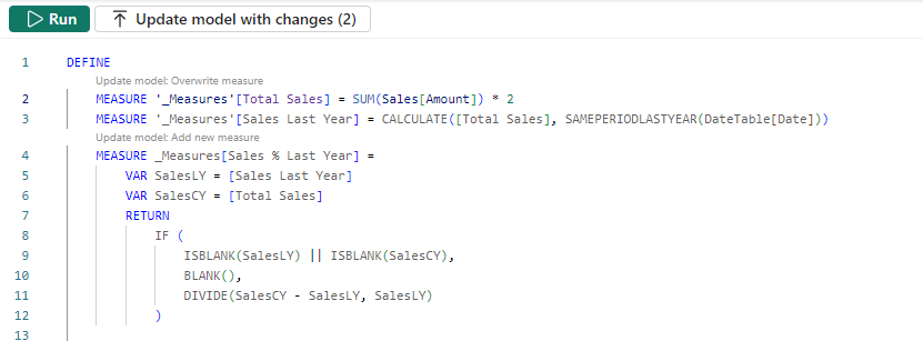
It is not about being for or against AI. It is about knowing exactly where the tool hits its stride and where it starts to trip over its own logic.
To cut through that uncertainty, we put Copilot to work on a practical sales model across five realistic scenarios: writing measures, building advanced logic, explaining complex DAX, debugging errors, and documenting the semantic model. Along the way, each result gets a simple rating:
🟢 Green Light — Copilot handles it reliably. Safe to use with a quick review.
🟡 Yellow Light — Copilot provides a strong starting point, but the output needs validation before it goes into production.
🔴 Red Light — Copilot struggles or misleads. A human needs to drive.
A sample report is available for download at the end of this post so you can follow along and test these prompts against the same data.
Let’s find out where each scenario lands.
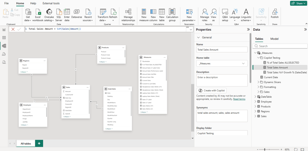
The Data Model: A Standard Sales Model
Instead of testing Copilot on isolated or theoretical formulas, we are putting it to work on a simplified but practical dataset.
The model consists of four core tables connected through a standard star schema:
- Sales: The fact table. Each row is a single transaction with a SalesID, Amount, SalesDate, and CustomerID.
- Product: 15 products across 6 categories: Smartphones, Laptops, Tablets, TVs, Headphones, and Watches, each with a Product Code and Product Image.
- Employee: 17 employees spanning four departments: Retail, Sales, Marketing, HR, and R&D — with JobTitle, Department, and a ManagerID for hierarchy.
- Region: Three regions: the United States, Europe, and Asia
The Sales table connects to each dimension through its ProductID, EmployeeID, and RegionID. Column names are descriptive, and the schema is intentionally straightforward.
Why does that matter? Copilot’s output quality is directly tied to how well the model is structured. Column names like Amount and SalesDate give it far more to work with than Col1 or Fld_003. A little upfront investment in clean, readable naming pays off quickly when we start prompting.
The Five Scenarios
The goal is to move beyond simple sums and see how Copilot handles the tasks that actually eat up our time. Here is what we are testing:
- Establishing the Basics: Foundational measures like total sales and department-filtered aggregations, to confirm Copilot correctly reads the model structure and relationships.
- Building Advanced Logic: More complex calculations like year-over-year growth and percentage of total, where filter context starts to matter.
- Explaining Existing Measures: Handing Copilot DAX that is already in the model and asking it to translate the logic into plain language.
- Debugging Logical Errors: Providing a measure that runs without error but returns incorrect results, and seeing whether Copilot can identify the real problem.
- Generating Measure Descriptions & Comments: Using Copilot to auto-document completed measures directly in the model, and evaluating whether the output is accurate and usable.
Because of the generative nature of Copilot, it may not produce the exact same DAX or explanations for you as shown here. The patterns and behaviors should be consistent, but the specific wording may vary.
This is not an attempt to break the tools with impossible requests. It is a straightforward evaluation of how much repetitive, manual DAX work we can safely offload to Copilot in a standard reporting environment.
TL;DR — Key Findings at a Glance
If you are short on time, here is the summary. We tested Copilot in Power BI Desktop across five scenarios using the sales model described above. Each scenario was tested using both the Copilot pane and the DAX query view inline Copilot where applicable.
The findings:
- 🟢 Establishing the Basics: Copilot correctly identified table relationships and column names without being told. Basic measure and filtered aggregations came back clean and accurate.
- 🟡 Building Advanced Logic – Copilot Pane: Strong DAX patterns for YoY growth and percentage contribution, but both measures carry dependencies that Copilot does not resolve on its own. The Date table requirement and the
ALLvsALLSELECTEDdesign decision still need a human in the loop. - 🟢 Building Advanced Logic – DAX Query View: Writing measures through the inline Copilot added a meaningful validation step. The
% of Total Sales by Productmeasure usedALLSELECTEDcorrectly without prompting, and the Suggest measures feature returned six well-structured analytical measures in a single query with inline comments and a preview ready to run. - 🟡 Explaining Complex DAX Measures – Copilot Pane: Once the full DAX is pasted in, Copilot handles even the most complex measures accurately. A multi-variable measure combining
SUMMARIZE,TOPN,CONCATENATEX, and HTML rendering was broken down step by step in plain language. - 🟢 Explaining Complex DAX Measures – DAX Query View: The Define and Evaluate workflow eliminates the manual paste step and produces a more structured, variable-by-variable explanation. The better entry point for thorough measure audits.
- 🟡 Debugging DAX Logical Errors: Correctly diagnosed an
ALLvsALLSELECTEDfilter context issue and provided two well-reasoned solutions with clear guidance on when to use each. Yellow light only because the fix still requires the developer to understand which option fits the specific report design. - 🟢 Generating Measure Descriptions – Model View: Accurate, readable, and business-aware descriptions generated in seconds. Descriptions travel with the model metadata and surface as tooltips in the Fields pane.
- 🟢 Adding Inline Comments – DAX Query View: Copilot added meaningful, explanatory comments to an existing measure, explaining the reasoning behind each step rather than just restating variable names. Combined with measure descriptions, this covers documentation for both developers and report authors
Copilot earned five Green Lights and three Yellow Lights across eight tests. No Red Lights. The gaps that produced Yellow Lights were not about DAX correctness. They were about model architecture decisions and report design context that Copilot simply does not have access to. The developers who get the most value from Copilot are those who know enough DAX to validate the results.
Getting Started: How to Access Copilot in Power BI Desktop
Before jumping into the scenarios, it helps to know where Copilot lives in Power BI Desktop and how to reach it for each type of task. There are three entry points, and each one serves a different purpose.
Note: Copilot in Power BI Desktop requires access to a paid Fabric capacity (F2 or higher) or Power BI Premium capacity (P1 or higher). A Power BI Pro or Premium Per User (PPU) license alone is not sufficient. If the Copilot button in your ribbon appears greyed out or disabled, confirm with your administrator that Copilot is enabled at the tenant level. Review licensing and other requirements or limitations here: Copilot for Power BI overview.
The Copilot Pane (Report View)
This is the primary entry point for writing measures, debugging logic, and asking questions about the data model.
- Open the Copilot pane: Open the report in Power BI Desktop and select Copilot in the ribbon. The first time we use Copilot, we will be prompted to select a compatible workspace to associate with the report.
- Describe the measure: Once connected, the Copilot pane opens on the right side of the screen. Describe the measure in plain language. Reference the relevant table or column and be as specific as the business requirement calls for.
- Debug with Copilot: For debugging, paste the broken measure directly into the chat and describe what it should return versus what it is actually returning.
The more specific our prompt, the better the output. “Calculate total sales” will get us a basic SUM. “Calculate total sales for employees in the Retail department only” gives Copilot enough context to apply the correct filter across the right table relationship.
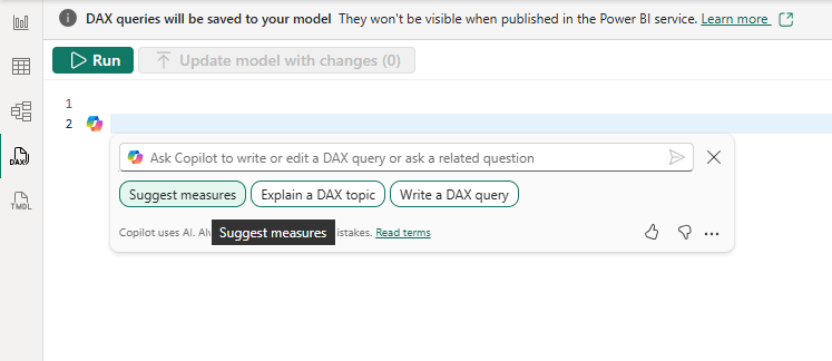
The DAX Query View (Inline Copilot)
The DAX query view has its own separate inline Copilot, distinct from the report view pane. It is particularly useful for writing DAX queries, understanding existing measures, and learning DAX concepts in context.
- Open the inline Copilot. Switch to DAX query view using the left navigation bar. It is the fourth icon from the top. Open the inline Copilot by clicking the Copilot button in the query editor or pressing
CTRL + I. - Use the inspire buttons. Three inspire buttons give us a quick starting point for the most common tasks:
- Write DAX query: describe what you want in plain language, and Copilot generates the DAX, with automatic syntax validation and a retry if the first attempt contains errors.
- Suggest measures: reviews your data and suggests new measures in a DAX query for further analysis.
- Explain a DAX topic: ask about a specific function or concept and get a contextual explanation tied to your actual model.
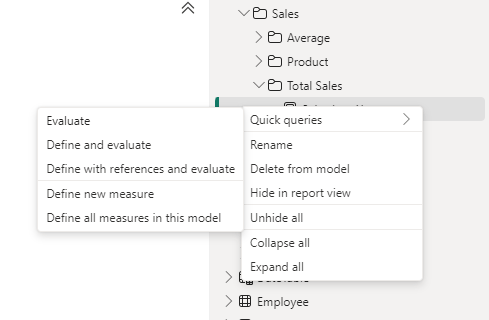
- Work with an existing measure. To use Copilot with an existing measure, right-click it in the Data pane and select Define and Evaluate. This loads the full measure definition into the query editor, where we can then use the Explain or Write prompts to work with it.
Practical insight: This is the better entry point when you want to understand why a measure works the way it does. It is also useful for adding inline comments to complex measures before saving them back to the model. A small habit that pays off in team environments.
The Model View (Measure Descriptions)
This entry point is specifically for generating measure descriptions and is easy to miss if you spend most of your time in Report view.
- Select the measure. Switch to Model view in Power BI Desktop. In the Data pane, select the measure we want to document.
- Generate the description. In the Properties pane on the right, locate the Description field. Click Create with Copilot to generate a description, then select Keep it to save it.
The description is stored directly in the .pbix file and surfaces as a tooltip when users hover over the measure in the Fields pane. It is a small detail that makes a meaningful difference in shared models and self-service environments.
Note: Copilot will only generate descriptions for measures in a valid state with no errors. Resolve any measure issues before attempting to generate a description.
Scenario 1: Establishing the Basics
Does Copilot Understand Your Data Model?
Before throwing complex logic at Copilot, the first step is confirming it understands the data model. If it cannot identify the correct columns for a simple aggregation, it will not stand a chance with more complex requests.
Test 1: Total Sales Amount
The Prompt: Provide a DAX measure that calculates the Total Sales Amount
Copilot’s Response:
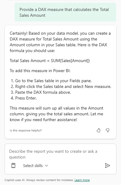
🟢 Green Light
Practical Insight: This looks like a small step, but it is where we verify that Copilot recognizes the data model structure. Copilot correctly identified the
Amountcolumn in theSalestable without being told its exact name. That is a good sign before moving into more complex requests.
Helpful Tip: Although Copilot correctly identified the table and column here, it is a good habit to always use the fully qualified name —
Table[Column]— in DAX measures. As data models grow, ambiguous column references become a real problem.
Test 2: Total Retail Sales
The Prompt: Create a measure for Total Retail Sales that calculates the total sales amount for employees in the Retail department only
Copilot’s Response:
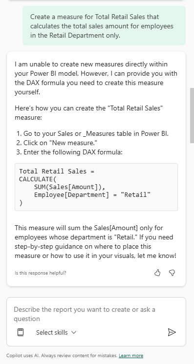
🟢 Green Light
Practical Insight: This second test confirms something more important than syntax. Copilot understands the relationship between the
SalesandEmployeetables. It correctly usedCALCULATEto modify the filter context and applied the"Retail"filter from theEmployeetable to push through to theSalestable, returning the appropriate result.Notice that Copilot opened with “I can’t create new measures or calculated columns directly within Power BI.” This disclaimer appears frequently and is worth knowing upfront. Copilot generates the DAX and guides us through the steps, but the act of creating the measure in the model is always ours to complete.
Helpful Tip: When using Copilot-generated DAX, pay attention to whether it relies on base column aggregation or references existing measures. Copilot used
SUM(Sales[Amount])directly rather than referencing the[Total Sales Amount]measure created in the previous test. This is a common pattern. It defaults to base column aggregation rather than measure branching. Both approaches work, but referencing existing measures improves consistency, reduces redundancy, and makes the model easier to maintain long term.
Scenario 2: Building Advanced DAX Logic
Where Filter Context Starts to Matter
With the basics confirmed, the next step is to see how Copilot handles more complex measures. This is where filter context starts to matter and where the quality of the data model structure begins to influence the output.
Test 1: Year-Over-Year Growth
Calculating Year-over-Year (YoY) growth is one of the more common requirements in sales reporting. It requires a solid understanding of date filters and is one of the first places where DAX relies on model structure rather than just formula syntax.
The Prompt: Create a measure that calculates year-over-year growth for total sales.
Copilot’s Response:
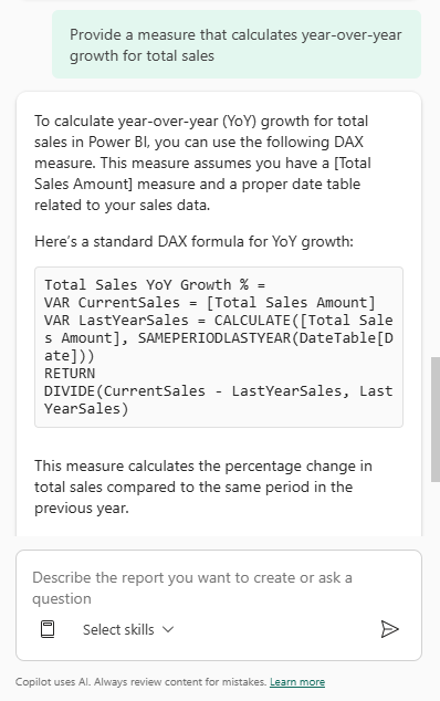
🟡 Yellow Light — Strong DAX, external dependency required
Practical Insight: This is a strong result for a common time intelligence pattern. The measure references the existing
[Total Sales Amount]measure, uses variables for readability, and appliesDIVIDEto handle potential zero denominators cleanly.The yellow light is not about the formula. It is about what sits beneath it. Copilot correctly flagged that this measure requires a properly configured Date table, but it did not help us build one or verify that ours is set up correctly. Always validate that the Date table is marked, continuous, and correctly related to the fact table before putting a time intelligence measure into production.
Helpful Tips:
- Be explicit in prompts. Specify “percentage growth” or “absolute difference” depending on what the business actually needs
- Review naming conventions so the generated measure aligns with the rest of the data model
- After adding the measure, set the format. Copilot provides the logic but does not automatically update value formatting
- Always test the result in a simple visual before adding it to a report
Overlooked Detail: One thing that is easy to miss here is the Date Table assumption. Copilot explicitly noted this measure requires a “proper date table.”
In our sample dataset, we have a
SalesDatecolumn in theSalestable, but for time intelligence functions likeSAMEPERIODLASTYEARto work reliably, Power BI requires a continuous date column and a correctly configured, marked Date table. If the measure referencesSalesDatedirectly from the fact table, it may appear to work but can return incomplete or incorrect results under certain filter conditions. This dependency is not always obvious from the generated DAX alone.
Alternative Approach:
Copilot used SAMEPERIODLASTYEAR, which is a common and readable pattern. An alternative for more complex or flexible requirements is DATEADD:
Total Sales YoY Growth % = VAR CurrentSales = [Total Sales Amount]VAR LastYearSales = CALCULATE( [Total Sales Amount], DATEADD(DateTable[Date], -1, YEAR) )RETURN DIVIDE(CurrentSales - LastYearSales, LastYearSales)
Both approaches achieve similar results. SAMEPERIODLASTYEAR is more concise and easier to read. DATEADD provides more flexibility and uses the same structure whether shifting by days, months, quarters, or years. In practice, the choice often comes down to readability versus flexibility and how the Date table is structured.
Test 2: Percentage Contribution by Region
Let’s look at how Copilot handles a different kind of problem: calculating how much a specific segment contributes to the overall total. In this case, we want to understand how much each region contributes to total sales.
This requires calculating a value in the current filter context and comparing it against a total that ignores that filter.
The Prompt: Provide a measure that calculates the percentage contribution of each region to total sales.
Copilot’s Response:
🟡 Yellow Light — Correct answer, incomplete solution
Practical Insight: The formula is syntactically correct and Copilot appropriately removes the filter context from the
Regiontable. The yellow light here is about report design, not DAX correctness.Copilot gave exactly what was asked for, but the prompt itself may not have fully capture the business requirement. If users apply a Region slicer and expect percentages to reflect only what is selected, this measure will stay anchored to the grand total and the numbers will not add up to 100%.
Copilot answered the question. It just did not ask whether the question was the right one.
Helpful Tips:
- Once we add this measure to a visual, apply a Region slicer and observe the behavior. If the percentages no longer sum to 100% after filtering, consider switching to
ALLSELECTEDinstead ofALL- Like the YoY measure, set the format to percentage manually after creating the measure
Overlooked Detail: The difference between
ALLandALLSELECTEDis easy to miss here but it matters significantly in interactive reports.ALL(Region)removes every filter on the Region table, including filters applied by slicers, meaning the denominator is always the grand total regardless of what users have selected.ALLSELECTEDwould preserve slicer selections while still ignoring the visual’s own row context. Copilot applied a standard pattern correctly, but it did not account for the nuances of how the report will actually be used.
Alternative Approach:
An alternative is to use REMOVEFILTERS, which makes the intent of the measure clearer to anyone reading it later:
% of Total Sales by Region =DIVIDE( [Total Sales Amount], CALCULATE( [Total Sales Amount], REMOVEFILTERS(Region) ))
REMOVEFILTERS is generally preferred in team environments because its name explicitly describes what it does. ALL can be used both to clear filters and to return a table of values, which can lead to confusion when someone else reads the measure later.
DAX Query View Approach
Writing Measures with Inline Copilot
The Copilot pane is not the only way to generate DAX. For developers who prefer to validate output before committing it to the model, the DAX query view inline Copilot offers a useful alternative. Write the query, run it, review the results, and keep it if it looks right.
Here is a % of Total Sales by Product measure generated using DAX query view:
- Open a new query tab. Switch to DAX query view using the left navigation bar. Open a new query tab and press
CTRL + Ito open the inline Copilot. - Enter the prompt and press Enter.
- Preview the results. Before keeping the query, select Run or press
F5to preview the results directly in the query editor. - Add the measure to the model. Once satisfied with the output, select Keep query. Then use the Update model with changes button to add the measure to the data model.
The Prompt: Create a % of Total Sales by Product measure
Copilot’s Response:
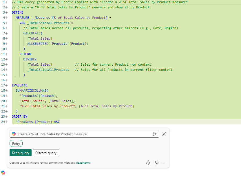
Before keeping the query, select Run or press F5 to preview the results directly in the query editor.
🟢 Green Light
Practical Insight: This is a strong result. Copilot correctly named the measure
% of Total Sales by Product, usedALLSELECTEDinstead ofALL, and included inline comments explaining the logic of each variable.Using
ALLSELECTEDmeans the denominator will respect external slicers like Date and Region while still comparing across all products. The preview results confirm the measure is working as expected before anything gets committed to the model.
Helpful Tip: The
DEFINE MEASUREblock and theEVALUATEstatement serve different purposes in this query.The
DEFINEblock creates the measure definition. This is what gets added to the model when we select Update model with changes.The
EVALUATEblock runs a query using that measure to preview the results. We can modify theEVALUATEportion freely to test the measure across different dimensions without affecting what gets committed to the model.
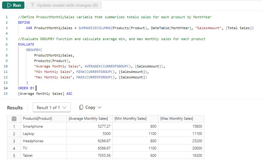
Bonus: Let Copilot Suggest What to Build Next
One of the more practical features in DAX query view is the Suggest measures inspire button. Rather than prompting Copilot for a specific measure, we can ask it to analyze the model and recommend what to build next.
The Prompt: Based on my data suggest new measures in a DAX query for further analysis and try them out with one or more suitable columns
Copilot’s Response:
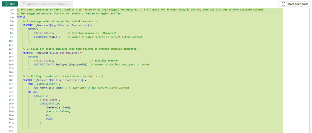
🟢 Green Light
Practical Insight: In a single prompt, Copilot analyzed the model, identified six meaningful analytical measures, wrote clean DAX for each one with inline comments, and wired them into a single
EVALUATEquery so we can preview all of them together before committing anything to the model.For a developer starting a new report or looking to expand an existing model, this is a useful starting point. It is not just a list of suggestions. It is working DAX we can run and evaluate immediately.
Helpful Tip: Run the query first and review the results across all six measures before selecting Update model with changes.
Not every suggested measure will be relevant to every report. For example the suggested
Region Sales RankusingDENSEranking, and may or may not reflect the ranking behavior the business requires. Use the preview as a decision-making tool. Select the measures that make sense for the specific reporting requirements and add them individually if needed.
Overlooked Detail: Two of the six suggested measures —
Sales Last 12 MonthsandSales 3M Rolling Avg— reference'DateTable'[Date], which assumes a properly configured Date table is present in the model.As noted in the YoY Growth scenario, these measures will not work reliably without one. Copilot surfaced the right patterns, but the model still needs the right foundation beneath them.
Scenario 3: Explaining Complex DAX Measures
From Black Box to Plain Language
One of the most practical ways to use Copilot is not writing new DAX. It is making sense of DAX that already exists in the model. Whether we are inheriting a report from a colleague or revisiting logic written six months ago, Copilot can help translate complex measures into plain language.
This test uses the [Top Performers] measure — a multi-variable measure that summarizes sales by region and employee, identifies the top three performers, and returns a fully formatted HTML string for use in a custom visual. It is a realistic example of the kind of measure that is genuinely difficult to read cold.
Test 1: Asking Copilot to Explain Without the DAX
The Prompt: Explain the logic of the [Top Performers] measure. What is it calculating, and how is it displaying results?
Copilot’s Response:
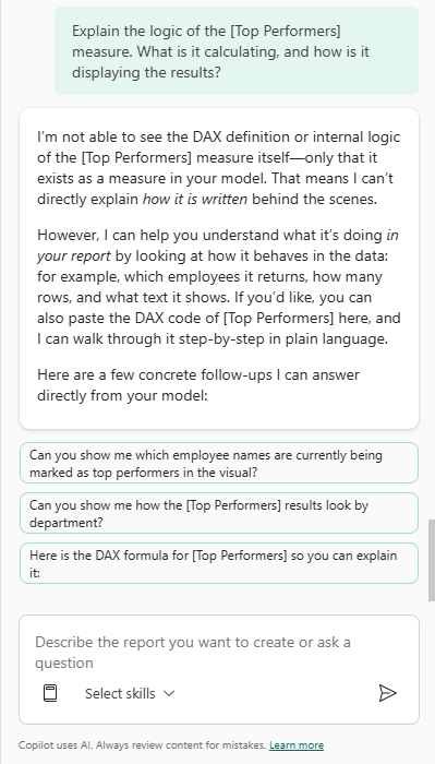
Practical Insight: This is an important behavior to understand before relying on Copilot for explanations. By default, Copilot in the report view pane cannot read the DAX inside measures. It only knows a measure exists.
This is not a failure; it is a limitation worth knowing upfront. The fix is straightforward: paste the full formula directly into the chat. As we will see in the follow-up, that changes the result entirely.
The Follow-Up Prompt: Here is the DAX formula for [Top Performers] so you can explain it:
Top Performers = VAR _groupedByRegionEmployee = SUMMARIZE( Sales, Regions[Region], Employee[EmployeeID], "EmployeeTotalSalesMetricCY", [Sales Metric (CY)] )VAR _top3Performers = TOPN( 3, _groupedByRegionEmployee, [EmployeeTotalSalesMetricCY], DESC, Employee[EmployeeID], ASC )VAR _belowTop5Count = COUNTROWS(_groupedByRegionEmployee) - COUNTROWS(_top3Performers)VAR _top5HTML = CONCATENATEX( TOPN(3, _top3Performers, [EmployeeTotalSalesMetricCY], DESC), VAR _imageURL = LOOKUPVALUE(Employee[Image], Employee[EmployeeID], Employee[EmployeeID]) VAR _salesMetricCY = [EmployeeTotalSalesMetricCY] VAR _rank = RANKX(_top3Performers, [EmployeeTotalSalesMetricCY],,DESC,Dense) RETURN "<div style='width:50px; height:50px; border-radius:50%; overflow:visible; border:2px solid #0b4d78;'> <img src='" & _imageURL & "' style='width:100%; height:100%; object-fit:cover; border-radius:50%;' /> <div style='position:absolute; bottom:-8px; right:-8px; width:35px; height:35px; border-radius:50%; background-color:#0b4d78; color:white; font-size:9px;'> " & FORMAT(_salesMetricCY, "$#,0,.0K") & " </div> </div>", "", [EmployeeTotalSalesMetricCY], DESC )VAR _additionalCircle = IF( _belowTop5Count > 0, "<div style='width:30px; height:30px; border-radius:50%; background-color:#bfbfbf; color:white; font-size:16px; margin-left:5px;'> +" & FORMAT(_belowTop5Count, "0") & " </div>", "" )VAR _finalOutput = "<div style='display:flex; align-items:center; justify-content:flex-end; overflow:hidden; max-width:400px; padding-right:5px; padding-bottom:8px'> " & _top5HTML & _additionalCircle &" </div>"RETURN _finalOutput
Copilot’s Response:
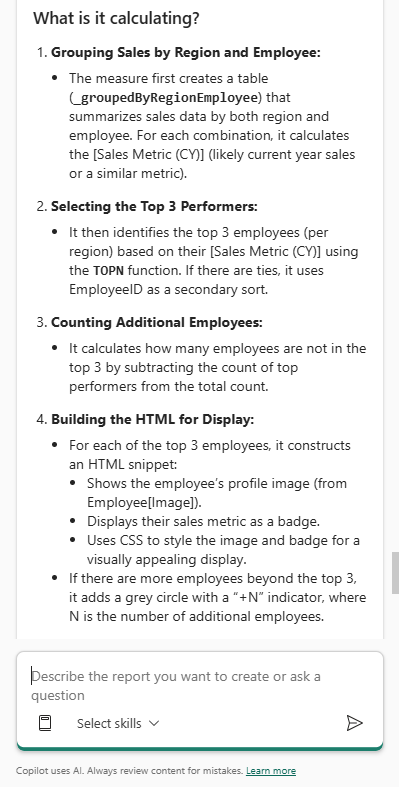
Certainly! Here’s a step-by-step explanation of what the [Top Performers] measure is doing and how it displays results:
What is it Calculating?
- Grouping Sales by Region and Employee:
- The measure first creates a table (_groupedByRegionEmployee) that summarizes sales data by both region and employee. For each combination, it calculates the [Sales Metric (CY)]
- Selecting the Top 3 Performers:
- It then identifies the top 3 employees (per region) based on their [Sales Metric (CY)] using the TOPN function. If there are ties it uses EmployeeID as a secondary sort.
- Counting Additional Employees:
- It calculates how many employees are not in the top 3 by subtracting the count of top performers from the total count.
- Building the HTML for Display
- For each of the top 3 employees, it constructs an HTML snippet:
- Shows the employee’s profile image (from Employee[Image]).
- Displays their sales metric as a badge
- Uses CSS to style the image and badge for a visually appealing display
- If there are more employees beyond the top 3, it adds a grey circle with a “+N” indicator, where N is the number of additional employees.
- Combining Everything for Output:
- The final output is a single HTML string that visually displays the top 3 performers (with image and sales badges) and, if applicable, a circle indicating how many more employees there are.
How is it displaying the results?
Visual Output: The measure returns an HTML string designed for use in a Power BI visual that supports HTML rendering.
What You See:
- Up to three employee profile images, each with a badge showing their sales metric
- If there are more than three employees, a grey circle with “+N” to indicate additional performers not shown.
- The layout is styled to be compact, visually appealing, and aligned to the right.
Summary
- Purpose: Highlights the top 3 sales performers per region, visually, with profile images and sales badges
- Display: Uses HTML and CSS for a rich, custom visual experience, including a “+N” indicator for additional employees beyond the top 3.
If you need a breakdown of any specific part of the DAX or want to know how to adapt this logic, let me know!
🟢 Green Light
Practical Insight: Once the full DAX formula is provided, this is one of Copilot’s strongest use cases. This measure includes various variables, HTML, and CSS, and Copilot still correctly identified the ranking logic, the visual intent, and the role of each variable in the output.
For complex measures like this, Copilot can save a developer meaningful time during onboarding, code reviews, or model audits.
Helpful Tips:
- The Context Gap. If Copilot says it cannot explain a measure, do not give up. Pasting the full DAX formula directly into the chat almost always produces a detailed and accurate breakdown
- Onboarding Tool. This workflow works well for bringing new team members up to speed on complex models. Ask Copilot to explain a measure in plain language and use that output as a starting point for internal documentation
- DAX Query View Alternative. For a more detailed breakdown, switch to DAX query view, right-click the measure, and select Define and Evaluate. From there, use the Explain this query prompt for a structured, step-by-step analysis.
Overlooked Detail: Copilot explained what the measure is doing accurately, but it did not surface deeper technical considerations unprompted, such as the performance implications of nesting
TOPNinsideCONCATENATEX, whether repeatedTOPNcalls could be consolidated, or the assumption thatLOOKUPVALUEwill always return a single match.These are the kinds of questions that should always be asked when reviewing measure definitions.
If we need that level of analysis, we can follow up with a specific prompt such as “Are there any performance concerns with this measure?” Copilot responds well to targeted follow-up questions; it just does not volunteer that analysis on its own.
Alternative Approach — Explaining Measures in DAX Query View
In the main test, explaining the [Top Performers] measure required pasting the full DAX formula directly into the Copilot pane. The DAX query view offers a cleaner path to the same result and goes one step further by letting us run the measure and explain it in the same workflow.
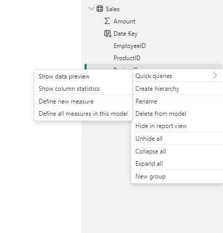
- Load the measure into DAX query view. Switch to DAX query view using the left navigation bar. In the Data pane, right-click the
[Top Performers]measure and select Define and Evaluate. This automatically loads the full measure definition into the query editor as aDEFINE MEASUREandEVALUATEstatement, with no manual copying required. - Open the inline Copilot and explain the query. Select the DAX query in the editor and press
CTRL + Ito open the inline Copilot. Use the Explain this query inspire button or type the prompt directly.
The Prompt: Explain this DAX query
Copilot’s Response:
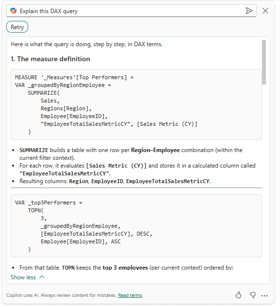
🟢 Green Light
Practical Insight: The DAX query view explanation is noticeably more structured than the report view pane equivalent. Because the measure is loaded via Define and Evaluate, Copilot has the full definition in context from the start with no pasting required.
The breakdown is organized by variable, walks through the logic in sequence, and surfaces the purpose of each section clearly. For a measure of this complexity, that structure makes a real difference in how quickly someone can follow the logic.
Helpful Tip: The Define and Evaluate right-click option is the fastest path to getting a useful Copilot explanation for any existing measure in the model.
It eliminates the manual copy-paste step from the report view pane workflow and ensures the full measure definition is in context before Copilot begins its analysis. Make it a habit when onboarding to a new model or auditing measures written by someone else.
Overlooked Detail: Compare the two explanation workflows side by side. The report view pane required the full DAX to be pasted manually, and Copilot’s response, while accurate, was structured around the user’s framing of the question.
The DAX query view response was driven by the query structure itself, which produced a more methodical, variable-by-variable breakdown.
Neither is strictly better. The pane is faster for a quick question, while the query view is better for a thorough audit. Knowing which to reach for depending on the situation is the more important skill.
Scenario 4: Debugging DAX Logical Errors
Finding What the Red Squiggle Misses
Identifying syntax errors is straightforward. Power BI flags them immediately with a red underline. The real challenge is logical debugging: when a measure runs without error but returns results that are incorrect for the business requirement. This test determines whether Copilot can identify why a measure is technically functional but practically broken.
The Setup
For this test, we want to create a dynamic % of Total Sales measure that displays correctly across multiple dimensions — Products, Regions, and Departments — while also respecting report-level filters like Year. Here is the measure as it currently exists in the model:
% of Total Sales = VAR CurrentSales = SUM('Sales'[Amount])VAR TotalSales = CALCULATE(SUM('Sales'[Amount]), ALL('Sales'))RETURN DIVIDE(CurrentSales, TotalSales)
The measure uses ALL(Sales), which removes every filter from the Sales table, including slicers and report-level filters.
For our requirements, this is a common mistake that effectively freezes the denominator to the grand total of the entire dataset, regardless of what filters are applied.
For example, when users apply a Year slicer to focus on the previous year, the numerator correctly reflects only the previous year’s sales, but the denominator still reflects all years.
The result is percentages that appear unexpectedly small and never add up to 100% within the filtered context.
We see the percentages are smaller than expected and bring the problem to Copilot.
The Prompt:
I have a measure for % of Total Sales, but when I filter my report to the year 2025, the percentages are small when viewed on multiple visuals across various dimensions and don’t add up to 100%. How do I make this dynamic so I can display the percent of total for multiple dimensions?
Copilot’s Response:
The issue you’re experiencing is due to the use of ALL(‘Sales’) in your measure. This removes all filters from the Sales table—including filters on Year, Product, Department, etc.—so your denominator is always the grand total sales for all years and all data, not just for the filtered year (e.g., 2025). As a result, when you filter to 2025, the numerator is only 2025 sales, but the denominator is still the total for all years, making the percentages appear small and not sum to 100% within the filtered context.
To make the measure dynamic and context-aware (so that it always sums to 100% within the current filter, such as year, product, or department), you should use the REMOVEFILTERS or ALLSELECTED function, depending on your needs:
- REMOVEFILTERS: Removes filters only from the specified columns or tables, but keeps filters from outside the specified scope (such as report/page/visual filters).
- ALLSELECTED: Keeps filters applied by slicers and visuals, but ignores filters from the current visual’s breakdown.
Here’s how you can rewrite your measure for dynamic percent of total within the current filter context:
Option 1: Using REMOVEFILTERS (recommended for most scenarios)
But this still ignores filters on the Sales table. If you want the denominator to respect external filters (like Year = 2025), but ignore breakdowns within the visual (like Product or Department), use ALLSELECTED.
Option 2: Using ALLSELECTED (best for visuals with slicers/filters)
How to choose:
- Use REMOVEFILTERS if you want the denominator to always be the total for the current report/page/visual filter context (e.g., Year = 2026).
- Use ALLSELECTED if you want the denominator to respect slicers and filters, but ignore breakdowns within the visual.
Try replacing your measure with the ALLSELECTED version above. When you filter to 2026, the percentages across your breakdown (e.g., by Product, Department, etc.) will sum to 100% for that year.
🟡 Yellow Light
Practical Insight: This is a strong performance from Copilot. It accurately diagnosed that
ALL('Sales')was removing too much filter context, explained clearly why the percentages were appearing small, and provided two well-reasoned options with guidance on when to use each one. Updating the measure using theALLSELECTEDoption produces the expected results and meets the original business requirement.

If you are building reports where slicers play a central role in user decision-making, providing essential context before users make their selections can be extremely beneficial.
The design of those slicers matters just as much as the DAX behind them. For a deeper look at how to turn static slicers into interactive decision aids that give users meaningful context before they make a selection, check out Design Meets Data: From Static Slicers to Interactive Decision Aids.

Design Meets Data: From Static Slicers to Interactive Decision Aids
What if your slicers could answer questions before you even select them? With a little preview context, they can guide users toward the right decisions instantly.
Helpful Tips:
- Slicers vs. Rows: If we want percentages in a visual to always sum to 100% based only on what a user selects in an external slicer,
ALLSELECTEDis the right tool. It bridges the gap between the dataset’s grand total and the total currently visible on screen- Test Across Dimensions: After applying the fix, swap the dimension in the visual. Switch from Region to Product to Department. If the logic is truly dynamic, the percentages should sum to 100% for whichever category is in context
Overlooked Detail: The distinction between
REMOVEFILTERSandALLSELECTEDis subtle but consequential.If a filter is applied at the visual level,
ALLSELECTEDwill calculate the percentage based on the filtered data, whereasREMOVEFILTERSmay still calculate against the broader filter context.In an interactive report with multiple slicers and cross-filtering visuals, these two measures can return noticeably different results from the same visual.
Scenario 5: Generating Measure Descriptions and Comments
Documenting the Semantic Model
One of the most tedious parts of semantic model development is documentation. Measures get built, reports get published, and descriptions rarely get written. This test determines how useful Copilot can be in handling that documentation work and whether the output is accurate and professional enough to actually use.
Test 1 — Generating Measure Descriptions in Model View
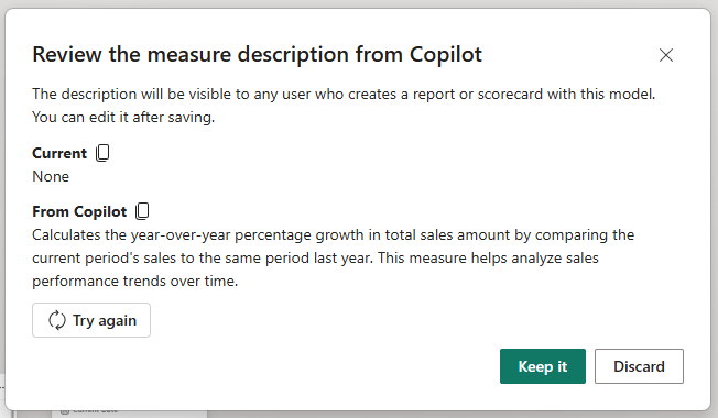
For this test, we navigate to Power BI Desktop’s Model view, select the Total Sales YoY Growth % measure, and use the Create with Copilot option in the Properties pane.
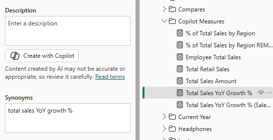
Copilot’s Response:
🟢 Green Light
Practical Insight: Copilot does not just restate the measure name. It explains what the measure calculates and, importantly, why a report author or business user would reach for it.
That distinction matters in shared models where multiple people are building reports from the same semantic layer. A description that explains business intent is more useful than one that simply restates the DAX.
Helpful Tips:
- Hover for Clarity: Once the description is saved, it appears as a tooltip when a user hovers over the measure in the Fields pane. This reduces the “what does this measure actually do?” questions in self-service environments
- Try Again: If the generated description feels too technical or does not quite capture the business intent, use the Try again option to generate a new version. For more tailored adjustments such as “Rewrite this description for a non-technical sales manager,” prompt Copilot directly in the Copilot pane
- Keep It Current: If we update a measure’s DAX logic later, select the Create with Copilot button again to regenerate the description and keep documentation aligned with the actual calculation
Test 2: Adding Inline Comments in DAX Query View
Measure descriptions in the Properties pane are valuable for self-service users browsing the Fields pane, but they are not visible to the developer editing the measure.
Inline comments inside the DAX formula serve a different purpose. They document the logic for anyone who opens the measure editor, making complex calculations easier to read, audit, and maintain over time.
DAX query view Copilot can add those comments automatically.
- Load the measure. Switch to DAX query view using the left navigation bar. In the Data pane, right-click the
Total Sales YoY Growth %measure and select Define and Evaluate. This loads the full measure definition into the query editor. - Add comments with Copilot, Press
CTRL + Ito open the inline Copilot. Enter the prompt and press Enter. - Commit the changes. Select Keep query and then Update model with changes to commit the commented measure definition back to the model.
The Prompt: Add comments to this MEASURE
Copilot’s Response:
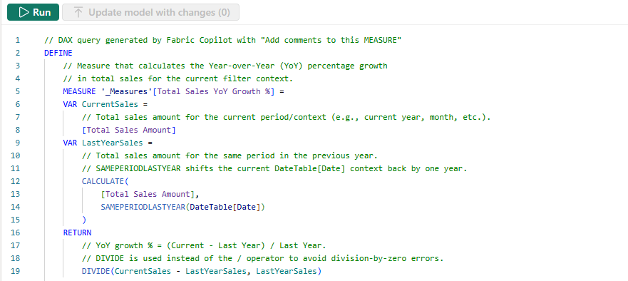
🟢 Green Light
Practical Insight: Copilot did not just add surface-level comments restating the variable names. It explained the why behind each step.
The comment on
SAMEPERIODLASTYEARclarifies that it shifts the current date context back by one year.The comment on
DIVIDEexplains why it is preferred over the division operator.For a developer inheriting this model six months from now, those comments answer the questions they would otherwise have to work out themselves.
Helpful Tip: Inline comments and measure descriptions solve different documentation problems and work best together.
The description in the Properties pane is visible to report authors browsing the Fields pane. It answers the question “what does this measure do and when should I use it?”
The inline comments inside the DAX are visible to developers editing the measure. They answer “how does this measure work and why is it written this way?” Neither replaces the other. Using Copilot to generate both takes a matter of minutes and covers both audiences.
Overlooked Detail: Copilot scoped the comments specifically to the
DEFINE MEASUREblock. It did not attempt to comment theEVALUATEportion of the query loaded by Define and Evaluate.This is the right behavior. The comments that travel with the measure when we select Update model with changes are the ones inside the
DEFINE MEASUREblock. Copilot correctly focused its documentation effort where it counts.
Practitioner’s Verdict:
How Far Can You Trust Copilot for DAX Development?
After running Copilot through five scenarios — writing measures, building advanced logic, explaining existing DAX, debugging logical errors, and documenting the semantic model — here is the honest assessment.
Copilot is a capable and practical assistant for semantic model development. Across the five scenarios, it earned five Green Lights and three Yellow Lights. No Red Lights, but the Yellow Lights carry real weight and are worth understanding before we start offloading DAX work to AI.
Where Copilot hits its stride:
The results were strongest where the task was well-defined and the model was clean. Basic and intermediate measures came back quickly and accurately. The debugging scenario performed well — correctly diagnosing an ALL vs ALLSELECTED issue, explaining the underlying cause clearly, and offering two well-reasoned solutions with guidance on when to use each. Measure descriptions were accurate, readable, and business-aware rather than just restating the formula name.
The explanation scenario highlighted something equally valuable. Feed Copilot a complex, multi-variable measure with HTML rendering logic and it will walk through it step by step in plain language. For onboarding new team members, auditing inherited models, or simply revisiting logic written months ago, that capability is genuinely useful.
The DAX query view inline Copilot adds further value. The Suggest measures feature returned six well-structured analytical measures in a single prompt, complete with inline comments and a live preview. The Add comments workflow produced useful documentation rather than just variable name restatements. These are the features that make the biggest difference in team environments where maintainability matters.
Where we still have to drive:
The three Yellow Lights pointed to the same underlying pattern: Copilot answers the question we ask, not necessarily the question we should have asked.
The YoY Growth measure was syntactically strong but assumed a properly configured Date table without helping us verify or build one.
The percentage contribution measure was correct for the prompt, but did not anticipate how ALL versus ALLSELECTED would behave in an interactive report with slicers.
In both cases, Copilot did its job. The gap was in the prompt, the model structure, or the report design context that Copilot simply does not have access to.
This is the part that matters most: Copilot does not know our report. It does not know how users interact with slicers or what the business actually needs versus what was typed into the prompt. That context lives with the developer, not the AI.
Practical Insight: The developers who will get the most out of Copilot are not the ones who trust it blindly. They are the ones who have a solid understanding of DAX and can review what comes back.
Copilot compresses the time it takes to get from a blank formula bar to a working starting point. The validation, the model design decisions, and the business context still require a human in the loop.
The broader DAX community reinforces this point. The continued investment in deep technical content covering advanced concepts signals that DAX expertise is not becoming less relevant in an AI-assisted world. If anything, it is becoming more important. We need to know what correct DAX looks like to evaluate what Copilot hands us.
Copilot in Power BI Desktop is a practical productivity tool for Power BI semantic model development. It handles the repetitive, time-consuming parts of DAX work reliably enough to trust, with a close eye and a solid foundation in the fundamentals.
The tool earns its keep. Your expertise still earns its keep, too.
The sample report is available at the link below!

GitHub – Power BI’s AI Toolkit
In an era where AI is moving from experimental to essential, this toolkit is designed to help Power BI developers explore AI workflows, learn Power BI AI tools, and get started on their journey to modernize the way they build!
What’s Next: A Look at What’s Coming
This post focused on one specific question: how useful is Copilot in Power BI Desktop for the day-to-day work of semantic model development?
Across five scenarios, the answer is encouraging. Copilot is a practical addition to a developer’s workflow, particularly for first drafts, documentation, and explaining DAX logic to team members.
But this post only covers one piece of what AI-assisted Power BI development looks like in 2026.
There is a meaningful difference between using AI as a conversational assistant inside a tool and configuring AI with the right context, tools, and environment to take real action on a model.
As that setup becomes more capable, the tasks we can delegate to AI grow significantly, from generating a single measure to planning and executing complex modeling workflows with minimal manual intervention.
That progression is what the rest of this series will explore:
- Copilot in Power BI Desktop for Report Development: staying within the built-in experience but shifting focus from semantic model development to report design, visual creation, and data exploration
- AI-Assisted Development: stepping outside Power BI Desktop to pair a more capable AI interface with direct, programmatic access to the semantic model. Two practical approaches worth exploring here: VS Code with GitHub Copilot and the Power BI Modeling MCP Server, and Claude Desktop with MCP Servers, both of which unlock capabilities the built-in Copilot pane cannot match.
- Agentic Development: the most advanced tier, where community projects like GitHub – data-goblin/power-bi-agentic-development or articles such as Introducing AI and agentic development for Power BI explore what fully autonomous Power BI development workflows look like when agents plan and execute tasks end to end.
Each post in the series will follow the same format used here — real prompts, real outputs, and a clear-eyed view of where AI earns its keep and where the human still needs to drive.
Thank you for reading! Stay curious, and until next time, happy learning.

And, remember, as Albert Einstein once said, “Anyone who has never made a mistake has never tried anything new.” So, don’t be afraid of making mistakes, practice makes perfect. Continuously experiment, explore, and challenge yourself with real-world scenarios.
If this sparked your curiosity, keep that spark alive and check back frequently. Better yet, be sure not to miss a post by subscribing! With each new post comes an opportunity to learn something new.