Design Meets Data: From Static Slicers to Interactive Decision Aids


Slicers are some of the most commonly used elements in Power BI, yet they often receive less attention than they deserve. They are frequently added to a report, filled with data, and then left for users to navigate on their own.

Users understand their selections, but often lack additional context to inform their decisions. Choosing a category or product line is straightforward, yet the impact of that choice remains unclear until after the selection is made.

We can design our slicers to do more. By displaying preview counts, averages, or percentages, they give users a better understanding of scale and significance before making decisions. This results in smoother exploration and more confident choices, allowing slicers to actively guide analysis rather than merely filtering data.

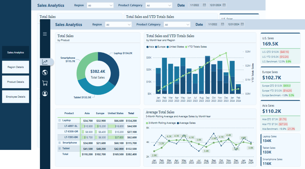
A sample report is available at the end of this post. Visit the sample report below to explore the examples in action!

From Static Slicers to Interactive Decision Aids – Sample Power BI Report


Building the First Dynamic Slicer with Count of Sales

Let’s begin with a straightforward example of this method, where we display counts next to each slicer value. Instead of selecting an option and waiting for a visual update, or using limited canvas space to show a simple count, the user can see the amount of data associated with each choice directly within the slicer.

Thanks to Davide Bacci (GitHub – PBI-David/PBI-Core-Visuals-SVG-HTML) for the idea and the DAX measures that got us started.

We are developing a sales region slicer. Typically, a user would only see the list of regions. By adding a measure that calculates the number of related sales records for each option, we can transform that list into a preview of the selection’s impacts.

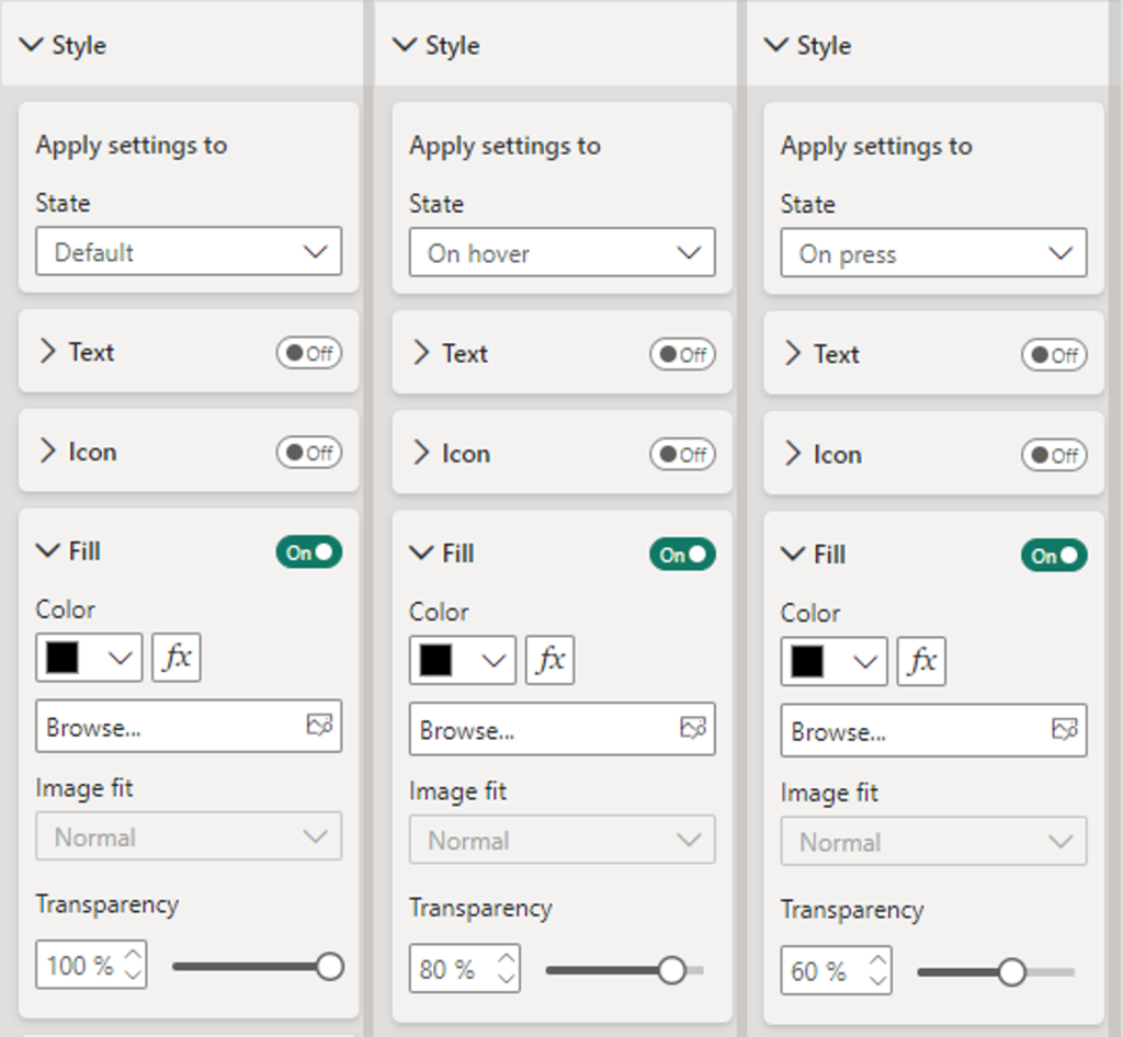
The pattern utilizes the Power BI list slicer, coupled with an SVG measure used for its image property based on the button selection state (default, hover, pressed, selected).

Step #1 – Base Metric

The base metric is the measure displayed to the right of the sales region name. For our first example, this is a simple count of our sales records.

Sales Count = COUNTROWS(Sales)

Step #2 – Centralized Styling

We style the SVG with CSS, allowing us to set colors, fonts, and other aesthetics for the different button states (default, hover, selected, etc.).

SVG Slicer Styling = "
<style>
.slicerTextDefault {
    font:9pt Segoe UI Regular;
    fill:#9FC2D9;
    text-anchor: end;
    alignment-baseline: middle
    }

.slicerTextHover {
    font:9pt Segoe UI Regular;
    fill:#FFFFFF;
    text-anchor: end;
    alignment-baseline: middle
    }

.slicerTextPressed {
    font:9pt Segoe UI Regular;
    fill:#FFFFFF;
    text-anchor: end;
    alignment-baseline: middle
    }

.slicerTextSelected {
    font:9pt Segoe UI Regular;
    fill:#073450;
    text-anchor: end;
    alignment-baseline: middle
    }
</style>
"
    

Step #3 – SVG Measure

Next, we create the SVG measure for each state we are targeting.

SVG Slicer Default =
"data:image/svg+xml;utf8,
<svg xmlns='http://www.w3.org/2000/svg' viewBox='0 0 100% 100%'>" & [SVG Slicer Styling] & "
<rect x='0' y='0' width='100%' height='100%' fill='transparent'></rect>
<text x='100%' y='55%' class='slicerTextDefault'>(" & FORMAT([Sales Count], "#,#") & ")</text>
</svg>"

SVG Slicer Hover =
"data:image/svg+xml;utf8,
<svg xmlns='http://www.w3.org/2000/svg' viewBox='0 0 100% 100%'>" & [SVG Slicer Styling] & "
<rect x='0' y='0' width='100%' height='100%' fill='transparent'></rect>
<text x='100%' y='55%' class='slicerTextHover'>(" & FORMAT([Sales Count], "#,#") & ")</text>
</svg>"

SVG Slicer Pressed =
"data:image/svg+xml;utf8,
<svg xmlns='http://www.w3.org/2000/svg' viewBox='0 0 100% 100%'>" & [SVG Slicer Styling] & "
<rect x='0' y='0' width='100%' height='100%' fill='transparent'></rect>
<text x='100%' y='55%' class='slicerTextPressed'>(" & FORMAT([Sales Count], "#,#") & ")</text>
</svg>"

SVG Slicer Selected =
"data:image/svg+xml;utf8,
<svg xmlns='http://www.w3.org/2000/svg' viewBox='0 0 100% 100%'>" & [SVG Slicer Styling] & "
<rect x='0' y='0' width='100%' height='100%' fill='transparent'></rect>
<text x='100%' y='55%' class='slicerTextSelected'>(" & FORMAT([Sales Count], "#,#") & ")</text>
</svg>"

Step #4 – Build the List Slicer

We add the List Slicer visual to our report and set the Slicer settings, Layout, Callout values, and Buttons properties to meet our reporting needs and styling requirements.

Then we move to the Images property to take our slicer from basic to a decision aid. Using the State dropdown menu, we set the following measures for the field property.

  • Default: SVG Slicer Default
  • Hover: SVG Slicer Hover
  • Pressed: SVG Slicer Pressed
  • Selected: SVG Slicer Selected

The result is a dynamic slicer that provides context before a choice is made. This enhances the data exploration experience, allowing for informed and confident selections.


From Totals to Insight: Rich Previews on Your Slicer

Displaying record counts is a good starting point, but we can expand on this idea. Instead of showing just totals, we can surface insights that make the slicer a guide rather than just a filter.

Make it Reusable & Maintainable

Before jumping into examples, let’s first make our SVG Slicer measures easier to reuse and update. We will replace the explicit measure used for display (e.g. [Number of Sales]) with a single new measure, [SVG Slicer Display].

SVG Slicer Default =
"data:image/svg+xml;utf8,
<svg xmlns='http://www.w3.org/2000/svg'  viewBox='0 0 100% 100%'  >" & [SVG Slicer Styling] &"
<rect x='0' y='0' width='100%' height='100%' fill='transparent'> </rect>
<text x='100%' y='55%' class='slicerTextDefault'>" &  [SVG Slicer Display] & "</text>
</svg>"

// Do the same swap in Hover / Pressed / Selected

Referencing this new measure will allow us to set what we want to display in one location, and all of our SVG Slicer measures (Default, Hover, Pressed, Selected) will update accordingly.

Example #1: % of Total (Within Selection vs Overall)

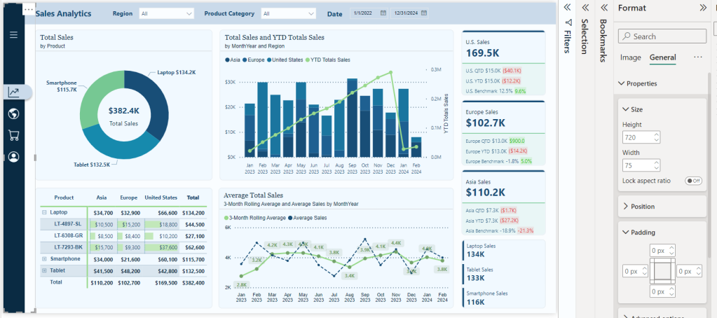
Our report presents the user with the total sales amounts for each region and product. But totals don’t always tell the story. Showing percentages helps answer two key questions quickly: How big is this option compared to the other? and How much does it contribute overall?

We can provide better insights at a glance by presenting a % of Total measure for each slicer option.

SVG Slicer % of Total = 
--% of Total (Within Selection vs Overall)

-- Base value calculated total sales for each value
VAR _contextTotal = [Sales Metric (CY)]
-- Total sales of the dimension within scope
VAR _selectedTotal = 
    SWITCH(
        TRUE(),
        ISINSCOPE(Regions[Region]),CALCULATE([Sales Metric (CY)], REMOVEFILTERS(Regions[Region])),
        ISINSCOPE(Products[Product]),CALCULATE([Sales Metric (CY)], REMOVEFILTERS(Products[Product]))
    )
-- Annual overall total sales
VAR _overallTotal = CALCULATE([Sales Metric (CY)], REMOVEFILTERS(Products[Product]), REMOVEFILTERS(Regions[Region]))
-- The two percentage calculations to show
VAR __percentageWithinSelection = DIVIDE(_contextTotal, _selectedTotal)
VAR _percentageOverall = DIVIDE(_contextTotal, _overallTotal)
-- Logic determining which calculation to show
---- Region Slicer and Products are filtered -> show within selection
---- Product Slicer and Regions are filtered -> show within selection
---- Otherwise -> show overall
VAR _percentageDisplay = 
    SWITCH(
        TRUE(), 
        //Regional Slicer Conditions
        ISINSCOPE(Regions[Region]) && ISFILTERED(Products), __percentageWithinSelection,
        //Products Slicer Conditions
        ISINSCOPE(Products[Product]) && ISFILTERED(Regions), __percentageWithinSelection,
        //Default
        _percentageOverall
    )
RETURN
    IF( 
        NOT ISBLANK(_percentageDisplay) && _percentageDisplay <> 0, 
        FORMAT(_percentageDisplay, "0.0%"), 
        "-–"
    )

To avoid confusion and clarify the meaning of each percentage within its current context, we also add the following measures to the subtitle property of our slicers.

SVG Slicer Region SubTitle = IF(ISFILTERED(Products), "% w/in Product Selection", "% Overall")

SVG Slicer Product SubTitle = IF(ISFILTERED(Regions), " % w/in Regional Selection", "% Overall")

BONUS!: Curious about the Top Performers on the Regional data cards? Check out My Best Power BI KPI Card (So Far 😅) by Isabelle Bittar for the details!

Why show both “overall” and “within selection”?

  • Overall answers: “How important or significant is this choice globally?” Helpful in spotting major contributors or outliers without any filtering required.
  • Within selection answers: “Inside my current regional selection, how much does this item contribute or matter?” Perfect when users have already narrowed the context (e.g. filtered to a specific region and are now choosing products within it).

Example #2: Tracking Sales Trends

Totals and percentages show size and share, but they don’t show direction. By adding arrows and percent change to slicer items, users see momentum at a glance. What’s rising, what’s falling, and what’s holding steady.

Step #1: Calculating the 6-Month Trend

This measure compares sales from the past six months to those from the previous six months. The outcome is a percent change that serves as the basis for our trend indicator.

Sales Trend % (6M vs Prev 6M) = 
-- Trend preview (6M vs prior 6M)

-- Anchor date for the window (respects current filter context; falls back to max Sales date)
VAR _anchor = MAX(Sales[SalesDate])
-- Total sales for the last 6 months ending at the anchor date
VAR _last6m =
    CALCULATE ([Total Sales], DATESINPERIOD (DateTable[Date], _anchor, -6, MONTH))
-- Total sales for the prior 6 months (months -12 to -6 from the anchor)
VAR _prev6m =
    CALCULATE (
        [Total Sales],
        DATESBETWEEN (DateTable[Date], EDATE (_anchor, -12), EDATE (_anchor, -6))
    ) 

RETURN 
DIVIDE ( _last6m - _prev6m, _prev6m )

Step #2: Enhancing Percent Change With A Visual Indicator

Once we have identified the trend, the next step is to add a visual indicator to quickly determine whether the trend is moving up or down. A positive change is represented by an upward arrow, a negative change by a downward arrow, and any changes that fall within our defined noise band are indicated with a flat arrow.

SVG Slicer Trend Indicator = 
-- Render trend as arrow + % change label

-- Sales trend % from the prior measure
VAR _pct   = [Sales Trend % (6M vs Prev 6M)]
-- Noise band threshold (avoid flipping arrows on tiny changes)
VAR _band  = 0.02
-- Select arrow symbol based on trend direction
VAR _arrow =
    SWITCH ( TRUE(),
        ISBLANK ( _pct ),  "",
        _pct >  _band,     UNICHAR(11165),
        _pct < -_band,     UNICHAR(11167),
                           UNICHAR(11166)
    )
-- Format percentage text, fallback to “--” if blank
VAR pctTxt =
    IF (ISBLANK(_pct), "--", FORMAT(_pct, "0.0%"))
RETURN 
_arrow & " " & pctTxt

Step #3: Assigning Classes for Styling

To ensure our indicator remains readable across various slicer states (e.g. default, hover, pressed, selected), each state is assigned a simple class key: up, down, or flat. These keys correspond to different color rules in our SVG Slicer Styling measure.

SVG Trend Class Key = 
-- Assign trend class (up, down, flat) for slicer styling

-- Sales trend %
VAR pct  = [Sales Trend % (6M vs Prev 6M)]
-- Noise band threshold (avoid class flips on tiny changes)
VAR band = 0.02
-- Return class string for styling: up / down / flat
RETURN
    SWITCH ( TRUE(),
        ISBLANK ( pct ), "flat",
        pct >  band,     "up",
        pct < -band,     "down",
                         "flat"
    )

Step #4: Add Styling for State and Trend

Enhance the styling of our slicers by adding classes for trend and selection states. Defining these colors will ensure readability on both dark and light slicer backgrounds.

SVG Slicer Styling = 
"
<style>
.slicerTextDefault {
    font:9pt Segoe UI Regular; 
    fill:#9FC2D9;
    text-anchor:end; 
    alignment-baseline:middle
    }
.slicerTextHover {
    font:9pt Segoe UI Regular; 
    fill:#FFFFFF;
    text-anchor:end; 
    alignment-baseline:middle
    }
.slicerTextPressed {
    font:9pt Segoe UI Regular; 
    fill:#FFFFFF;
    text-anchor:end; 
    alignment-baseline:middle
    }
.slicerTextSelected {
    font:9pt Segoe UI Regular; 
    fill:#073450;
    text-anchor:end; 
    alignment-baseline:middle
    }

.up-default   { fill:#79D3B5; }  
.down-default { fill:#FFA19A; }  
.flat-default { fill:#BFD4E2; }

.up-hover     { fill:#79D3B5; }  
.down-hover   { fill:#FFA19A; }  
.flat-hover   { fill:#BFD4E2; }

.up-pressed   { fill:#79D3B5; }  
.down-pressed { fill:#FFA19A; }  
.flat-pressed { fill:#BFD4E2; }

.up-selected   { fill:#0F7B5F; }  
.down-selected { fill:#B23D33; } 
.flat-selected { fill:#4A6373; }
</style>
"

Step #4: Wrap Our Trend Indicator in our SVG Slicer Measures

Finally, we update our display measure, which determines what appears in our slicer. This wrapper combines the class key with the slicer’s state.

SVG Slicer Display = 
-- Display sales trend comparing the last 6M to the 6M prior 
    [SVG Slicer Trend Indicator] 
SVG Slicer Default = 
VAR _state = "default"
VAR _cls = [SVG Trend Class Key] & "-" & _state        
RETURN
"data:image/svg+xml;utf8,
<svg xmlns='http://www.w3.org/2000/svg'  viewBox='0 0 100% 100%'  >" & [SVG Slicer Styling] &"
<rect x='0' y='0' width='100%' height='100%' fill='transparent'> </rect>
<text x='100%' y='55%' class='slicerTextDefault " & _cls & "'>" &  [SVG Slicer Display] & "</text>
</svg>"

SVG Slicer Hover = 
VAR _state = "hover"
VAR _cls = [SVG Trend Class Key] & "-" & _state   
RETURN
"data:image/svg+xml;utf8,
<svg xmlns='http://www.w3.org/2000/svg'  viewBox='0 0 100% 100%'  >" & [SVG Slicer Styling] &"
<rect x='0' y='0' width='100%' height='100%' fill='transparent'> </rect>
<text x='100%' y='55%' class='slicerTextHover " & _cls & "'>" & [SVG Slicer Display] & "</text>
</svg>"

SVG Slicer Pressed = 
VAR _state = "pressed"
VAR _cls = [SVG Trend Class Key] & "-" & _state   
RETURN
"data:image/svg+xml;utf8,
<svg xmlns='http://www.w3.org/2000/svg'  viewBox='0 0 100% 100%'  >" & [SVG Slicer Styling] &"
<rect x='0' y='0' width='100%' height='100%' fill='transparent'> </rect>
<text x='100%' y='55%' class='slicerTextPressed " & _cls & "'>" &  [SVG Slicer Display] & "</text>
</svg>"

SVG Slicer Selected = 
VAR _state = "selected"
VAR _cls = [SVG Trend Class Key] & "-" & _state   
RETURN
"data:image/svg+xml;utf8,
<svg xmlns='http://www.w3.org/2000/svg'  viewBox='0 0 100% 100%'  >" & [SVG Slicer Styling] &"
<rect x='0' y='0' width='100%' height='100%' fill='transparent'> </rect>
<text x='100%' y='55%' class='slicerTextSelected " & _cls & "'>" &  [SVG Slicer Display] & "</text>
</svg>"

Why This Matters

By incorporating trend indicators directly into the slicer, users can see not only the magnitude of sales but also the momentum behind them. A mid-level product that is experiencing rising sales can stand out just as much as a top seller in decline. This additional context helps focus attention on what is changing, rather than just what is popular.


Slicers can be more than just passive filters in our reports. By incorporating a few DAX measures and some simple SVG styling, we can transform them into interactive visuals that provide insights and help users better understand their selections. Since our reports have limited canvas space, enhancing our slicers with these features enables us to utilize the entire canvas area effectively.

The next time you add a slicer, consider going beyond a simple list. Consider how the slicer can facilitate a dynamic interaction with the data, helping to inform decisions and answer key questions before users take action. This subtle design shift can significantly enhance users’ ability to explore our reports.

The example report can be found at the link below!

A practical series on blending UX and analytics in Power BI. Each entry includes a working PBIX and sample data so you can explore design patterns directly in your own environment.


Thank you for reading! Stay curious, and until next time, happy learning.

And, remember, as Albert Einstein once said, “Anyone who has never made a mistake has never tried anything new.” So, don’t be afraid of making mistakes, practice makes perfect. Continuously experiment, explore, and challenge yourself with real-world scenarios.

If this sparked your curiosity, keep that spark alive and check back frequently. Better yet, be sure not to miss a post by subscribing! With each new post comes an opportunity to learn something new.

Design Meets Data: A Guide to Building Engaging Power BI Report Navigation


Before we begin developing the navigational element of our reports, we must decide what tools to use. The Design Meets Data series started with two previous posts in which we explored two approaches: using Figma to design and customize our navigation and using Power BI’s built-in shapes, bookmarks, and buttons to create a similar experience with native tools.

From Sketch to Screen: Bringing your Power BI report navigation to life for an enhanced user experience.

User-Centric Design: Next level reporting with interactive navigation for an enhanced user experience

This post will explore using Power BI’s Page Navigator to simplify our navigation setup. Each approach has its own level of flexibility and ease of maintenance, so it’s important to choose the right method based on the project’s requirements.


The Power BI Page Navigator

Power BI’s Page Navigator lets us create a dynamic and interactive navigation menu in our reports. It is an out-of-the-box solution that simplifies the navigation experience.

Since the Page Navigator is a native feature, it requires minimal setup and automatically adjusts when new pages are added to the report. However, some adjustments may still be needed, such as resizing or formatting changes to accommodate report updates.

To add a Page Navigator to our report, we go to the Insert tab in Power BI Desktop, then select Navigator > Page navigator under the Buttons dropdown.

Customization Options

Power BI provides various options to customize the appearance of our Page Navigator, such as changing the font, colors, shapes, borders, and even what pages are listed. This allows us to create a navigational element that fits seamlessly within our report’s aesthetic.

Although the design flexibility is not as extensive as in our previous example using Figma, the Page Navigator option strikes a balance between ease of use and visual appeal.


Building the Navigation Pane

Now that we have covered the basics of the Page Navigator, we can begin building the navigation pane for our report. The navigation pane will be located on the left-hand side of our report and will serve as both the page navigation and container for our page slicers.

Below, is the final product. Follow the detailed step-by-step guide provided to create your own navigation pane

Building the navigation pane

We begin building the navigational pane on the left-hand side of our report canvas. First, we add a rectangle to the report canvas and style it to meet our needs. The navigation pane has a height equal to the report canvas and a width of 140. We set the fill color to dark blue, which is our Theme 1, 50% darker.

Next, we add a rectangle at the top of the navigation pane to provide an accent and space for displaying an organizational logo within our report. This rectangle has a height of 40 and a width of 140, and its fill color is set to the accent color of our report theme.

With the basic structure of our navigation pane in place, we then move on to adding the Page Navigator.

Formatting the Page Navigator

We begin by selecting the Insert tab on the main ribbon. Then, under the Button dropdown, select Navigator > Page navigator.

Once the Page Navigator is added to the report canvas, go to the Format pane and select Vertical from the Orientation dropdown under the Grid layout property.

Under the Pages property, we find options to control what pages are displayed within our report navigation. In the Options group, we can set general options such as Show hidden pages, Show tooltip pages, and Show all by default. Additionally, in the Show group, we can explicitly set which pages are shown in the navigation by using the toggles next to each report page.

Once our navigation displays the required pages, we adjust the width of the navigator object to 130 and the height to 105. Note that the height should be adjusted based on the number of pages in the navigation. In this example, we use a basic calculation to calculate the height by multiplying the number of pages by 35 ( 3 pages x 35 = 105).

Lastly, we set the horizontal position of the navigator object to 10 and the vertical position to 100.

Styling the Page Navigator

Once we finish the basic formatting, we customize the navigator to match the look of our report. Our aim with the styling is to make it easier to identify the current page.

We do this by adjusting the Style properties of the Page Navigator and using the Apply settings to State dropdown.

Below are the key differences between our page navigator’s Default, Hover, Press, and Selected states.

Default
Text > Font: Segoe UI
Text > Font Color: light blue, Theme color 1, 60% lighter
Text > Horizontal alignment: left
Text > Padding: left 5 px
Fill > Color: dark blue (#06435F)
Border: off
Shadow: off
Glow: off
Accent bar: off

Hover
Text > Font: Segoe UI Semibold
Text > Font Color: white
Text >Horizontal alignment: left
Text> Padding: left 5 px
Fill > Color: dark blue, Theme color 1, 25% darker
Border: off
Shadow: off
Glow: off
Accent bar: off

Press
Text > Font: Segoe UI Semibold
Text > Font Color: dark blue, Theme color 1, 50% darker
Text >Horizontal alignment: left
Text> Padding: left 5 px
Fill > Color: white
Border: off
Shadow: off
Glow: off
Accent bar: off

Selected
Text > Font: Segoe UI Semibold
Text > Font Color: dark blue, Theme color 1, 50% darker
Text >Horizontal alignment: left
Text> Padding: left 5 px
Fill > Color: white
Border: off
Shadow: off
Glow: off
Accent bar > Position: right
Accent bar > Color: accent green (#6CBE4B)
Accent bar > Width: 6px

After configuring all the styling options, our report page will have an engaging and interactive navigation panel.


Comparing the Approaches

When building a navigational component within our reports, we have a wide variety of options and approaches to choose from. Each report has unique requirements, so it’s important to compare and contrast these different approaches based on performance, ease of maintenance, and design flexibility.

Performance Comparison

Figma: Our Figma-based designs require importing images into Power BI. This can improve the load time of our reports because the report does not have to render each shape and component independently.

Power BI Native Shapes and Buttons: This option has the advantage of only requiring our development work to occur in Power BI. However, each shape and component added to build our navigation pane has to be loaded each time our report page is viewed.

Page Navigator: This offers a fully integrated approach with minimal overhead. However, we lose full control over design and aesthetics.

Ease of Maintenance

Figma: Our Figma-based approach is the most complex to maintain. Every design update requires going back to Figma, redesigning, re-exporting from Figma, and re-importing and integrating into our Power BI report.

Power BI Native Shapes and Buttons: This approach has the advantage of only using Power BI to maintain our navigational element but still requires manual updates when adding or removing pages from our report.

Page Navigator: This is the easiest option to maintain because the page navigator updates with any page additions or changes. However, the size of the object may still need to be adjusted.

Design Flexibility

Figma: Offers the highest level of design customization. We can create any design we can think up, however, this comes with added complexity and time requirements.

Power BI Native Shapes and Buttons: Provides us more flexibility than the page navigator, allowing us to customize our design and layout. However, we may still encounter design limitations depending on the options provided by Power BI.

Page Navigator: The most straightforward to implement but offers limited customization options, which restricts design flexibility. It prioritizes ease of maintenance over complex designs.


Final Thoughts

Deciding on the proper navigation for our Power BI reports depends on balancing design flexibility, ease of maintenance, and performance. Leveraging Figma allows for fully custom designs but comes with more complex maintenance. Power BI offers various native tools to help design navigational elements, although building a custom navigational pane will still require manual updates. Power BI’s Page Navigator stands out for its simplicity, dynamic updating, and minimal maintenance effort. However, the cost of the simplicity is limited customization and design flexibility.

The Design Meets Data series explored three approaches to building a Power BI report navigational pane.

From Sketch to Screen: Bringing your Power BI report navigation to life for an enhanced user experience.

User-Centric Design: Next level reporting with interactive navigation for an enhanced user experience

There are seemingly endless other approaches to creating this critical part of our Power reports. How do you approach your report’s navigation?


Thank you for reading! Stay curious, and until next time, happy learning.

And, remember, as Albert Einstein once said, “Anyone who has never made a mistake has never tried anything new.” So, don’t be afraid of making mistakes, practice makes perfect. Continuously experiment, explore, and challenge yourself with real-world scenarios.

If this sparked your curiosity, keep that spark alive and check back frequently. Better yet, be sure not to miss a post by subscribing! With each new post comes an opportunity to learn something new.

Design Meets Data: Crafting Interactive Navigations in Power BI


An essential aspect of any multi-page report is an effective and intuitive way to navigate between the various report pages. A well-designed navigational element in our Power BI reports enhances our users’ experience and guides them to the data and visualizations they require.

This post outlines and explores how Power BI native tools and functionalities can be utilized to create a similar navigational experience that was created in the previous post using Figma and Power BI: Design Meets Data: A Guide to Building Interactive Power BI Report Navigation.

Looking for another approach to building report navigation that uses built-in Power BI tools? Visit Part 3 of this Power BI Navigation series.

Streamlined report navigation with built-in tools to achieve functional, maintainable, and engaging navigation in Power BI reports.

For those interested in implementing the navigation element presented in this post, there are 2-, 3-, 4-, and 5-page templates available for download, with more details at the end of the post.

Revisiting Interactive Navigation in Power BI

Welcome back to another Design Meets Data exploration focused on interactive report navigation in Power BI. In the first part, we dove into using Figma to design and develop a user-friendly report interface.

Now, it is time to shift our focus towards leveraging Power BI’s native arsenal of tools, primarily bookmarks, buttons, and tool tips, to achieve similar, if not enhanced, functionalities.

Why go native? Utilizing Power BI’s built-in tools streamlines support and maintenance and provides a reduction in external complexities and dependencies. Plus, staying within a single platform makes it easier to manage and update our reports.

This post will highlight the nuances of Power BI’s navigation capabilities. It will demonstrate how to replicate the interactive navigation from Design Meets Data: A Guide to Building Interactive Power BI Report Navigation using tools available directly within Power BI. These tools will help simplify our report while maintaining an engaging and interactive navigational element.

Let’s get started!


Setting the Stage with Power BI Navigation

Before diving into the details, let’s step back with a quick refresher on the Power BI tools that we can leverage for crafting our report navigation. Power BI is designed to support complex reporting requirements with ease, thanks to features like bookmarks, buttons, and tooltips that can be intricately configured to guide our users through our data seamlessly.

Bookmarks

Bookmarks in Power BI save various states of a report page, allowing users to switch views or data contexts with a single click. We can use bookmarks to allow our users to toggle between different data filters or visual representations without losing context or having to navigate multiple pages.

For our navigational element, bookmarks will be key to creating the collapsing and expanding functionality. To create a bookmark, we get the report page looking just right, then add a bookmark to save the report state in the bookmark pane.

The new bookmark can now act as a restore point, bringing the user back to this specific view whenever it is selected. To keep our bookmarks organized it is best to rename them with a description name, generally including the report page and an indication of what the bookmark is used for (e.g. Page1-NavExpanded).

Buttons

Buttons take interactivity to the next level. We can use buttons to trigger various events, such as bookmarks, and also serve as navigation aids within the report. Buttons within our Power BI reports can be styled and configured to react dynamically to user interactions.

To create a button, we simply add the button object from the Insert ribbon onto the report canvas. Power BI offers a variety of button styles, such as a blank button for custom designs, or predefined icons for common actions like reset, back, or informational buttons.

Each button can be styled to match our report’s theme, including colors, text, and much more. Another key property to configure is the button action. Using this, we can define whether the button should direct our users to a different report page, switch the report context to a different bookmark, or another one of the many options available.

Tooltips

Tooltips in Power BI can provide simple text hints, but when properly utilized, they can provide additional insights or contextual data relevant to specific visuals without cluttering the canvas. This provides detail when required while keeping our reports clean and simple.

Power BI allows us to customize tooltips to show detailed information, including additional visuals. This can turn each tooltip into a tool to provide context or additional layers of data related to a report visual when a user hovers over the element.

By effectively using tooltips we transform user interaction from just viewing to an engaging, exploratory experience. This boosts the usability of our reports and ensures that users can make informed decisions based on the data view provided.


The Navigation Framework

Now that we have explored some details of the elements used to create our navigation, let’s dive into building the navigational framework. We will craft a minimalistic navigation on the left-hand side of our report, with the functionality to expand when requested by user interaction. This approach to our navigation is focused on making the navigation pane both compact and informative, ensuring that it does not overpower the content of the report.

In the Design Meets Data: A Guide to Building Interactive Power BI Report Navigation blog post the navigational element was built using Figma. Although Figma is a powerful and approachable design tool, in this guide, we will explore creating a similar navigation pane using native Power BI tools and elements. We will use Power BI’s shapes, buttons, and bookmarks to construct the framework and functionality.

The Navigation Pane Base Elements

We will start by creating the navigation pane by adding the base elements. In this compact and expandable design, this includes the background of the navigation pane, which will contain the page navigation and menu icons.

Collapsed Navigation Pane

The base of the navigation consists of three main components that we add to our Power BI report to start building our interactive navigational element.

The collapsed navigation pane starts by adding the shape of the pane itself. The color is set to theme color 1, 50% darker of the Power BI theme. Using the theme color will help our navigation remain dynamic when changing Power BI themes.

The next base element is the menu icon, which expands and collapses our navigation pane. The button is configured to slightly darken when hovered over and darken further when pressed. Additionally, when the button is disabled, the icon color is set to the same color as the navigation pane and is used to contrast the current page indicator bar. This configuration is used for all buttons contained within the navigation pane (both the bookmark and page navigation buttons).

The last base element is the current page indicator. This is a lighter-colored (theme color 1, 60% lighter) rectangle tab that clearly indicates what page in the navigation pane is currently being viewed.

Here is the collapsed navigation pane containing the base elements.

Expanded Navigation Pane

The expanded navigation consists of the same base elements, with the addition of a close icon, and a click shield to prevent the user from interacting with the report visuals when the navigation is expanded.

The additional elements of the expanded menu provide the user with multiple methods to collapse the navigation pane. The close (X) button is added as a flyout from the base navigation pane background, so it is easily identifiable.

When the navigation pane is expanded, we want to prevent users from interacting with the report visuals. To achieve this, we use a partially transparent rectangle to serve as a click shield. If the user clicks anywhere on the report page outside of the navigation pane, the navigation pane will collapse returning the user to the collapsed report view.

Navigation Bookmarks

The last base element required for the interactive navigation is creating the required bookmarks to transition between the collapsed and expanded view. This is done by creating two bookmarks to store each of the required report page views, Page1-Default-NavCollapsed and Page1-NavExpanded.

We can now build on these base elements and bring our navigation to life with Power BI buttons and interactive features.


Navigation Interactive Features

The interactive features in the navigation pane consist of two types of buttons: (1) bookmark buttons and (2) page navigation buttons.

Expanding and Collapsing the Navigation Pane

The previous section added the base elements of the navigation pane which included a menu icon on both the collapsed and expanded navigation panes, and a close button and click shield on the expanded navigation screen.

Building the interactive elements of the navigation starts by assigning actions to each of these bookmark buttons, allowing the user to expand and collapse the navigation pane seamlessly.

The action property for each of these buttons is set to a bookmark type, with the appropriate bookmark selected. For example, for the menu icon button on the collapsed menu, the bookmark selected corresponds to the expanded navigation bookmark. This way, when a user selects this button on the collapsed navigation, it expands, revealing the additional information provided on the expanded navigation pane.

Page Navigation Buttons

The last element to add to the report navigation is the report page navigation buttons.

Each report page button is a blank button configured and formatted to meet the report’s requirements. For this report, each page button contains a circular numbered icon to indicate the report page it navigates to. When the navigation is expanded, an additional text element displays the report page title.

At the end of this post, there are details on obtaining templates that implement this report navigational element. The templates are fully customizable, so they will come with the numbered icons and default page titles, but these can simply be updated to match the aesthetic of any reporting needs.


Wrapping Up: Elevating Your Power BI Reports with Interactive Navigation

As Power BI continues to evolve, integrating more engaging and interactive elements into our reports will become crucial for creating dynamic and user-centric reports. The transition from static to interactive reports empowers our users to explore data in a more meaningful and memorable way. By leveraging bookmarks, buttons, and tooltips, we can transform our reports from a simple presentation of data into engaging, intuitive, and powerful analytical tools.

For those eager to implement the navigational element outlined in this post, there are 2-, 3-, 4-, and 5-page templates available for download. Each template has all the functionality built in, requiring only updating the button icons, if necessary, to better align with your reporting needs.

The template package is available here!

You will get individual template files for a 2-, 3-, 4-, and 5-page report provided in the PBIX, PBIT, and PBIP (12 total files) formats! 


Thank you for reading! Stay curious, and until next time, happy learning.

And, remember, as Albert Einstein once said, “Anyone who has never made a mistake has never tried anything new.” So, don’t be afraid of making mistakes, practice makes perfect. Continuously experiment, explore, and challenge yourself with real-world scenarios.

If this sparked your curiosity, keep that spark alive and check back frequently. Better yet, be sure not to miss a post by subscribing! With each new post comes an opportunity to learn something new.

Design Meets Data: A Guide to Building Interactive Power BI Report Navigation


In the world of data visualization, we are constantly seeking ways to convey information and captivate our audience. Our goal is to enhance the aesthetic appeal of our Power BI reports, making them more than just vehicles for data—they become compelling narratives. By leveraging Figma, we aim to infuse our reports with design elements that elevate the overall user experience, transforming complex data into interactive stories that engage and enlighten.

A cornerstone of impactful multi-page reports is effective navigation. Well-designed navigation is a beacon that guides our users through the sea of data, ensuring they can uncover the insights they seek without feeling overwhelmed or lost. This post serves as a guide on how we can use Figma to enhance our Power BI report navigation beyond the use of just Power BI shapes, buttons, and bookmarks to create interactive report navigation that boosts the user experience of our reports.

In this guide, we will explore how to go beyond using the page navigator button option in Power BI and craft a report navigation that is intuitive, interactive, and elevates the visual aspects of our report. We will dive into how we can use Figma’s design capabilities combined with the interactive features of Power BI to create such an experience.

The navigation we will create is a vertical and minimalistic navigation displaying visual icons for each of the report’s pages. This allows our users to focus on the data and the report visuals and not be distracted by the navigation. However, when our users require details on the navigation options, we will provide an interactive experience to expand and collapse the menu.

Keep reading to get all the details on leveraging the design functionality offered by Figma and the interactive elements, including buttons and bookmarks in Power BI. By the end, we will have all we need to craft report navigation elements that captivate and guide our audience, making every report an insightful and enjoyable experience.

Get Started with Power BI Templates: For those interested in crafting a similar navigation experience using Power BI built-in tools, visit the follow-up post below. Plus, get started immediately with downloadable Power BI templates!

User-Centric Design: Next level reporting with interactive navigation for an enhanced user experience

Also, check out the latest guide on using Power BI’s page navigator for a streamlined, engaging, and easy-to-maintain navigational experience.

Streamlined report navigation with built-in tools to achieve functional, maintainable, and engaging navigation in Power BI reports.

Diving Into Figma: Designing Our Navigation

Starting the journey of enhancing our Power BI reports with Figma begins with understanding why Figma is a powerful design tool. The beauty of Figma lies in its simplicity and power. It is a web-based tool that allows designers to create fluid and dynamic UI elements without a steep learning curve associated with some other design software. Another great aspect of Figma is the community that provides thousands of free and paid templates, plugins, and UI kits to get our design kickstarted.

Explore thousands of free and paid templates, plugins, and UI kits to kickstart your next big idea.

To get started with Figma, we will need to create an account. Figma offers various account options, including a free version. The free version provides access to the most important aspects of Figma but limits the number of files we can collaborate on with others. Here is a helpful guide on getting started.

Welcome to Figma. Start your learning journey with beginner-friendly resources that will have you creating in no time.

For our Power BI reports, using Figma means designing elements that are aesthetic and functional. Reducing the number of shapes and design elements required in our Power BI reports aids in performance.

Crafting the Report Navigation

Once logged into Figma, we will start by selecting Drafts from the left side menu, then Design File in the upper right to open a new design file in Figma.

To get started with our new design we will add a frame to our design file and define the shape and size of our design.

After selecting Frame, a properties panel will open to set the size of the Frame. For a standard Power BI report, the canvas size is typically 1280 x 720. We can use the pre-established size option for TV (under Desktop). We then rename the Frame by double-clicking on the Frame name in the Layers Panel and entering the new name, here we will use Power BI Navigation Collapsed. Then modify the width, since the navigation won’t occupy the entire report, to 75, and set the fill to transparent. This will act as the background or a container for our navigation when collapsed.

Creating Local Variables and Base Elements

Before getting started adding elements to our navigation we will create local variables to store the theme colors of our navigation. On the Design pane, locate local variables and then select open variables.

Select Create variable and then Color to get started. For the navigation, we will create two color variables, one corresponding to the background element color and the other the first-level element color of our Power BI theme. If we are using Figma to design wireframes or mock-ups of our Power BI report, we can easily expand the number of variables to include all the colors used within the Power BI theme.

We start building our navigation by adding the base elements. This design includes the dark blue rectangle that will contain our navigation icons and the menu icon that, when clicked, will expand the navigation menu. Under the Shape tools menu select rectangle to add it to our Power BI Navigation - Collapsed frame, then set the width to 45.

Next, we will add the menu icon that will act as a button to expand and collapse the navigation menu. For this navigation, we will use a list or hamburger menu icon with a height and width of 25 that is centered and set towards the top within our navigation background. Then, set the color of the icon to our background-element variable. When searching for icons that fit the report’s styling, the Figma community has a wide range of options to offer.

Adding Page Navigation Icons

Once our base elements are set, we can move on to adding our page icons that will act as the page navigation buttons when the menu is collapsed. In the final report, we will add this navigation menu to contain four pages, so we will add an icon for each page. All icons will be the same size as the menu icon (height and width set to 25), centered horizontally in the navigation background, positioned vertically towards the top, and their color set to our background-element color.

This will serve as our base or template navigation menu for all pages. Next, we will copy this for each page in our report and modify it to indicate the current page.

To do this, we first add a line (under the Shape tools) with a width of 45, a stroke color of our background element, a stroke size of 35, and a round end point. Then, position it in the layers pane directly above the navigation so that it appears under the page icons. Once created, align it horizontally with the navigation background, and vertically centered under the current page icon. Update the color of the icon to the first-level-element variable, and then add a drop shadow. Repeat this process for each page icon, creating a navigation menu that can be added to each page of our report.

Creating the Expanded Menu

Now that we have completed the collapsed menu design elements, we will use these as the base to create the expanded menu. Creating the expanded menu starts by duplicating each of the collapsed menus. Once duplicated, we will rename each of the Power BI Navigation Frames to replace Collapsed with Expanded and then carry out a few steps for each.

First, we increase the width of the Frame from 75 to 190, the width of the navigation-background rectangle, and the current-page indicator from 45 to 155.

Next, add new Text components for each page icon in the menu. The font color for each text component will match the icon’s color, and the font weight for the selected page text will be set to semi-bold.

In addition to being able to use the menu icon to toggle the navigation between collapsed and expanded, we will also add a specific collapse menu icon to the expanded menu. We first add a new line element to the expanded menu frame, with a width of 15, stroke size 35, and stroke color first-level-element. We position this on the right side of our navigation background and align it vertically centered with the menu icon. Then add a close icon with the same dimensions as all of our other icons and position it centered on this new line component.

By following these steps, we have taken the first step towards creating a visually appealing, dynamic, and interactive navigation element that will make our Power BI reports more engaging and user-friendly.

Exporting Figma Designs and Importing in Power BI

Once our navigation element is finished in Figma, the next step is bringing it to life within our Power BI Report. This involves exporting the designs from Figma and importing them into Power BI.

Preparing Our Figma Design for Export

Before exporting our design, it is always a good idea to double-check the size of the different components to ensure they are exactly what we want, and so they integrate with our Power BI report seamlessly. Figma allows us to export our designs in various formats, but for Power BI, PNG or SVG files are a common choice.

To export our designs, select the Frame from the layers pane (e.g., Power BI Navigation—Expanded—Sales), and then locate export at the bottom of the design pane on the right. Select the desired output file type, then select Export.

Importing and Aligning Figma Designs within Power BI

Once our designs are exported, importing them into Power BI is straightforward. We can add images through the Insert menu, selecting Image and navigating to our exported design files.

Once imported, we adjust a few property settings on the image so it integrates with our report, creating a cohesive look and feel. First, select the image, and in the Format pane under General > Properties, we turn off the Lock aspect ratio option and then set the height to 720 and width to the width of the Figma frame (e.g., 75). Then we set the padding on all sides to zero. This ensures that our navigation is the same height as our report and appears properly.

Repeat the above process for the expanded navigation design.

Bringing Our Navigation to Life with Power BI Interactivity

When we merge our design elements with the functionality of interactivity of Power BI, we elevate our Power BI reports into dynamic, user-centric journeys through the data. This fusion is achieved through the strategic use of Power BI’s buttons and bookmarks, paired with the aesthetic finesse of our Figma-designed navigation.

Understanding the Role of Buttons and Bookmarks

Buttons in Power BI serve as the interactive element that users engage with, leading to actions such as page navigation, data filtering, or launching external links. The key to leveraging buttons effectively is to design them in a way that they are intuitive and aligned with the overall design of our report.

Bookmarks capture and recall specific states of a report, and most importantly for our navigation, this includes the visibility of objects. To create a bookmark first go to the View menu and select bookmarks to show the Bookmarks pane. Then we set our report how we want it to appear, then click Add, or if the bookmark already exists, we can right-click and select Update.

Step-by-Step Guide

  1. First from the View menu we will turn on the Selection and Bookmarks pane to get our report objects and bookmarks set for our navigation. We will see the image object in our Selection pane, which will be the two navigation images we previously imported. Rename these to give descriptive names, so we can tell them apart. For example nav-collapsed and nav-expanded.
  1. We will add two bookmarks to this page of the report, one corresponding to the collapsed navigation and one for the expanded navigation. To keep our bookmarks organized, we will give them a descriptive name (<page-name>- Nav Collapsed and <page-name>-Nav Expanded) and if needed we can use groups to further organize them.
  1. Now we will add buttons that overlay our navigation design element to add interactivity for our users. We will a blank button to our report with a width of 45 and a height of 35.
    • Then on the Format pane under Style, locate the Fill option for the button toggle it on, and set the following for the Default, On Hover, and On Press states.
      • Default: Fill: Black, Transparency: 100%
      • On Hover: Fill: Black, Transparency: 80%
      • On Press: Fill: Blank, Transparency: 60%

Duplicate this button for each page icon and position the buttons so that they overly each icon in the navigation menu. In the Selection pane double-click each button to rename the object providing it a description name (e.g. nav-collapsed-menu). Then select all and group them, providing the group a name as well (e.g. nav-collapsed-buttons).

  1. Now that our buttons are created, styled, and positioned, we will set the specific actions required by each.
    • Navigation menu icon
      • Action
        • Type: Bookmark
        • Bookmark: Sales – Nav Expanded
        • Tooltip text: Expand Navigation Menu
    • The current page icon button
      • Action
        • Type: Page navigation
        • Destination: None
        • Tooltip text: Sales Analytics
      • Style
        • Fill: Toggle off (this will remove the darkening effect when hovered over since this page is active)
    • All other page icon buttons
      • Action
        • Type: Page navigation
        • Destination: Select the appropriate page for the icon
        • Tooltip text: Name of the destination page
  1. Next, we copy and paste the nav-collapsed-buttons group to duplicate the buttons so we can modify them for our expanded navigation menu. After pasting the nav-collapsed-buttons group ensure to set the position to the same position as the initial grouping.
    • Rename this group with a descriptive name such as nav-expanded-buttons.
    • Additionally, rename all the buttons objects within the group to keep all our objects well organized and clearly named (e.g. nav-expanded-menu).
    • Adjust the visibility of our object so that the nav-collapsed-buttons group and nav-collapsed image are not visible, and their expanded counterparts are visible.
  1. Set the width for all the page navigation buttons to 155. This will match our navigation background, which we created in Figma. No other properties should have to be set for these buttons.
  2. Update the action of the nav-expanded-menu button and select the Sales - Nav Collapsed bookmark we created previously.
    • Copy and paste this button, then rename the new button as nav-expanded-close.
    • Resize and position this button over the close icon in our expanded navigation.
    • In the Selection pane drag and drop this button into the nav-expanded-buttons grouping.
  3. When the navigation is expanded, we want to prevent interaction with report visuals. To do this, we will add a new blank button to the report and size it to cover the entire report canvas.
    • In the Selection pane, place this button directly following the navigation images so it is below nav-expanded.
    • In the Format pane for the new button, under the General tab turn on the background and set the color to black with 80% transparency.
    • Turn on the action for this button, set it to a Bookmark type, and set the bookmark to our Sales—Nav Collapsed bookmark. This will ensure that if a user selects outside of the navigation options when the navigation is expanded, they are returned to the collapsed navigation state, where they can interact with the report visuals.
  1. Lastly, we will set our bookmarks, so the correct navigation objects are shown for the expanded and collapsed bookmarks.
    • Right-click each bookmark and uncheck the Data option, so this bookmark will not maintain the current data state. When a user expands or collapses the menu or moves to a different page, we do not want to impact any selected slicers or filters they have selected.
    • Ensure the nav-collapsed-buttons grouping and nav-collapsed images are hidden while their expanded counterparts are visible. Then right-click the expanded bookmark and select update.
    • Select the collapsed bookmark, unhide the collapsed objects, and hide the expanded objects. Right-click the collapsed bookmark and select update.

Now that we have created all the interactivity for our navigation in Power BI for our Sales Analytics page, we can easily copy and move these objects (e.g., the button groupings) to each page in our report. Then, on each page, we will import the 2 Figma navigation designs specific to that page and then size and align them. After this we can add two new bookmarks for that page to store the collapsed and expanded state, using the same process we used in step #9. Finally, update the current page button to toggle off the styling fill and toggle on styling fill for the sales icon buttons (See step #4).

By blending Figma’s design capabilities with Power BI’s interactive features, we can create a navigation experience that elevates the appearance of our report and feels intuitive and engaging. This approach ensures our reports are not just viewed but interacted with, providing deep insights and a more enjoyable user experience.

Bringing It All Together: A Complete Navigation Experience

After creating our navigation visual elements in Figma and integrating them with the interactive powers of Power BI buttons and bookmarks, it’s time to bring it all together and see it in action.

Testing and Refining the Navigation

The key to a successful navigation experience for our users lies in its usability. It is important to conduct user testing sessions to gather feedback on the intuitiveness of the navigation. During these sessions, we can note areas where users hesitate or get lost. Then, using this feedback, we can further refine our navigation, making adjustments to ensure users can effortlessly find the information they need within our reports.

User Experience (UX) Tips for Power BI Reports

Well-designed navigation is just one piece of the UX puzzle. To further enhance our Power BI reports, we should also consider the following.

  • Clarity: ensure our reports are clear and easy to understand at a glance. We should use consistent labeling and avoid cluttering a page with too much information.
  • Consistency: apply the same navigation layout and style throughout our reports, and perhaps even across different reports. This consistency helps users learn how to navigate our reports more quickly.
  • Feedback: Provide visual and textual feedback when users interact with our report elements. For example, we could set the on hover and on pressed options for our buttons or use tooltips to explain what a button does.

Elevating Power BI Reports

By embracing the fusion of Figma’s design capabilities, UX tips, and Power BI’s interaction and analytical power, we can unlock new potential in our reports and user engagement. This journey from design to functionality has enhanced the aesthetic appeal, usability, and functionality of our report. Remember the goal of our reports is to tell the data’s story in an insightful and engaging way. Let’s continue to explore, iterate, and enhance our reports as we work towards achieving this goal while crafting reports that are beyond just tools for analysis but experiences that inform, engage, and fuel data-driven decisions.

If you found this step-by-step guide useful, check out the quick start on creating interactive navigation solely using Power BI’s built-in tools. It provides details on where and how to get downloadable templates to begin implementing this navigational framework for 2-, 3-, 4-, and 5-page reports!

User-Centric Design: Next level reporting with interactive navigation for an enhanced user experience

Also, check out the latest guide on using Power BI’s page navigator for a streamlined, engaging, and easy-to-maintain navigational experience.

Streamlined report navigation with built-in tools to achieve functional, maintainable, and engaging navigation in Power BI reports.


Thank you for reading! Stay curious, and until next time, happy learning.

And, remember, as Albert Einstein once said, “Anyone who has never made a mistake has never tried anything new.” So, don’t be afraid of making mistakes, practice makes perfect. Continuously experiment, explore, and challenge yourself with real-world scenarios.

If this sparked your curiosity, keep that spark alive and check back frequently. Better yet, be sure not to miss a post by subscribing! With each new post comes an opportunity to learn something new.