User-Centric Design: Next level reporting with interactive navigation for an enhanced user experience.
An essential aspect of any multi-page report is an effective and intuitive way to navigate between the various report pages. A well-designed navigational element in our Power BI reports enhances our users’ experience and guides them to the data and visualizations they require.
This post outlines and explores how Power BI native tools and functionalities can be utilized to create a similar navigational experience that was created in the previous post using Figma and Power BI: Design Meets Data: A Guide to Building Interactive Power BI Report Navigation.
Looking for another approach to building report navigation that uses built-in Power BI tools? Visit Part 3 of this Power BI Navigation series.

Design Meets Data: A Guide to Building Engaging Power BI Report Navigation
Streamlined report navigation with built-in tools to achieve functional, maintainable, and engaging navigation in Power BI reports.
For those interested in implementing the navigation element presented in this post, there are 2-, 3-, 4-, and 5-page templates available for download, with more details at the end of the post.
Revisiting Interactive Navigation in Power BI
Welcome back to another Design Meets Data exploration focused on interactive report navigation in Power BI. In the first part, we dove into using Figma to design and develop a user-friendly report interface.
Now, it is time to shift our focus towards leveraging Power BI’s native arsenal of tools, primarily bookmarks, buttons, and tool tips, to achieve similar, if not enhanced, functionalities.
Why go native? Utilizing Power BI’s built-in tools streamlines support and maintenance and provides a reduction in external complexities and dependencies. Plus, staying within a single platform makes it easier to manage and update our reports.
This post will highlight the nuances of Power BI’s navigation capabilities. It will demonstrate how to replicate the interactive navigation from Design Meets Data: A Guide to Building Interactive Power BI Report Navigation using tools available directly within Power BI. These tools will help simplify our report while maintaining an engaging and interactive navigational element.
Let’s get started!
Setting the Stage with Power BI Navigation
Before diving into the details, let’s step back with a quick refresher on the Power BI tools that we can leverage for crafting our report navigation. Power BI is designed to support complex reporting requirements with ease, thanks to features like bookmarks, buttons, and tooltips that can be intricately configured to guide our users through our data seamlessly.
Bookmarks
Bookmarks in Power BI save various states of a report page, allowing users to switch views or data contexts with a single click. We can use bookmarks to allow our users to toggle between different data filters or visual representations without losing context or having to navigate multiple pages.
For our navigational element, bookmarks will be key to creating the collapsing and expanding functionality. To create a bookmark, we get the report page looking just right, then add a bookmark to save the report state in the bookmark pane.
The new bookmark can now act as a restore point, bringing the user back to this specific view whenever it is selected. To keep our bookmarks organized it is best to rename them with a description name, generally including the report page and an indication of what the bookmark is used for (e.g. Page1-NavExpanded).
Buttons
Buttons take interactivity to the next level. We can use buttons to trigger various events, such as bookmarks, and also serve as navigation aids within the report. Buttons within our Power BI reports can be styled and configured to react dynamically to user interactions.
To create a button, we simply add the button object from the Insert ribbon onto the report canvas. Power BI offers a variety of button styles, such as a blank button for custom designs, or predefined icons for common actions like reset, back, or informational buttons.
Each button can be styled to match our report’s theme, including colors, text, and much more. Another key property to configure is the button action. Using this, we can define whether the button should direct our users to a different report page, switch the report context to a different bookmark, or another one of the many options available.
Tooltips
Tooltips in Power BI can provide simple text hints, but when properly utilized, they can provide additional insights or contextual data relevant to specific visuals without cluttering the canvas. This provides detail when required while keeping our reports clean and simple.
Power BI allows us to customize tooltips to show detailed information, including additional visuals. This can turn each tooltip into a tool to provide context or additional layers of data related to a report visual when a user hovers over the element.
By effectively using tooltips we transform user interaction from just viewing to an engaging, exploratory experience. This boosts the usability of our reports and ensures that users can make informed decisions based on the data view provided.
The Navigation Framework
Now that we have explored some details of the elements used to create our navigation, let’s dive into building the navigational framework. We will craft a minimalistic navigation on the left-hand side of our report, with the functionality to expand when requested by user interaction. This approach to our navigation is focused on making the navigation pane both compact and informative, ensuring that it does not overpower the content of the report.

In the Design Meets Data: A Guide to Building Interactive Power BI Report Navigation blog post the navigational element was built using Figma. Although Figma is a powerful and approachable design tool, in this guide, we will explore creating a similar navigation pane using native Power BI tools and elements. We will use Power BI’s shapes, buttons, and bookmarks to construct the framework and functionality.
The Navigation Pane Base Elements
We will start by creating the navigation pane by adding the base elements. In this compact and expandable design, this includes the background of the navigation pane, which will contain the page navigation and menu icons.
Collapsed Navigation Pane
The base of the navigation consists of three main components that we add to our Power BI report to start building our interactive navigational element.
The collapsed navigation pane starts by adding the shape of the pane itself. The color is set to theme color 1, 50% darker of the Power BI theme. Using the theme color will help our navigation remain dynamic when changing Power BI themes.
The next base element is the menu icon, which expands and collapses our navigation pane. The button is configured to slightly darken when hovered over and darken further when pressed. Additionally, when the button is disabled, the icon color is set to the same color as the navigation pane and is used to contrast the current page indicator bar. This configuration is used for all buttons contained within the navigation pane (both the bookmark and page navigation buttons).
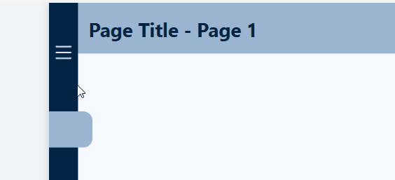

The last base element is the current page indicator. This is a lighter-colored (theme color 1, 60% lighter) rectangle tab that clearly indicates what page in the navigation pane is currently being viewed.
Here is the collapsed navigation pane containing the base elements.

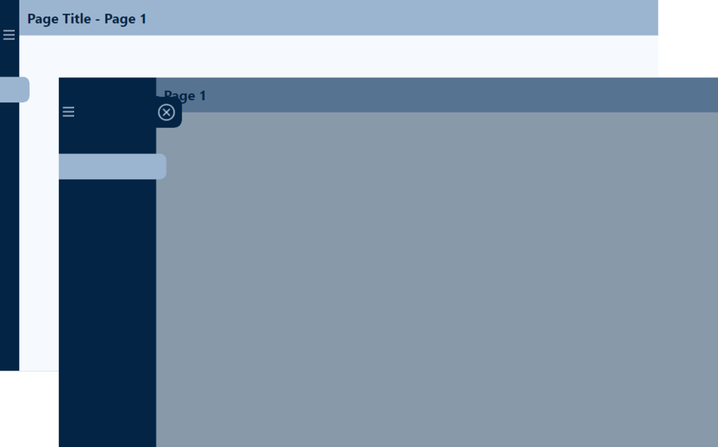
Expanded Navigation Pane
The expanded navigation consists of the same base elements, with the addition of a close icon, and a click shield to prevent the user from interacting with the report visuals when the navigation is expanded.
The additional elements of the expanded menu provide the user with multiple methods to collapse the navigation pane. The close (X) button is added as a flyout from the base navigation pane background, so it is easily identifiable.
When the navigation pane is expanded, we want to prevent users from interacting with the report visuals. To achieve this, we use a partially transparent rectangle to serve as a click shield. If the user clicks anywhere on the report page outside of the navigation pane, the navigation pane will collapse returning the user to the collapsed report view.

Navigation Bookmarks
The last base element required for the interactive navigation is creating the required bookmarks to transition between the collapsed and expanded view. This is done by creating two bookmarks to store each of the required report page views, Page1-Default-NavCollapsed and Page1-NavExpanded.

We can now build on these base elements and bring our navigation to life with Power BI buttons and interactive features.
Navigation Interactive Features
The interactive features in the navigation pane consist of two types of buttons: (1) bookmark buttons and (2) page navigation buttons.
Expanding and Collapsing the Navigation Pane
The previous section added the base elements of the navigation pane which included a menu icon on both the collapsed and expanded navigation panes, and a close button and click shield on the expanded navigation screen.
Building the interactive elements of the navigation starts by assigning actions to each of these bookmark buttons, allowing the user to expand and collapse the navigation pane seamlessly.
The action property for each of these buttons is set to a bookmark type, with the appropriate bookmark selected. For example, for the menu icon button on the collapsed menu, the bookmark selected corresponds to the expanded navigation bookmark. This way, when a user selects this button on the collapsed navigation, it expands, revealing the additional information provided on the expanded navigation pane.

Page Navigation Buttons
The last element to add to the report navigation is the report page navigation buttons.
Each report page button is a blank button configured and formatted to meet the report’s requirements. For this report, each page button contains a circular numbered icon to indicate the report page it navigates to. When the navigation is expanded, an additional text element displays the report page title.
At the end of this post, there are details on obtaining templates that implement this report navigational element. The templates are fully customizable, so they will come with the numbered icons and default page titles, but these can simply be updated to match the aesthetic of any reporting needs.

Wrapping Up: Elevating Your Power BI Reports with Interactive Navigation
As Power BI continues to evolve, integrating more engaging and interactive elements into our reports will become crucial for creating dynamic and user-centric reports. The transition from static to interactive reports empowers our users to explore data in a more meaningful and memorable way. By leveraging bookmarks, buttons, and tooltips, we can transform our reports from a simple presentation of data into engaging, intuitive, and powerful analytical tools.
For those eager to implement the navigational element outlined in this post, there are 2-, 3-, 4-, and 5-page templates available for download. Each template has all the functionality built in, requiring only updating the button icons, if necessary, to better align with your reporting needs.
The template package is available here!

Power BI – Interactive Navigation Templates
You will get individual template files for a 2-, 3-, 4-, and 5-page report provided in the PBIX, PBIT, and PBIP (12 total files) formats!
Thank you for reading! Stay curious, and until next time, happy learning.

And, remember, as Albert Einstein once said, “Anyone who has never made a mistake has never tried anything new.” So, don’t be afraid of making mistakes, practice makes perfect. Continuously experiment, explore, and challenge yourself with real-world scenarios.
If this sparked your curiosity, keep that spark alive and check back frequently. Better yet, be sure not to miss a post by subscribing! With each new post comes an opportunity to learn something new.