Explore Power BI Core Visualizations: Part 4 – Table and Matrix Visuals


Table and Matrix visuals in Power BI are essential for presenting detailed and structured data. Both visuals excel at displaying large amounts of information while highlighting trends, relationships, and hierarchies.

Tables offer a simple way to present data in a straightforward tabular format and are best for displaying detailed row-level data, such as sales records, inventory lists, or customer information. Unlike other visuals that summarize data at a high level, tables retain all details, making them an excellent tool for deep-dive analysis.

Matrix visuals enhance this capability by grouping and summarizing data hierarchically. Unlike tables that present data in a flat structure, matrix visuals allow for expandable rows. Users can then collapse or expand these groupings interactively to meet their needs.

Table and Matrix visuals are excellent for presenting data and hierarchical summaries, but they may not be suitable for every situation. It’s important to choose the right visual for effective reporting. To discover other essential visuals, check out Parts #1, #2, and #3 of the Explore Power BI Core Visualizations series.

Chart your data journey! Transform data into insights with Power BI core visualizations. 

Chart your data journey! Transform data into insights with Power BI core visualizations. 

Chart your data journey! Transform data into insights with Power BI core visualizations. 


Customizing Table Visuals

Table visuals in Power BI can be challenging to read and may become overwhelming if not formatted properly. Power BI offers a range of properties that allow us to customize our table visuals, enhancing readability, improving structure, and dynamically highlighting key insights.

Formatting the Table Layout

The fundamentals of formatting our table visuals involve customizing the grid, values, column headers, and totals properties. By adjusting these elements, we can enhance the appearance and clarity of our table visuals, making them more readable for our viewers.

The grid properties of our table visuals dictate how rows and columns are separated, providing a structured appearance.

We can toggle the horizontal and vertical gridlines on or off based on the requirements of the visual and the desired level of separation between rows and columns. Enabling the gridlines results in a structured layout, while disabling them offers a more minimalist design.

Additionally, the borders property allows us to define and apply borders to various sections of the table visual, including the column header, values section, and totals section.

In this example, we enable both the horizontal and vertical gridlines and set the bottom border of the column header section to an accent green color.

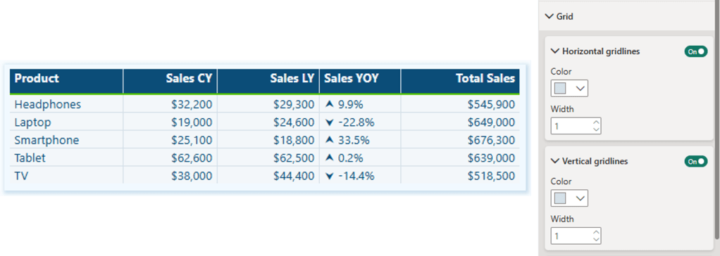
Next, we will focus on the Values property section. This area allows us to customize text styles and background colors, essential for ensuring our tables are readable and visually engaging.

We can specify the primary text color, background color, and alternate colors to differentiate between alternating rows in the visual. Alternating the styles of the rows improves readability and makes it easier to track values across each row.

The final basic formatting properties to consider are the column headers and totals. The column header properties allow us to adjust the font size, background color, and text alignment, which helps create a structured and easy-to-read table.

When we enable the Totals property, our table will include a row that aggregates the values from each column. We can customize this row’s font style, text color, and background color to distinguish it from the standard data rows.

In our example, we set the column headers to white with a dark blue background, making the header row easily identifiable. Additionally, we activate the totals row, giving it dark blue text, a gray background, and top and bottom borders to further differentiate it from the other data rows.

Enhancing Tables with Advanced and Conditional Formatting

In addition to basic formatting, Power BI provides multiple settings and options for advanced and conditional formatting, allowing for greater control over the appearance of table visuals. These options enable targeted formatting for specific columns and dynamic styling for key data points and trends.

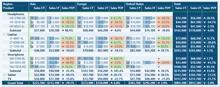
We can utilize the specific column properties to apply unique formatting to individual columns, offering the flexibility to adjust the styling of headers, values, and total values for different series.

For example, we can include the count of transactions alongside our sales data in the table. Using the specific column properties, we can set the text color of the values and totals to visually distinguish them from the primary focus of the sales amounts.

The cell elements properties offer additional customization options and enable dynamic formatting. These customizations enhance our ability to highlight trends and identify key values.

For instance, using these properties, we can conditionally format the background and text color of the Sales Year-over-Year (YoY) series. This lets us quickly see which products have experienced growth or decline compared to the previous year.

We enable data bars for the current and last year’s sales series, visually comparing sales values across different products.

We also activate the icons feature for the current year’s sales values. We add a trending upward arrow for products whose current-year sales exceed those of the previous year and a downward arrow for products whose current-year sales are lower than last year’s. This visual representation quickly indicates product sales growth next to each product category and complements the Sales Year-over-Year series.

By integrating fundamental concepts, specific column formatting, cell elements, and conditional formatting, our Power BI table visuals can become dynamic and intuitive report elements that lead users to insights.


Customize Matrix Visuals

The Matrix visual in Power BI shares many of the same formatting options as the Table visual, including Grid, Values, Column headers, Specific column, and Cell elements formatting. However, Matrix visuals introduce additional formatting options for the hierarchical data structure.

Row Headers

Row headers are a key feature of Matrix visuals, allowing viewers to group and drill into the data. Power BI lets us define the font styling, text alignment, text color, and background color. We can also customize the size and color of the expand and collapse (+/-) buttons, or not show them all together.

Subtotals and Grand Totals

Row subtotals summarize data at each hierarchical level, allowing viewers to see how individual categories contribute to the overall total.

By toggling a setting in the Format options, we can enable or disable row subtotals. When row subtotals are enabled, we can customize the font and background styling and define the total label and its position.

In our example, we enable row subtitles and adjust the styling to ensure consistency with other visual elements. We then set the position of the subtotal to the bottom and activate the row-level settings. Under these settings, we select Product Code and label it as “Subtotal.” Next, we choose Product and label it “Grand Total.”

Grand totals display the final sum of all row and column values in our Matrix visuals. Proper formatting ensures these totals remain distinct and easy to locate.

The formatting options include font styling, font color, and background color.


Advanced Techniques and Customizations

The table and matrix visuals in Power BI provide a range of options for creating unique presentations that enhance data visualization, interactivity, and analytical depth. By designing these visuals thoughtfully, we can highlight key insights, delve deeper into our data, and create dynamic reports tailored to the viewers’ needs. Let’s explore some advanced examples that go beyond the basics.

Clean and Straightforward Sales Totals

This matrix visual presents a structured overview of our sales totals across different regions, product categories, and years. The clear and straightforward presentation makes analyzing trends over time and across regions easy.

We add a matrix visual to our report canvas to create this visual. Next, we place the Region and Product data into the Rows field, the Year into the Columns field, and a Total Sales measure into the Values field. After that, we expand all rows by one level and position the row subtotals at the bottom. Finally, we change the label for the Product row level label to Subtotal.

In the Layouts and Style Presets options, we set the Style to “None” and the Layout to “Outline.” We also toggled off the Repeat Row Headers option.

Under the Values properties, we adjust the background color and alternate background color to match the color of the matrix background.

Next, we format our column headers and the grand total section.

Column Headers:

  • Background color: matrix background color
  • Font color: dark blue font color
  • Font style: semi-bold and font size 11

Row/Column Grand Total:

  • Background color: a darker tone of the matrix background color
  • Font color: the same dark blue used for the values

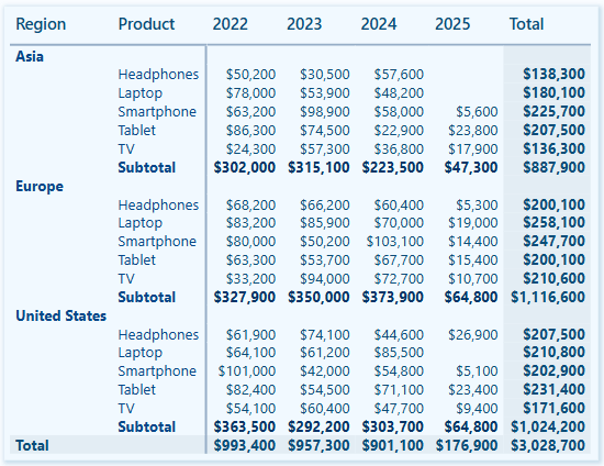
To complete the visual, under the Cell elements properties, we enable data bars and set the positive bar color to a tone of the matrix background, ensuring that the bars and values are easy to read.

Month and Day of Week Sales Heat Map

We can use the Power BI matrix visual to create a heat map that visually displays sales performance across different days of the week and months. This heat map is created using the conditional formatting feature for cell elements, effectively highlighting patterns in our sales distribution.

We place a month name series in the rows field, a weekday name abbreviation series in the columns field, and a total sales measure in the values field.

Then, we toggle off the row and column subtotals.

To create a heat map, we start by enabling the background color property under the Cell elements section.

In the Background Color dialog box, we set the Format Style to gradient based on our Total Sales measure. Next, we add a middle color and set the colors for both the minimum and center values to match the matrix background, while the color for the maximum value is set to a dark blue. Including a middle color helps emphasize the top performances in the heat map.

Next, we enable the font color property under Cell elements.

In the Font Color dialog box, we set the Format Style to gradient based on our Total Sales measure. We then add a middle color and set both the minimum and maximum values to match the background color of the matrix. For the center value, we select a slightly darker shade. By setting these colors, we can hide values close to the minimum, gradually reveal values as they approach the maximum, and ensure that the light color of the maximum stands out against the dark blue background.

Product Review Ratings with Custom SVG Icons

This matrix visual uses custom SVG icons to show average product ratings by region, product, and product code.

We start by adding the Product and Product Code columns to the Rows fields, the Region column to the Columns field, three measures to the Values fields, and applying general formatting to the column headers.

The measures are:

Score SVG = 
VAR prefix = MAXX(FILTER(Icons, Icons[Name]="prefix"), Icons[SVGIcon])
VAR _00 = MAXX(FILTER(Icons, Icons[Name]="Satisfaction0.0"), Icons[SVGIcon])
VAR _05 = MAXX(FILTER(Icons, Icons[Name]="Satisfaction0.5"), Icons[SVGIcon])
VAR _10= MAXX(FILTER(Icons, Icons[Name]="Satisfaction1.0"), Icons[SVGIcon])
VAR _15= MAXX(FILTER(Icons, Icons[Name]="Satisfaction1.5"), Icons[SVGIcon])
VAR _20= MAXX(FILTER(Icons, Icons[Name]="Satisfaction2.0"), Icons[SVGIcon])
VAR _25= MAXX(FILTER(Icons, Icons[Name]="Satisfaction2.5"), Icons[SVGIcon])
VAR _30= MAXX(FILTER(Icons, Icons[Name]="Satisfaction3.0"), Icons[SVGIcon])
VAR _35= MAXX(FILTER(Icons, Icons[Name]="Satisfaction3.5"), Icons[SVGIcon])
VAR _40= MAXX(FILTER(Icons, Icons[Name]="Satisfaction4.0"), Icons[SVGIcon])
VAR _45= MAXX(FILTER(Icons, Icons[Name]="Satisfaction4.5"), Icons[SVGIcon])
VAR _50= MAXX(FILTER(Icons, Icons[Name]="Satisfaction5.0"), Icons[SVGIcon])

RETURN
SWITCH(
    TRUE(),
    [Average Score]<0.5, prefix&_00,
    [Average Score]>=0.5 && [Average Score]<1.0, prefix&_05,
    [Average Score]>=1.0 && [Average Score]<1.5, prefix&_10,
    [Average Score]>=1.5 && [Average Score]<2.0, prefix&_15,
    [Average Score]>=2.0 && [Average Score]<2.5, prefix&_20,
    [Average Score]>=2.5 && [Average Score]<3.0, prefix&_25,
    [Average Score]>=3.0 && [Average Score]<3.5, prefix&_30,
    [Average Score]>=3.5 && [Average Score]<4.0, prefix&_35,
    [Average Score]>=4.0 && [Average Score]<4.5, prefix&_40,
    [Average Score]>=4.5 && [Average Score]<=5.0, prefix&_50
)
Average Score = 
AVERAGE(Reviews[SatisfactionScore])
Review Count = 
COALESCE(COUNTROWS(Reviews), 0)

We enable column and row subtotals and format the grand totals section to visually distinguish it from the main data.

This visual enhances the user experience by making the review score data more intuitive to explore and understand.

These examples demonstrate how Power BI’s Table and Matrix visuals can be used and customized to improve our reports. By leveraging these visuals and the customization options they offer, we can create engaging, insightful, and easy-to-interpret reports.


Wrapping Up

Table and Matrix visuals in Power BI are effective tools for presenting structured data, whether through detailed tables or hierarchical matrices. By applying formatting and customization techniques, these visuals can transform our data and provide clear and intuitive insights.

Advanced features such as drill-down capabilities, cell element customization, and conditional formatting enhance these visuals beyond merely presenting numbers, making them more interactive and visually engaging. Table and Matrix visuals offer the flexibility to meet a variety of our reporting needs.

If you’d like to follow along and practice these techniques, sample data, and a Power BI report template file are available here: GitHub – EMGuyant Power BI Core Visuals.


Thank you for reading! Stay curious, and until next time, happy learning.

And, remember, as Albert Einstein once said, “Anyone who has never made a mistake has never tried anything new.” So, don’t be afraid of making mistakes, practice makes perfect. Continuously experiment, explore, and challenge yourself with real-world scenarios.

If this sparked your curiosity, keep that spark alive and check back frequently. Better yet, be sure not to miss a post by subscribing! With each new post comes an opportunity to learn something new.

Explore Power BI Core Visualizations: Part 3 – Pie, Donut, and Treemap


Pie, Donut, and Treemap charts can be helpful tools when we need to show how different parts contribute to a whole. Pie charts represent data as slices of a circle and show the relationship of parts to a whole. Donut charts are similar to pie charts. However, their center is blank, providing space to add a label or other icon. Treemap charts use nested rectangles to visualize each level of hierarchy in our data.

These charts can be helpful for specific visualizations, but it is important to recognize their limitations. As with all of our data visualization tasks, choosing the right type of visual is essential. To explore bar and column charts, visit Part #1 of this series, and to learn more about line and area charts, check out Part #2.

Chart your data journey! Transform data into insights with Power BI core visualizations. 

Chart your data journey! Transform data into insights with Power BI core visualizations. 


Customizing Pie Charts

Customizing our pie charts enhances their clarity, making it easier for our report viewers to interpret the data.

Adjusting Colors

The color choices used in our pie charts play a crucial role in their readability. Within the Slices property of our Pie chart, we can customize the colors used for each slice. When selecting colors, we should ensure they are visually distinct and that the colors used for our data categories are consistent across all visuals on the page and within the report.

We set the color of our slices in the Format pane, under the slices section. Here, we will find each data category included in the chart, and we can explicitly see the color.

Formatting Data Labels

The data labels on our pie charts help convey important insights to our viewers. Within the Data label properties of our pie chart we find several options to edit and format our data labels. We have options to set the position of our data labels (e.g. outside, prefer inside), what information to display such as category name, values, or percent of total, and under the Value grouping, we can format the text of the data labels.

Using a combination of these properties, we can make our charts more informative at a glance. For example, we can improve the above plot by displaying the category name and percent of total directly on our chart.

It is important to be cautious when using data labels. We want to provide essential information without overcrowding the chart with too much text. Adjusting the font size, background, font color, and label position can help us maintain a clean and organized look.

Using Legends Effectively

Our data labels display information directly on our charts, while legends offer a clean way to display what data category corresponds to which chart slice. Within the Legend properties we can set the position of the legend, set the title, and format the text and title of the legend.

We can update the Pie chart above to display the legend and then update the data label to display the total sales value and the percent of total value.

When using pie charts, it is important to limit the number of categories to ensure clarity. Pie charts are most effective when displaying data with no more than a few slices. If this cannot be accomplished, it’s best to consider other visuals to provide our insights.


Customizing Donut Charts

Donut charts provide an alternative to pie charts, with the added benefit of a central blank space. This space can be used for a variety of purposes or left blank. By customizing our donut charts, we can enhance their effectiveness and make them more informative and engaging.

Like pie charts, donut charts allow us to set the color of each chart slice, use data labels to provide additional information and position the legend to provide additional context.

Donut charts also offer additional properties we can customize to enhance these charts even further.

Modifying the Inner Radius

One of the main differences between our pie and donut charts is the open area in the center. Within the Slices property grouping, we will find a Spacing option. Here, we can adjust the inner radius, controlling how wide or narrow the chart’s ring appears.

Increasing this value creates a more pronounced donut shape, which can help draw viewers’ attention to the center of the chart. Decreasing this value makes the chart look more like a traditional pie chart.

Donut charts can be helpful when we need to compare proportions while also displaying an aggregate metric that we can place in the open center of the visual. However, like pie charts it is important to only use these charts when there is a small and manageable number of segments. When there are too many segments, donut and pie charts become cluttered and difficult to interpret.

When using these comparison charts, we should aim for simplicity and clarity.


Customizing Treemap Charts

Treemap charts are useful when visualizing hierarchical data. They allow us to display a large amount of information in a compact space. Each category in the visual is represented by a rectangle, the size of which reflects the category’s value.

Treemap charts offer various properties that we can customize to enhance their clarity, ensuring they effectively convey complex data structures and insights.

Adjusting the Colors

In our treemap visuals, colors distinguish between our different categories. Like in our other charts, we can set the color for each category, and it is important that this color selection is consistent across all visuals within our report. For example, we can create a treemap of our Total Sales by product category and product code and set the colors for each category to ensure visual consistency.

Setting Labels and Viewing Tooltips

Like many of our other Power BI visuals, Treemap visuals allow us to customize visual labels and tooltip properties to improve the readability of our visuals. Labels on our visuals provide context by displaying category names and values directly within each rectangle. By using the options available under the data labels and categories labels we can adjust the font size, color, display units, and the number of decimal places to improve the clarity of our visual.

We will use these properties to improve the treemap above by increasing the font size and weight of the category labels so they are easily identifiable. We will also turn on data labels to provide our viewers with precise information for the largest contributors.

Tooltips are another feature common across our Power BI visuals that adds an interactive element to our reports and can provide our viewers with additional information. When a user hovers over a rectangle, a tooltip appears, providing them with information about that category. Additionally, the information included within the tooltip can be customized to provide further context, such as percentages or other metrics.

In treemaps, some rectangles may be too small to display the data label, and tooltips become a valuable asset for delivering details without cluttering the visual.

Using Drill-Down Features

One strength of treemaps is their ability to represent hierarchical data. Power BI’s drill-down functionality lets us explore these hierarchies in detail. A user can use the drill-down feature to drill into the next level of the hierarchy, focusing on the subcategories or finer details of the data.

Drill-down features provide our viewers with another interactive element, allowing them to explore the dataset at multiple levels without overwhelming them with too much information upfront.

In our example treemap above, the first-level category is Product, and the second is Region. This allows our viewers to drill into a product category to view the distribution of product sales across sales regions.

Treemap charts can be a helpful tool for comparing proportions within hierarchical data. However, they are most effective when the differences in value between categories are significant. When all categories are similar in size, the visual can be difficult to interpret, so it is important to evaluate whether a treemap is appropriate for each use case.


Advanced Techniques and Customizations

Current Year Sales by Product Selection

The Current Year Sales donut chart helps visualize how a selected product contributes to the total current year sales.

To build this visual, we first, create two measures: Total Sales CY and Remaining CY Sales.

The Total Sales CY measure calculates the current year’s total sales, and the Remaining CY Sales calculates the difference between the total sales of all products and the selected product’s sales.

Total Sales CY = TOTALYTD([Total Sales], DateTable[Date])
Remaining CY Sales = 
VAR _allSales = CALCULATE([Total Sales CY], ALL(Sales))

RETURN
_allSales - [Total Sales CY]

We then add these two measures to our donut chart’s Values property and set the color of the Total Sales CY to a dark blue and Remaining CY Sales to a light gray.

We then turn off the legend, and update the data labels to show only the percent of total value.

Next, we create a new measure that will be used for the visual subtitle. The subtitle provides additional context by showing how close the product’s sales are to hitting a sales target, and how this year’s sales compare to last year’s sales for the same period of time.

Product Sales Subtitle = 
VAR _lyYTDSales = 
   TOTALYTD(
      [Total Sales],
      DATESBETWEEN(
         DateTable[Date], 
         DATE(MAX(DateTable[Year])-1, 1, 1), 
         DATE(YEAR(TODAY())-1, MONTH(TODAY()), DAY(TODAY()))
      )
   )
VAR _compare = 
   [Total Sales CY] - _lyYTDSales
VAR _percentDiff =
    _compare/((_lyYTDSales+[Total Sales CY])/2)

RETURN
FORMAT(
   [CY Sales Percent of Target], "0.0%") 
   & " of Sales Target | " 
   & IF(_compare<0, "▼", "▲") 
   & FORMAT(ABS(_percentDiff), "0.0%") & " compared to previous"

Lastly, we use the empty center of the donut chart to provide additional details to our viewers. Here, we display the total sales value for the selected product and add a dynamic label to clearly show what the sales value represents.

To do this we create another measure to dynamically update based on user selections. The Selected Product measure shows “All Products” when there is no product selection; otherwise, it displays the selected product name, or when there are multiple selections, it displays a list of all the selected products.

Selected Product = 
IF (
    ISFILTERED ( Products[Product] ),
    IF (
        HASONEVALUE ( Products[Product] ),
        VALUES ( Products[Product] ),
        CONCATENATEX ( 
            ALLSELECTED ( Products[Product] ), 
            Products[Product], 
            ", "
        ) & " Sales"
    ),
    "All Products"
)

Current Year Regional Sales

The Current Year Regional Sales donut chart compares sales across different sales regions.

We start building this chart with a series of measures. First, a set of measures calculating the current year sales for each region.

Asia Sales CY = CALCULATE([Total Sales CY], Regions[Region]="Asia")
Europe Sales CY = CALCULATE([Total Sales CY], Regions[Region]="Europe")
US Sales CY = CALCULATE([Total Sales CY], Regions[Region]="United States")

Then, we add another set of measures calculating the difference between the total sales and the region-specific sales.

Asia Sales CY Diff = [Total Sales CY] - [Asia Sales CY]
Europe Sales CY Diff = [Total Sales CY] - [Europe Sales CY]
US Sales CY Diff = [Total Sales CY] - [US Sales CY]

Similar to the visual above, we add the region-specific measures to a donut chart and format them to appear as concentric donut charts. This is done by turning off the border and background of the two inner donut charts and resizing them.

Next, we build a customized legend element that not only shows the total sales for each region but also the percentage that each region contributes to the overall sales. The percentage of overall sales is calculated using 3 new measures.

Asia CY % Sales = DIVIDE([Asia Sales CY], [Total Sales CY])
Europe CY % Sales = DIVIDE([Europe Sales CY], [Total Sales CY])
US CY % Sales = DIVIDE([US Sales CY], [Total Sales CY])

This visual is also dynamic based on the user interaction and selections made on the product slicer.

This visual provides our viewers with a quick comparison of regional sales. It clearly shows the sales distribution across our regions, allowing our viewers to identify which regions have the highest or lowest sales.


Wrapping Up

In this part of the series, we explored Pie, Donut, and Treemap charts and how to effectively use and customize these visuals in our Power BI reports. Pie and Donut charts can be helpful tools when displaying proportions but should be used selectively when comparing only a few categories. Treemap charts excel at displaying hierarchical data and provide us with a compact and insightful way to visualize this data.

While these visuals can prove to be just the right fit for a given requirement, they must only be used in the right scenarios, with an emphasis on simplicity and clarity.

In the next part of the series, we will explore Power BI’s Gauge, Card, and KPI visuals. These visuals help us display metrics and provide at-a-glance insights into key data points.


Thank you for reading! Stay curious, and until next time, happy learning.

And, remember, as Albert Einstein once said, “Anyone who has never made a mistake has never tried anything new.” So, don’t be afraid of making mistakes, practice makes perfect. Continuously experiment, explore, and challenge yourself with real-world scenarios.

If this sparked your curiosity, keep that spark alive and check back frequently. Better yet, be sure not to miss a post by subscribing! With each new post comes an opportunity to learn something new.

Explore Power BI Core Visualizations: Part 2 – Line and Area Charts


Welcome back to our exploration of the core visuals in Power BI. In Explore Power BI Core Visualizations Part 1 we explored bar and column charts and how they can be used and customized within our report to provide insights.

Now, we will explore another set of visuals in Power BI: Line and Area charts. These visuals are essential tools for displaying trends and patterns over time, making them ideal for analyzing time series data, monitoring performance, or illustrating cumulative values.

Let’s dive in and explore how to create, customize, and enhance our Line and Area Charts in Power BI to elevate our reports.


Types of Line Charts

Line charts are a fundamental tool in data visualization, especially when it comes to displaying trends and changes over time. A line chart provides our viewers a continuous flow of connected data points that are easy to follow and makes them ideal for visualizing trends.

In Power BI, we have several varieties of line charts, each serving a unique purpose and offering different way to analyze and display different data. Let’s explore these main types.

Line Chart

A standard line chart is the simplest form, and typically used to display time on our x-axis and a metric being measured on the y-axis. This type of chart is excellent for tracking sales or other metrics over months, quarters, or years.

Line and Stacked Column Chart

Line and stacked column charts combines a line chart with a stacked column chart, providing a dual perspective on our data. The line represents one metric, while the stacked column represents another. This type of chart can be useful for comparing the overall distribution of different categories along with the trend of a key metric.

For example, we can use a line and stacked column chart to display our year-to-date cumulative sales as a continuous series while showing the monthly contribution of each sales region.

Line and Clustered Column Chart

The line and clustered column chart is another hybrid visual that combines a line and clustered column charts. In this chart type, columns represent individual categories clustered together, while the line element shows the trend of a specific metric. For example, we can show a comparison of the previous year and current year monthly total sales as our clustered columns and the average sales for each year over time on our line axis.

Each of these chart types provides a unique way to visualize data, offering flexibility and depth to our analysis. Understanding when and how to use these different line charts can greatly enhance our ability to communicate data insights effectively.


Customizing Line Charts

Customizing line charts in Power BI allows us to create visually appealing and informative visuals that effectively communicate our data trends to our viewers. There are various ways and opportunities for out of the box thinking when it comes to our customizations. Here we will focus on some of the main customization options available across all of the line chart types.

Line Color and Styles

To make our lines more visually distinct we can leverage the properties found under the Line property group. These options let us define the color, style, and thickness of all the lines on our chart or for specific series.

Let’s explore these options to improve the Total & Average Sales Line and Clustered Column visual shown above.

We start by adjust our colors, we will keep a blue color theme for 2024 data and use a gray color theme for 2023 data. Under our Lines property setting we select our Average Sale 2024 in the Series drop down and select 60% lighter color of our dark blue in our Power BI theme, keeping it consistent and corresponding to the 2024 column.

Next, we select the Average Sale 2023 series in the Series dropdown and set the color to a gray. We select a color that is light enough to contrast with the dark blue bars, yet dark enough to contrast the light-colored background of the visual.

This slight change already improves our visual’s clarity, but we can go one step further. In addition to using different colors to differentiate our lines we can use different styles to further differentiate our series. Here, with the Average Sale 2023 series selected, under the Line options we set the Line style to Dashed and reduce the width to 2px.

Data Markers and Labels

In addition to setting different colors and styles for our lines, we can also set the data marker style or not show them at all.

Data markers make it easier to identify specific values and can help compare different values. For example, in the above visual we only show data labels for the Average Sale 2024 series. However, since we show the data markers for both series, we can present our user the current year’s average and its value, and then it can easily be compared to the previous year’s data marker.

Let’s further clarify our different series by setting the data marker for our Average Sale 2023 to a diamond shape and reduce its size to 4px. We select the series we want to modify from the drop down, and then select diamond in the shape dropdown and then reduce the size.

Adding data labels to our visuals provides our viewer additional context and precise information by displaying the value of each data point on the chart. We find the options to customize our data labels under the Data labels property group. Here, we find options to set the position of our data labels, display a title, customize the value displayed and how it is formatted, add additional detail to display another value, set the background of the label, and define whether the label should appear on a single line or multiple lines.

To help not clutter our Total & Average Sales visual we turn off the labels for the 2023 column and series. To do this we select each series in the Series dropdown and toggle off the Show for this series option.

Then we modify our data labels for our 2024 columns and Average Sale 2024 series. We start with our 2024 column data label and select it in the Series dropdown. Then we set the background of the data label to the same color as the column, set the value color to white, and under the options settings we select Outside end in the Position (column) dropdown.

Then we select our Average Sale 2024 in the Series dropdown, set the background to the same color as the line, the value color to a dark blue, and select Above in the Position (line) dropdown.

By customizing our line color, style, data markers and data labels our visual now more clearly differentiates between our 2024 and 2023 data through the use of different colors and styles. Clearly labeling our 2024 data points provide precise information for the current year data, while also being able to relatively compare this value to the previous year data.

Other Customizations

There are many other customization options available. There are other line chart specific options to explore including series labels and shading the area under the line series. Then there are also customization options that are common across many different visual types including formatting the x- and y-axis, the legend, gridline, tooltips, etc. For examples and an exploration of these common options visit Part 1 of this series.

Chart your data journey! Transform data into insights with Power BI core visualizations. 

By customizing our line charts, we are able to create compelling visuals that highlight key trends and insights in our data. By leveraging these different customization options, we can enhance the clarity and impact of our visuals.


Types of Area Charts

Area charts are a variation of line charts that fills the area beneath the line with color, emphasizing the magnitude of the values. They can be particularly useful for visualizing cumulative data, where the area fill highlights the overall value in addition to the trend.

Area Chart

A standard area chart fills the area below the series line making it easy to see both the trend and volume of the dataset over time. We can use this chart to display continuous data where the emphasis is on the total value represented by the area. For example, we can use an area chart to visualize our year-to-date running total sales for our dataset.

Stacked Area Chart

The Stacked Area Chart is an extension of the basic area chart, where multiple data categories are stacked on top of each other. Each category is represented by a different colored area, showing the contribution of each category to the total value. Similar to the stacked bar/column charts, this chart type is useful for visualizing the contribution of different categories to the whole.

For example, we will update our Running Total Sales to show each region’s contribution to the running total over time. By stacking the areas, it becomes clear how each region’s sales trend and compare to the others. This chart is effective when we need to show the relationship between multiple data series and their cumulative impact on a metric.

100% Stacked Area Chart

The 100% Stacked Area Chart is similar to the stacked area chart but shows the relative percent contribution of each category to the total. Each area is normalized to fill 100% of the y-axis, making it easy to see the proportional contribution of each category over time. This type of area chart is ideal for when we need to compare the relative size of different categories.

For example, with a 100% Stacked Area chart we can update our Running total sales visual to show how each sales region contribution to our annual total sales has changed throughout the year. This provides a different method to visualize and understand how each of our sales regions contribute to our total sale through time.

Each of these area chart types provides a unique way to visualize data, offering us flexibility and depth to our data analysis. Understanding when and how to use each different type can greatly enhance our ability to communicate data insights effectively.


Customizing Area Charts

Customizing our area charts allows us to ensure our charts are informative as well as visually appealing and effectively communicate our data insights. Let’s explore several customization options to enhance our area charts.

Fill Colors and Transparency

To make sure our area charts are visually consistent with other visuals in our report we can set the color of each series and adjust the transparency to get the visual just right. For example, a common theme within our Sales report is to visualize our regions using a green color palette.

So, when creating the Running Sales stacked area chart above, we set the color for each sales region explicitly to ensure consistency.

Power BI provides us two property groups to help customize the line and fill color of our area charts. The first is setting the line color, here we can select each series we want to customize from the Series dropdown and apply the desired formatting. The other is the Shade area properties that we can customize. By default, the Match line color is toggled on however, if required we can toggle this option off and set the area color to a specific color.

Data Labels and Markers

By using data labels and markers we can enhance the clarity of our area charts by displaying the exact values and providing our viewers the information they require at just a glance. To label our area charts we can utilize data and series labels and for our stacked area charts we also have a total label property. Let’s explore each of these on Running Total Sales stacked area chart.

We will start by formatting the data labels. The data labels will be formatted the same for all our regional sales series. We set the color to a dark green color, and then under Options we set the position to inside center. This will show each regional contribution to the total cumulative sales and display it in the center of the shaded area.

Next, we toggle on the Total labels to show the cumulative total of our sales through time. To distinguish this value from the data labels, we set the background of the label to a darker green, transparency to 0%, and then set the color of our values to white.

Lastly, to better clarify what each area on our chart represents, we turn on the series labels. We position the series labels on the right side of the chart and format the series colors to correspond with the line/area color for each series.

In addition to using data labels, we can identify each data point using markers. We can also set different marker for each data series to continue to provide our viewers visual cues to differentiate our series. Here, we set the Asia sales regions to use circle markers, the Europe sales region to use diamond markers, and the United States sales region to use square markers.

Other Customizations

Like our line charts there are many other customization options available then we explored here. Check out Part 1 of this series for details on customizing our visual’s x- and y-axis, legend, gridlines, tooltips, and more.

Chart your data journey! Transform data into insights with Power BI core visualizations. 

By customizing our area chart, we can create a compelling visual narrative that highlight the key data trends in our data. To maximize our visual’s clarity when it includes multiple data series (e.g. stacked area charts) it’s important to use clearly distinguished colors and to avoid displaying areas that excessively overlap. By effectively leveraging our customization options, we can enhance our visuals ensuring our data tells a compelling story.


Ribbon Chart

A ribbon chart is a unique and powerful visual that showcases rankings of different categories. These charts highlight both the rank of the categories within and across different groupings. A ribbon chart is particularly effective in scenarios where we want to understand the flow and change of ranks over different groupings, such as the totals sales of product categories across our different sales regions.

The customization options available for us for our ribbon charts are similar to the options we have already explored in the previous sections, so we won’t explore then again here. For example, in the above visual we leveraged total labels, data labels, and specific colors for our columns.

Ribbon charts can be a powerful tool for visualizing ranking and trends, providing valuable insights into the relative performance of different categories. By effectively utilizing ribbon charts in our reports, we can provide our viewers an informative and unique visual that drives deeper insights.


Advanced Techniques and Customizations

Enhancing our Line and Area charts with advanced techniques and customizations can help us elevate the clarity and impact of our visuals. Let’s explore some examples.

Plotting Year over Year Comparisons

Year-over-year comparisons can help improve our understanding of trends and annual patterns in our data. Using a line chart allows us to clearly visualize these patterns.

Here is the plot we will be creating to provide year-over-year insights to our viewers.

First, we ensure our data includes the proper time dimension, in this example we use the total sales for each month. We start building the visual by adding a Total Sales measure to the y-axis of our line chart and our Month time dimension to the x-axis.

We can see now that our plot displays the Total Sales for each month. To separate and distinguish the monthly total sales for each year we add our Year time dimension to the chart’s Legend field.

The line chart now shows the monthly Total Sales for each year within our dataset. To enhance the clarity of this visual and highlight the current year we continue to format this visual.

To start, we use the Line properties for each series to improve the visual distinction between the previous years and the current year. We set the color of the 2022 series to a light blue and set the line style to dotted, 2023 we set the color to a slightly darker blue and the line style to dotted. Lastly, we set 2024 to a dark blue, keep the line style as solid and increase the width to 4px.

Then we move to adding line markers to give our viewers more precise information on each monthly value. For all of the data series we set the marker type to a circle. For the 2022 and 2023 series the marker size is 3px and then to better highlight the 2024 values we increase the size to 5px.

Lastly, to display the specific monthly values for only 2024 we enable Data labels and then for the 2022 and 2023 we toggle Off the Show for this series option. To ensure the data labels for 2024 sales stands out and are easy to read we set the background of the label to the same color as the series line and set the transparency to 0%, and the Value color to white.

These formatting options gives us our final visual.

By using this approach, we can quickly compare our year-over-year total sales while highlighting the data our viewers are most interested in.

Conditional Formatting Based on Data Thresholds

In the above year-over-year line chart we used line style and color to distinguish our data series and highlight data. Conditional formatting provides us another excellent way to draw attention to key data points. By using conditional formatting, we can automatically change the color of various chart components based on defined thresholds.

The goal with this plot is to highlight for our viewers when the current year’s average monthly sales are above or below the previous year’s average monthly sales. Here is the final visual.

To create this visual we have two measures, the first calculates the monthly average sales for the current year and the second calculates the monthly average sales for the previous year.

In addition to these two measures, we create three new measures to assist with labeling and formatting the specific data points.

Annual Comparision = [Average Sale Current Year] - [Average Sale Previous Year]

Annual Comparison CY < LY Label = 
If([Annual Comparision] < 0,[Average Sale Current Year])

Annual Comparison CY > LY Label = 
If([Annual Comparision] > 0,[Average Sale Current Year])

The first measure provides us a comparison of the current year sales and the previous year sales. We then use this to create the label measures.

Once we have our measures, we start constructing our visual by adding a Line and Clustered Column chart to our report. To create this visual we use the Line and Cluster chart, this allows us to add multiple series to the Line y-axis field.

We start by adding both of the average monthly sales measures to the line y-axis data field of the visual and our MonthName time dimension field to the x-axis data field. Then format the lines in a similar fashion that we did in the above example.

We then add the Annual Comparison CY < LY Label and Comparison CY > LY Label measures to the visual. On this visual the ordering of the data series is important. The order of the measures in the Line y-axis data field is Average Sale Current Year, Average Sale Previous Year, Annual Comparison CY < LY, and lastly Annual Comparison CY > LY.

Now that all of the series we need are added to our visual we need to enhance it with our customization and formatting.

Since the only lines we want on the visual are the Average Sale Current Year and Average Sales Previous Year, we start by setting the Line width of the Annual Comparison measures to 0px and the color to the same color as the visual background color so the dot for these series cannot be seen in the legend.

We then move to formatting the markers for the Annual Comparison series. For the Annual Comparison CY > LY Label series we set the marker size to 6px and color to green, and for the Annual Comparison CY < LY Label series we set the marker size to 6px and the color to red.

Lastly, for the data labels that we will apply to the Annual Comparison series we add another measure that we can use to show the percent difference between the previous year average sales and the current year average sales.

Annual Comparison Percent Difference = 

VAR _percentDiff = ([Average Sale Current Year]-[Average Sale Previous Year])/(([Average Sale Current Year]+[Average Sale Previous Year])/2)

RETURN

IF(_percentDiff <0, "▼ " & FORMAT(ABS(_percentDiff), "0.0%"), "▲ " & FORMAT(_percentDiff, "0.0%"))

We toggle on our Data labels property, and then toggle off Show for this series for our Average Sales Current Year and Average Sales Previous Year series.

Then for the Annual Comparison CY < LY Label series under the Options property settings we set the Position (line) setting to Under, set the Value field to the Annual Comparision Percent Difference measure, the color of the value to white, and the background of the label to the same red color as the marker with a transparency of 0 %.

We format the Annual Comparison CY > LY Label series in a similar fashion, however, we set the Position (line) to Above and the background color to the same green we used for the marker.

Lastly, we rename the Annual Comparison measures for the visual and clear the series name so like the marker in the legend the series name is not shown.

Using conditional formatting helps us make our visuals more informative by visually emphasizing data points that meet certain criteria.

Visualizing Thresholds with Area Charts

Visualizing threshold or ranges with area charts can be a useful and powerful way to compare actual performance against a benchmark or target. We can use this approach to compare our historic actual sales to the forecasted value and visualize the forecasted data projected into the future.

This is the visual we will be creating.

We start to build this visual by adding an Area chart to our report. Then a time dimension hierarchy to the x-axis to plot the values for each year and month and add our Actuals Sales and Forecast measures to the plot.

We then format these series. For our Actual Sales series we set the line color to green with a width of 4px, we toggle off the Shade area setting and set the markers to circles with a dark green color. Then for the Forecast series we set the line color to gray with a width of 3px, we toggle off the Shade area setting, and toggle off the markers.

Then we add our Forecast Upper Limit and Forecast Lower Limit measures to the visual. The order of the series is essential to have the visual display correctly. The order should be Sales Actual, Forecast, Forecast Upper Limit, and lastly Forecast Lower Limit.

After adding the Upper and Lower Limit series we must format them to display just the way we want. For both the Forecast Upper and Lower Limit series we set the Line color to a light gray, and toggle off the Show for this series option for both the Line and Markers properties. Then we move to the Shade area properties, and for the Forecast Lower Limit series we toggle off Match line color and set the share area color to the same color as our visual background with the area transparency set to 0%.

Lastly, we ensure the visual is just right by setting the x-axis and y-axis titles and toggling off the built-in Legend. In place of the built-in legend, we construct a custom Legend to better identify each component on the visual.

Once all our customizations are complete, we have a visual packed with information that allows our report viewers to easily compare our historic actual sales to the forecasted values and view the forecasted sales projected into the future.


Wrapping Up

In this second part of this series on Power BI core visuals, we explored the versatility and power of Line and Area Charts along with their variations and combinations. Line Charts help us track changes over time with clarity, making them a perfect tool for trend analysis and performance monitoring. Area Charts add a layer of visual emphasis on cumulative data allowing for a visual understanding of volumes in addition to trends. The hybrid charts, combing Line and Column Charts offer a multifaceted view of our data allowing us to provide our report viewers comprehensive insights.

By understanding the strengths and weaknesses of these charts we are able to identify opportunities to leverage them to create more informative and visually appealing reports in Power BI.

Stay tuned for Part 3, where we will delve into Pie, Donut, and Treemap visuals. We explore how they can help us provide a quick snapshot of proportional data, discuss their limitations, and where they fit into our visualization toolkit.


Thank you for reading! Stay curious, and until next time, happy learning.

And, remember, as Albert Einstein once said, “Anyone who has never made a mistake has never tried anything new.” So, don’t be afraid of making mistakes, practice makes perfect. Continuously experiment, explore, and challenge yourself with real-world scenarios.

If this sparked your curiosity, keep that spark alive and check back frequently. Better yet, be sure not to miss a post by subscribing! With each new post comes an opportunity to learn something new.

Explore Power BI Core Visualizations: Part 1 – Bar and Column Charts


Overview of the blog series

This series is designed to explore and better understand the core visuals in Power BI. These visuals act as the bridge between data and decision making. They provide the means to turn our numbers into data stories, making it easier to identify trends, patterns, and outliers.

Each post in the series will focus on a different group of the Power BI core visuals and we will be covering everything from the basics to advanced customizations ensuring we have the skills and knowledge needed to create stunning and informative visuals.

Bar and Column Charts

Bar and column charts are some of the most commonly used visuals in Power BI, and for good reason. They are the perfect tool for comparing categorical data, making it easy to spot trends and differences at a glance. In any analysis these charts can help us present our data clearly and effectively.

The key difference between bar and column charts is the orientation of the bars. When we refer to bar charts in Power BI the data is displayed with horizontal bars, while column charts use vertical bars. Both types allow us to compare different categories side by side.

These charts can be used in a variety of ways and can be customized to fit our specific needs. In this post we will explore the different types of bar and column charts, how to customize them, and some recommendations on using them effectively.

Let’s dive in!


Types of Bar and Column Charts

Stacked Charts

Stacked charts help us show the composition of a whole across different categories. Power BI offers both bar and column stacked charts. Each bar or column is divided into segments that represent different sub-categories, stacked on top of each other.

  • Stacked Bar Charts: display horizontal bars where each bar is divided into sub-categories. They are ideal for comparing total values across categories and understanding the breakdown within each category.
  • Stacked Column Charts: display vertical bars divided into sub-categories. They can be the perfect tools for showing changes over time such as yearly or monthly sales or comparing the composition of different categories such as sales regions.

Stacked charts excel in highlighting part-to-whole relationships, making it easy to see both the overall totals and individual contributions. However, they can become cluttered if there are too many sub-categories, so it is best to use them with a limited number of segments.

100% Stacked Charts

100% stacked charts show the relative percentages of sub-categories within each category. Each bar or column represents 100%, and the segments show the contribution of each sub-category.

  • 100% Stacked Bar Chart: these charts can be useful for comparing the relative distribution of parts to the who across different categories. Each horizontal bar represents the total 100%, with each segment indicating that categories contribution shown as percentage.
  • 100% Stacked Column Chart: these charts are similar to the 100% Stacked Bar Charts but display the data with vertical columns.

100% Stacked charts help us focus on the proportions rather than absolute values. They can help visualize how sub-categories contribute to the whole, allowing quick insights into how proportions change over time or between categories. However, it can be challenging to compare the actual value of sub-categories across different bars or columns because the focus in on percentages.

Clustered Charts

Clustered charts display the bar or columns grouped by category, each group contains individual bars or columns for each different subcategory.

  • Clustered Bar Chart: display horizontal bars grouped by category and like the previous charts are a good choice when comparing multiple series of data across categories. Each cluster of bars makes it easy to understand and compare the same subcategory across the different categories.
  • Clustered Column Chart: these charts are similar to clustered bar charts but display the data using vertical columns with each subcategory displayed side by side.

Clustered charts are effective for highlighting similarities and differences across categories. They help us identify patterns and variations within and across the categories of our data. However, they can quickly become overwhelming if they include too many bars or columns, so it is essential to balance the number of categories and subcategories


Customization and Formatting Options

Colors and Themes

Deliberate choices in the colors used when making our bar and column charts can help elevate our visuals improving the visual appeal and ease of understanding.

A key aspect of color selection is choosing visually distinct colors for each of the categories and subcategories. This helps our users quickly and easily identify and understand the visual. Just as important is to ensure we maintain consistency with our color selections across all visuals on the page and within the report.

For example, in the visuals above the Product category is always represented by a monochromatic blue color scheme, while the Region category uses a monochromatic green color scheme. Consistently applying color schemes to our visuals greatly improve the readability of our reports.

The color of each bar in the visual can be explicitly set in the Visual properties under the Bar or Column section. We can choose the series we want to set the color for and apply formatting options such as color, transparency, or adding a border.

Colors can also be used to highlight specific data points or be applied conditionally based on business logic. See the Advanced Techniques and Customizations section for more details on how we can use and apply colors to improve our data visualizations.

Data Labels

Data labels provide our users precise information on our bar and column charts. Adding data labels to our charts helps display the exact values for each bar or column providing an extra layer of context.

Power BI provides us a variety of ways to format and customize our data labels to ensure they provide the required information without cluttering our visuals. In the advanced techniques section, we will explore how to leverage our data labels to enhance our visuals beyond just static text labels.

Let’s take a look and the data label properties available to us in Power BI.

Apply to settings: select All to apply the data label customizations to all series or select a specific series

With this we can apply a data label setting for all the data series included in our visual or pinpoint and customize the label for specific series. For example, we can continue to modify the Totals Sales by Region and Product stacked bar chart by turning off the data labels for our Laptop product category, turning on the title property for our Tablet product category, and leaving the Smartphone category with the setting applied to All series.

Options: under the options section we will find the ability to set the position of our data labels and for column charts we also have the option to set the orientation of labels.

The available positions depend on the type of visual we are adding our labels to. For example, stacked charts the options include Auto, inside end, inside center, or inside base. When working with clustered bar or column charts, we will see the addition of the outside end positing option.

Let’s explore these options by continuing to work with the Total Sales by Region and Product visual. Here, the Laptop category labels are set to inside end, smartphone labels are set to inside center, and the tablet labels are set to the inside base.

Title: the title setting allows us to toggle on and off the data label titles for all and specific data categories within out bar and column charts. The Title properties include the ability to set the title to the series name or a custom value, as well as general formatting options (e.g. font, font size, font color).

Value: within the value section are the settings available to display (or not display) the data label values and how these values should be formatted. With these options we can format the data label font and colors as well as set the display units and the number of decimal places to show.

For example, we can set the data labels for our Laptop category to display the value to the nearest thousand dollars by setting the value decimal places to 0, and we can set the display units for the Smartphone sales to Millions to adjust how the values are displayed.

Detail: the detail section of our data label properties allows us to provide additional context to our bar and column visuals and can be used by itself or in tandem with the Value property. We can control these details for each individual series or apply the customization to all data series on the visual.

Let’s explore how we can improve a 100% Stacked column chart by leveraging the Value and Details property of our data labels. A noted limitation of the 100% Stacked charts is the focus on percentage rather than the actual value. By default, if we turn on data labels, they will show each categories percentage of the whole.

We can add an additional layer of information for our viewers by using the Detail property to show the percent of total for each sub-category and use the Value property to display the total sales amount for the category. This can help provide our report viewers a more complete picture.

Background: our data labels have a background property we can use to ensure they are easy to read for our viewers. Above we can see we added a slightly transparent and darker background to the visual on the right. This improves the readability on the lighter color segments of the visual.

Layout: the layout property lets us specify if we want our data labels to appear in a single line or multi-line layout and set the horizontal alignment of the data label text. We can see this property used in the visual on the right above. Setting the layout to multi-line ensures the Value and Detail values are displayed on different lines improving the readability of the label.

By effectively using data labels, we can enhance the clarity and the information provided on our visuals.

Axes and Gridlines

Axes and gridlines are another component of our bar and column chart we can customize to improve the readability of our visuals.

X- and Y-axis: the options to customize our visual’s axes will vary depending on the data visualized and the type of visual used. Some common properties between the x- and y-axis across the bar and column charts include formatting of the values and customization of the axis title.

In addition to formatting the appearance of the value, on the categorical axis we will also see options to set the maximum height/width and a toggle to concatenate labels for hierarchies.

On the numeric axis we see the options to set the display units, how many decimal places should be shown, and the ability to set the axis range.

For each type of chart in the y-axis properties we can switch the axis position to display it on the right- or the left-hand side.

Let’s explore some of these additional options.

We can see in the column chart on the left the default displays the hierarchy of the dates (Year > Quarter > Month). Using the concatenate labels x-axis option we can change this behavior.

Below we see the set axis position property in action.

Gridlines: adding gridlines can help our viewers trace data points back to the axis, making it easier to read values accurately. We can customize the appearance of our visual’s gridlines including their color, line style, transparency, and width, to suite our design needs.

The color of the gridlines can be set to one of our report theme colors or using conditional formatting. Line styles available include solid, dashed, dotted, or custom.

Using the axis and gridline options available we can update our Total Sales by Product and Region visual to ensure our viewers can easily read and understand the visual.

Tooltips

Tooltips provide us a great way to provide additional contextual information and detail when required by the user without cluttering the overall visual.

When a user hovers over a data point, a tooltip displays extra details, and these tooltips can be customized to meet our needs. Tooltips can go beyond just displaying text and values, and display additional visuals based on report pages created in our Power BI report.

By default, the tooltip displays the data point’s value and category, we can enhance this information by customizing the tooltip.

For basic customization, we can drag additional fields into the tooltips bucket on the Build pane. We can further customize our tooltip by selecting an aggregation function for a selected field.

Let’s continue to improve our Total Sales by Region and Product visual by customizing the tooltip.

We would like to include the Average Sales Amount to the tool tip to provide additional information to our viewers. We achieve this by adding our Amount field from our Sales table to the tooltip bucket of our visual then we select the arrow next to the field to view the available aggregation functions, and finally select Average. By default, the name will be Average of Amount, we can rename this for the visual as Average Sales.

Now when we hover over a segment of our visual, we can see the newly added Average Sales value.

Using tooltips effectively can enhance the interactivity of our reports and provide deeper insights and important contextual details without overwhelming our visuals.

Sorting

On the visual within the more options pane, we can set the sort axis options. Using these options, we define what field to sort by and the sorting ordering.

The sort axis options help use ensure our bar and column charts are easily understandable and that the viewers can easily interpret the trends and comparisons the visual provides.

By default, we can see that our Total Sales by Region and Product visual sorts our Regions by descending Total Sales. Although this sorting makes it clear the order of our sales region by Total Sales it could lead to confusion if this ordering frequently changes. Additionally, it can improve readability to sort our categories in a logical alphabetical order.


Advanced Techniques and Customizations

Highlight Key Performers with Conditional Formatting

Conditional formatting is a powerful tool in Power BI that lets us apply specific formatting to data within our visuals based on their values. The specific formatting helps highlight key insights and makes our bar and column charts more informative and visually engaging.

When examining our total sales across product categories it can be helpful to add a reference line to visualize a benchmark that the sales values can be compared to.

We can use conditional formatting and some advanced techniques to improve this visual to draw our viewer’s attention to the categories that exceed the average total sales values. We will conditionally format each product category bar based on whether its total sales are above the average sales across all product categories (i.e. above or below the reference line).

To do this we will create a new measure to help format our visual.

This measure first creates a _summaryTable variable the generates a table with each product and its total sales. Then the variable _ProductTotalSalesAverage is calculated which is the average total sales across all product categories. The last variable, _comparison, is then calculated and stores a boolean value indicating whether the totals sales of the current product is above the average total sales.

Lastly, in the return statement the measure uses IF to return a color code based on whether the product category’s total sales are above or below the average total sales.

Product Code Above Average Sales Conditional Format = 

VAR _summaryTable = 
   SUMMARIZE(
      ALL(Sales), 
      Products[Product], 
      "Product Total", 
      [Total Sales]
)
VAR _ProductTotalSalesAverage = 
   AVERAGEX(
      _summaryTable, 
      [Product Total]
)
VAR _comparison = 
   [Total Sales] > _ProductTotalSalesAverage

RETURN
IF(
   _comparison, 
   "#064789", 
   "#B4C9DD"
)

In the Color and Theme section we discussed using the bar or column section of the visual properties to set the colors of each bar or column. We can also use this property to conditionally format our bars or columns.

In the Bars section, we set the Apply setting to option to All, then next to the Color dropdown we use the fx option to conditionally format our bars. In the Color – Categories dialog box we set the Format style to Field value and then in the What field should we base this on? dropdown we select our newly create measure.

After clicking Ok, we see the conditional formatting applied and our visual gets an instant improvement by highlighting the key performers in our sales data.

Using Clustered Bar/Column to Add Context

We can use a different technique to enhance the Total Sales & Average Sales Comparison visual in a different way. Rather than conditionally formatting the bars, we wish to add additional context to the visual and indicate the percentage of the total sales each category contributes.

To do this we will add an empty series to our x-axis. We will create a new Bar Spacer measure and simply set the value of it to 0. This will add a series to our visual but since the value is 0, it will not display a bar on the visual. We can then leverage its data labels properties to add additional information to our visual.

First, we will create a new measure to calculate and return the percentage of total sales that a product category contributes. The measure calculates the total sales value of the entire Sales table, ignoring any filters that are applied. Then calculates the percent contribution of the current product category in context, and finally returns the label text we will use within out visual.

Product Code Totals Sales Label = 
VAR _allSales = CALCULATE([Total Sales], ALL(Sales))
VAR _percentage = Round(([Total Sales]/_allSales)*100, 0)
RETURN
_percentage & "% of total sales"

We now can make the updates to our clustered bar chart. We start by adding in our placeholder series which is a measure set to 0.

Then we go to the Data label properties of our clustered bar chart and in the Apply settings to drop down we select our Bar Spacer series. Once selected we update the Field to our newly created label measure.

Our visual will now display and provide our viewers additional contextual information. With this our viewer not only gets insights into each product’s total sales amount, but also what percentage of the overall sales each product category contributes.

Year-to-Date Sales & Previous Year Total Sales

Another important piece of information to provide our viewers is how the total sales of each product category vary through time. We have a requirement to incorporate the year-to-date sales, the total sales of the previous year, and how the previous year’s sale compare to the prior year (i.e. current 2024 sales, 2023 total sales, and how does 2023 sales compare to 2022 sales).

Including all the required information may seem like an impossible task. However, using some advanced techniques and customizations we can meet these requirements and create a visual that is both visually appealing and informative.

Here is the final visualization we will be creating.

In order to create a visual with these various components we create 4 sales measures. The first two measures calculate the previous year’s total sales and the second calculates the annual total of the year prior to this.

Total Sales (-1 years) = 
VAR _offset = 1
VAR _year = YEAR(TODAY()) - _offset
VAR _periodStart = DATE(_year, 1, 1)
VAR _periodEnd = DATE(_year, 12, 31)
RETURN
CALCULATE([Total Sales], DATESBETWEEN(DateTable[Date], _periodStart, _periodEnd))
Total Sales (-2 years) = 
VAR _offset = 2
VAR _year = YEAR(TODAY()) - _offset
VAR _periodStart = DATE(_year, 1, 1)
VAR _periodEnd = DATE(_year, 12, 31)
RETURN
CALCULATE([Total Sales], DATESBETWEEN(DateTable[Date], _periodStart, _periodEnd))

We then create a measure calculating the difference between these two sales amounts.

Total Sales (-1) vs Total Sales (-2) = 
[Total Sales (-1 years)] - [Total Sales (-2 years)]

The last sales measure calculates the year-to-date total sales of the current year.

Total Sales CY = 
TOTALYTD([Total Sales], DateTable[Date])

We start building this visualization by creating a field parameter to dynamically name our Total Sales (-1) and Total Sales (-2) measures to show the year they represent (currently 2023 Totals Sales and 2022 Total Sales).

Previous Years Sales = {
    (YEAR(TODAY())-1 & " Total Sales", NAMEOF('_Measures'[Total Sales (-1 years)]), 0),
    (YEAR(TODAY())-2 & " Total Sales", NAMEOF('_Measures'[Total Sales (-2 years)]), 1)
}

Then we can add this parameter to a clustered column chart to start building the dumbbell comparison of these two sales values.

Under the Columns grouping of properties we expand the Layout properties, with All selected in the series drop down we turn on Overlap and set the Space between series to 100%. Then under the Color properties we set the transparency applied to the 2023 Total Sales to 80% and applied to the 2022 Total Sales series to 100%.

The next step is to create the end point markers of the dumbbell comparison. To do this we use the error bar functionality of the column chart.

Select the 2023 Total Sales series in the drop down, then under Options we enable the error bars and set the Upper and Lower bound to our Total Sales (-1 years) measure. Under the Bar properties we then format the error bar, setting the color to a medium to dark blue, the marker shape to a circle, the marker size to 8, the border color to a dark blue, and the border size to 1.

We repeat this process for the 2022 Total Sales error bar using the Total Sales (-2 years) measure and formatting the bar with a lighter color blue and a marker size of 6.

We now need to connect the two endpoints of our dumbbell which represent our 2022 and 2023 totals sales. To do this we create a new Total Sales Dumbbell Connector measure and set it equal to the Total Sales (-2 years) measure.

We add this to the Y-axis of our column chart and position it above the Parameter data. We rename the measure for this visual and clear the name and set the color of the column to the background of our visual, so it does not appear in the legend.

Then similar to the 2023 and 2022 series we enable error bars. We set the Upper bound to the Total Sales (-1) vs Total Sales (-2) we previously created and then in the Relationship to measure drop down select Relative.

Under the Bar properties we format this error bar with a medium to dark gray color, width of 2, marker shape set to none and a border size of 0.

Now, we want to label these endpoints with the total sales values. The labeling of these endpoints has 4 different scenarios we must account for. For each annual sales data point we need to be able to dynamically position the label above or below the point depending on if 2022 sales are higher or lower than 2023 sales.

To do this we add another series to the plot to help us with addressing this labeling challenge. For this series we create a new measure similar to the Total Sales Dumbbell Connector measure. The Total Sales Dumbbell Label Help measure is set equal to the Total Sales (-1 year) measure and formatted the same way as the Total Sales Dumbbell Connector series. We do not need to enable error bars for this new helper series since we will just be leveraging its data label properties.

Next, we create 4 new measures to assist with displaying and formatting our data labels.

Dumbbell Above Label (-1) = 
IF(
    [Total Sales (-1 years)] > [Total Sales (-2 years)],
    [Total Sales (-1 years)]
)

Dumbbell Below Label (-1) = 
IF(
    [Total Sales (-1 years)] < [Total Sales (-2 years)],
    [Total Sales (-1 years)]
)

Dumbbell Above Label (-2) = 
IF(
    [Total Sales (-1 years)] < [Total Sales (-2 years)],
    [Total Sales (-2 years)]
)
Dumbbell Below Label (-2) = 
IF(
    [Total Sales (-1 years)]  > [Total Sales (-2 years)],
    [Total Sales (-2 years)]
)

After creating the formatting measures, we turn on Data labels for our clustered column chart and start formatting the labels, so they display as we need them. For example, if 2023 Sales are higher than 2022 Sales, we want the label for the 2023 Sales value to be above the data point.

To start, in the Data labels apply settings to we select our 2023 Total Sales, then we set the position to Outside End. This will show our 2023 Total Sales value above each of the 2023 Sales points.

To show the label only when 2023 sales are greater than 2022 sales in the Value property, we set the Field value to the Dumbbell Above Label (-1) measure and format the label by setting the font size to 14 and the color to green indicating from 2022 to 2023 sales of the product category increased.

Next, in the apply settings to dropdown we select the helper series, which is equal to our 2023 Sales value. For this label we set the position to Inside end and the field to the Dumbbell Below Label (-1). Then format the label by setting the font size to 14 and the color to red indicating from 2022 to 2023 sales of the product category decreased.

We then repeat this process for the 2022 Total Sales and the Total Sales Dumbbell Connector series. Using the “(-2)” formatting measures for the field values and formatting the data labels with a font size of 12 and their color set to a dark gray.

Now for that last couple of finishing touches. We also want to display the current year-to-date sales and we do this by adding our Total Sales CY to the clustered column chart. We format this column by setting the column color to a dark blue and position the data labels to the Inside end of the column with a font size of 12. Then sort the Product Category axis alphabetically by the product category name.

By implementing some advanced techniques to format and customize our cluster column chart we now present our viewers with a clean and simple visualization that is easy to read and packs in all the information required. This visual now provides key insights into how each category is performing in the current year alongside historical context of the category’s performance.


Wrapping Up

Bar and column charts are a common and powerful tool in Power BI. These charts offer us a versatile visualization option with seemingly endless opportunities to format, customize, and tailor them to our specific needs.

We have explored how basic and advanced customizations in Power BI can help us create bar and column charts that are visually appealing and highly informative. By using features such as conditional formatting, dynamic labels, and interactive elements we can significantly enhance the user experience and insights our reports provide.

Subscribe below to stay tuned in as we continue to explore the other core visuals in Power BI as part of this series, helping to grow our skills and expand our data visualization capabilities.


Thank you for reading! Stay curious, and until next time, happy learning.

And, remember, as Albert Einstein once said, “Anyone who has never made a mistake has never tried anything new.” So, don’t be afraid of making mistakes, practice makes perfect. Continuously experiment, explore, and challenge yourself with real-world scenarios.

If this sparked your curiosity, keep that spark alive and check back frequently. Better yet, be sure not to miss a post by subscribing! With each new post comes an opportunity to learn something new.