Stay ahead of the latest features with a focused look at Power BI’s latest features, their benefits, and use cases. Dive into walkthroughs and tips to enhance your reports.
The Power BI update for January 2025 introduces several exciting features that improve report interactivity, visualization, modeling, and development efficiency.
This post will highlight three key updates: improvements to the text slicer, upgrades to the treemap visual, and the preview of TMDL scripting experience.
The text slicer (preview) was introduced in November 2024, now allows mutli-selection, addressing a major limitation in text-based filtering. The treemap visual gains new tiling and spacing formatting options and TMDL view previews a code-first approach to semantic modeling.
The January 2025 update addresses this limitation by introducing an option for users to input multiple values. With this new feature, users can now add multiple text inputs to the slicer, enabling them to make multiple selections for filtering the dataset.
The text slicer now includes a Allow multiple values toggle in the format settings for allowing multiple values. For more details and how to enable the text slicer (preview) see: Enhancement to Text slicer (Preview).
By allowing multiple text values, this update enhances flexibility and gives users greater control over data slicing and insight generation.
Use Case: Applying the Text Slicer in Reports
Filter on Parts of a Product Code – Explore data without a standalone field
Many datasets store information in a single field, such as a product code that includes details like color, size, or category. The new text slicer with multi-selection functionality makes filtering easier based on multiple embedded attributes.
For example, in the sample dataset, product codes contain embedded color codes (e.g. SM-5933-BK, where BK stands for black). Previously, users could only filter by one color code at a time. Now, users can select multiple color codes simultaneously to display all products that match their desired colors.
This enhancement enables better utilization of existing data structures, enhancing report filtering efficiency and flexibility without requiring additional transformations.
Search and Filter Product Reviews – Analyze long-form text fields
The text slicer was already a powerful tool for filtering customer reviews by keyword. Now, with the introduction of multi-selection, users can dive deeper and gain insights across multiple topics at the same time.
For instance, when working with a dataset containing product reviews, we could previously filter by a single keyword like “battery” to see all related reviews. With the new update, we can now filter for both “battery” and “charging” simultaneously.
A Better Treemap: The Latest Enhancements Explained
The January 2025 Power BI Desktop update enhances the treemap visual, providing greater control and customization, ensuring treemaps remain an effective tool for visualizing hierarchical data. We can now adjust the tiling method and spacing controls within the visual’s Layout properties.
New Tiling Methods: More Control Over Treemap Layouts
Squarified: Uses a squarified treemap algorithm to create a balanced layout where rectangles maintain an aspect ratio close to squares. This method prevents elongated rectangles, improving size comparisons and readability.
Binary: Continuously divides the chart area into two sections, incrementally adding new rectangles and creating a balanced format. Each hierarchy level is split further, resulting in a well-organized treemap that adjusts to the underlying data structure.
Alternating (Columns, Rows): Distinguish categories by splitting them into columns, and each is split into rows. This method is effective at visualizing data at multiple hierarchical levels.
New Spacing Options: Improved Readability and Appearance
Space between all nodes: Introduces gaps between adjacent nodes at all hierarchy levels, reducing visual clutter and improving clarity.
Space between groups: Adds extra space around each node group, helping to separate different categories visually.
For more information and details check out the Enhancements to Treemap visual section of the January 2025 update feature summary. If you are looking to dive in and get hands-on with this update, take a look at the 2025 Week 7 Power BI Workout Wednesday challenge. This challenge uses the new treemap feature to create a treemap visual organized into columns.
TMDL Scripting Experience (Preview)
The TMDL view is a new feature added to Power BI Desktop and has gotten a lot of attention for good reason.
TMDL view offers a scripting environment that enables developers to script, modify, and implement changes to the semantic model using Tabular Model Definition Language (TMDL). This view provides an alternative experience for semantic modeling in Power BI Desktop, allowing users to work with code rather than relying solely on the user interface.
The key benefits of the TMDL scripting experience include:
Enhanced Development Efficiency: The code editor includes features such as search-and-replace and support for multi-line edits, streamlining the coding process.
Increased Reusability: TMDL scripts allow for scripting, sharing, and reusing semantic model objects, making it easier to manage and replicate work.
Greater Control and Transparency: This feature exposes all semantic model objects and properties, enabling users to set or modify elements that may not be accessible through the Power BI Desktop user interface.
The January 2025 Power BI update delivers significant updates that improve report interactivity, usability, and development efficiency. The new multi-select capability of the text slicer removes a key limitation, and the treemap visual improvements provide greater control, helping us make our report more intuitive.
The introduction of the TMDL scripting experience unlocks tools directly in Power BI Desktop to adopt a code-first approach to semantic modeling, providing greater reusability.
As Power BI continues to evolve, the updates provide us with the tools necessary to create more dynamic, interactive, and insightful reports.
Thank you for reading! Stay curious, and until next time, happy learning.
And, remember, as Albert Einstein once said, “Anyone who has never made a mistake has never tried anything new.” So, don’t be afraid of making mistakes, practice makes perfect. Continuously experiment, explore, and challenge yourself with real-world scenarios.
If this sparked your curiosity, keep that spark alive and check back frequently. Better yet, be sure not to miss a post by subscribing! With each new post comes an opportunity to learn something new.
Make your Power BI reports more impactful—learn how to highlight key data points in a bar chart!
Workout Wednesday is a weekly challenge series designed to help develop Power BI skills through hands-on exercises.
This guide outlines my solution for the Power BI 2025 Week 5 challenge, which focused on adding an All category to a bar chart in Power BI. The challenge emphasized data transformation, visualization, and dynamic formatting to enhance insights.
The Challenge Requirements
The 2025 Week 5 Power BI challenge involved creating a bar chart that displays the unadjusted percent change in the consumer price index from December 2023 to December 2024 across various categories. Here are the challenge requirements:
Add a “total average” row to the data that contains the average of the unadjusted_percent_change values in the original data set.
Plot the items and associated percent increase in a bar chart. Sort the items by descending value of unadjusted_percent_change.
Add data labels to the bar chart to show the exact percent change for each item.
Use a different bar color for eggs to make it stand out. Also, use a different color for your total average to make it look distinct from the other items.
Use a canvas background color or image related to eggs.
The Final Result
Before we start the step-by-step guide, let’s look at the final result.
The original data sources are BLS and USDA, and the data used for this challenge is hosted on Data.World. The background image is a photo by Gaelle Marcel on Unsplash.
Adding a Total Average Row in Power Query
The initial step involved loading and transforming the raw dataset in the Power Query Editor, where a total average row was added. This row calculates the average unadjusted percent change values and acts as a benchmark for comparison.
Here is the Power Query used to complete this step.
let
    Source = Excel.Workbook(File.Contents("C:\temp\PBIWoW2025W5.xlsx"), null, true),
    data = Source{[Item="Sheet1",Kind="Sheet"]}[Data],
    setHeaders = Table.PromoteHeaders(data, [PromoteAllScalars=true]),

    // Adjust "Unadjusted Percent Change" by converting values to percentages
    adjustPercentages = Table.TransformColumns(setHeaders, {{"Unadjusted Percent Change", each _*0.01}}),

    // Calculate the total average and create a new row
    totalAverage = List.Average(adjustPercentages[Unadjusted Percent Change]),
    averageRow = #table(
        Table.ColumnNames(setHeaders),
        {{"Total average", totalAverage}}
    ),

    //Append Total Average to the initial dataset
    finalTable = Table.Combine({adjustPercentages, averageRow}),

    setDataTypes = Table.TransformColumnTypes(finalTable,{{"Item", type text}, {"Unadjusted Percent Change", Percentage.Type}})
in
    setDataTypes
Once the data is loaded, Power Query converts the percent values so they display correctly when the data type is set to Percentage.Type.
It then calculates the average of the unadjusted percent change data using the List.Average() function, which computes the average of all the values in the unadjusted percent change column. Once calculated, we create a single-row table using #table() to ensure the structure matches the initial dataset. In this table, Total Average is set for the Item column, and the calculated average is in the Unadjusted Percent Change column.
Lastly, the Power Query appends this row to our initial dataset using Table.Combine() and sets the column data types.
Creating the Bar Chart and Sorting the Data
With the Total Average data now included in the dataset, the next step was creating the Power BI bar chart to visualize the data.
The visual is a clustered bar chart, where Item is set for the y-axis and Unadjusted Percent Change is set for the x-axis.
The axis is sorted in descending order by Unadjusted Percent Change and data labels are enabled.
Additional formatting steps included disabling the titles for the x- and y-axes, darkening the vertical gridlines, and removing the visual background.
At this point, the bar chart displays all categories, including the Total Average row, but the colors are uniform. The next step is to apply conditional formatting using DAX to highlight key insights to improve clarity.
Applying Conditional Formatting Using DAX
The bar colors differentiate key categories to make the visualization more insightful.
Values above the average should be highlighted to stand out*.
The average value should have a distinct color to serve as a benchmark.
Values below the average should have a uniform color.
* This only applies to the Eggs category in the current data set. Although this doesn’t strictly meet the requirement of explicitly making the Eggs category stand out, it remains dynamic. It will highlight any value in the future that would be above the average.
The measure looks up the total average value and retrieves the Unadjusted Percent Change value of the category within the current evaluation context.
Then, using the SWITCH() function, the color code is set based on whether the current _value is less than, equal to, or greater than the total average.
Applying the DAX Measure to the Bar Chart
Select the visual on the report canvas.
In the Format pane, locate the Bars sections.
Click the fx (Conditional Formatting) button next to the Bar Color property.
In the Format style drop-down, select Field value, and in the What field should we base this on? select the newly created Bar Color measure.
To also have the data label match the bar color, locate the data labels section in the Format pane and the Values section. Follow the same steps to set the color of the data label value.
The visual is now structured to highlight key categories based on their relationship to the Total Average value.
BONUS: Creating Dynamic Titles with DAX
To improve the visualization, a dynamic subtitle can be added. This subtitle automatically updates based on the dataset, providing insights at a glance.
I start by creating the DAX measure:
Subtitle =
VAR _topPercentChange =
    TOPN(1, pbiwow2025w5, pbiwow2025w5[Unadjusted Percent Change], DESC)
VAR _topItem =
    MAXX(_topPercentChange, pbiwow2025w5[Item])
VAR _topValue =
    MAXX(_topPercentChange, pbiwow2025w5[Unadjusted Percent Change])
VAR _average =
    COALESCE(
        LOOKUPVALUE(
            pbiwow2025w5[Unadjusted Percent Change],
            pbiwow2025w5[Item],
            "Total average"
        ),
        0
    )
VAR _belowAverage =
    ROUNDUP(
        MAXX(
            FILTER(pbiwow2025w5, pbiwow2025w5[Unadjusted Percent Change] < _average),
            pbiwow2025w5[Unadjusted Percent Change]
        ),
        2
    )

RETURN
_topItem & " prices have increased by "
& FORMAT(_topValue, "0.0%") & ", exceeding the average of "
& FORMAT(_average, "0.00%") & ", while other categories remain under "
& FORMAT(_belowAverage, "0%") & "."
The measure identifies the category with the highest percentage change, extracting both the item name and the percent change value. It then retrieves the total average value to incorporate into the title. Next, it finds the highest percent change value for all the items that fall below the average and rounds the value up.
Finally, the RETURN statement constructs a text summary that displays the category with the highest price change, its percentage change, a comparison to the total average, and a summarized value for all items below the average.
Applying the Dynamic Subtitle
Select the visual on the report canvas.
In the Format pane, locate the Title section.
Under the Subtitle section, select the fx button next to the Text property.
In the Format style drop-down, select Field value, and in the What field should we base this on? select the newly created Subtitle measure.
This subtitle provides quick insights for our viewers.
Now that you have seen my approach, how would you tackle this challenge? Would you use a different Power Query transformation method, a different visualization style, or an alternative approach to dynamic formatting?
If you’re looking to grow your Power BI skills further, be sure to check out the Workout Wednesday Challenges and give them a try!
Thank you for reading! Stay curious, and until next time, happy learning.
And, remember, as Albert Einstein once said, “Anyone who has never made a mistake has never tried anything new.” So, don’t be afraid of making mistakes, practice makes perfect. Continuously experiment, explore, and challenge yourself with real-world scenarios.
If this sparked your curiosity, keep that spark alive and check back frequently. Better yet, be sure not to miss a post by subscribing! With each new post comes an opportunity to learn something new.
Learn how to create interactive, audience-friendly visuals with custom formatting and dynamic insights
I recently participated in a data challenge and used it to explore dynamic titles and subtitles in the final report. Dynamic titles provide context, guide users to key insights, and create a more interactive experience.
Dynamic titles were created by developing DAX measures that utilized various DAX functions, including FORMAT. The DAX FORMAT function proved to be a valuable tool in crafting these dynamic elements. FORMAT enables us to produce polished and audience-friendly text, all while leveraging the power of DAX measures.
This guide dives deep into the capabilities of the FORMAT function. We will explore how to use predefined numeric and date formats for quick wins, uncover the secrets of custom numeric and date/time formats, and highlight practical examples that bring clarity to our Power BI visualizations.
The Basics of FORMAT
The FORMAT function in DAX is a valuable tool for customizing the display of data. Its syntax is straightforward:
FORMAT(<value>, <format_string>[, <locale_name>])
In this syntax, <value> represents a value or expression that evaluates to a single value we want to format. The <format_string> is a string that defines the formatting template and <locale_name> is an optional parameter that specifies the locale for the function.
The FORMAT function enables us to format dates, numbers, or durations into standardized, localized, or customized textual formats. This function allows us to define how the <value> is visually represented without changing the underlying data.
It’s important to note that when we use FORMAT, the resulting value is converted to a string (i.e. text data type). As a result, we cannot use the formatted value in visuals that require a numeric data type or in additional numerical calculations.
Power BI offers a Dynamic Format Strings for measures preview feature that allows us to specify a conditional format string that maintains the numeric data type of the measure.
Learn more about: Dynamic Format strings for measures
Since FORMAT converts the value to a string, it easily combines with other textual elements, making it ideal for creating dynamic titles.
Numeric Formats
The predefined numeric formats allow for quick and consistent formatting of numerical data.
General Number: Displays the value without thousand separators.
Currency: Displays the value with thousand separators and two decimal places. The output is based on system locale settings unless we provide the <locale_name> parameter.
Fixed: Displays the value with at least one digit to the left and two digits to the right of the decimal place.
Standard: Displays the value with thousand separators, at least one digit to the left and two to the right of the decimal place.
Percent: Displays the value multiplied by 100 with two digits to the right of the decimal place and a percent sign appended to the end.
Scientific: Displays the value using standard scientific notation.
Yes/No: Displays the value as No if the value is 0; otherwise, displays Yes.
True/False: Displays the value as False if the value is 0; otherwise, displays True.
On/Off: Displays the value as Off if the value is 0; otherwise, displays On.
Predefined formats are ideal for quick, standardized formatting without requiring custom format strings.
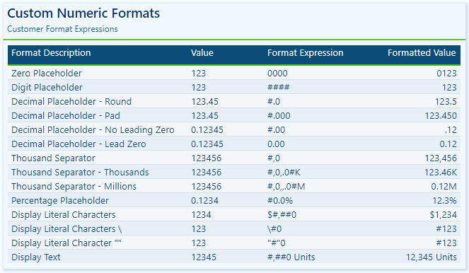
Custom Numeric Formats
Predefined numeric formats work well for standard situations, but sometimes, we need more control over how data is displayed. Custom numeric formats enable us to specify exactly how a numeric value appears, providing the flexibility to meet unique scenarios and requirements.
Custom numeric formats use special characters and patterns to define how numbers are displayed. The custom format expression may consist of one to three format strings, separated by semicolons.
When a custom format expression contains only one section, that format is applied to all values. However, if a second section is added, the first section formats positive values, while the second formats negative values. Finally, if a third section is included, it determines how to format zero values.
Here is a summary of various characters that can be used to define custom numeric formats.
0 Digit placeholder: Displays a digit or a zero, pads with zeros as needed, and rounds where required.
# Digit placeholder: Displays a digit or nothing and skips leading and trailing zeros if needed.
. Decimal placeholder: Determines how many digits are displayed to the left and right of the decimal separator.
,Thousand separators: adds a separator or scales the numbers based on usage. Consecutive , not followed by 0 before the decimal place divides the number by 1,000 for each comma.
% Percentage placeholder: Multiplies the number by 100 and appends %
- + $ Display literal character: Display the literal character, to display characters other than -, +, or $ proceed it with a backslash (\) or enclose it in double quotes (" ").
Visit the FORMAT function documentation for additional details on custom numeric formats.
Learn more about: custom numeric format characters that can be specified in the format string argument
Custom numeric formats allow us to present numerical data according to specific reporting requirements. When utilizing custom numeric formats, it is typically best to use 0 for mandatory digits and # for optional digits, include , and . to improve readability, and combine with symbols such as $ or % for intuitive displays.
Date & Time Formats
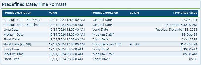
Dates and times are often key elements in our Power BI reports as they form the basis for timelines, trends, and performance comparisons. The FORMAT function provides several predefined date and time formats to simplify the presentation of date and time values.
General Date: Displays a date and/or time, with the date display determined by the application’s current culture value.
Long Date: Displays the date according to the current culture’s long date format.
Medium Date: Displays the date according to the current culture’s medium date format.
Short Date: Displays the date according to the current culture’s short date format.
Long Time: Displays the time according to the current culture’s long-time format, typically including hours, minutes, and seconds.
Medium Time: Displays the time in a 12-hour format.
Short Time: Displays the time in a 24-hour format.
Predefined formats offer a quick and simple way to standardize date and time outputs that align with current cultural settings.
Custom Date & Time Formats
When the predefined date and time formats don’t meet our requirements, we can utilize custom formats to have complete control over how dates and times are displayed. The FORMAT function supports a wide range of custom date and time format strings.
d, dd, ddd, dddd Day in numeric or text format: single digit (d), with leading zero (dd), abbreviated name (ddd), or full name (dddd).
wDay of the week as a number (1 for Sunday through 7 for Saturday).
wwWeek of the year as a number.
m, mm, mmm, mmmm Month in numeric or text format: single digit (m), with leading zero (mm), abbreviated name (mmm), or full name (mmmm).
qQuarter of the year as a number (1-4)
yDisplay the day of the year as a number.
yy, yyyy Display the year as a 2-digit (yy) number of a 4 digit (yyyy) number.
cDisplays the complete date (ddddd) and time (ttttt).
Visit the FORMAT function documentation for additional details and format characters.
Learn more about: custom date/time format characters that can be specified in the format string
Practical Examples in Power BI
Dynamic elements elevate our Power BI visuals by making them context-aware and responsive to user selections. They guide users through the report and help shape the data narrative. The FORMAT function in DAX is one tool we can use to craft these dynamic elements, which allows us to combine formatted values with descriptive text.
Here are three examples where the FORMAT function can have a significant impact.
Enhancing Data Labels
At times, numbers alone do not effectively convey insights. Enhancing our labels with additional text features, such as arrows or symbols to indicate trends like growth or decline, can greatly improve their informative value.
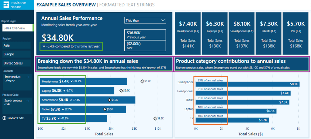
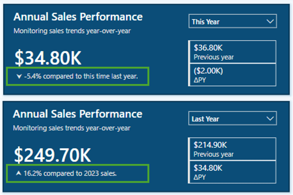
In this report, we have a card visual that presents both the annual performance and year-over-year (YoY) performance.
Let’s look at how the FORMAT function was used to achieve this.
The YoY Measure
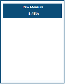
The Power BI data model includes a measure called Sales Metric YOY, which calculates the percentage change between the selected year and the previous year.
The measure is formatted as a percentage and displays as expected when added to our visuals.
We then use this measure to create an enhanced label. If the value is positive, we add an upward arrow to indicate growth, and if the value is negative, we include a downward arrow to signify decline.
Adding the arrow text elements to the label can be done with the following expression.
This expression can be greatly improved by leveraging the power of the FORMAT function. The following expression uses FORMAT to create the enhanced label in a simpler manner for better clarity.
We can then use the Sales Metric YoY Label throughout our report, such as a data label detail in our bar chart displaying the annual sales by product category and each product’s YoY Label.
To finalize the label in our Annual Sales Performance card, we combine the Saless Metric YoY Label with additional context based on the user’s selected year.
Annual Sales Performance Label =
[Sales Metric YOY Label] &
If(SELECTEDVALUE(DateTable[Year Category]) = "This year",
    " compared to this time last year.",
    " compared to " & YEAR(MAX(DateTable[Date])) - 1 & " sales."
)
We now have a dynamic and informative label that we can use to create visuals packed with meaningful insights, improving the user experience for our report viewers.
Improving Data Label Clarity
Data labels in our Power BI visuals offer users additional details, provide context, and highlight key insights. By combining the FORMAT function with descriptive text, we can create clear and easy-to-understand labels. Let’s look at an example.
This visual displays the annual total sales for each product category. To provide viewers with more information, we include a label that indicates each product’s contribution to the annual total as a percentage. Instead of presenting a percentage value without context, we enhance the label’s clarity by incorporating additional descriptive text.
This data label uses the FORMAT function and the following expression.
We now have a clear and concise label for our visuals, allowing our viewers to quickly understand the value.
Building Dynamic Titles
Dynamic titles and subtitles in our Power BI reports can improve our report’s overall storytelling experience. They can summarize values or highlight key insights and trends, such as identifying top-performing products and year-over-year growth.
Let’s explore how to create dynamic titles and subtitles, focusing on the role of the FORMAT function in this process.
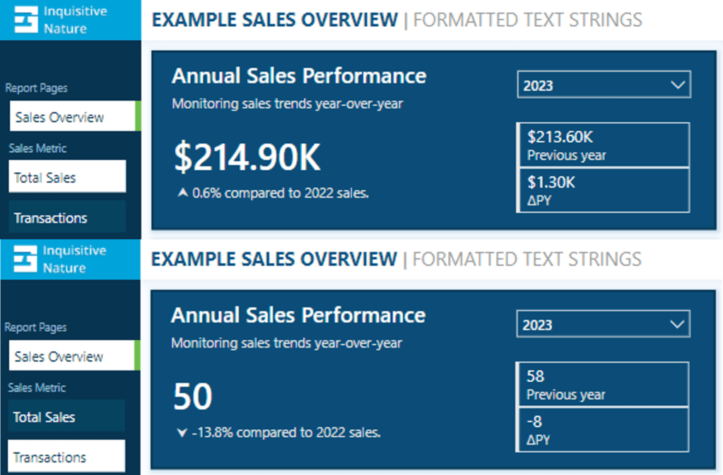
First, we need to create a measure for our visual title. The title should display the total annual sales values. Additionally, if the selected year is a previous year, the title should specify which year the annual sales data represents. To achieve this, we will use the following DAX expression.
Annual Sales Title =
"Breaking down the " & FORMAT([Sales Metric (CY)], "$#,.00K") &
IF(
    SELECTEDVALUE(DateTable[Year Category]) = "This Year",
    " in annual sales",
    " of annual sales in " & YEAR(MAX(DateTable[Date]))
)
The DAX measure first combines descriptive text with the formatted current year’s sales value. It then checks the selected year category from our visual slicer. If “This Year” is selected, it appends “in annual sales.” For other year selections, the title appends “of annual sales in” and explicitly includes the chosen year.
As a result, the final output will be titles such as Breaking down the $34.80K in annual sales for the current year and Breaking down the $214.90K of annual sales in 2023 when previous years are selected.
Additionally, we enhance this visual by including a dynamic subtitle that identifies top-performing products based on both annual sales and year-over-year growth.
Here is the DAX expression used to create this dynamic and informative subtitle.
Annual Sales SubTitle =
VAR _groupByProduct =
    ADDCOLUMNS(
        SUMMARIZE(Sales, Products[Product], "TotalSalesCY", [Sales Metric (CY)]),
        "YOY", [Sales Metric YOY]
 )
VAR _topProductBySales = TOPN(1, _groupByProduct, [TotalSalesCY],DESC)
VAR _topProductCategoryBySales = MAXX(_topProductBySales, Products[Product])
VAR _topProductSalesValueBySales = MAXX(_topProductBySales, [TotalSalesCY])

VAR _topProductByYOY = TOPN(1, _groupByProduct, [YOY], DESC)
VAR _topProductCategoryByYOY = MAXX(_topProductByYOY, Products[Product])
VAR _topProductYOYValueByYOY = MAXX(_topProductByYOY, [YOY])

VAR _topProductCheck = _topProductCategoryBySales=_topProductCategoryByYOY

RETURN
IF(
    SELECTEDVALUE(DateTable[Year Category])="This Year",
    _topProductCategoryBySales &
        " leads the way with " &
        FORMAT(_topProductSalesValueBySales, "$#,.00K") &
        " in sales" &
        IF(_topProductCheck, " and ", ", while ") &
        _topProductCategoryByYOY &
        " has the highest YoY growth of " &
        FORMAT(_topProductYOYValueByYOY, "0%"),
    _topProductCategoryBySales &
        " led the " &
        YEAR(MAX(DateTable[Date])) &
        " with " &
        FORMAT(_topProductSalesValueBySales, "$#,.00K") &
        " in sales " &
        IF(_topProductCheck, "and ", ", while ") &
        _topProductCategoryByYOY &
        " has the highest YoY growth of " &
        FORMAT(_topProductYOYValueByYOY, "0%")
)
The measure first creates a summary table that calculates the annual sales and year-over-year (YOY) values, grouped by product category. Next, it identifies the top item for both annual sales and YOY growth, extracting the corresponding values along with the associated product category.
Total Sales
VAR _topProductBySales = TOPN(1, _groupByProduct, [TotalSalesCY],DESC)
VAR _topProductCategoryBySales = MAXX(_topProductBySales, Products[Product])
VAR _topProductSalesValueBySales = MAXX(_topProductBySales, [TotalSalesCY])
YOY Growth
VAR _topProductByYOY = TOPN(1, _groupByProduct, [YOY], DESC)
VAR _topProductCategoryByYOY = MAXX(_topProductByYOY, Products[Product])
VAR _topProductYOYValueByYOY = MAXX(_topProductByYOY, [YOY])
Next, the measure evaluates whether the top performers, determined by total sales and YoY growth, are the same.
VAR _topProductCheck = _topProductCategoryBySales=_topProductCategoryByYOY
Finally, we build the dynamic text based on the selected year and the value of _topProductCheck.
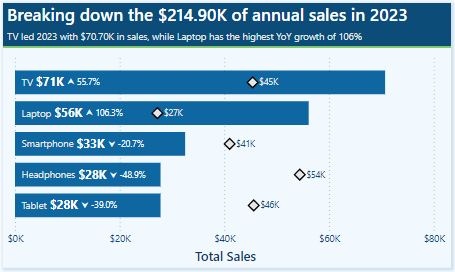
This results in subtitles like, Smartphone leads the way with $8.10K in sales and has the highest YoY growth of 37% for the current year. Alternatively, for previous, such as 2023, the subtitle reads, TV led 2023 with $70.70K in sales, while Laptop has the highest YoY growth of 106% .
BONUS: Dynamic Format Strings
Dynamic format strings are a useful preview feature in Power BI that allows us to change the formatting of a measure dynamically, depending on the context or user interaction.
One additional benefit of the dynamic format strings feature is that it preserves numeric data types. This means we can use the resulting value in situations where a numeric data type is required.
For instance, consider our report with a measure called Sales Metric (CY). Depending on the user’s selection, this measure calculates either the total annual sales or the number of annual transactions.
With dynamic format strings, if Total Sales is selected, the value is formatted as currency, and if Transactions is chosen, the value is displayed as a whole number.
With the format set to Dynamic and the format string condition defined, users can switch between the two metrics, and the values update and display dynamically.
Dynamic format strings unlock a new level of customization for our Power BI reports and allow us to deliver highly polished and interactive reports.
The FORMAT function and dynamic formatting techniques are vital tools for improving the usability, clarity, and visual appeal of our Power BI reports. These techniques allow us to create dynamic titles, develop more informative labels, and utilize dynamic format strings. By incorporating these methods, we can create interactive reports that are more engaging and user-friendly for our audience.
Continue exploring the FORMAT function and download a copy of the example file (power-bi-format-function.pbix) from my Power BI DAX Function Series: Mastering Data Analysis repository.
This dynamic repository is the perfect place to enhance your learning journey.
Thank you for reading! Stay curious, and until next time, happy learning.
And, remember, as Albert Einstein once said, “Anyone who has never made a mistake has never tried anything new.” So, don’t be afraid of making mistakes, practice makes perfect. Continuously experiment and explore new DAX functions, and challenge yourself with real-world data scenarios.
If this sparked your curiosity, keep that spark alive and check back frequently. Better yet, be sure not to miss a post by subscribing! With each new post comes an opportunity to learn something new.
A Beginner’s Guide to Exploring Data Models with DAX Queries
Getting Started with DAX Query View
DAX Query View in Power BI Desktop lets us interact directly with our data model using DAX queries. It provides a dedicated workspace for executing queries to explore data and validate calculations.
Clarifying the difference between DAX formulas and DAX queries here is essential, as they may become confused.
We use DAX formulas to create measures and calculated columns to extend our data model. We use DAX queries to retrieve and display existing data within our data model.
Whenever we add a field to a report or apply a filter, Power BI executes the DAX query required to retrieve and display the results. With DAX Query View, we can create and run our own DAX queries to test, explore, and validate our data models without impacting the design or outputs of our report.
Don’t just read; get hands-on and follow along with the example report provided here:
Command Palette: the command palette in the ribbon (or CTRL+ALT+P) provides a list of DAX query editor actions.
DAX Query Editor: this is where we write and edit our DAX queries. The editor includes features such as syntax highlighter, suggestions, and intellisense to help us construct and debug our queries.
Results Grid: when we execute a query, the data retrieved by our query appears in the results grid at the bottom of the DAX Query View window.The results grid provides instant feedback on our query or calculation outputs. When we have more than one EVALUATE statement in the Query Editor, the results grid has a dropdown we can use to switch between the results of each EVALUATE statement.
Query Tabs: located at the bottom of the DAX Query View window, different query tabs allow us to manage and navigate between multiple queries. We can create, rename, and navigate between them quickly and easily. Each tab displays a status indicator helping to identify each query’s current state (has not been run, successful, error, canceled, or running).
Data Pane: the data pane lists all the data model’s tables, columns, and measures. It provides a reference point when constructing our queries and helps us locate and include the necessary elements in our analysis. The data pane’s context menu also gives us various Quick Query options to get us started with common tasks.
For more details about the DAX Query View layout, check out the documentation: DAX Query View Layout.
Writing and Executing DAX Queries
In DAX Query View, we create and execute queries to explore and validate our data models in Power BI. DAX queries can be as simple as displaying the contents of a table to more complex, utilizing a variety of keywords.
Writing a DAX query involves using a structured syntax to retrieve data from our data model. While DAX queries provide an approach similar to SQL queries to explore our data, they are tailored specifically for working with our Power BI data model.
Every DAX query requires the EVALUATE keyword, defining the data the query will return. A DAX query at the most basic level contains a single EVALUATE statement containing a table expression.
This basic query retrieves all rows from the Sales table and is a straightforward way to examine the table’s contents without adding a table visual to our report canvas.
We can build on this basic example by refining the returned data further, for example, by applying a filter to return only sales with a sales amount greater than or equal to $9,000.
Optional Keywords and Their Usage
ORDER BY
ORDER BY sorts the results of our DAX query based on one or more expressions. In addition to the expression parameter, we specify ASC (default) to sort the results in ascending order or DESC to sort in descending order.
We can continue to build on our sales query by ordering the values by descending sales amounts and ascending sales dates.
START AT
START AT is used along with the ORDER BY statement, defining the point at which the query should begin returning results.
It is important to note that the START AT arguments have a one-to-one relationship with the columns of our ORDER BY statement. This means there can be as many values in the START AT statement as in the ORDER BY statement, but not more.
We continue to build out our basic query by adding a START AT statement to take our descending list of Sales amount and return values starting at $9,500 and return the remaining results.
DEFINE
DEFINE creates one or more reusable calculated objects for the duration of our query, such as measures or variables.
The DEFINE statement and its definitions precede the EVALUATE statement of our DAX query, and the entities created within the DEFINE statement are valid for all EVALUATE statements.
Entities are created within the DEFINE statement using another set of keywords: MEASURE, VAR, COLUMN, and TABLE.
Along with the entity keyword, we must provide a name for the measure, var, table, or column definition. After the name parameter, we provide an expression that returns a table or scalar value.
MEASURE
We use theMEASURE keyword within our DEFINE statement to create a temporary local measure that persists only during the execution of our DAX query.
When we use MEASURE to define a local measure with the same name as a measure in our data model during the execution of our DAX query, the query will use the measure defined within the query rather than the measures defined in the data model. This allows us to test or troubleshoot specific calculations without modifying the data model measure.
VAR
The VAR keyword within the DEFINE statement defines a temporary variable we can use in our DAX query. Variables store the result of a DAX expression, which we can use to make our queries more straightforward to read and troubleshoot.
We use VAR to create both query variables and expression variables. When we use VAR along with our DEFINE statement, we create a query variable that exists only during the query’s execution.
We can also use VAR within an expression along with RETURN to define an expression variable local only to that specific expression.
Other keywords to be aware of within our DEFINE statement include COLUMN and TABLE. These statements allow us to create temporary calculated tables or columns that persist only during the execution of our DAX query.
Stay tuned for a follow-up blog post that will discuss the details of working with these statements and the feature-rich external tool DAX Studio.
Practical Use Cases for DAX Query View
Quick Queries
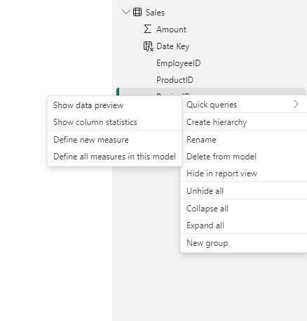
Quick Queries in DAX Query View provide a fast and easy way to start exploring aspects of our data model. They are found in the context menu when we right-click a table, column, or measure within the Data pane.
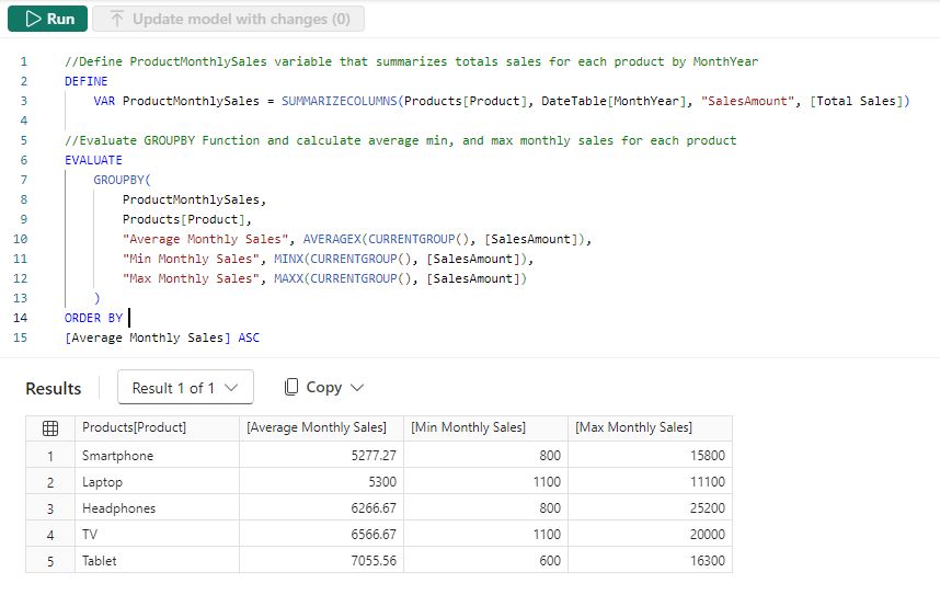
For example, we can right-click our Sales table and select Quick queries > Show top 100 rows from the context menu. Selecting this option will create a new query tab containing the DAX query resulting in the top 100 rows of our Sales table by evaluating the functions SELECTCOLUMNS() with TOPN() and using the ORDER BY statement.
We can then modify this query to tailor the results to our needs, such as only showing the RegionId, SalesDate, and Amount columns.
When we right-click a column and view the Quick queries, we notice the available options change and provide a Show data preview query.
Selecting this option creates a new query tab showing the distinct values of the selected column. For example, we can use this quick query in our Sales table to view our distinct Sales regions.
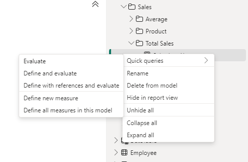
Lastly, the quick queries available within the context of measures are Evaluate, define and evaluate, and define with references and evaluate.
In our data model, we have a Sales Last Year measure. We can quickly view its value by right-clicking it and then selecting Quick queries > Evaluate.
This quick query uses SUMMARIZECOLUMNS(), which means we can quickly modify the query to add a group by column, such as Year.
We can hover over the Sales Last Year measure within the query editor window to view its DAX formula. Viewing this formula, we can see that this measure references another measure ([Total Sales]) within our data model.
We cannot view the formula for the referenced measure in the overlay. However, DAX Query View provides helpful tools to view this information. When we select a measure’s name in the query editor window, a lightbulb appears to the left.
Selecting this displays more actions available. Within the more actions menu, we choose Define with references to add a DEFINE statement to our DAX query where we can view the measure formulas. If our query already contains a DEFINE block, we will not see the lightbulb or the more actions menu.
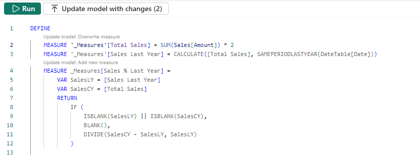
The updated DAX query now displays the measure definitions. Note that we can get this result directly by right-clicking the measure, selecting the Define with references and evaluate quick query option.
This DAX query can help test updates to the existing measures or assess the addition of new measures. For example, adding a new Sales % Last Year measure.
DAX Query View Measure Workflow
As we work with our measures in DAX Query View, it detects whether we have updated the DAX formula in an existing measure or created a new one. When a measure is updated, or a new measure is added, Query View CodeLens appears as a clickable superscript.
For example, if we update our Totals Sales measure to double it, we see the CodeLens providing us the option to update the measure within our data model. For the new Sales % Last Year measure, CodeLens gives us the option to add the new measure to the data model.
Using the measure quick queries and CodeLens assists us in streamlining our measure development workflow.
Documenting Data Models
We can also use DAX Query View to help document our data model by creating and saving queries that output model metadata.
For example, we can use the Define all measures in this model quick query to quickly create a DAX query that defines and evaluates all the measures.
In addition to viewing all the measures and their definitions in a single window, we can also use different features to understand our measures, such as using the Find option on the top ribbon to search and locate specific text (e.g. a measure’s name).
INFO Functions
DAX also includes various INFO functions that provide additional metadata on our data model to assist in documenting it. Key INFO functions include INFO.TABLES, INFO.COLUMNS, INFO.RELATIONSHIPS and INFO.MEASURES.
INFO.TABLES retrieves data about the tables in our data model, including their names, descriptions, and whether the table is hidden.
INFO.COLUMNS provides metadata for all the columns within our data model, including the column name and data type.
INFO.RELATIONSHIP provides details about the relationships between our data model tables, such as if the relationship is active, the from table and column ID, and the to table and column ID.
INFO.MEASURES lists all the measures in our data model, including their name, description, expression, and home table ID.
Since the INFO functions are just like other DAX functions, we can use them together with other DAX functions that join or summarize tables.
For example, our INFO.MEASURES function provides us with a list of all our measures. However, it just provides the home table ID, which may not be as helpful as the table name. We can create a DAX query that combines the required information from INFO.MEASURES and INFO.TABLE and returns a table with all the information we seek.
We can then review these results in the Query View results pane and save the query for future reference.
Also, check out the INFO.VIEW.COLUMNS, INFO.VIEW.MEASURES, INFO.VIEW.RELATIONSHIPS, INFO.VIEW.TABLES functions that provide similar results with the added benefit of being able to be used to define a calculated table stored and refreshed with our data model.
Optimizing Model Performance
DAX Query view also plays a role in performance optimization when we pair it with Power BI’s Performance Analyzer tool. The visuals on our report canvas get data from the data models using a DAX query. The Performance Analyzer tool lets us view this DAX query for each visual.
On the Report view, we run the Performance Analyzer by selecting the Optimize option on the ribbon and then Performance Analyzer. In the Performance Analyzer pane, we select Start recording and then Refresh visuals on the ribbon. After the visuals are refreshed, we expand the title of the visual we are interested in and choose the Run with DAX query view option to view the query in DAX Query View.
Using the Run in DAX Query View option, we review the query captured from a visual. By identifying slow-running queries and isolating their execution in DAX Query View, we can optimize DAX expressions and streamline calculations for better overall performance.
Wrapping Up
DAX Query View in Power BI Desktop creates additional possibilities for exploring our data model. Providing a dedicated workspace for writing, executing, and saving DAX queries enables us to dive deeper into our model, test calculation logic, and ensure accuracy without impacting our report or model structure.
Stay tuned for upcoming blog posts on how we can use external tools to go even further in understanding our data models using DAX queries.
To continue exploring DAX Query View, visit the following:
Thank you for reading! Stay curious, and until next time, happy learning.
And, remember, as Albert Einstein once said, “Anyone who has never made a mistake has never tried anything new.” So, don’t be afraid of making mistakes, practice makes perfect. Continuously experiment, explore, and challenge yourself with real-world scenarios.
If this sparked your curiosity, keep that spark alive and check back frequently. Better yet, be sure not to miss a post by subscribing! With each new post comes an opportunity to learn something new.
Stay ahead of the latest features with a focused look at Power BI’s latest features, their benefits, and use cases. Dive into walkthroughs and tips to enhance your reports.
The Power BI November 2024 update introduced several exciting enhancements and preview features.
I was particularly interested in the new text slicer preview feature and the quick query option for defining measures in DAX query view. Both of these improvements have the potential to enhance data filtering flexibility, simplify workflows, and increase overall efficiency.
The New Text Slicer: Customized Filtering for Power BI
The new text slicer visual preview feature, introduced in the November 2024 Power BI update, is a versatile tool designed to enhance interactivity and filtering based on text input. This feature allows users to enter specific text, making it easier to explore data and quickly find relevant information.
Benefits of the Text Slicer: Improved Usability and Customization
The text slicer offers a user-friendly and adaptable filtering option with straightforward functionality. Its advantages are particularly evident when filtering datasets that contain high-cardinality fields, such as customer names, product IDs, or order numbers.
Additionally, the slicer features customization options that allow us to adjust its design to fit our report. We can set placeholder text to guide users on what input is expected, and its properties enable us to customize the font and color of various elements, ensuring both readability and visual appeal.
After updating to the latest version of Power BI Desktop, you can enable the new feature by navigating to Options and Settings > Options > Preview features and then checking the box next to the Text Slicer visual.
Once enabled, you will find the new slicer in the Build menu, allowing you to add the visual to your report canvas.
After adding the visual to the report canvas, drag the text field from the data model that you want the slicer to filter on into the slicer’s Field property. Then, type your desired text into the slicer’s input box and click the apply icon to filter the results instantly.
Use Cases: Applying the Text Slicer in Reports
Filtering by Product Category– Exploring the basics
My sample dataset includes product sales, with each product assigned to a specific category. We can use the text slicer to filter the data by product category, such as “Laptop.”
After entering and applying the desired input, the text slicer quickly filters the report page to display only the specified product category. Once the filter is applied, clicking the dismiss (“X”) button will remove it and return to the full dataset.
Filtering our dataset using the text filter alongside the product category yields the same results as using the standard slicer. However, unlike the standard slicer, which displays all categories, the text slicer allows users to type and filter to the desired category directly.
This feature is handy when there are numerous categories to choose from, as scrolling through the list can be time-consuming. Additionally, the text slicer does not require users to toggle on a search functionality like the standard dropdown-styled slicer. With the text slicer, users can enter the category, apply the filter, and quickly narrow the report to the relevant sales data.
This application serves as a good introduction to the functionality of the text slicer and provides a useful comparison with the standard slicer.
Filter on Parts of a Product Code – Explore data without a standalone field
The Products table in the dataset contains product codes that have embedded information, such as the product’s color code. The text slicer offers a quick and effective solution for filtering on this embedded information.
For instance, a product code like SM-5933-BK includes the color code “BK,” which signifies the color black. Using a text slicer on the product code field with the input “BK,” we can filter all products linked to the color black without needing a separate product color filtering dimension in the data model.
The text slicer in this scenario helps us better utilize the data in our dataset to analyze sales data.
Removing the need to extract the color code and add extra filtering dimensions to the data model can be beneficial, especially in cases where changes to the data model are not allowed.
Search and Filter Product Review – Analyze long-form text fields
The sample dataset includes a table of product reviews. The text slicer allows us to filter by keywords, enabling exploration and analysis of specific feedback. For instance, entering the keyword “battery” filters the report page to only the reviews that mention battery across all products.
This allows decision-makers to concentrate on relevant reviews, recognize trends, and extract insights regarding common issues or exceptional features.
Since the text slicer is currently a preview feature, I am not prepared to incorporate it into any production reports just yet. However, I find the potential it offers for our reports intriguing. A current limitation of the text slicer is it only allows us to input a single text input, limiting our ability to search a variety of related terms. I look forward to seeing how it develops with the introduction of new properties and functionalities.
DAX Query View Quick Queries: Define new measure
With the November 2024 update, the DAX query view quick queries options were updated and now include a define new measure option. Quick queries boost productivity for common tasks and can be further modified. Adding the ability to define a new measure to the quick queries options will aid in streamlining workflows in Power BI.
This option, available through the context menu of tables and columns, generates a query-scoped DAX measure formula framework, allowing us to modify and execute custom measures with minimal setup.
For instance, the Review Count visual utilizes the implicit count of Review IDs to show the number of reviews for each product category. We can quickly and easily use the Define a new measure option to create our DAX formula syntax to get started creating an explicit summary measure to add to this visual. After customizing the formula for our specific measure, we can view the results and update the data model accordingly.
This simple and clear example demonstrates how quick queries can assist us in starting common tasks. We can easily expand on this foundation to develop more complex calculations and measures to enhance our data model.
To learn more about working with DAX query view, check out the Work with DAX query view documentation.
Wrapping Up
The new text slicer preview feature in the November 2024 Power BI update is an exciting addition. It will be interesting to see how this feature develops over time. Once fully implemented, its ability to provide quick and intuitive filtering will enhance user interactivity, making it a valuable tool for dynamic and user-friendly reporting.
The new “Define a new measure” quick query option in DAX query view is a helpful addition. This feature allows us to quickly create new measures by providing a starting point for the syntax needed to create a query-scoped measure DAX formula.
Power BI updates continually transform how we explore and analyze data, enabling us to create more compelling and interactive reports. By experimenting with the text slicer and other new features, we can gain a better understanding of how to fully utilize them in our reports.
Thank you for reading! Stay curious, and until next time, happy learning.
And, remember, as Albert Einstein once said, “Anyone who has never made a mistake has never tried anything new.” So, don’t be afraid of making mistakes, practice makes perfect. Continuously experiment, explore, and challenge yourself with real-world scenarios.
If this sparked your curiosity, keep that spark alive and check back frequently. Better yet, be sure not to miss a post by subscribing! With each new post comes an opportunity to learn something new.