
Ever wondered how to tackle Power BI data challenges? Find out how I transformed this challenge into an opportunity to learn and then into an achievement.
Over the last two years I have ended each of my posts with two main messages, (1) stay curious and happy learning, and (2) continuously experiment, explore and challenge yourself. However, at times it can be hard to identify open ended opportunities to fulfill these.
One opportunity available is participating in various data challenges. I recently participated in and was a top 5 finalist in the FP20 Analytics ZoomCharts Challenge 15. This data challenge was a HR data analysis project with a provided dataset to explore and a chance to expand your report development skills.

What I enjoyed about the challenge is along with the dataset, it provided a series of questions to help guide the analysis and provide direction and a focus for the report.
Here is the resulting report submitted to the challenge and discussed in this post. View, interact, and get the PBIX file at the link below.

ZoomCharts – FP20 Analytics Challenge 15 – HR Data Analysis (Ethan Guyant)
The report was built with the HR Analysis dataset and includes ZoomCharts custom Drill Down PRO visuals for Power BI.


About the Challenge
The FP20 Analytics challenge was in collaboration with ZoomCharts and provided an opportunity to explore custom Power BI ZoomCharts drill down visuals.
The requirements included developing a Power BI report with a default canvas size, a maximum of 2 pages, and include at least two ZoomCharts Drill Down Visuals.
The goal of the challenge was to identify trends within the dataset and develop a report that provides viewers the answers to the following questions.
- How diverse is the workforce in terms of gender, ethnicity, and age?
- Is there a correlation between pay levels, departments, and job titles?
- How about the geographic distribution of the workforce?
- What is the employee retention rate trend yearly?
- What is the employee retention rate in terms of gender, ethnicity, and age?
- Which business unit had the highest and lowest employee retention rate?
- Which business unit and department paid the most and least bonuses annually?
- What is the annual historical bonus trend? Can we show new hires some statistics?
- How about the pay equity based on gender, ethnicity, and age?
- What is the employee turnover rate (e.g., monthly, quarterly, annually) since 2017?
There are countless ways to develop a Power BI report to address these requirements. You can see all the FP20 Analytics ZoomCharts Challenge 15 report submissions here.
This post will provide an overview and some insight into my approach and the resulting report.
Understanding the Data
With any analysis project, before diving into creating the report, I started by exploring and getting an understanding of the underlying data. The challenge provided a single table dataset, so I loaded the data into Power BI to use the Power Query editor’s column distribution, column profile, and column quality to help get an understanding of the data.
Using these tools, I was able to identify missing values, data errors, data types, and get a better sense of the distribution of the data. This initial familiarity will help inform the analysis and help identify what data could be used to answer the requirement questions, identify data gaps, and help ask the right questions to create an effective report.
The dataset contained 16 columns and provided the following data on each employee.
- Employee/Organizational characteristics
- Employee ID, full name, job title, department, business unit, hire date, exit date
- Demographic information
- Age, gender, ethnicity
- Salary information
- Annual salary and bonus percentage
- Location information
- City, country, latitude, longitude
The dataset was already clean. No columns contained any errors that had to be addressed, and the only column that had empty/null values was exit date, which is expected. One thing I noted at this stage is that the Employee ID column did not provide a unique identifier for an employee.

Additionally, I used a temporary page in the Power BI report containing basic charts to visualize distributions and experiment with different types of visuals to see which ones best represent the data and help reach the report objectives. Another driver of using this approach was start experimenting with and understanding the different ZoomCharts and their customizations.
Identifying Key Data Attributes
Once I had a basic understanding of the dataset, it is always tempting to jump right into data manipulation and visualization. However, I find it helpful at this stage to pause and review the questions the report should answer.
During this review I was able to further define these goals, with my new understanding of the data, which guided the selection of relevant data within the dataset.
I then broke the questions down into 3 main areas of focus and began to think about what data attributes within the dataset can be used, and possibility more importantly, think about what is missing or how I can enrich the dataset to create a more effective report.
Workforce Diversity (Question #1 and #3)
To analyze the workforce diversity, the dataset provided a set of demographic information fields that aligned with these questions.
Salary & Bonus Structure (Questions #2, #7, #8, #9)
The next set of questions I focused on revolved around the salary and bonus structure of the organization. I identified I could use the demographic fields along with the salary information to provide insights.
Employee Retention & Turnover (Questions #4, #5, #6, and #10)
The dataset did not directly include the retention and turnover rates and required enriching the dataset to calculate these values. To do this I used the hire date and exit date. Once calculated I am able to add an organization context to the analysis by using the business unit, department, and job title attributes.
Dataset Enrichment
After identifying key data attributes that can be used to answer the objectives of the report, it becomes clear that there are opportunities for enriching the dataset to aid in making a more effective visualization (e.g. age bins) and address data gaps or require calculations (e.g. employee retention and turnover).
For this report I achieved this through the use of both calculated columns and measures.
Creating Calculated Columns
Calculated columns are a great tool to add new data based on existing information in the dataset. For this report I created 7 calculated columns which were required because I wanted to use the calculated result in axes of report visuals or as a filter condition in a DAX query.
- Age Bin: categorized the employee’s age based on their age decade (20s, 30s, 40s, 50s, or 60s). Here I used a calculated column rather than the built-in data group option to provide more flexibility and control over the bins.
- Tenure (Years): while exploring salary across departments and demographic categories, I also wanted to include context for how long the employee has been with the organization as this might influence their salary and/or bonus.
- Total Compensation: the dataset provided annual salary and bonus percent. The bonus percent was helpful when examining this attribute specifically, however when analyzing the organization pay structure across groups, I found the overall page (salary + bonus) to be more insight and provide the entire picture of the employee’s compensation.
- Employee Status: the dataset included current and past employees. To ease analysis and provide the users the ability to filter on the employee’s status I included a calculated column to label the employee as active or inactive.
- Abbreviation: the report required providing insight broken down by business unit, country, and department all of which could have long names and clutter the report. For each of these columns I included a calculated column providing a 3-letter abbreviation to be used in the report visuals.
Defining Measures
In addition to calculated columns, the report included various calculated measures. These dynamic calculations are versatile and aid the interactive nature of the Power BI report.
For this report I categorized my measure into the following main categories.
- Explicit Summaries: these measures are not strictly required. However, I prefer the use of explicit aggregation measures over implicit auto-aggregation measures on the visuals due to the increased flexibility and reusability.
- Average Total Compensation
- Average Bonus ($)
- Average Bonus (%)
- Highest Average Bonus % (Dept) Summary
- Lowest Average Bonus % (Dept) Summary
- Maximum Bonus %
- Minimum Bonus %
- Average Annual Salary
- Maximum Annual Salary
- Median Annual Salary
- Minimum Annual Salary
- Active Employee Count
- Total count
- Each ethnicity count
- Male/Female count
- Inactive Employee Count
- Report Labels: these measures were used to add additional context and information to the user when interacting with drill down visuals. On the drill down visuals when a user selects a data category or data point the visual drills down and shows the next level of the data hierarchy. What is lost, is what top level category was selected, so these labels are used to provide that information.
- Selected Age Bin
- Selected Business Unit Retention
- Selected Business Unit Turnover
- Selected Dept Retention
- Selected Dept Turnover
- Retention & Turnover: 4 of the report objectives revolved around employee retention and turnover rates. The dataset only provided employee hire dates and exits which are used to calculate these values.
- Cumulative Total Employee Count (used in retention rate)
- Employee Separations (used in retention rate)
- Employee Retention
- Brazil Retention Rate
- China Retention Rate
- United Sates Retention Rate
- Employee Turnover Rate
- Brazil Turnover Rate
- China Turnover Rate
- United States Turnover Rate
Report Development
After understanding the dataset, identifying key data attributes, and enriching the dataset I moved onto the report development.
Report Framework
From the requirements I knew the report would be 2 pages. The first focused on Workforce Diversity and Salary & Bonus Structure. The second focused on Employee Retention & Turnover.
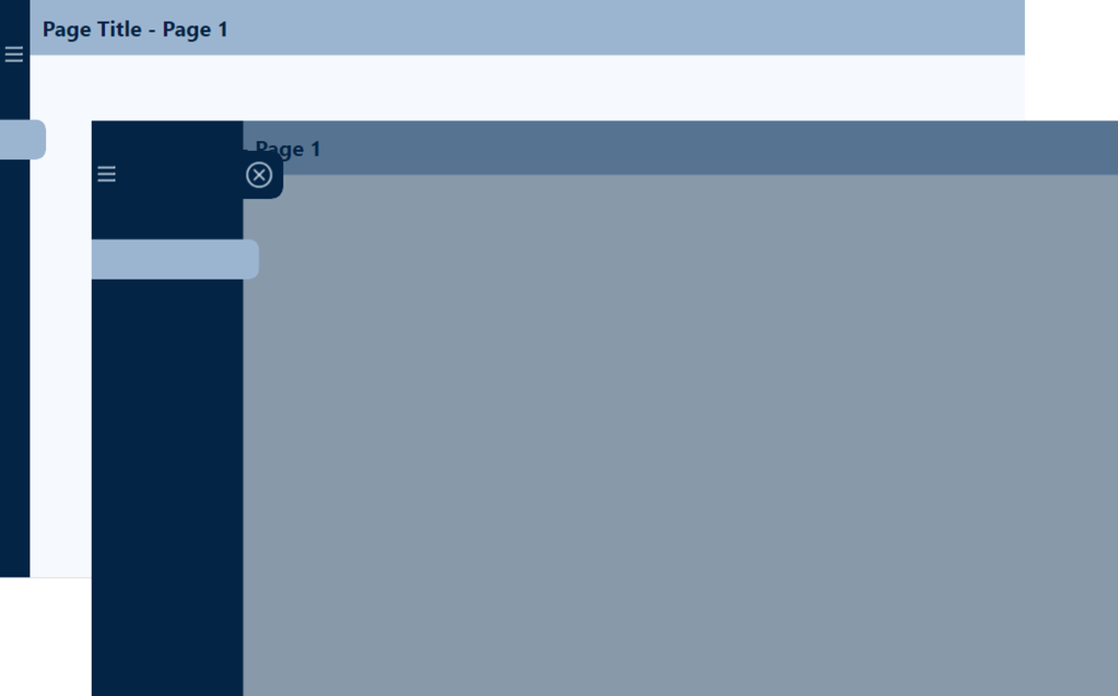
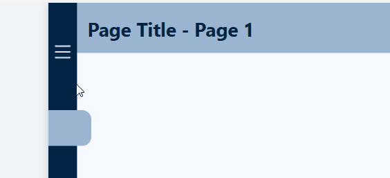
I started the report with a two-page template that included all the functionality of an expandable navigational element. For details on how I created this, and where to find downloadable templates see my post below.
This navigation is a compact vertical navigation that can be expanded to provide the user page titles and was highlighted as a strong point of the report in the Learn from the Best HR Reports: ZoomCharts TOP Picks.

Design Meets Data: Crafting Interactive Navigations in Power BI
User-Centric Design: Next level reporting with interactive navigation for an enhanced user experience
Then I selected the icons used in the navigation and updated the report page titles on each page and within the expanded navigation.
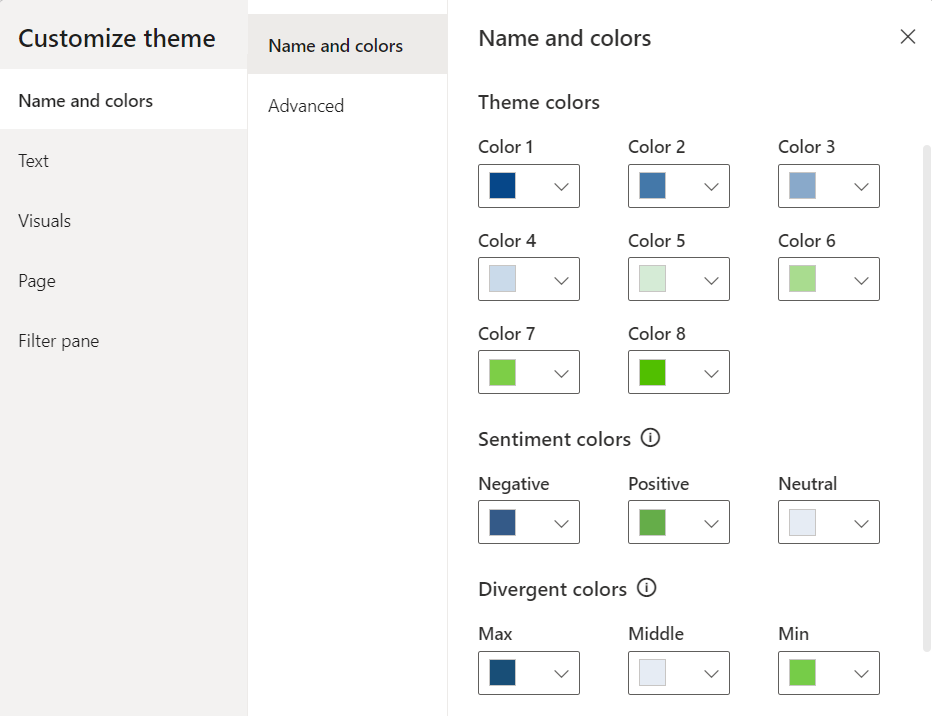
Once the template was updated for the specifics of this report, I applied a custom theme to get the aesthetic just right. For more on creating custom themes and where to find downloadable themes, including the one used in this report (twilight-moorland-plum), see the following post.

Design Meets Data: The Art of Crafting Captivating Power BI Themes
Dive into the details of blending design and data with custom Power BI themes.
After updating the navigation template and implementing the report theme, I was set with a solid foundation to begin adding report visuals.

Demographic & Compensation Analysis
The first page of the report focused on two main objectives, the demographic distribution of the workforce and an in-depth analysis of the organizational compensation structure.
Demographic Distribution
The first objective was to provide the user insights into the diversity of the workforce in terms of gender, ethnicity, and age. This was a perfect fit for the Drill Down Combo PRO (filter) by ZoomCharts visual. The visual displays the percentage of the workforce broken down by gender and displayed by employee age. Each age bin then can be drilled into to reveal additional insights into the age bins ethnicity make up.
In addition to the core visual, I included a card visual displaying the Selected Age Bin measure to provide context to the data when viewing an age bins ethnicity make up.

Geographic Distribution
The other component of this analysis was objective #3 focused on the geographic distribution of the workforce. In my submitted report this comprised of two elements the first and primary visual is the Drill Down Map PRO (Filter) by ZoomCharts visual. The second is a Drill Down Combo Bar PRO (Filter) by ZoomCharts visual.
The Map visual shows the ethnicity of the workforce as a percentage of the total workforce for each geographic location.

This visual in the report had noted limitation. Mainly the initial view of the map did not show all the data available. The inclusion of the country break provided an effective means to filter to a specific country however, it crowded the visual. Additionally, the colors in the report for the ethnicity groups of Asian and Black used the same colors used throughout the report for Male and Female which can be a source of confusion. See the Feedback and Improvements sections to see the updates to more effectively visual this data.
Organization Compensation Structure – Compensation Equity
The first component of the compensation structure analysis was to examine the median total compensation (salary + bonus) by departments, business units and job title. The second was to provide insights into compensation equity among the demographic groups of age, ethnicity, and gender.
I used the Drill Down Combo PRO (Filter) visual to analyze the median total compensation for each organizational department broken down by gender. Each department can be drilled into to extract insights about the business unit and further drilled into each job title. I also included the average tenure in years of the employees within each category to better understand the compensation structure of the organization.

This report section contained another Drill Down Combo PRO (Filter) visual to provide insights on the median total compensation by ethnicity and gender. These two visuals when used in tandem and leveraging cross-filtering can provide a nearly complete picture of the compensation structure between departments and equity across demographic groups.

When the two Median Total Compensation visuals are used along with the demographic and geographic distributions visuals a full understanding and in-depth insights can be extracted. The user can interact and cross-filter all of these visuals to tailor the insights to meet their specific needs.
Organization Compensation Structure – Departmental & Historic Bonus Analysis
The second component of the compensation structure analysis was to provide an analysis of departmental bonuses and historical bonus trends.
To provide detailed insights into the bonus trends I utilized a set of box and whisker plots to display granular details and card visuals to provide high-level aggregations. I will note that box and whisker plots may not be suitable in every scenario. However, for an audience that is familiar and comfortable interpreting these plots they are a great tool and were well suited for this analysis.

Workforce Retention & Turnover
The second page of the report focused on the analysis of employee retention and turnover. For this report the retention rate was calculated as the percentage of employees that remained with the organization during a specific evaluation period (e.g. annually) and the turnover rate is the rate at which employees left the organization expressed as a percentage of the total number of employees.
For this analysis, I thought it was key to provide the user and quick and easy way to flip between these metrics depending on their specific requirement. I did this by implementing a button experience at the top of the report, so the user can easily find and reference what metric they are viewing.

Another key aspect to enhance the clarity of the report is the visuals remain the same regardless of the metric being viewed. This eases the transition between the different views of the data.
Across the top of the report page is a set of Drill Down Combo Bar PRO (Filter) visuals to analyze the selected metric by department and business unit on the left and age, gender, and ethnicity in the right-side grouping.
Each of these visuals also use the threshold visual property to display the average across all categories. This provides a clear visual indicator of how a specific category is performing compared to the overall average (e.g. retention for the R&D Business Unit is slightly worse (87%) than the organizational average of 92%).
All of these visuals can be used to cross-filter each other to get highly detailed and granular insights when required.

In addition to examining the retention and turnover rate among organizational and demographic groups there was an objective to provide insight to the temporal trends of these metrics. The Drill Down Timeline PRO (Filter) visual was perfect for this.
This visual provides a long-term view of the retention and turnover rate trend while providing the user an intuitive and interactive way to zoom into specific time periods of interest.

Additional Features
Outside to of the main objectives of the report outlined by the 10 specified questions there were additional insights, features, and functionalities built into the report to enhance usability and the user experience.
On the Demographic & Compensation Analysis page this included a summary statistics button to display a high-level overlay of demographic and salary summaries.

On both pages of the report there was also a clear slicer button to clear all selected slicer values. However, this clear slicer button did not reset the report to an initial state or reset data filters due to user interactions with the visuals. See the Feedback and Improvements section for details and the implemented fix.
Lastly, each page had a guided tutorial experience to inform new users about the report page and all the different features and functionalities the report and the visuals offered.

There are various other nuanced and detailed features of this reports and too much to all cover here. But please check out and interact with the report here:
ZoomCharts – FP20 Analytics Challenge 15 – HR Data Analysis (Ethan Guyant)
The report was built with the HR Analysis dataset and includes ZoomCharts custom Drill Down PRO visuals for Power BI.
Feedback and Improvements
My submitted report was discussed in the Learn from the Best HR Reports: ZoomCharts TOP Pick webinar which provided excellent feedback on areas to improve the report.
You can view the webinar discussion below.
The first improvement was to address the sizing of the map. Initially, when the report loads the map visual is too small to view all of the data it provides.
To address and correct this the Employee Count by country visual was removed. This visual provided helpful summary information and an effective way to filter the map by country, however, the benefits of displaying all the data on the map outweigh the benefits of this visual.

Also mentioned in the discussion of the map is the limitation in colors. Initially the ethnicity groups Black and Asian used the same colors used to visualized gender and a source of potential confusion.
To address this, I extended the color palette to include two additional colors to better distinguish these groups. These groupings are also visible on the Workforce Retention & Turnover page. These visuals were also updated to ensure consistency across the report.

The next area of feedback was around the clear slicer button. As shown in the webinar it only clears the selected slicer values and uses Power BI’s built-in Clear all slicers button.
The functionality of the clear filter button on both pages was updated to reset the report context to a base state with no filters applied to the page. The size of the button was also increased to make it easier to identify for the user.
Another point of feedback was regarding the navigation icon tooltips. I did not make an adjustment to the report to address this. As shown in the webinar if you hover over the active page icon there is not a visible tool tip. I left the report this way because the current page icon indicator on the navigational element and the report page has a title providing this information to the user.
However, on each page if you hover over an icon to a different page, there should be a tool tip that displays and addresses the main objective of this feedback. This functionality is correct on the Demographic & Compensation Analysis page but required correcting on the Workforce Retention & Turnover page to be consistent.

Lastly, there was feedback on the use of the Box and Whisker plot within the report. I agree the use of this visual is heavily dependent on the end user’s comfortability with interpreting these visuals and is not suitable in all cases. However, for this report I think they provide a helpful visualization of the bonus data and remained in the report.
Wrapping Up
Getting started with participating in these type of data challenges can be an intimidating task. With Power BI and report development there is always more to learn and areas to improve so there is not some static skill level or point to begin with these challenges. The best method to move forward is to just start and show yourself patience as you learn more and grow your skills.
For me, the main take aways from participating in this challenge and why I plan to participate in more moving forward are:
- When learning a new skill repetition and continued use is essential, and with report development the more reports you create the better and more experienced you will be. This challenge provided an excellent opportunity to use a unique dataset to create a report from scratch.
- Others are using the same data and creating the own report to share. Viewing these different reports to see how others solved the same data challenge can be extremely helpful in growing your skills and expanding the way you approached the challenge.
- Participating in the ZoomCharts Challenge provided tailored feedback on the report submission. Providing helpful insight on how others viewed my report and highlighting areas for improvement.
- Access to custom visuals. Through this challenge I was able to learn and work with ZoomCharts custom visuals. I really enjoyed learning these and adding that experience to my skillset. Find out more about these extremely useful visuals here.
Thank you for reading! Stay curious, and until next time, happy learning.

And, remember, as Albert Einstein once said, “Anyone who has never made a mistake has never tried anything new.” So, don’t be afraid of making mistakes, practice makes perfect. Continuously experiment, explore, and challenge yourself with real-world scenarios.
If this sparked your curiosity, keep that spark alive and check back frequently. Better yet, be sure not to miss a post by subscribing! With each new post comes an opportunity to learn something new.


 Ethan Guyant