Stay ahead of the latest features with a focused look at Power BI’s latest features, their benefits, and use cases. Dive into walkthroughs and tips to enhance your reports.
The Power BI November 2024 update introduced several exciting enhancements and preview features.
I was particularly interested in the new text slicer preview feature and the quick query option for defining measures in DAX query view. Both of these improvements have the potential to enhance data filtering flexibility, simplify workflows, and increase overall efficiency.
The New Text Slicer: Customized Filtering for Power BI
The new text slicer visual preview feature, introduced in the November 2024 Power BI update, is a versatile tool designed to enhance interactivity and filtering based on text input. This feature allows users to enter specific text, making it easier to explore data and quickly find relevant information.
Benefits of the Text Slicer: Improved Usability and Customization
The text slicer offers a user-friendly and adaptable filtering option with straightforward functionality. Its advantages are particularly evident when filtering datasets that contain high-cardinality fields, such as customer names, product IDs, or order numbers.
Additionally, the slicer features customization options that allow us to adjust its design to fit our report. We can set placeholder text to guide users on what input is expected, and its properties enable us to customize the font and color of various elements, ensuring both readability and visual appeal.
Check out this post for a good explanation of the new text slicer’s options and properties: Drumroll please! The new Text slicer is here!
Getting Started with the Text Slicer
After updating to the latest version of Power BI Desktop, you can enable the new feature by navigating to Options and Settings > Options > Preview features and then checking the box next to the Text Slicer visual.
Once enabled, you will find the new slicer in the Build menu, allowing you to add the visual to your report canvas.

After adding the visual to the report canvas, drag the text field from the data model that you want the slicer to filter on into the slicer’s Field property. Then, type your desired text into the slicer’s input box and click the apply icon to filter the results instantly.
Use Cases: Applying the Text Slicer in Reports
Filtering by Product Category – Exploring the basics
My sample dataset includes product sales, with each product assigned to a specific category. We can use the text slicer to filter the data by product category, such as “Laptop.”
After entering and applying the desired input, the text slicer quickly filters the report page to display only the specified product category. Once the filter is applied, clicking the dismiss (“X”) button will remove it and return to the full dataset.

Filtering our dataset using the text filter alongside the product category yields the same results as using the standard slicer. However, unlike the standard slicer, which displays all categories, the text slicer allows users to type and filter to the desired category directly.
This feature is handy when there are numerous categories to choose from, as scrolling through the list can be time-consuming. Additionally, the text slicer does not require users to toggle on a search functionality like the standard dropdown-styled slicer. With the text slicer, users can enter the category, apply the filter, and quickly narrow the report to the relevant sales data.
This application serves as a good introduction to the functionality of the text slicer and provides a useful comparison with the standard slicer.
Filter on Parts of a Product Code – Explore data without a standalone field
The Products table in the dataset contains product codes that have embedded information, such as the product’s color code. The text slicer offers a quick and effective solution for filtering on this embedded information.
For instance, a product code like SM-5933-BK includes the color code “BK,” which signifies the color black. Using a text slicer on the product code field with the input “BK,” we can filter all products linked to the color black without needing a separate product color filtering dimension in the data model.
The text slicer in this scenario helps us better utilize the data in our dataset to analyze sales data.
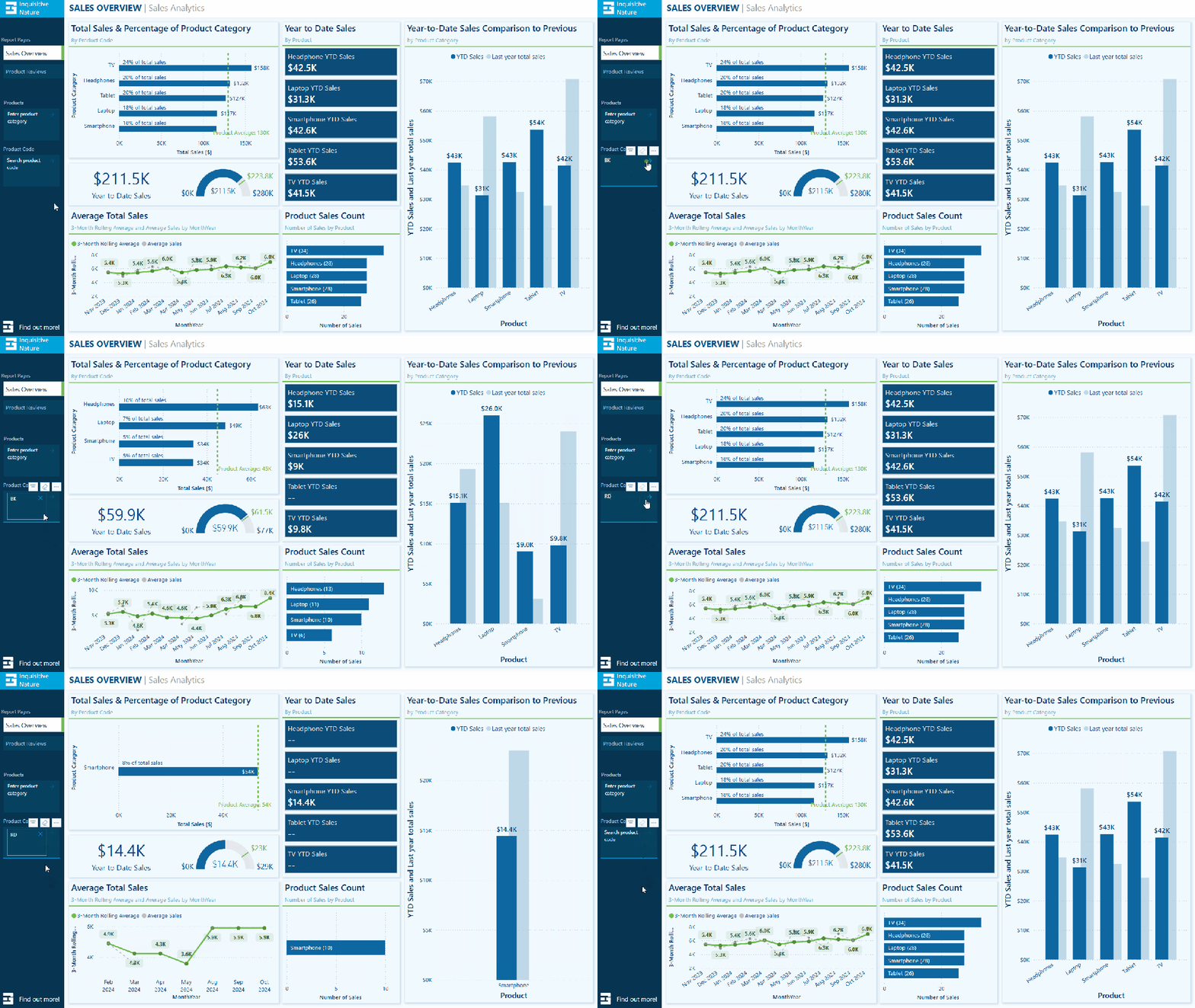
Removing the need to extract the color code and add extra filtering dimensions to the data model can be beneficial, especially in cases where changes to the data model are not allowed.
Search and Filter Product Review – Analyze long-form text fields
The sample dataset includes a table of product reviews. The text slicer allows us to filter by keywords, enabling exploration and analysis of specific feedback. For instance, entering the keyword “battery” filters the report page to only the reviews that mention battery across all products.
This allows decision-makers to concentrate on relevant reviews, recognize trends, and extract insights regarding common issues or exceptional features.

Since the text slicer is currently a preview feature, I am not prepared to incorporate it into any production reports just yet. However, I find the potential it offers for our reports intriguing. A current limitation of the text slicer is it only allows us to input a single text input, limiting our ability to search a variety of related terms. I look forward to seeing how it develops with the introduction of new properties and functionalities.
DAX Query View Quick Queries: Define new measure
With the November 2024 update, the DAX query view quick queries options were updated and now include a define new measure option. Quick queries boost productivity for common tasks and can be further modified. Adding the ability to define a new measure to the quick queries options will aid in streamlining workflows in Power BI.
This option, available through the context menu of tables and columns, generates a query-scoped DAX measure formula framework, allowing us to modify and execute custom measures with minimal setup.

For instance, the Review Count visual utilizes the implicit count of Review IDs to show the number of reviews for each product category. We can quickly and easily use the Define a new measure option to create our DAX formula syntax to get started creating an explicit summary measure to add to this visual. After customizing the formula for our specific measure, we can view the results and update the data model accordingly.

This simple and clear example demonstrates how quick queries can assist us in starting common tasks. We can easily expand on this foundation to develop more complex calculations and measures to enhance our data model.
To learn more about working with DAX query view, check out the Work with DAX query view documentation.
Wrapping Up
The new text slicer preview feature in the November 2024 Power BI update is an exciting addition. It will be interesting to see how this feature develops over time. Once fully implemented, its ability to provide quick and intuitive filtering will enhance user interactivity, making it a valuable tool for dynamic and user-friendly reporting.
The new “Define a new measure” quick query option in DAX query view is a helpful addition. This feature allows us to quickly create new measures by providing a starting point for the syntax needed to create a query-scoped measure DAX formula.
Power BI updates continually transform how we explore and analyze data, enabling us to create more compelling and interactive reports. By experimenting with the text slicer and other new features, we can gain a better understanding of how to fully utilize them in our reports.
Check out the Power BI November 2024 Feature Summary for more details and updates.
Thank you for reading! Stay curious, and until next time, happy learning.
And, remember, as Albert Einstein once said, “Anyone who has never made a mistake has never tried anything new.” So, don’t be afraid of making mistakes, practice makes perfect. Continuously experiment, explore, and challenge yourself with real-world scenarios.
If this sparked your curiosity, keep that spark alive and check back frequently. Better yet, be sure not to miss a post by subscribing! With each new post comes an opportunity to learn something new.


