Stay ahead of the latest features with a focused look at Power BI’s latest features, their benefits, and use cases. Dive into walkthroughs and tips to enhance your reports.
With each update, Power BI continues to grow its feature set, offering more options to improve how we present our data to our report viewers. The October 2024 update included enhancements to data markers in our line and scatter visuals.
Data markers can easily be overlooked, but they effectively draw the report viewer’s attention to critical data within our visuals. This update introduces new options and flexibility to customize these data point markers within our line and scatter visuals.
In this post, we will examine these new options and their benefits, providing practical examples to demonstrate how to maximize these updates in your Power BI reports.
What’s New with Marker Enhancements
The enhancements to the markers provide us with a broader toolkit to emphasize specific data points and series. The updates allow us to customize markers for individual categories as well as for the entire series, opening up new opportunities to highlight trends, make comparisons, and showcase key insights.
Our markers for line and scatter charts can be customized in two ways.
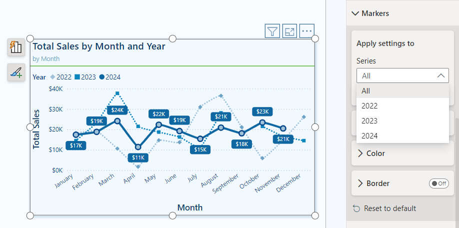
Categories: When our visual does not include individual series, the Markers dropdown menu shows the categories represented on the x-axis. This feature allows us to adjust the markers for each data point based on its category. We can use this option to highlight specific time periods or product categories within our dataset.

Series: When our visual includes a series legend, the Markers dropdown menu displays the available series. By selecting a series, we can customize the markers for the entire series. This modification enables us to create more cohesive visual indicators that distinguish between different series, rather than relying solely on color differences.
New Formatting & Customization Options
Our line and scatter visuals now include three additional formatting options for our data markers.
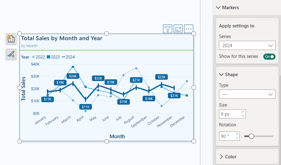
Shape: We can modify the shape and size of our markers, and now we can also rotate the shape (with the exception of circle markers) within our line and scatter marker properties. This added feature allows us to create unique shapes for different data series, offering greater variety in representation.
Color: Alongside the new shape properties, we now have improved color options for our markers. We can adjust the transparency of markers on a per-category or per-series basis. This flexibility enables us to present details subtly without overwhelming the visual impact.
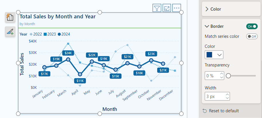
Border: Marker borders are a new customization feature that lets us tailor our markers according to our preferences. We can add borders to specific categories, series, or to all markers within the visual. These border options are excellent for adding depth to our visuals and for highlighting specific data points.
Practical Applications: Marker Customization
These new marker customizations offer a wide range of possibilities for enhancing visuals in our Power BI reports. Below is a visual representing Total Sales by Month, showcasing various options for using markers to highlight specific trends and series.
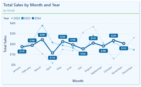
In this example, the marker properties are adjusted for each series to ensure they are visually distinct from one another, not just by color.
The markers for the 2022 and 2023 series are displayed with a transparency level set to 40%. This subtle adjustment allows viewers to see historical data without overshadowing the 2024 data, making it easier to focus on the current year’s trends while still retaining reference to past data when necessary.
For the 2024 series, the markers have a border that matches the line series color and a lighter blue fill. This combination draws attention to each data point, emphasizing it against the more muted markers of the previous years.
Recommendations for Using Markers in Power BI Visuals
With the expanded marker customization options in Power BI, it can be easy to overdo it. To use these enhancements effectively, it’s important to follow some recommended best practices.
Markers are useful tools for emphasizing data; however, overusing or misapplying them can lead to visual clutter, negatively affecting the clarity of our reports. Here are some guidelines for using markers in Power BI visuals:
Use sparingly: Avoid placing markers on every data point unless necessary. Instead, use markers to highlight the most critical data series or points.
Consistency is key: When using markers across multiple visuals in a report, keep the sizes, shapes, and colors consistent. This creates a cohesive visual experience and makes it easier for viewers to interpret data across different visuals.
Accessibility: To ensure our visuals are accessible to all users, choose marker colors, sizes, and shapes that stand out clearly. Do not rely solely on color to differentiate data point markers. Utilizing the new shape rotation and border properties can help make markers more distinguishable.
Transparency and emphasis: Carefully adjust the transparency properties to emphasize certain data points while minimizing visual noise.
Borders for added contrast: Using borders can effectively create contrast between data points. Contrasting border colors can help them stand out, drawing viewers’ attention to the most critical data.
Wrapping Up: Power BI Marker Enhancements
The recent marker enhancement update in Power BI introduces greater customization and flexibility for line and scatter charts. With increased control over marker shapes, transparency, borders, and settings specific to each series, we can better highlight key data points.
While these marker enhancements are beneficial, an additional feature that could improve our marker customization is the ability to apply conditional formatting directly within the marker properties. This would streamline the process of highlighting specific data points that meet certain conditions, eliminating the need for separate DAX measures or other workarounds.
Power BI updates continue to empower us to craft compelling data stories. By experimenting with the new marker options, we can fully leverage the customization capabilities that Power BI provides. For more details and additional updates, check out the Power BI October 2024 Feature Summary.
Thank you for reading! Stay curious, and until next time, happy learning.

And, remember, as Albert Einstein once said, “Anyone who has never made a mistake has never tried anything new.” So, don’t be afraid of making mistakes, practice makes perfect. Continuously experiment, explore, and challenge yourself with real-world scenarios.
If this sparked your curiosity, keep that spark alive and check back frequently. Better yet, be sure not to miss a post by subscribing! With each new post comes an opportunity to learn something new.
