This is the second post in the Power BI AI Toolkit series. The series takes a practical look at how AI is changing the way we build in Power BI. From Power BI Copilot built directly into Power BI Desktop to fully autonomous, agent-based workflows.
In the first post, Power BI AI Toolkit: Evaluating Copilot for DAX Development in Power BI Desktop, we covered how Power BI Copilot can help you write, debug, and document DAX measures without ever leaving the tool. This time, we’re staying in Power BI Desktop but shifting the focus from the semantic model to the report canvas itself.
It’s easy to overlook that Power BI Copilot helps with more than generating DAX or documenting measures. In this post, we explore how to use Power BI Copilot to design report pages, generate visuals, and explore data without writing code or leaving the tool.
If you have a semantic model you’re happy with and a blank report canvas, this one’s for you. A sample report is available for download at the end of this post so you can follow along and test these prompts against the same data.
From Model to Report
Here is the scenario we will use to explore Power BI Copilot’s capabilities in Power BI Desktop for report development. A Power BI developer at a small retail store just finished developing a semantic model and now needs to begin developing the report to deliver insights to the stakeholders.
Three pages are needed: an executive summary, a regional sales breakdown, and a product performance view. Starting from scratch could take considerable time before anyone has seen anything worth reviewing.
This is where we put Power BI Copilot to the test. Not as a replacement for the developer, but as a tool to get from blank canvas to something reviewable much faster.
Before You Start
A few things must be in place before Copilot works in Power BI Desktop for report development. Check these before you get too far.
Capacity and licensing: You need admin, member, or contributor access to at least one workspace assigned to a paid Fabric capacity (F2 or higher) or Power BI Premium capacity (P1 or higher). Power BI Premium Per User (PPU) is not supported. For more information, see Use Copilot in Power BI Desktop.
Tenant-level setting: Copilot must be enabled at the tenant level in the Fabric Admin Portal. Note that in Desktop, the Copilot button appears in the ribbon even when the tenant setting is off. If Copilot shows up but does not respond, check this first. For more information, see Enable Fabric Copilot for Power BI.
Workspace association: The first time you open the Copilot pane in Power BI Desktop, you will be prompted to associate a workspace.
Q&A feature switch: The Q&A feature switch in your semantic model must be enabled. If it is off, report page creation will not work. This is easy to overlook. For more information, see Create and Edit Power BI Reports with Copilot.
Step-by-Step: Building a Report with Copilot
Step 1: Open the Copilot Pane
With your report open in Power BI Desktop, select the Copilot icon in the ribbon. The Copilot pane will open on the right side of the screen.
If this is your first time using Power BI Copilot, you will be prompted to associate a workspace before using Copilot. Pick a workspace assigned to a supported Fabric or Premium capacity.
If the Copilot button is visible in the ribbon but nothing happens when you select it, check the tenant-level setting covered in the Before You Start section. This is the most common reason Copilot appears available but does not respond.
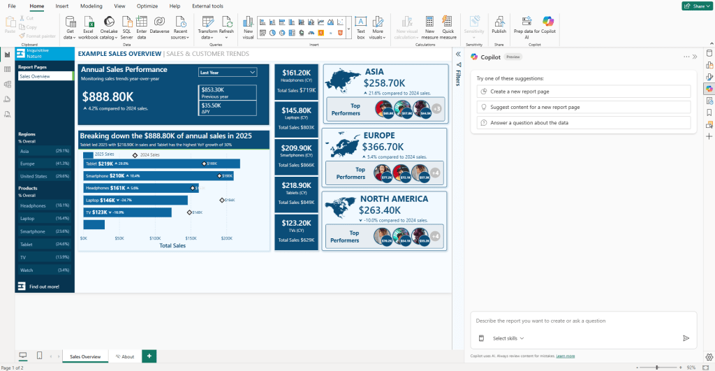
Once the pane is open and a workspace is associated, you are ready to start building.
Step 2: Let Power BI Copilot Suggest Report Content
At the top of the Copilot pane, you will see a suggested prompt labeled “Suggest content for a new report page”. This is a good starting point if you are not sure how to structure the report or just want to see what Copilot thinks is worth showing.
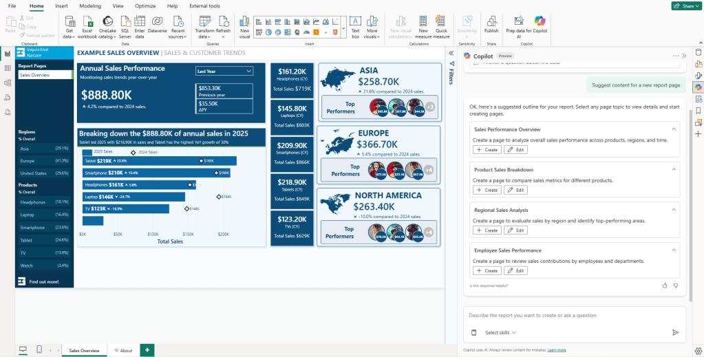
When you select it, Copilot scans the semantic model and returns a set of suggested report pages, each with a title and a brief description. You can select the pages you want and let Copilot build them, or use the suggestions as a starting point for your own prompts.
Using the suggested pages, you can directly create them by using the “+ Create” option or edit the prompt using the “Edit” option.
For this walkthrough, start with the suggested Regional Sales Analysis page using the “+ Create” option. This is a good way to get a feel for what Power BI Copilot can do out of the box without writing a single prompt.
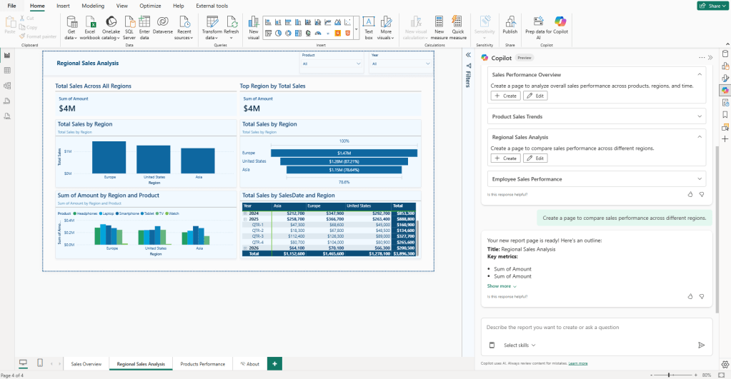
Copilot will make its own decisions about which visuals to use, which fields to pull in, and how to structure the page. The result will not be perfect, but it gives you an honest baseline for what the suggested content feature can produce on its own against your semantic model.
This is a spot where report creators can expect too much. The pages Copilot generates at this stage are basic drafts, not finished products. Treat them as a starting point and move on from there.
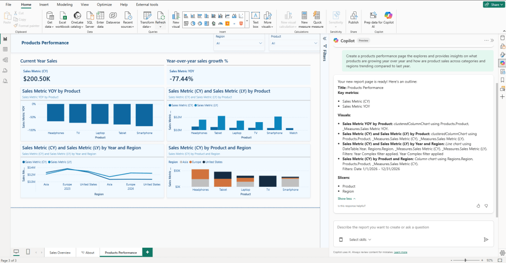
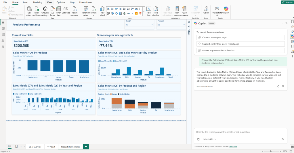
Once you have reviewed the Regional Sales Analysis page, the next step is to go deeper using a custom prompt. This is where the Product Performance page comes in, which is the second page from our retail scenario. Rather than relying on Copilot’s suggestions, you will write a targeted prompt built around a specific business question. That is what Step 3 covers.
Note: Because of the generative nature of Power BI Copilot, it may not produce the exact same pages, visuals, or field selections as shown here. The patterns and behaviors should be consistent, but the specific output may vary each time you run the same prompt.
Step 3: Prompt Power BI Copilot Directly for a Specific Page
Once you have a feel for what Copilot can do, writing your own prompts is a more reliable way to get pages that match your requirements. Instead of selecting “Suggest content for this report,” type your request directly into the Copilot pane.
The quality of the output depends on the quality of the prompt. Most people underestimate what Copilot can do because their prompts are too vague to produce useful results.
Here is a simple example of the difference:
| Too vague | “Create a product performance page” |
| Business question-driven | “Create a product performance page that explores and provides insights on what products are growing year over year and how product sales across categories and regions are trending compared to last year.” |
Using the second prompt in the retail semantic model, Copilot returned a page with two KPI cards for current-year sales and YOY growth, a YOY-by-product bar chart, a current-year vs. last-year comparison by product, a regional breakdown by product, and both a product and region slicer. All of that from a single prompt, with no visual types specified.
The more context you give, the better the output. References to business questions, specific fields, time periods, and audiences help Copilot produce something closer to what you need on the first attempt.
A few patterns that tend to work well:
- Frame the prompt around a business question: “which products are…”, “how are regions performing against…”
- Reference the audience where relevant: “Create a page for regional sales managers showing…”
- Reference specific measure names when you know them: “Use Sales Metric (CY) and Sales Metric (LY)…”
Copilot works best when the prompt describes the business need, not just the visual type. Asking for “a bar chart of sales by region” gets you a bar chart. Asking for “a page that helps regional managers compare their performance against targets” gets you something more useful.
Step 4: Edit Visuals Using Power BI Copilot Follow-Up Prompts
Once Copilot has generated the page, you can refine it with follow-up prompts directly in the Copilot pane, without manually rebuilding anything.
Looking at the Product Performance page generated in Step 3, the output was a starting point but not perfect. The bottom-left chart uses a line chart to display current-year and last-year sales by year and region, and it is difficult to read.
A follow-up prompt can be used to address this:
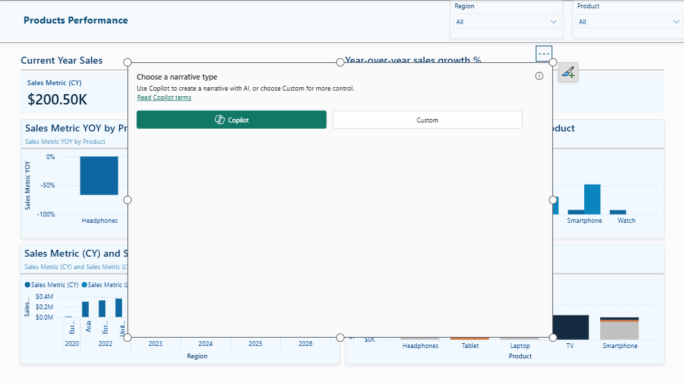
“Change the Sales Metric (CY) and Sales Metric (LY) by Year and Region chart to a clustered column chart.”
This produces a cleaner result. A clustered bar chart handles two measures side by side across a category axis in a way that is much easier to read than the original line chart configuration.
Follow-up prompts work best when they are focused on one targeted change at a time, with a specific visual referenced.
Each prompt builds on the page’s current state, so you can work iteratively, reviewing one change at a time before moving on to the next.
This is where things can get confusing. Copilot edits at the page level, not the individual visual level. If your prompt is not clear about which visual you are referring to, Copilot may apply changes more broadly than intended. Referencing the visual by its title or the measures it contains helps avoid this.
If a follow-up prompt produces an unexpected result, use the Undo button in Power BI Desktop to step back and try a more specific prompt. Do not keep layering prompts onto a result you are not happy with. Starting fresh from the last good state, with a cleared chat history, is almost always faster.
Step 5: Add a Narrative Summary Visual using Power BI Copilot
A useful but often overlooked feature of Power BI Copilot is the ability to add a narrative summary visual to a report page. This is a text-based visual generated by Copilot from the page’s data.
To add one, select the Narrative visual from the Visualizations pane. Once the visual is placed on the canvas, you will see a prompt inside it to generate a summary with Copilot.
Before generating, note that the narrative pane includes a link to the Copilot terms. If you use this feature in an organizational context, take a few minutes to review these terms and ensure they align with your organizational requirements before proceeding. This is easy to skip, but it is worth being aware of, especially how data is processed when generating the narrative.
After reading the Copilot terms, select the Copilot option, and Copilot will produce a written summary of the data currently visible on the page.
A few things worth knowing:
You can scope the summary. By default, Copilot attempts to summarize the full page, but you can prompt it to focus on specific visuals or questions.
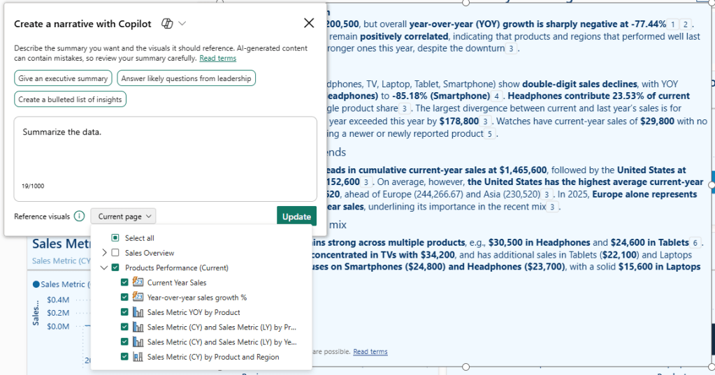
For example:
- “Summarize the year-over-year performance by product.”
- “Highlight which products are underperforming compared to last year.”
- “Focus on the regional breakdown and call out any significant differences.”
The summary responds to slicer selections. If a user filters the page by region or product, the narrative updates to reflect the filtered data. This makes it useful on pages where the audience is expected to explore the data themselves.
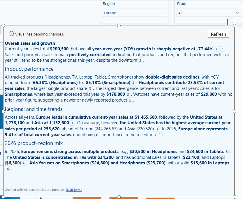
It is a starting point, not a finished output. The language Copilot produces is functional but often generic. Treat it as a draft. You can refine it using follow-up prompts within the narrative visual.
One thing that is easy to miss is that the narrative visual is separate from the Copilot pane. Follow-up prompts for the narrative are entered directly in the visual, not in the main Copilot pane on the right.
Step 6: Refine and Finish Manually
This is where Copilot hands off to the developer, and it is an important handoff to recognize. The pages Copilot generates are a starting point, but not production-ready. Expecting them to be is the most common source of disappointment with the tool.
Here is what typically needs manual attention after Copilot has done its part:
Layout and spacing. Copilot places visuals on the canvas in a functional arrangement, but it is rarely the arrangement you would choose yourself. Resizing and repositioning visuals can significantly affect how the finished page reads.
Formatting and theming. Copilot applies the report theme styling when generating pages, but often needs some manual adjustments. Individual visual formatting, fonts, colors, and axis labels will still need attention.
Slicers and cross-filter behavior. Copilot will add slicers where it thinks they are appropriate, but the placement, style, and cross-filter configuration usually need to be reviewed. Check that slicers interact with the correct visuals and that the filter behavior matches the report’s intended behavior.
Visual titles and labels. The titles Copilot generates are descriptive but often verbose. Cleaning these up to match your audience’s language makes the report feel more polished and intentional.
Measures and field selections. It is worth checking the Build pane on each visual after generation to confirm that Copilot has used the right measures and fields. In most cases, it will be close, but it is not always exact, particularly on more complex semantic models.
The overall pattern is straightforward. Use Copilot to quickly get from a blank canvas to something reviewable, then use your judgment to finish and make it production-ready. The two parts complement each other well when treated as separate phases rather than expecting Copilot to do everything.
Wrapping Up
Power BI Copilot will not design your report for you. But it will get you off the blank canvas and into something reviewable faster than starting from scratch, and that is where most of the value sits.
The workflow covered in this post follows a natural progression.
- Use “Suggest content for this report” when you need a starting point and are not sure how to structure the pages.
- Switch to direct prompts when you know what business question a page needs to answer.
- Use follow-up prompts to refine what Copilot generates, with the understanding that some changes will need to be made manually. Add a narrative visual that adds context for the audience.
- Then finish the report the way you always have, with manual formatting, layout polish, and a final review of every measure and field selection.
The honest summary: Copilot is a useful first-draft tool. The pages it generates will not be ready to publish, but they will be a better starting point than a blank canvas and, in most cases, will surface the right visuals and fields without requiring you to specify every detail. That is a meaningful time-saving for anyone building reports regularly.
Power BI Copilot also has a clear ceiling. Structural edits to complex visuals, precise layout control, and anything requiring deep knowledge of your report design standards still need a developer’s hand. Knowing this ceiling lets you use Copilot where it adds value and move on quickly when it does not.
The sample report is available at the link below!

GitHub – Power BI’s AI Toolkit
In an era where AI is moving from experimental to essential, this toolkit is designed to help Power BI developers explore AI workflows, learn Power BI AI tools, and get started on their journey to modernize the way they build!
What’s Next
Power BI Copilot covers a lot of ground when you stay within the built-in experience. But both posts in this series so far have operated within the same boundary: what is possible inside the tool itself.
Post #1: Power BI’s AI Toolkit: Evaluating Copilot for DAX Development in Power BI Desktop
The next two posts step outside that boundary entirely:
- AI-Assisted Development: stepping outside Power BI Desktop to pair a more capable AI interface with direct, programmatic access to the semantic model. Two practical approaches that will be explored here: VS Code with GitHub Copilot and the Power BI MCP Server, and Claude Desktop with MCP Servers, both of which unlock capabilities that the built-in Copilot pane cannot match.
- Agentic Development: the most advanced tier, where community projects like GitHub – data-goblin/power-bi-agentic-development and articles such as Introducing AI and agentic development for Power BI explore what fully autonomous Power BI development workflows look like when agents plan and execute tasks end to end.
Thank you for reading! Stay curious, and until next time, happy learning.

And, remember, as Albert Einstein once said, “Anyone who has never made a mistake has never tried anything new.” So, don’t be afraid of making mistakes, practice makes perfect. Continuously experiment, explore, and challenge yourself with real-world scenarios.
If this sparked your curiosity, keep that spark alive and check back frequently. Better yet, be sure not to miss a post by subscribing! With each new post comes an opportunity to learn something new.

One thought on “Power BI AI Toolkit: Build Better Reports Faster with Copilot”