Power BI Partial RLS Explained: Let Users See the Bigger Picture


This post is part two of a series on Power BI security patterns. Check out part one for a beginner-friendly overview of row-level security in Power BI.

Discover how to personalize your reports and show each user only the data they require in just a few clicks.

This post will take our security design pattern one step further.

While row-level security (RLS) allows us to restrict data based on user roles and identities, there are times when we don’t want everything locked down. Occasionally, users need to see their data in relation to broader metrics, such as company-wide totals or averages.

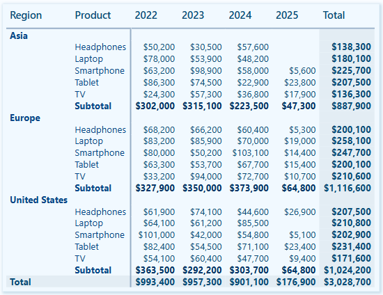
In the sample report, regional sales teams should see detailed information only about their assigned region and the total sales for other regions.

In the previous post, we noted that standard RLS filters out other regional sales, preventing the totals from other regions from being displayed. This is where partial RLS becomes useful and can fulfill this requirement.

In this post, we will walk through:

  • What Partial RLS is and when to use it
  • A real-world scenario that calls for it
  • Key limitations and design tips

What is Partial Row-Level Security

Row-Level Security (RLS) applies filters at the dataset level throughout the entire datamodel for a user. This means that if RLS restricts a user to view only sales data for the North America region, every visual and measure in the report will be automatically limited to data associated with the North America region.

Using RLS is effective for data protection, but it can be a limitation when a report needs to provide a broader context to the user.

With report-level filters and slicers, DAX provides functions like ALL() and REMOVEFILTERS(), which can bypass data filtering. However, DAX expressions cannot bypass RLS.

Partial RLS is a design approach in Power BI that helps mitigate RLS’s limitations when necessary. The concept involves separating secured data from summary data, allowing users to view filtered and unfiltered insights side by side.

To achieve this, we will create a summary table (Annual Sales Summary (Regional)) within our datamodel. This summary table will aggregate the total sales across all regions and will not be affected by RLS filters. It provides overall totals that offer essential context when needed, while the RLS still restricts access to detailed sales information within our sales table.

In our sample report, RLS is applied to the Region table, and the RLS filter propagates to the Sales table.

In the datamodel, filters applied to the Region table do not directly impact the rows in our summary table. This means that users can see the total aggregated sales for all regions while still having RLS filters applied to the detailed sales data.


Use Case: Display Regional Total Sales and Percentage of Company-Wide Sales

We are designing a Power BI report for a global sales team. Each regional sales team member should only be able to:

  • View detailed transaction-level data for their assigned region
  • See key metrics, like total sales for all regions, to provide a broader context

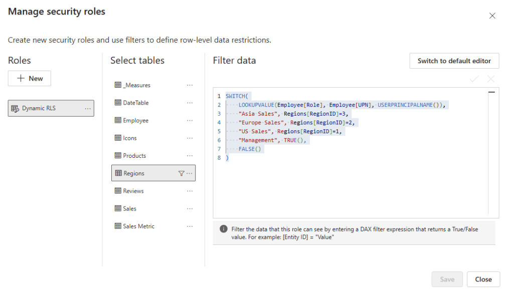
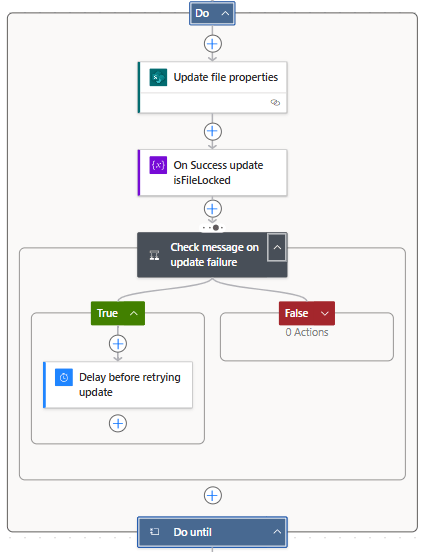
Step 1: Apply RLS rules to the Region table

First, we define our RLS rules in Power BI Desktop, see Power BI Row-Level Security Explained: Protect Data by User Role.

The implemented RLS rules filter the Sales table and limits access to the appropriate region per user.

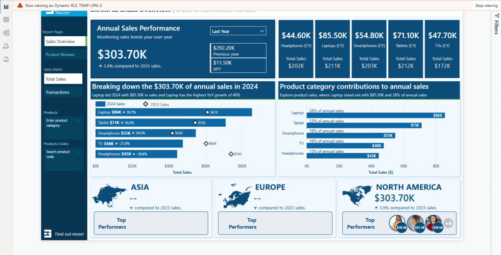
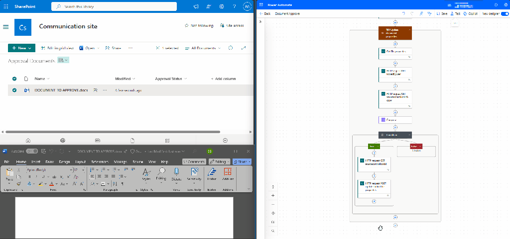
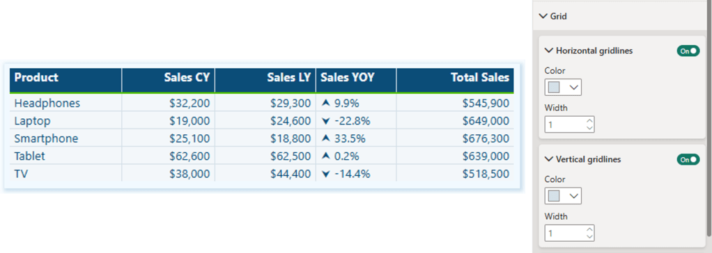
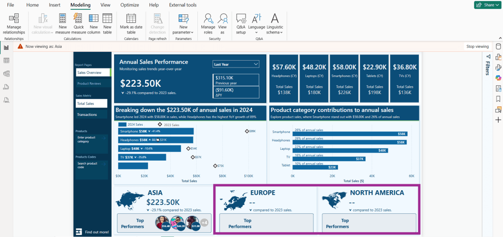
A challenge arises when we implement RLS while also trying to meet the second requirement. As shown in the image above, the total sales figures for Asia and North America appear blank when viewing the report with the Europe role.

This is because the measure used to calculate the totals uses the following expression.

Total Sales = SUM(Sales[Amount])

When RLS is implemented, users only have access to data specific to their region. For instance, when the Total Sales measure is evaluated, the Sales table is filtered to include only the sales data associated with the Europe sales region. As a result, the Total Sales measure reflects the total sales relevant to the user’s region rather than the entire dataset.

Step 2: Create a summary table

To address this issue and meet our requirements, we will create a calculated summary table in our data model. This table will store pre-aggregated total sales and total transactions by year and region.

Annual Sales Summary (Regional) =       
   SUMMARIZECOLUMNS(
      Sales[SalesDate].[Year],
      Regions[Region],
      "TotalRegionalSales", SUM(Sales[Amount]),   
      "TotalRegionalTransactions", COUNTROWS(Sales),
      "DateKey", FORMAT(DATE(MAX(Sales[SalesDate].[Year]), 12, 31), "YYYYMMDD")
)

This table does not have a direct relationship with the Region table, which is under RLS control, and our RLS roles will not filter it.

Step 3: Build dynamic DAX measures

We can now utilize this table in our measures to establish company-wide or cross-region metrics while ensuring the security of the underlying transactional data.

We first create two new measures within our datamodel to calculate the entire company’s total sales and transaction counts.

Total Sales (nonRLS) =
SUM('Annual Sales Summary (Regional)'[TotalRegionalSales])

Transaction Count (nonRLS) =
SUM('Annual Sales Summary (Regional)'[TotalRegionalTransactions])

We can use these base measures to dynamically display total sales or total transactions for all regions in the data cards at the bottom of the report, utilizing the following expression and visual filters.

Regional Total Sales =
VAR _currentYear = YEAR(MAX(Sales[SalesDate]))
VAR _selectedMetric = SELECTEDVALUE('Sales Metric'[Sales Metric Fields])

RETURN
If(
    _selectedMetric = "'_Measures'[Total Sales]",
    CALCULATE(
        [Total Sales (nonRLS)], 
        'Annual Sales Summary (Regional)'[Year]=_currentYear),
    CALCULATE(
        [Transation Count (nonRLS)], 
        'Annual Sales Summary (Regional)'[Year]=_currentYear)
)

Note: we can also use the fact that RLS filters the region table and expressions such as COUNTROWS() or SELECTEDVALUE() to hide or show the top performers data card.

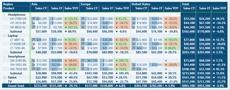
RLS still applies to the top-row visuals and bar charts, which provide detailed breakdowns of regional sales. However, the summary table enables us to present the total sales for all regions within the data card along the bottom of our report.

Step 4: Combine RLS-filtered and unfiltered measures

The non-RLS base measures can also compare regional total sales or transactions based on the current user (RLS-filtered) as a percentage of the company-wide measure (unfiltered).

% of CompanyWide Sales =
DIVIDE([Total Sales], [Total Sales (nonRLS)])

Considerations and Limitations

While the partial RLS pattern can enhance the usability and insightfulness of our Power BI report, we must consider its capabilities and limitations, as well as the associated technical and design trade-offs.

Partial RLS does not override existing RLS filters; instead, it isolates high-level summary data in a separate table unaffected by these filters. This allows partial RLS to be used for comparisons or to add additional global context without exposing detailed row-level information.

1) When implementing partial RLS, it’s important to remember that datamodel relationships matter. The summary table must be included in the datamodel to ensure that cross-filtering from tables affected by RLS does not impact it. If the summary table is related to a table with RLS filters applied at the datamodel level, it will also be subject to the RLS filters.

2) When combining measures filtered by RLS with unfiltered measures, users may need assistance interpreting the visuals associated with these measures. Visual cues or proper labeling, such as Total Sales Across All Regions versus Your Regional Sales may be necessary to help clarify what users are seeing.

3) Partial RLS can be implemented efficiently when the summary table is small and pre-aggregated without complex DAX filtering. However, keep in mind that if the summary table grows too large or includes too much granularity, it may negatively impact the performance of our reports.

4) Implementing partial RLS can add complexity when creating DAX measures. Since RLS is enforced on our Sales table, any attempts to calculate totals, even when using functions like ALL() or REMOVEFILTER(), will still be subject to our RLS rules. While partial RLS offers additional insights into our data, it does not grant any additional access.

5) We must assess edge cases, such as data gaps or undefined user roles. If a user is assigned a role that is not properly mapped in our datamodel, they may encounter an empty report or access to detailed data. We should always validate our RLS roles to ensure they function as expected.


Wrapping Up

Partial RLS is a design approach used in cases where RLS filtering restricts our ability to give users a broader context for their data. This approach allows us to ensure secure access to detailed, role-specific data while providing users insight into the overall picture and how their data fits into a larger context.

We can provide contextual insights without revealing specific row details by utilizing partial row-level security, enabling us to create more comprehensive and insightful reports.

Row-Level Security (RLS) enables us to filter data at the row level, but it does not allow us to secure entire tables or columns within our datamodel. Make sure to check back for the next post, or better yet, subscribe so you don’t miss it!

In the next post, we will explore Object-Level Security (OLS) in Power BI. OLS is essential because it allows us to secure specific tables and columns from report viewers.

If you’d like to follow along and practice these techniques, Power BI sample reports are available here: EMGuyant GitHub – Power BI Security Patterns.


Thank you for reading! Stay curious, and until next time, happy learning.

And, remember, as Albert Einstein once said, “Anyone who has never made a mistake has never tried anything new.” So, don’t be afraid of making mistakes, practice makes perfect. Continuously experiment, explore, and challenge yourself with real-world scenarios.

If this sparked your curiosity, keep that spark alive and check back frequently. Better yet, be sure not to miss a post by subscribing! With each new post comes an opportunity to learn something new.

Power BI Row-Level Security Explained: Protect Data by User Role


When creating reports for teams across various departments or regions, it’s important to recognize that not everyone needs or wants to see the same data. This is where Row-Level Security (RLS) becomes essential.

We can use RLS to restrict data access for report viewers based on their identity. This eliminates the need to create separate reports for different departments or regions. With RLS, we can use a single report and dataset to generate personalized views for each individual or role.

In this guide, we will walk through:

  • What RLS is and why we should use it
  • Static vs Dynamic RLS
  • Step-by-step examples for each
  • Limitations and Considerations when implementing RLS

By the end of this guide, you will better understand RLS, its applications, and its limitations. Additionally, a PBIX example file will be provided for in-depth, hands-on exploration of this topic.


What is Row-Level Security

Row-level Security (RLS) within Power BI restricts data access for report viewers based on their identity by enabling us to establish rules within our data model to filter data rows.

Consider it as always adding another filter to the appropriate users. These filters are applied at the dataset level, ensuring that users can only see the information they can access, regardless of how they interact with the report

It is important to note that users who have more than viewer permissions to the Power BI workspace have access to the entire semantic model. RLS only restricts data access for users with Viewer permissions.


Why use Row-Level Security

There are several key advantages to using Row-Level Security (RLS) when creating our reports.

Security and Privacy

RLS helps prevent users from seeing data they shouldn’t have access to. This can become especially important when the dataset includes sensitive data.

Efficiency and Scalability

Managing separate reports for different departments or roles can be cumbersome. With RLS, we can create and customize one report for each user role. This approach is easier to maintain, scales better, and reduces the likelihood of inconsistencies and errors.

Improved User Experience

Users no longer need to apply slicers or filters to view only their data of interest. RLS automatically handles this when the report is rendered, resulting in a cleaner and more user-friendly report.


Static Row-Level Security

Static Row-Level Security (RLS) is the most straightforward form of RLS. In this approach, we manually define which users can access specific rows of data, usually by applying filters based on criteria such as Region or Department. This method works well when there is a small group of users and the access rules do not change frequently.

Step-by-Step: Static RLS

Static RLS applies a fixed value in the DAX filter when rendering our report. Configuring static RLS involves several steps.

1. Creating RLS roles in Power BI Desktop
To create RLS roles in Power BI Desktop, navigate to the Modeling tab and select Manage Roles.

Then, we select + New under Roles on the manage security roles dialog box. For this sample report, we create a role for each sales region.

We give each role a descriptive name, select the table to which the filter is applied, and create the filter condition.

After each role is created, any user we assign to the Asia, Europe, or United States role will only see data filtered to that specific region.

This approach is considered Static RLS since we use a static value to define each role.

2. Testing the roles in Power BI Desktop
Within Power BI Desktop, we can test each role to validate it by selecting the View as option on the modeling tab.

After selecting a role, we can see the report rendered as if we are a member of that role.

3. Deploying the report to the Power BI Service
Once we create and validate the roles, we publish the report to the Power BI Service as with any other report.

4. Add members to the role in the Power BI Service
To add a member to the role in the Power BI Service, we must navigate to the workspace where we published the report. We locate the semantic model and select the More options ellipsis (…) and then Security.

Within the Row-Level Security screen, we add users or security groups to each role we created. RLS rules will not apply to users who have access to the report but have not been added to a role.

5. Testing the roles in the Power BI Service
On the Security screen, we select the More options ellipsis (…) next to each role and then Test as role.

Once all roles have been validated, we have successfully implemented static row-level Security in Power BI.


Dynamic Row-Level Security

While static RLS can be great for smaller teams, it doesn’t scale well. Manually assigning roles to individuals quickly becomes unmanageable.

Dynamic RLS solves this issue using a User Access Table or a field that defines each user’s role inside our data model. The report utilizes this table to filter itself based on who is viewing the report.

For this example, our data model has an Employee table that contains each employee’s user principal name and role (e.g., Asia Sales, Europe Sales, US Sales, Management, or blank). We utilize this information to implement dynamic RLS by looking up the user’s role based on the user principal name of the viewer currently signed in.

Step-by-Step: Dynamic RLS

1. Set up a dynamic role using DAX
Navigate to the Modeling tab and select Manage Roles. Then, in the Manage Security Roles dialog box, select + New under Roles.

We name the role, select the table to which the filter is applied, and, this time, rather than creating a static filter condition, select Switch to DAX editor to create our dynamic rule.

We filter the Region table based on the current user’s role using the following DAX expression:

SWITCH(
    LOOKUPVALUE(
        Employee[Role], 
        Employee[UPN], 
        USERPRINCIPALNAME()
    ),
    "Asia Sales", Regions[RegionID]=3,
    "Europe Sales", Regions[RegionID]=2,
    "US Sales", Regions[RegionID]=1,
    "Management", TRUE(),
    FALSE()
)

The DAX expression looks up the user’s Role based on the current user’s user principal name (e.g. email).

2. Testing the dynamic filter
After creating the rule, we must test and validate that it functions as expected. We navigate to the Modeling tab and select View as. Then, in the dialog box, we check the Other User option and enter a user’s email. We also check the dynamic filter rule we just created and select OK.

The report will refresh, and we will validate that the TEMP-UPN-2 user, who has the role of US Sales, sees data only for their assigned region.

3. Publish the report and add members to the role
We publish the report to the Power BI Service. Then, to add members to the role in the Power BI Service, we must navigate to the workspace where we published the report. We locate the semantic model and select the More options ellipsis (…) and then Security.

Within the Row-Level Security screen, similar to what we did for static RLS, we can add users or security groups to each role we created.

Since we may implement dynamic row-level Security for better scalability, assigning a security group when adding members can be beneficial. Better yet, this security group can also give users their Viewer access to the report or app.

4. Validate roles in the Power BI Service
On the Security screen, we select the More options ellipsis (…) next to each role and then Test as role.

Then, at the top, we select Now viewing as and Select a person to validate that the RLS is functioning as expected. We will view the report as Jasper (TEMP-UPN-2) as we did in Power BI Desktop.

Note: The TEMP-UPN-# provided in the sample file will only function for testing in Power BI Desktop without requiring an actual email address. The UPN field must contain actual user email addresses to validate in the Power BI Service.

We can also validate the report for Diego (TEMP-UPN-4), who is assigned the Management role and should be able to see data for all sales regions

One last consideration is what happens when a user intentionally or unintentionally has access to view the report but does not have a Role defined in the Employee table.

If we review the DAX expression used for the filter:

SWITCH(
    LOOKUPVALUE(
        Employee[Role], 
        Employee[UPN], 
        USERPRINCIPALNAME()
    ),
    "Asia Sales", Regions[RegionID]=3,
    "Europe Sales", Regions[RegionID]=2,
    "US Sales", Regions[RegionID]=1,
    "Management", TRUE(),
    FALSE()
)

The last value, or the default if no other condition is true, is set to FALSE(). This means that if a user is in the Employee table but either does not have a role or their role doesn’t match one defined in the rule, the report will be empty.

When testing the report, Grady (TEMP-UPN-5) is contained in the Employee table but does not have a role assigned.

Now that everything is working as expected, we have successfully implemented dynamic row-level Security. The benefit is that by using dynamic RLS, we replace four roles with a single rule applied dynamically based on the current user. Additionally, we can add an extra layer and hide data for users who have access to the report but are not assigned a role in the Employee table.


Considerations and Limitations

Before implementing RLS across our reports, it is important to consider and evaluate the impacts of RLS limitations.

A list of limitations can be viewed here:

Learn more about: Row-Level Security with Power BI

It’s also important to understand when Row-Level Security (RLS) is and is not the right tool.

We may consider publishing multiple semantic models if we have only a few simple RLS rules. For example, if we have just two sales regions, we might publish a separate semantic model for each region. Although the semantic models do not enforce RLS, we can use query parameters to filter the source data to the specific sales region. The use of query parameters would still allow us to publish the same model while displaying the relevant data for each region.

Advantages of not using Row-Level Security (RLS) include:

  • Improved Query Performance: With fewer filters applied to the data model, queries can run faster.
  • Smaller Models: While avoiding RLS may increase the number of models, each individual model is generally smaller, which can enhance query performance and data refresh responsiveness.
  • Full Access to Power BI Features: Certain features, like “Publish to the Web”, do not work with RLS.

However, there are also disadvantages to not implementing RLS:

  • Multiple Workspaces Required: Each user audience for reports may require its own workspace.
  • Content Duplication: Reports and dashboards must be created in each workspace, leading to redundancy and increased maintenance efforts.
  • Lack of Consolidated View: Users who belong to multiple report user audiences must open various reports, resulting in no single, consolidated view of their data.

Wrapping Up

Row-Level Security (RLS) is a valuable feature in Power BI that enables us to protect and customize report data according to the identity of the report viewer. With static RLS, we can implement straightforward, fixed access rules, while dynamic RLS offers a more scalable and flexible solution. RLS allows us to provide tailored insights that meet the specific needs of different users.

It’s important to remember that Row-Level Security only filters rows in a table and does not limit access to model objects like tables or columns. If your requirements involve hiding entire tables or specific columns within a table, you should consider using Power BI Object-Level Security (OLS).

RLS can sometimes be overly restrictive when it comes to broader calculations. For example, we could display the total sales for each region to all users or calculate the percentage of total sales across all regions. However, RLS rules filter these total sales values, leading to complications. This is where the concept of partial RLS comes into play, allowing us to secure specific data while still accessing global context for certain calculations.

Stay tuned and subscribe so you won’t miss upcoming posts in this series, focusing on the partial RLS design pattern and object-level security.

If you’d like to follow along and practice these techniques, Power BI sample reports are available here: EMGuyant GitHub – Power BI Security Patterns.


Thank you for reading! Stay curious, and until next time, happy learning.

And, remember, as Albert Einstein once said, “Anyone who has never made a mistake has never tried anything new.” So, don’t be afraid of making mistakes, practice makes perfect. Continuously experiment, explore, and challenge yourself with real-world scenarios.

If this sparked your curiosity, keep that spark alive and check back frequently. Better yet, be sure not to miss a post by subscribing! With each new post comes an opportunity to learn something new.

Power Automate vs. Locked Files: A Smarter Way to Update Locked SharePoint Files


The Hidden Workflow Killer: Locked Files in SharePoint

Imagine you have created a Power Automate workflow for a document approval process that updates a status property of the document to keep end users informed. The workflow operates smoothly until you encounter failures, with an error message stating, “The file <file_path> is locked for shared use by <user_email>“.

This is a common issue encountered in workflows that update file metadata while users have the file open or during co-authoring. Without proper error handling, users may not even realize that the workflow has failed, which can lead to confusion and increased support requests to resolve the workflow problem.

A common solution to this problem involves checking whether the file is locked and repeatedly attempting to update it until the lock is released.

In this post, we will explore a more practical approach. Instead of waiting for the file lock to be released, we can detect the lock, extract the source control lock ID, and use it to update the file without any user intervention, even when the file is in use.


The Waiting Game: Why Do Until Loops Leave Everyone Hanging

One workaround for a locked SharePoint file in Power Automate is to use a Do Until loop. The concept is straightforward: check if the file is locked, and if it is, use a delay action to wait before checking again. Repeat this process until the file becomes available. While it may not be the most elegant solution, it effectively gets the job done—at least sometimes.

Here is how this approach may look.

This process can be improved by identifying the user who has locked the file and sending them a notification to close it, allowing the workflow to continue. While this approach enhances the system, it still requires user intervention for the workflow to proceed.

In practice, this approach can be clunky. By default, it runs silently in the background and continues to loop without providing feedback to users. From their perspective, the workflow is broken. Users may attempt to retry the action, submit duplicate requests, or contact the workflow owner. When, in reality, the workflow is functioning as intended, it is simply waiting for the file to become available.

Even if notifications are sent to the user who has the file locked, the process still relies on that user to take action before it can proceed. If the user ignores the alert, is away or is out of the office, the process stalls. This type of automated update to file metadata should not depend on user action to function correctly.


The Upgrade: Skip the Wait and Update Locked Files Instantly

There is a more effective way to manage locked files without needing to retry failed updates or alert users to close their documents. Instead of waiting for SharePoint to release the lock, we can leverage some lesser-known features and properties of the files.

The key component of this approach is the LockedByUser file property. We can send an HTTP request to SharePoint using the lockedByUser endpoint to determine if the file is locked and by whom. More importantly, SharePoint also maintains a source control lock ID that can be used to override the lock in specific scenarios.

The process operates as follows: The workflow first checks if the file is locked by inspecting the lockedByUser response. If the file is locked, the workflow extracts the lock ID and then updates the file by passing the lock ID to SharePoint. If the file is not locked, it is updated as usual.

This method allows users to bypass waiting on the workflow. The file metadata is updated seamlessly, and the workflow moves to its subsequent actions.

Step-by-Step Guide to Implementing the New Approach

This method may seem technical, and while it is more complex than the Do until loop workaround, it is more straightforward than you might think.

Here is the workflow overview.

Get the file properties

The workflow starts by using the Get file properties action to retrieve all the properties of the file that triggered the workflow. We set the Site Address and Library Name and use dynamic content to select the ID from the selected file trigger.

Get lockedByUser Property

To retrieve the lockedByUser property value, we use the Send an HTTP request to SharePoint action. In this action, we set the Site Address to our SharePoint site and set the Method to GET. For the Uri, we use:

_api/web/lists('<documentlibrary_guid>')/items('<documentlibrary_itemId>')/File/lockedByUser

Finding the <documentlibrary_guid> for this action can be challenging. However, since we already have the Get file properties action, we can use Power Automate’s Code view to locate the required value.

Then, we use dynamic content for the <documentlibrary_itemId> to add the required ID value. Lastly, under Advanced parameters, we set the headers as follows:

{ 
   "Accept": "application/json;odata=nometadata", 
   "Content-Type": "application/json;odata=nometadata" 
}

Check the lockedByUser Response

When the file is locked, the response body of the HTTP request GET lockedByUser action indicates who has the file locked.

{
  "Id": 11,
  "IsHiddenInUI": false,
  "LoginName": "i:0#.f|membership|<user_email>",
  "Title": "<user_displayName>",
  "PrincipalType": 1,
  "Email": "<user_email>",
  "Expiration": "",
  "IsEmailAuthenticationGuestUser": false,
  "IsShareByEmailGuestUser": false,
  "IsSiteAdmin": false,
  "UserId": {
    "NameId": " ",
    "NameIdIssuer": " "
  },
  "UserPrincipalName": "<user_upn>"
}

The body contains the following information when the file is not locked.

{
  "odata.null": true
}

We use the odata.null property value in the Condition flow control to check if the file is locked.

We utilize the following function to include odata.null in the condition.

body('HTTP_request_GET_lockedByUser')?['odata.null']

Locked File Branch

If odata.null is not equal to true, our file is locked, and the workflow progresses down the True branch. We first need to obtain the source control lock ID to update the locked file.

You might be wondering where to find the lock ID. To view a list of file properties available within our workflow—beyond the basic properties returned by the Get file properties action—we add another Send an HTTP request to SharePoint action.

First, set the Site Address to our SharePoint site and choose “GET” as the Method. Then, use the following URI:

_api/web/lists('<documentlibrary_guid>')/items('<documentlibrary_itemId>')/File/Properties

*See the Get lockedByUser Property section to located <documentlibrary_guid> and <documentlibrary_itemId>

We can proceed to run a test of our workflow to examine the raw output of this request. In the output, we will see a list of available properties. The specific property we need is the value of vti_x005f_sourcecontrollockid.

Next, we will update the URI to select this particular property value.

_api/web/lists('<documentlibrary_guid>')/items('<documentlibrary_itemId>')/File/Properties?$select=vti_x005f_sourcecontrollockid

Once we have the required lock ID, we use another Send HTTP request to SharePoint action to perform the update. We set the Site Address to our SharePoint site and choose POST as the Method. Then, under the Advanced parameters, we select Show all to provide the necessary headers and body values.

For the Headers parameter, we use the following:

{ 
   "Accept": "application/json;odata=nometadata", 
   "Content-Type": "application/json;odata=nometadata" 
}

For the Body parameter, we will use:

{ 
   "formValues": [ 
      { 
         "FieldName": "ApprovalStatus", 
         "FieldValue": "In Process (Updated Locked File)" 
      } 
   ], 
   "sharedLockId": "body('HTTP_request_GET_sourcecontrollockid')?['vti_x005f_sourcecontrollockid']", 
   "bNewDocumentUpdate": true 
}

We dynamically utilize the lock ID within the Body parameter using this function.

body('HTTP_request_GET_sourcecontrollockid')?['vti_x005f_sourcecontrollockid']

Unlocked File Branch

If the file is not locked, we use the Send a HTTP request to SharePoint action to update the file. We configure the action the same way as the HTTP request used for the locked file, with the only difference being the body parameter.

Since the file is not locked, we do not include the sharedLockId property in the body parameter.

{ 
   "formValues": [ 
      { 
         "FieldName": "ApprovalStatus", 
         "FieldValue": "In Process (Updated Locked File)" 
      } 
   ], 
   "bNewDocumentUpdate": true 
}

Here is the workflow in action.

Continue the workflow with any Additional Actions

Once the update to the file metadata is complete, the workflow continues as usual. The file is updated directly, regardless of whether it is locked.

Although this approach requires some initial setup, once implemented, the workflow becomes more resilient and less dependent on unpredictable user behavior.


Wrapping Up

Locked SharePoint files can disrupt our Power Automate workflows, causing updates to stall and confusing users. Common fixes, such as using Do Until loops and notifications rely heavily on timing and user intervention.

The approach outlined here first checks if the file is locked. If it is, the method extracts the lock ID and sends an HTTP request to update the file with no retries or end-user intervention.

This workflow makes our workflow more efficient and reliable, enabling true automation without requiring any user action for the workflow to proceed.

Curious about the TRY Update document properties scope within the workflow?

Check out this post focused on Power Automate error handling and notifications.

Learn how to create a dynamic failure notification framework across Teams channels with a centralized SharePoint setup.


Thank you for reading! Stay curious, and until next time, happy learning.

And, remember, as Albert Einstein once said, “Anyone who has never made a mistake has never tried anything new.” So, don’t be afraid of making mistakes, practice makes perfect. Continuously experiment, explore, and challenge yourself with real-world scenarios.

If this sparked your curiosity, keep that spark alive and check back frequently. Better yet, be sure not to miss a post by subscribing! With each new post comes an opportunity to learn something new.

Explore Power BI Core Visualizations: Part 4 – Table and Matrix Visuals


Table and Matrix visuals in Power BI are essential for presenting detailed and structured data. Both visuals excel at displaying large amounts of information while highlighting trends, relationships, and hierarchies.

Tables offer a simple way to present data in a straightforward tabular format and are best for displaying detailed row-level data, such as sales records, inventory lists, or customer information. Unlike other visuals that summarize data at a high level, tables retain all details, making them an excellent tool for deep-dive analysis.

Matrix visuals enhance this capability by grouping and summarizing data hierarchically. Unlike tables that present data in a flat structure, matrix visuals allow for expandable rows. Users can then collapse or expand these groupings interactively to meet their needs.

Table and Matrix visuals are excellent for presenting data and hierarchical summaries, but they may not be suitable for every situation. It’s important to choose the right visual for effective reporting. To discover other essential visuals, check out Parts #1, #2, and #3 of the Explore Power BI Core Visualizations series.

Chart your data journey! Transform data into insights with Power BI core visualizations. 

Chart your data journey! Transform data into insights with Power BI core visualizations. 

Chart your data journey! Transform data into insights with Power BI core visualizations. 


Customizing Table Visuals

Table visuals in Power BI can be challenging to read and may become overwhelming if not formatted properly. Power BI offers a range of properties that allow us to customize our table visuals, enhancing readability, improving structure, and dynamically highlighting key insights.

Formatting the Table Layout

The fundamentals of formatting our table visuals involve customizing the grid, values, column headers, and totals properties. By adjusting these elements, we can enhance the appearance and clarity of our table visuals, making them more readable for our viewers.

The grid properties of our table visuals dictate how rows and columns are separated, providing a structured appearance.

We can toggle the horizontal and vertical gridlines on or off based on the requirements of the visual and the desired level of separation between rows and columns. Enabling the gridlines results in a structured layout, while disabling them offers a more minimalist design.

Additionally, the borders property allows us to define and apply borders to various sections of the table visual, including the column header, values section, and totals section.

In this example, we enable both the horizontal and vertical gridlines and set the bottom border of the column header section to an accent green color.

Next, we will focus on the Values property section. This area allows us to customize text styles and background colors, essential for ensuring our tables are readable and visually engaging.

We can specify the primary text color, background color, and alternate colors to differentiate between alternating rows in the visual. Alternating the styles of the rows improves readability and makes it easier to track values across each row.

The final basic formatting properties to consider are the column headers and totals. The column header properties allow us to adjust the font size, background color, and text alignment, which helps create a structured and easy-to-read table.

When we enable the Totals property, our table will include a row that aggregates the values from each column. We can customize this row’s font style, text color, and background color to distinguish it from the standard data rows.

In our example, we set the column headers to white with a dark blue background, making the header row easily identifiable. Additionally, we activate the totals row, giving it dark blue text, a gray background, and top and bottom borders to further differentiate it from the other data rows.

Enhancing Tables with Advanced and Conditional Formatting

In addition to basic formatting, Power BI provides multiple settings and options for advanced and conditional formatting, allowing for greater control over the appearance of table visuals. These options enable targeted formatting for specific columns and dynamic styling for key data points and trends.

We can utilize the specific column properties to apply unique formatting to individual columns, offering the flexibility to adjust the styling of headers, values, and total values for different series.

For example, we can include the count of transactions alongside our sales data in the table. Using the specific column properties, we can set the text color of the values and totals to visually distinguish them from the primary focus of the sales amounts.

The cell elements properties offer additional customization options and enable dynamic formatting. These customizations enhance our ability to highlight trends and identify key values.

For instance, using these properties, we can conditionally format the background and text color of the Sales Year-over-Year (YoY) series. This lets us quickly see which products have experienced growth or decline compared to the previous year.

We enable data bars for the current and last year’s sales series, visually comparing sales values across different products.

We also activate the icons feature for the current year’s sales values. We add a trending upward arrow for products whose current-year sales exceed those of the previous year and a downward arrow for products whose current-year sales are lower than last year’s. This visual representation quickly indicates product sales growth next to each product category and complements the Sales Year-over-Year series.

By integrating fundamental concepts, specific column formatting, cell elements, and conditional formatting, our Power BI table visuals can become dynamic and intuitive report elements that lead users to insights.


Customize Matrix Visuals

The Matrix visual in Power BI shares many of the same formatting options as the Table visual, including Grid, Values, Column headers, Specific column, and Cell elements formatting. However, Matrix visuals introduce additional formatting options for the hierarchical data structure.

Row Headers

Row headers are a key feature of Matrix visuals, allowing viewers to group and drill into the data. Power BI lets us define the font styling, text alignment, text color, and background color. We can also customize the size and color of the expand and collapse (+/-) buttons, or not show them all together.

Subtotals and Grand Totals

Row subtotals summarize data at each hierarchical level, allowing viewers to see how individual categories contribute to the overall total.

By toggling a setting in the Format options, we can enable or disable row subtotals. When row subtotals are enabled, we can customize the font and background styling and define the total label and its position.

In our example, we enable row subtitles and adjust the styling to ensure consistency with other visual elements. We then set the position of the subtotal to the bottom and activate the row-level settings. Under these settings, we select Product Code and label it as “Subtotal.” Next, we choose Product and label it “Grand Total.”

Grand totals display the final sum of all row and column values in our Matrix visuals. Proper formatting ensures these totals remain distinct and easy to locate.

The formatting options include font styling, font color, and background color.


Advanced Techniques and Customizations

The table and matrix visuals in Power BI provide a range of options for creating unique presentations that enhance data visualization, interactivity, and analytical depth. By designing these visuals thoughtfully, we can highlight key insights, delve deeper into our data, and create dynamic reports tailored to the viewers’ needs. Let’s explore some advanced examples that go beyond the basics.

Clean and Straightforward Sales Totals

This matrix visual presents a structured overview of our sales totals across different regions, product categories, and years. The clear and straightforward presentation makes analyzing trends over time and across regions easy.

We add a matrix visual to our report canvas to create this visual. Next, we place the Region and Product data into the Rows field, the Year into the Columns field, and a Total Sales measure into the Values field. After that, we expand all rows by one level and position the row subtotals at the bottom. Finally, we change the label for the Product row level label to Subtotal.

In the Layouts and Style Presets options, we set the Style to “None” and the Layout to “Outline.” We also toggled off the Repeat Row Headers option.

Under the Values properties, we adjust the background color and alternate background color to match the color of the matrix background.

Next, we format our column headers and the grand total section.

Column Headers:

  • Background color: matrix background color
  • Font color: dark blue font color
  • Font style: semi-bold and font size 11

Row/Column Grand Total:

  • Background color: a darker tone of the matrix background color
  • Font color: the same dark blue used for the values

To complete the visual, under the Cell elements properties, we enable data bars and set the positive bar color to a tone of the matrix background, ensuring that the bars and values are easy to read.

Month and Day of Week Sales Heat Map

We can use the Power BI matrix visual to create a heat map that visually displays sales performance across different days of the week and months. This heat map is created using the conditional formatting feature for cell elements, effectively highlighting patterns in our sales distribution.

We place a month name series in the rows field, a weekday name abbreviation series in the columns field, and a total sales measure in the values field.

Then, we toggle off the row and column subtotals.

To create a heat map, we start by enabling the background color property under the Cell elements section.

In the Background Color dialog box, we set the Format Style to gradient based on our Total Sales measure. Next, we add a middle color and set the colors for both the minimum and center values to match the matrix background, while the color for the maximum value is set to a dark blue. Including a middle color helps emphasize the top performances in the heat map.

Next, we enable the font color property under Cell elements.

In the Font Color dialog box, we set the Format Style to gradient based on our Total Sales measure. We then add a middle color and set both the minimum and maximum values to match the background color of the matrix. For the center value, we select a slightly darker shade. By setting these colors, we can hide values close to the minimum, gradually reveal values as they approach the maximum, and ensure that the light color of the maximum stands out against the dark blue background.

Product Review Ratings with Custom SVG Icons

This matrix visual uses custom SVG icons to show average product ratings by region, product, and product code.

We start by adding the Product and Product Code columns to the Rows fields, the Region column to the Columns field, three measures to the Values fields, and applying general formatting to the column headers.

The measures are:

Score SVG = 
VAR prefix = MAXX(FILTER(Icons, Icons[Name]="prefix"), Icons[SVGIcon])
VAR _00 = MAXX(FILTER(Icons, Icons[Name]="Satisfaction0.0"), Icons[SVGIcon])
VAR _05 = MAXX(FILTER(Icons, Icons[Name]="Satisfaction0.5"), Icons[SVGIcon])
VAR _10= MAXX(FILTER(Icons, Icons[Name]="Satisfaction1.0"), Icons[SVGIcon])
VAR _15= MAXX(FILTER(Icons, Icons[Name]="Satisfaction1.5"), Icons[SVGIcon])
VAR _20= MAXX(FILTER(Icons, Icons[Name]="Satisfaction2.0"), Icons[SVGIcon])
VAR _25= MAXX(FILTER(Icons, Icons[Name]="Satisfaction2.5"), Icons[SVGIcon])
VAR _30= MAXX(FILTER(Icons, Icons[Name]="Satisfaction3.0"), Icons[SVGIcon])
VAR _35= MAXX(FILTER(Icons, Icons[Name]="Satisfaction3.5"), Icons[SVGIcon])
VAR _40= MAXX(FILTER(Icons, Icons[Name]="Satisfaction4.0"), Icons[SVGIcon])
VAR _45= MAXX(FILTER(Icons, Icons[Name]="Satisfaction4.5"), Icons[SVGIcon])
VAR _50= MAXX(FILTER(Icons, Icons[Name]="Satisfaction5.0"), Icons[SVGIcon])

RETURN
SWITCH(
    TRUE(),
    [Average Score]<0.5, prefix&_00,
    [Average Score]>=0.5 && [Average Score]<1.0, prefix&_05,
    [Average Score]>=1.0 && [Average Score]<1.5, prefix&_10,
    [Average Score]>=1.5 && [Average Score]<2.0, prefix&_15,
    [Average Score]>=2.0 && [Average Score]<2.5, prefix&_20,
    [Average Score]>=2.5 && [Average Score]<3.0, prefix&_25,
    [Average Score]>=3.0 && [Average Score]<3.5, prefix&_30,
    [Average Score]>=3.5 && [Average Score]<4.0, prefix&_35,
    [Average Score]>=4.0 && [Average Score]<4.5, prefix&_40,
    [Average Score]>=4.5 && [Average Score]<=5.0, prefix&_50
)
Average Score = 
AVERAGE(Reviews[SatisfactionScore])
Review Count = 
COALESCE(COUNTROWS(Reviews), 0)

We enable column and row subtotals and format the grand totals section to visually distinguish it from the main data.

This visual enhances the user experience by making the review score data more intuitive to explore and understand.

These examples demonstrate how Power BI’s Table and Matrix visuals can be used and customized to improve our reports. By leveraging these visuals and the customization options they offer, we can create engaging, insightful, and easy-to-interpret reports.


Wrapping Up

Table and Matrix visuals in Power BI are effective tools for presenting structured data, whether through detailed tables or hierarchical matrices. By applying formatting and customization techniques, these visuals can transform our data and provide clear and intuitive insights.

Advanced features such as drill-down capabilities, cell element customization, and conditional formatting enhance these visuals beyond merely presenting numbers, making them more interactive and visually engaging. Table and Matrix visuals offer the flexibility to meet a variety of our reporting needs.

If you’d like to follow along and practice these techniques, sample data, and a Power BI report template file are available here: GitHub – EMGuyant Power BI Core Visuals.


Thank you for reading! Stay curious, and until next time, happy learning.

And, remember, as Albert Einstein once said, “Anyone who has never made a mistake has never tried anything new.” So, don’t be afraid of making mistakes, practice makes perfect. Continuously experiment, explore, and challenge yourself with real-world scenarios.

If this sparked your curiosity, keep that spark alive and check back frequently. Better yet, be sure not to miss a post by subscribing! With each new post comes an opportunity to learn something new.

Power BI Feature Spotlight: Multi-Select Text Slicer, Better Treemaps, and TMDL View


The Power BI update for January 2025 introduces several exciting features that improve report interactivity, visualization, modeling, and development efficiency.

This post will highlight three key updates: improvements to the text slicer, upgrades to the treemap visual, and the preview of TMDL scripting experience.

The text slicer (preview) was introduced in November 2024, now allows mutli-selection, addressing a major limitation in text-based filtering. The treemap visual gains new tiling and spacing formatting options and TMDL view previews a code-first approach to semantic modeling.


Text Slicer (Preview) Enhancements

In my previous post, Power BI Feature Spotlight: Data Filtering and Modeling, I introduced the Text Slicer, highlighting its benefits, use cases, and the limitation of allowing only a single text input.

The January 2025 update addresses this limitation by introducing an option for users to input multiple values. With this new feature, users can now add multiple text inputs to the slicer, enabling them to make multiple selections for filtering the dataset.

The text slicer now includes a Allow multiple values toggle in the format settings for allowing multiple values. For more details and how to enable the text slicer (preview) see: Enhancement to Text slicer (Preview).

By allowing multiple text values, this update enhances flexibility and gives users greater control over data slicing and insight generation.

Use Case: Applying the Text Slicer in Reports

Filter on Parts of a Product Code – Explore data without a standalone field

Many datasets store information in a single field, such as a product code that includes details like color, size, or category. The new text slicer with multi-selection functionality makes filtering easier based on multiple embedded attributes.

For example, in the sample dataset, product codes contain embedded color codes (e.g. SM-5933-BK, where BK stands for black). Previously, users could only filter by one color code at a time. Now, users can select multiple color codes simultaneously to display all products that match their desired colors.

This enhancement enables better utilization of existing data structures, enhancing report filtering efficiency and flexibility without requiring additional transformations.

Search and Filter Product Reviews – Analyze long-form text fields

The text slicer was already a powerful tool for filtering customer reviews by keyword. Now, with the introduction of multi-selection, users can dive deeper and gain insights across multiple topics at the same time.

For instance, when working with a dataset containing product reviews, we could previously filter by a single keyword like “battery” to see all related reviews. With the new update, we can now filter for both “battery” and “charging” simultaneously.


A Better Treemap: The Latest Enhancements Explained

The January 2025 Power BI Desktop update enhances the treemap visual, providing greater control and customization, ensuring treemaps remain an effective tool for visualizing hierarchical data. We can now adjust the tiling method and spacing controls within the visual’s Layout properties.

New Tiling Methods: More Control Over Treemap Layouts

Squarified: Uses a squarified treemap algorithm to create a balanced layout where rectangles maintain an aspect ratio close to squares. This method prevents elongated rectangles, improving size comparisons and readability.

Binary: Continuously divides the chart area into two sections, incrementally adding new rectangles and creating a balanced format. Each hierarchy level is split further, resulting in a well-organized treemap that adjusts to the underlying data structure.

Alternating (Columns, Rows): Distinguish categories by splitting them into columns, and each is split into rows. This method is effective at visualizing data at multiple hierarchical levels.

New Spacing Options: Improved Readability and Appearance

Space between all nodes: Introduces gaps between adjacent nodes at all hierarchy levels, reducing visual clutter and improving clarity.

Space between groups: Adds extra space around each node group, helping to separate different categories visually.

For more information and details check out the Enhancements to Treemap visual section of the January 2025 update feature summary. If you are looking to dive in and get hands-on with this update, take a look at the 2025 Week 7 Power BI Workout Wednesday challenge. This challenge uses the new treemap feature to create a treemap visual organized into columns.


TMDL Scripting Experience (Preview)

The TMDL view is a new feature added to Power BI Desktop and has gotten a lot of attention for good reason.

TMDL view offers a scripting environment that enables developers to script, modify, and implement changes to the semantic model using Tabular Model Definition Language (TMDL). This view provides an alternative experience for semantic modeling in Power BI Desktop, allowing users to work with code rather than relying solely on the user interface.

The key benefits of the TMDL scripting experience include:

  1. Enhanced Development Efficiency: The code editor includes features such as search-and-replace and support for multi-line edits, streamlining the coding process.
  2. Increased Reusability: TMDL scripts allow for scripting, sharing, and reusing semantic model objects, making it easier to manage and replicate work.
  3. Greater Control and Transparency: This feature exposes all semantic model objects and properties, enabling users to set or modify elements that may not be accessible through the Power BI Desktop user interface.

Interested to learn more about this feature? Check out the TMDL scripting experience (Preview) feature summary, the How to Use TMDL View in Power BI Desktop – Top Tricks! video, and this great blog post TMDL View And Power BI Developer Productivity: An Example Using The Detail Rows Definition Property.


Wrapping Up

The January 2025 Power BI update delivers significant updates that improve report interactivity, usability, and development efficiency. The new multi-select capability of the text slicer removes a key limitation, and the treemap visual improvements provide greater control, helping us make our report more intuitive.

The introduction of the TMDL scripting experience unlocks tools directly in Power BI Desktop to adopt a code-first approach to semantic modeling, providing greater reusability.

As Power BI continues to evolve, the updates provide us with the tools necessary to create more dynamic, interactive, and insightful reports.

Check out the Power BI January 2025 Feature Summary for more details and updates.


Thank you for reading! Stay curious, and until next time, happy learning.

And, remember, as Albert Einstein once said, “Anyone who has never made a mistake has never tried anything new.” So, don’t be afraid of making mistakes, practice makes perfect. Continuously experiment, explore, and challenge yourself with real-world scenarios.

If this sparked your curiosity, keep that spark alive and check back frequently. Better yet, be sure not to miss a post by subscribing! With each new post comes an opportunity to learn something new.