Elevate Power Automate Error Handling with Centralized Failure Notifications


Handling errors in Power Automate workflows can be challenging, especially when managing notifications across multiple flows. Adding contact details to each flow can become inefficient and difficult to maintain.

The Microsoft ecosystem offers various options and integrations to address these inefficiencies. In this approach, we will use a SharePoint list to centralize contact information, such as Teams Channel IDs and Teams Tag IDs. This method simplifies management and enhances our failure notification framework.

We will explore two methods. The first involves using Teams shared channels with @mentioning Teams tags to notify a specific group of users within our Power Automate Failure Notifications Teams team. The second method utilizes direct user @mentions in private Teams channels. Both methods employ a solution-aware flow, providing a reusable failure notification framework.


Power Automate Error Handling Best Practices

Before we can send failure notifications using our reusable framework, we first need to identify and handle errors within our workflows. It is essential to incorporate error handling into all our business-critical workflows to ensure that our Power Automate flows are resilient and reliable.

The configure run after setting is crucial for identifying the outcomes of actions within a workflow. It lets us know which actions were successful, failed, skipped, or timed out. By utilizing this feature, we can control how subsequent actions will behave based on the result of prior actions. Customizing these settings allows us to develop flexible and robust error-handling strategies.

Beyond using configure run after, there are important patterns that support effective error management in Power Automate:

Scoped Control (Try-Catch blocks): Grouping actions within the Scope control object aids in managing the outcomes of that set of actions. This method is valuable for isolating distinct parts of our workflow and handling errors effectively.

Parallel Branching: Establishing parallel branches enables certain workflow actions to continue even if others encounter errors. This approach allows us to run error-handling notifications or fallback actions concurrently with the primary process, enhancing the resilience of our flow and preventing interruptions.

Do Until Loop: For situations where actions may need multiple attempts to succeed, the Do Until control object permits us to execute actions until a specified success condition is met or a failure condition triggers our error-handling process.

These patterns collectively improve the reliability of our workflows by incorporating structured and consistent error handling. Identifying errors is just the first step; we must also notify the relevant individuals when a workflow encounters an issue so they can determine if further action or bug fixes are necessary.

Managing error notifications across multiple workflows can be difficult when contact information, such as an email address, is hardcoded into each individual flow. To address this, we will explore centralizing error notification details using a SharePoint list. This approach allows us to separate contact management from the flow logic and definitions.


The Final Solution in Action

Using Teams and Shared Channels with @mentioning Teams tags offers a practical and flexible solution. Teams tags enable us to group team members by their responsibilities, such as Development Team or workflow-specific groups. Using Teams tags makes it easy to alert an entire group using a single @mention tag.

In this example, we implement the Scoped Control (Try-Catch blocks) error handling pattern. This pattern groups a related set of actions into a scope, so if any action fails, we can handle the errors using an associated catch scope.

Here’s a basic flow that is triggered manually and attempts to list the members of a Teams Group chat.

When a non-existent Group chat ID is provided, the List members action will fail. This failure triggers the CATCH scope to execute. The CATCH scope is configured to run only when the TRY scope fails or times out.

When the CATCH scope executes, the flow filters the result of the TRY scope to identify which action failed or timed out using the following expressions:

From:
result('TRY_Teams_list_members_made_to_fail')
Criteria:
@or(equals(item()?['status'], 'Failed'), equals(item()?['status'], 'TimedOut'))

Next, the flow utilizes the reusable notification framework to send a notification to Teams identifying that an error has occurred and providing details of the error message. We use the Run a Child Flow action and select our reusable error notification workflow for this purpose. This workflow requires three inputs:

workflowDetails: string(workflow())
errorMessage: string(outputs('Filter_TRY_Teams_list_member_result')?['body'])
scopeName: manually entered

When this workflow is triggered, and the TRY scope fails, we receive a Teams notification dynamically sent to the appropriate channel within our Power Automate Failure Notification Team, alerting the necessary individuals using the Dev Team Teams tag and direct @mentioning the technical contact.

The advantage of this approach and framework is that the notification solution only needs to be built once, allowing it to be reused by any of our solution-aware and business-critical workflows that require error notifications.

Additionally, we can manage the individuals alerted by managing the members assigned to each Teams tag or by updating the technical and functional contact details within our SharePoint list. All these updates can be made without altering the underlying workflow.

Continue reading for more details on how to set up and build this error notification framework. This post will cover how the Power Automate Failure Notifications Teams team was set up, provide resources on Teams tags, demonstrate how to create and populate a centralized SharePoint list for the required notification details, and finally, outline the construction of the failure notification workflow.


Setting Up Teams

Our error notification solution utilizes a private Microsoft Team, which can consist of both shared and private channels.

Shared channels are a convenient and flexible option for workflows that are not sensitive in nature. By using shared channels, we can take advantage of the List all tags Teams action to notify a group with a single @mention in our error notifications.

For additional information on managing and using Teams tags, see the resources below:

Microsoft Learn – Manage tags in Microsoft Teams

Microsoft Support – Using tags in Microsoft Teams

Private channels should be used when the workflow involves more sensitive information or when error notifications need to be restricted to a specific subset of team members. In this case, the error notifications target specific individuals by using direct user @mentions.


Centralized Error Notifications Details with SharePoint

To improve the maintainability of our error notifications, we will centralize the storage of key information using a SharePoint list. This approach enables us to store essential details, such as functional and technical contacts, Teams channel IDs, Teams Tag IDs, workflow IDs, and workflow names in one location, making it easy to reference this information in our error notification workflow.

The SharePoint list will serve as a single source for all required flow-related details for our notification system. Each entry in the list corresponds to a specific flow. This centralized repository minimizes the need for hardcoded values. When teams or contact details change, we can simply update the SharePoint list without the need to modify each individual flow.

Steps to Create the SharePoint List

Create a New List: In SharePoint, create a new list with a descriptive name and an appropriate description.

Add Required Columns: Include all necessary required and optional columns to the new SharePoint list.

FlowDisplayName: identifies the specific flow that utilizes the error notification system we are creating.

FlowId: unique identifier for the workflow associated with the error notification system.

Technical Contact: the primary person responsible for technical oversight who will be notified of any errors.

Functional Contact: secondary contact, usually involved in business processes or operational roles.

TeamsChannelName: name of the Teams Channel where error notifications will be sent.

TeamsChannelId: unique identifier for the Teams Channel that the flow uses to direct notifications.

TeamsTagId: this field is relevant only for shared channel notifications and contains the ID of the Teams Tag used to notify specific groups or individuals.

Populate the List with Flow Details

Our failure notification system will send alerts using the Post message in a chat or channel action. When we add this action to our flow, we can use the drop-down menus to manually select which channel within our Power Automate Failure Notifications team should receive the message.

However, it’s important to note that the Channel selection displays the channel name for convenience. Using the peak code option, we can see that the action utilizes the Channel ID.

        parameters": {
            "poster": "Flow bot",
            "location": "Channel",
            "body/recipient/groupId": "00000000-0000-0000-0000-000000000000",
            "body/recipient/channelId": "00:00000000000000000000000000000000@thread.tacv2",
            "body/messageBody": ""
        }

The same applies when using the Get a @mention token for a tag. To dynamically retrieve the token, we need the Tag ID, not just the Tag name.

These key pieces of information are essential for our Failure Notification solution to dynamically post messages to different channels or @mention different tags within our Failure Notification team.

While there are various methods, such as peek code, to manually find the required values, this can become inefficient as the number of flows increases. We can streamline this process by creating a SharePoint Setup workflow within our Failure Notification solution.

This workflow is designed to populate the SharePoint list with the details necessary for the dynamic error notification framework. By automatically retrieving the relevant Teams channel information and Teams tag IDs, it ensures that all the required data is captured and stored in the SharePoint list for use in error notification flows.

SharePoint Set Up Workflow

This workflow has a manual trigger and allows us to run the setup as needed by calling it using the Run a Child Flow action when we want to add our error notifications to a workflow.

The inputs consist of 6 required string inputs and 1 optional string input.

channelDisplayName (required): the channel display name that appears in Teams.
workflowId (required): the flow ID to which we add our error notifications. We can use the expression: workflow()?['name'].
workflowDisplayName (required): the display name of the flow to which we are adding our error notifications. We can manually type in the name or use the expression: workflow()?['flowDisplayName'].
technicalContact (required): the email for the technical contact.
functionalContact (required): the email for the functional contact.
workflowEnvironment (required): the environment the flow we are adding the error handling notifications to is running in. We can use the expression: workflow()?['tags']?['environmentName']
tagName (optional): the display name of the Teams tag, which is manually entered. This input is optional because the error notification solution can be used for Shared or Private Teams channels. However, @mentioning a Teams tag is only utilized for Shared channels.

Following the trigger, we initialize two string variables. The first ChannelId and the second TagId.

Get the Teams Channel ID

The next set of actions lists all the channels for a specified Team and uses the channelDisplayName input to extract the ID for the channel and set the ChannelId variable.

The Teams List channels action retrieves a list of all available channels in our Power Automate Failure Notifications Teams team. The Filter array action then filters this list based on the channelDisplayName input parameter.

The flow then attempts to set the ChannelId variable using the expression:
outputs('Filter_array_to_input_teams_channel')['body'][0]?['id'].

However, if the output body of the Filter array action is empty, setting the variable will fail. To address this, we add an action to handle this failure and set the ChannelId to “NOT FOUND”. This indicates that no channel within our Power Automate Failure Notifications team matches the provided input value.

To achieve this, we use the Configure run after setting mentioned earlier in the post and set this action to execute only when the TRY Set ChannelId action fails.

Get the Teams Tag ID

After extracting the Teams Channel ID, the flow has a series of similar actions to extract the Tag ID.

Create an item on the SharePoint List

Lastly, the flow creates a new item on our supporting SharePoint list using the flow-specific inputs to store all the required information for our error notification solution.


Reusable Error Notification Flow Architecture

As the number of our workflows increases, a common challenge is developing a consistent and scalable error notification system. Instead of creating a new notification process for each workflow, we can leverage reusable solution-aware flows across multiple workflows within our environment. This approach minimizes duplication and streamlines our error notification processes.

Flow Structure for Reusable Notifications

The reusable notification flow is triggered when an error occurs in another workflow using the Run a Child Flow action and providing the required inputs.

The notification workflow parses the details of the workflow that encounters an error, creates an HTML table containing the details of the error that occurred, and then sends the notification using the centralized SharePoint list created in the previous section and dynamically alerts the appropriate individuals.

Trigger Inputs & Data Operations

We can catch and notify responsible parties that an error occurred in a workflow by calling this notification flow, using the Run a Child Flow action, and providing the workflowDetails, errorMessage, and scropeName.

workflowDetailsstring(workflow())
errorMessagestring(outputs(<FILTER_TRY_SCOPE_ACTION>)
scopeName: manually entered

After the trigger, we carry out two data operations. First, we parse the workflowDetails using the Parse JSON action and the expression json(triggerBody()?['text']) for the Content. Then, we create an HTML table using the information provided by our errorMessage input.

For the Create HTML table action, we use the following expressions for the inputs:

From:
json(triggerBody()?['text_1'])
Scope:
triggerBody()?['text_2'])
Action:
item()?['name']
Message:
concat(item()?['error']?['message'], item()?['outputs']?['body']?['error']?['message'],item()?['body']?['message'])

Retrieve Contact Information

The notification flow queries the centralized SharePoint list to retrieve the necessary contact details and Teams information associated with the workflow that encountered the error.

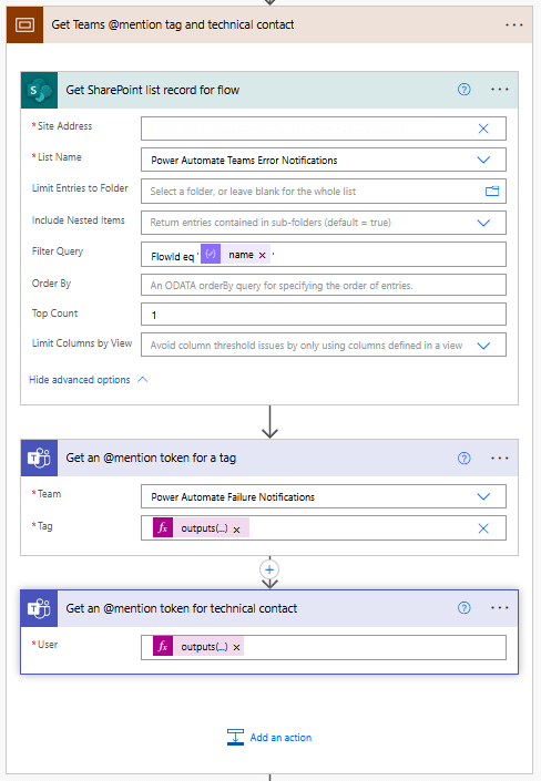
We begin this subprocess by using the SharePoint Get items action with the Filter Query:
FlowId eq 'body('Parse_workflowDetails_JSON')?['name']'.

Since each FlowID on our list should have only 1 record, we set the Top Count to 1.

Then, if our Power Automate Failure Notification Teams team uses Shared Channels, we use the Teams Get an @mention token for a tag and pass it the TagId stored within our SharePoint list using:
outputs('Get_SharePoint_list_record_for_flow')?['body/value'][0]?['TagId'].

If the notification team uses private channels, this action can be excluded.

Lastly, for both Shared and Private channel notifications, we use the Teams Get an @mention token for user action to get the token for the technical contact stored within our SharePoint list using:
outputs('Get_SharePoint_list_record_for_flow')?['body/value'][0]?['TechnicalContact']?['Email']

Send Teams Notification

Once we have retrieved the required contact details from SharePoint and Teams, the flow sends a notification to the appropriate Teams channel, notifying the relevant individuals. For Shared Channels, the message uses the @mention token for a Teams tag. If Private Channels are utilized, this should be removed from the flow and message.

Additionally, the message can be posted as the Flow bot when using Shared channels. However, when using Private channels, the message must be posted as User.

The flow dynamically sets the Channel using the ChannelId stored within our SharePoint list with the expression:
outputs('Get_SharePoint_list_record_for_flow')?['body/value'][0]?['ChannelId'].

The message begins by identifying the workflow in which an error was encountered and the environment in which it is running.

Error reported in workflow:
body('Parse_workflowDetails_JSON')?['tags']?['flowDisplayName'] {body('Parse_workflowDetails_JSON')?['tags']?['environmentName']}

Then, the message adds the HTML table created with the error message details using the following expression:
body('Create_HTML_table_with_error_action_and_message').

Finally, it notifies the contacts for the workflow by using the @mention tokens for the Teams tag and/or the technical contact. The message also provides the details on the functional contact using the expression:
outputs('Get_SharePoint_list_record_for_flow')?['body/value'][0]?['FunctionalContact']?['Email']

The notification process sends an informative and targeted message, ensuring all the appropriate individuals are alerted that an error has occurred within a workflow.

Reusability

This architecture enables us to develop a single workflow that can trigger error notifications for any new workflows, making our error handling and notification process scalable and more efficient.

By using this approach, we can avoid hardcoding notification logic and contact details in each of our workflows. Instead, we can centrally manage all error notifications. This reduces the time and effort needed to maintain consistent error notifications across multiple workflows.


Wrapping Up

This Power Automate error notification framework provides a scalable solution for managing notifications by centralizing contact information in a SharePoint list and leveraging solution-aware flows. Setting up a single, reusable notification flow eliminates the need to hardcode contact details within each workflow, making maintenance and updates more efficient.

The framework targeted two notification methods: Shared Teams channels with tags and Private Teams channels with direct mentions. This system ensures error notifications are delivered to the right individuals based on context and need.

Shared Channels with Teams Tags

This approach sends notifications to a shared Teams channel, with Teams tags allowing us to notify a group of individuals (such as a “Dev Team”) using a single @mention.

How It Works: The notification flow retrieves tag and channel details from the SharePoint list. It then posts the error notification to the shared channel, @mentioning the relevant Teams tag to ensure all tag members are alerted.

Advantages: This method is scalable and easy to manage. Team members can be added or removed from tags within Teams, so updates don’t require changes to the flow definition. This is ideal for notifying larger groups or managing frequent role changes.

Private Channels with Direct @Mentions

Private channels are used to send notifications directly alerting a technical contact when workflow and error details should not be visible to the entire Team.

How It Works: The flow dynamically retrieves contact details from the SharePoint list and posts the error notification to the private channel, mentioning the designated technical contact.

Advantages: This approach provides greater control over the visibility of the notifications, as access is restricted to only those users included in the private channel.

Each of these approaches is flexible and reusable across multiple workflows, simplifying the process of managing error notifications while ensuring messages reach the appropriate individuals based on the notification requirements.


Thank you for reading! Stay curious, and until next time, happy learning.

And, remember, as Albert Einstein once said, “Anyone who has never made a mistake has never tried anything new.” So, don’t be afraid of making mistakes, practice makes perfect. Continuously experiment, explore, and challenge yourself with real-world scenarios.

If this sparked your curiosity, keep that spark alive and check back frequently. Better yet, be sure not to miss a post by subscribing! With each new post comes an opportunity to learn something new.

Design Meets Data: A Guide to Building Engaging Power BI Report Navigation


Before we begin developing the navigational element of our reports, we must decide what tools to use. The Design Meets Data series started with two previous posts in which we explored two approaches: using Figma to design and customize our navigation and using Power BI’s built-in shapes, bookmarks, and buttons to create a similar experience with native tools.

From Sketch to Screen: Bringing your Power BI report navigation to life for an enhanced user experience.

User-Centric Design: Next level reporting with interactive navigation for an enhanced user experience

This post will explore using Power BI’s Page Navigator to simplify our navigation setup. Each approach has its own level of flexibility and ease of maintenance, so it’s important to choose the right method based on the project’s requirements.


The Power BI Page Navigator

Power BI’s Page Navigator lets us create a dynamic and interactive navigation menu in our reports. It is an out-of-the-box solution that simplifies the navigation experience.

Since the Page Navigator is a native feature, it requires minimal setup and automatically adjusts when new pages are added to the report. However, some adjustments may still be needed, such as resizing or formatting changes to accommodate report updates.

To add a Page Navigator to our report, we go to the Insert tab in Power BI Desktop, then select Navigator > Page navigator under the Buttons dropdown.

Customization Options

Power BI provides various options to customize the appearance of our Page Navigator, such as changing the font, colors, shapes, borders, and even what pages are listed. This allows us to create a navigational element that fits seamlessly within our report’s aesthetic.

Although the design flexibility is not as extensive as in our previous example using Figma, the Page Navigator option strikes a balance between ease of use and visual appeal.


Building the Navigation Pane

Now that we have covered the basics of the Page Navigator, we can begin building the navigation pane for our report. The navigation pane will be located on the left-hand side of our report and will serve as both the page navigation and container for our page slicers.

Below, is the final product. Follow the detailed step-by-step guide provided to create your own navigation pane

Building the navigation pane

We begin building the navigational pane on the left-hand side of our report canvas. First, we add a rectangle to the report canvas and style it to meet our needs. The navigation pane has a height equal to the report canvas and a width of 140. We set the fill color to dark blue, which is our Theme 1, 50% darker.

Next, we add a rectangle at the top of the navigation pane to provide an accent and space for displaying an organizational logo within our report. This rectangle has a height of 40 and a width of 140, and its fill color is set to the accent color of our report theme.

With the basic structure of our navigation pane in place, we then move on to adding the Page Navigator.

Formatting the Page Navigator

We begin by selecting the Insert tab on the main ribbon. Then, under the Button dropdown, select Navigator > Page navigator.

Once the Page Navigator is added to the report canvas, go to the Format pane and select Vertical from the Orientation dropdown under the Grid layout property.

Under the Pages property, we find options to control what pages are displayed within our report navigation. In the Options group, we can set general options such as Show hidden pages, Show tooltip pages, and Show all by default. Additionally, in the Show group, we can explicitly set which pages are shown in the navigation by using the toggles next to each report page.

Once our navigation displays the required pages, we adjust the width of the navigator object to 130 and the height to 105. Note that the height should be adjusted based on the number of pages in the navigation. In this example, we use a basic calculation to calculate the height by multiplying the number of pages by 35 ( 3 pages x 35 = 105).

Lastly, we set the horizontal position of the navigator object to 10 and the vertical position to 100.

Styling the Page Navigator

Once we finish the basic formatting, we customize the navigator to match the look of our report. Our aim with the styling is to make it easier to identify the current page.

We do this by adjusting the Style properties of the Page Navigator and using the Apply settings to State dropdown.

Below are the key differences between our page navigator’s Default, Hover, Press, and Selected states.

Default
Text > Font: Segoe UI
Text > Font Color: light blue, Theme color 1, 60% lighter
Text > Horizontal alignment: left
Text > Padding: left 5 px
Fill > Color: dark blue (#06435F)
Border: off
Shadow: off
Glow: off
Accent bar: off

Hover
Text > Font: Segoe UI Semibold
Text > Font Color: white
Text >Horizontal alignment: left
Text> Padding: left 5 px
Fill > Color: dark blue, Theme color 1, 25% darker
Border: off
Shadow: off
Glow: off
Accent bar: off

Press
Text > Font: Segoe UI Semibold
Text > Font Color: dark blue, Theme color 1, 50% darker
Text >Horizontal alignment: left
Text> Padding: left 5 px
Fill > Color: white
Border: off
Shadow: off
Glow: off
Accent bar: off

Selected
Text > Font: Segoe UI Semibold
Text > Font Color: dark blue, Theme color 1, 50% darker
Text >Horizontal alignment: left
Text> Padding: left 5 px
Fill > Color: white
Border: off
Shadow: off
Glow: off
Accent bar > Position: right
Accent bar > Color: accent green (#6CBE4B)
Accent bar > Width: 6px

After configuring all the styling options, our report page will have an engaging and interactive navigation panel.


Comparing the Approaches

When building a navigational component within our reports, we have a wide variety of options and approaches to choose from. Each report has unique requirements, so it’s important to compare and contrast these different approaches based on performance, ease of maintenance, and design flexibility.

Performance Comparison

Figma: Our Figma-based designs require importing images into Power BI. This can improve the load time of our reports because the report does not have to render each shape and component independently.

Power BI Native Shapes and Buttons: This option has the advantage of only requiring our development work to occur in Power BI. However, each shape and component added to build our navigation pane has to be loaded each time our report page is viewed.

Page Navigator: This offers a fully integrated approach with minimal overhead. However, we lose full control over design and aesthetics.

Ease of Maintenance

Figma: Our Figma-based approach is the most complex to maintain. Every design update requires going back to Figma, redesigning, re-exporting from Figma, and re-importing and integrating into our Power BI report.

Power BI Native Shapes and Buttons: This approach has the advantage of only using Power BI to maintain our navigational element but still requires manual updates when adding or removing pages from our report.

Page Navigator: This is the easiest option to maintain because the page navigator updates with any page additions or changes. However, the size of the object may still need to be adjusted.

Design Flexibility

Figma: Offers the highest level of design customization. We can create any design we can think up, however, this comes with added complexity and time requirements.

Power BI Native Shapes and Buttons: Provides us more flexibility than the page navigator, allowing us to customize our design and layout. However, we may still encounter design limitations depending on the options provided by Power BI.

Page Navigator: The most straightforward to implement but offers limited customization options, which restricts design flexibility. It prioritizes ease of maintenance over complex designs.


Final Thoughts

Deciding on the proper navigation for our Power BI reports depends on balancing design flexibility, ease of maintenance, and performance. Leveraging Figma allows for fully custom designs but comes with more complex maintenance. Power BI offers various native tools to help design navigational elements, although building a custom navigational pane will still require manual updates. Power BI’s Page Navigator stands out for its simplicity, dynamic updating, and minimal maintenance effort. However, the cost of the simplicity is limited customization and design flexibility.

The Design Meets Data series explored three approaches to building a Power BI report navigational pane.

From Sketch to Screen: Bringing your Power BI report navigation to life for an enhanced user experience.

User-Centric Design: Next level reporting with interactive navigation for an enhanced user experience

There are seemingly endless other approaches to creating this critical part of our Power reports. How do you approach your report’s navigation?


Thank you for reading! Stay curious, and until next time, happy learning.

And, remember, as Albert Einstein once said, “Anyone who has never made a mistake has never tried anything new.” So, don’t be afraid of making mistakes, practice makes perfect. Continuously experiment, explore, and challenge yourself with real-world scenarios.

If this sparked your curiosity, keep that spark alive and check back frequently. Better yet, be sure not to miss a post by subscribing! With each new post comes an opportunity to learn something new.

Explore Power BI Core Visualizations: Part 3 – Pie, Donut, and Treemap


Pie, Donut, and Treemap charts can be helpful tools when we need to show how different parts contribute to a whole. Pie charts represent data as slices of a circle and show the relationship of parts to a whole. Donut charts are similar to pie charts. However, their center is blank, providing space to add a label or other icon. Treemap charts use nested rectangles to visualize each level of hierarchy in our data.

These charts can be helpful for specific visualizations, but it is important to recognize their limitations. As with all of our data visualization tasks, choosing the right type of visual is essential. To explore bar and column charts, visit Part #1 of this series, and to learn more about line and area charts, check out Part #2.

Chart your data journey! Transform data into insights with Power BI core visualizations. 

Chart your data journey! Transform data into insights with Power BI core visualizations. 


Customizing Pie Charts

Customizing our pie charts enhances their clarity, making it easier for our report viewers to interpret the data.

Adjusting Colors

The color choices used in our pie charts play a crucial role in their readability. Within the Slices property of our Pie chart, we can customize the colors used for each slice. When selecting colors, we should ensure they are visually distinct and that the colors used for our data categories are consistent across all visuals on the page and within the report.

We set the color of our slices in the Format pane, under the slices section. Here, we will find each data category included in the chart, and we can explicitly see the color.

Formatting Data Labels

The data labels on our pie charts help convey important insights to our viewers. Within the Data label properties of our pie chart we find several options to edit and format our data labels. We have options to set the position of our data labels (e.g. outside, prefer inside), what information to display such as category name, values, or percent of total, and under the Value grouping, we can format the text of the data labels.

Using a combination of these properties, we can make our charts more informative at a glance. For example, we can improve the above plot by displaying the category name and percent of total directly on our chart.

It is important to be cautious when using data labels. We want to provide essential information without overcrowding the chart with too much text. Adjusting the font size, background, font color, and label position can help us maintain a clean and organized look.

Using Legends Effectively

Our data labels display information directly on our charts, while legends offer a clean way to display what data category corresponds to which chart slice. Within the Legend properties we can set the position of the legend, set the title, and format the text and title of the legend.

We can update the Pie chart above to display the legend and then update the data label to display the total sales value and the percent of total value.

When using pie charts, it is important to limit the number of categories to ensure clarity. Pie charts are most effective when displaying data with no more than a few slices. If this cannot be accomplished, it’s best to consider other visuals to provide our insights.


Customizing Donut Charts

Donut charts provide an alternative to pie charts, with the added benefit of a central blank space. This space can be used for a variety of purposes or left blank. By customizing our donut charts, we can enhance their effectiveness and make them more informative and engaging.

Like pie charts, donut charts allow us to set the color of each chart slice, use data labels to provide additional information and position the legend to provide additional context.

Donut charts also offer additional properties we can customize to enhance these charts even further.

Modifying the Inner Radius

One of the main differences between our pie and donut charts is the open area in the center. Within the Slices property grouping, we will find a Spacing option. Here, we can adjust the inner radius, controlling how wide or narrow the chart’s ring appears.

Increasing this value creates a more pronounced donut shape, which can help draw viewers’ attention to the center of the chart. Decreasing this value makes the chart look more like a traditional pie chart.

Donut charts can be helpful when we need to compare proportions while also displaying an aggregate metric that we can place in the open center of the visual. However, like pie charts it is important to only use these charts when there is a small and manageable number of segments. When there are too many segments, donut and pie charts become cluttered and difficult to interpret.

When using these comparison charts, we should aim for simplicity and clarity.


Customizing Treemap Charts

Treemap charts are useful when visualizing hierarchical data. They allow us to display a large amount of information in a compact space. Each category in the visual is represented by a rectangle, the size of which reflects the category’s value.

Treemap charts offer various properties that we can customize to enhance their clarity, ensuring they effectively convey complex data structures and insights.

Adjusting the Colors

In our treemap visuals, colors distinguish between our different categories. Like in our other charts, we can set the color for each category, and it is important that this color selection is consistent across all visuals within our report. For example, we can create a treemap of our Total Sales by product category and product code and set the colors for each category to ensure visual consistency.

Setting Labels and Viewing Tooltips

Like many of our other Power BI visuals, Treemap visuals allow us to customize visual labels and tooltip properties to improve the readability of our visuals. Labels on our visuals provide context by displaying category names and values directly within each rectangle. By using the options available under the data labels and categories labels we can adjust the font size, color, display units, and the number of decimal places to improve the clarity of our visual.

We will use these properties to improve the treemap above by increasing the font size and weight of the category labels so they are easily identifiable. We will also turn on data labels to provide our viewers with precise information for the largest contributors.

Tooltips are another feature common across our Power BI visuals that adds an interactive element to our reports and can provide our viewers with additional information. When a user hovers over a rectangle, a tooltip appears, providing them with information about that category. Additionally, the information included within the tooltip can be customized to provide further context, such as percentages or other metrics.

In treemaps, some rectangles may be too small to display the data label, and tooltips become a valuable asset for delivering details without cluttering the visual.

Using Drill-Down Features

One strength of treemaps is their ability to represent hierarchical data. Power BI’s drill-down functionality lets us explore these hierarchies in detail. A user can use the drill-down feature to drill into the next level of the hierarchy, focusing on the subcategories or finer details of the data.

Drill-down features provide our viewers with another interactive element, allowing them to explore the dataset at multiple levels without overwhelming them with too much information upfront.

In our example treemap above, the first-level category is Product, and the second is Region. This allows our viewers to drill into a product category to view the distribution of product sales across sales regions.

Treemap charts can be a helpful tool for comparing proportions within hierarchical data. However, they are most effective when the differences in value between categories are significant. When all categories are similar in size, the visual can be difficult to interpret, so it is important to evaluate whether a treemap is appropriate for each use case.


Advanced Techniques and Customizations

Current Year Sales by Product Selection

The Current Year Sales donut chart helps visualize how a selected product contributes to the total current year sales.

To build this visual, we first, create two measures: Total Sales CY and Remaining CY Sales.

The Total Sales CY measure calculates the current year’s total sales, and the Remaining CY Sales calculates the difference between the total sales of all products and the selected product’s sales.

Total Sales CY = TOTALYTD([Total Sales], DateTable[Date])
Remaining CY Sales = 
VAR _allSales = CALCULATE([Total Sales CY], ALL(Sales))

RETURN
_allSales - [Total Sales CY]

We then add these two measures to our donut chart’s Values property and set the color of the Total Sales CY to a dark blue and Remaining CY Sales to a light gray.

We then turn off the legend, and update the data labels to show only the percent of total value.

Next, we create a new measure that will be used for the visual subtitle. The subtitle provides additional context by showing how close the product’s sales are to hitting a sales target, and how this year’s sales compare to last year’s sales for the same period of time.

Product Sales Subtitle = 
VAR _lyYTDSales = 
   TOTALYTD(
      [Total Sales],
      DATESBETWEEN(
         DateTable[Date], 
         DATE(MAX(DateTable[Year])-1, 1, 1), 
         DATE(YEAR(TODAY())-1, MONTH(TODAY()), DAY(TODAY()))
      )
   )
VAR _compare = 
   [Total Sales CY] - _lyYTDSales
VAR _percentDiff =
    _compare/((_lyYTDSales+[Total Sales CY])/2)

RETURN
FORMAT(
   [CY Sales Percent of Target], "0.0%") 
   & " of Sales Target | " 
   & IF(_compare<0, "▼", "▲") 
   & FORMAT(ABS(_percentDiff), "0.0%") & " compared to previous"

Lastly, we use the empty center of the donut chart to provide additional details to our viewers. Here, we display the total sales value for the selected product and add a dynamic label to clearly show what the sales value represents.

To do this we create another measure to dynamically update based on user selections. The Selected Product measure shows “All Products” when there is no product selection; otherwise, it displays the selected product name, or when there are multiple selections, it displays a list of all the selected products.

Selected Product = 
IF (
    ISFILTERED ( Products[Product] ),
    IF (
        HASONEVALUE ( Products[Product] ),
        VALUES ( Products[Product] ),
        CONCATENATEX ( 
            ALLSELECTED ( Products[Product] ), 
            Products[Product], 
            ", "
        ) & " Sales"
    ),
    "All Products"
)

Current Year Regional Sales

The Current Year Regional Sales donut chart compares sales across different sales regions.

We start building this chart with a series of measures. First, a set of measures calculating the current year sales for each region.

Asia Sales CY = CALCULATE([Total Sales CY], Regions[Region]="Asia")
Europe Sales CY = CALCULATE([Total Sales CY], Regions[Region]="Europe")
US Sales CY = CALCULATE([Total Sales CY], Regions[Region]="United States")

Then, we add another set of measures calculating the difference between the total sales and the region-specific sales.

Asia Sales CY Diff = [Total Sales CY] - [Asia Sales CY]
Europe Sales CY Diff = [Total Sales CY] - [Europe Sales CY]
US Sales CY Diff = [Total Sales CY] - [US Sales CY]

Similar to the visual above, we add the region-specific measures to a donut chart and format them to appear as concentric donut charts. This is done by turning off the border and background of the two inner donut charts and resizing them.

Next, we build a customized legend element that not only shows the total sales for each region but also the percentage that each region contributes to the overall sales. The percentage of overall sales is calculated using 3 new measures.

Asia CY % Sales = DIVIDE([Asia Sales CY], [Total Sales CY])
Europe CY % Sales = DIVIDE([Europe Sales CY], [Total Sales CY])
US CY % Sales = DIVIDE([US Sales CY], [Total Sales CY])

This visual is also dynamic based on the user interaction and selections made on the product slicer.

This visual provides our viewers with a quick comparison of regional sales. It clearly shows the sales distribution across our regions, allowing our viewers to identify which regions have the highest or lowest sales.


Wrapping Up

In this part of the series, we explored Pie, Donut, and Treemap charts and how to effectively use and customize these visuals in our Power BI reports. Pie and Donut charts can be helpful tools when displaying proportions but should be used selectively when comparing only a few categories. Treemap charts excel at displaying hierarchical data and provide us with a compact and insightful way to visualize this data.

While these visuals can prove to be just the right fit for a given requirement, they must only be used in the right scenarios, with an emphasis on simplicity and clarity.

In the next part of the series, we will explore Power BI’s Gauge, Card, and KPI visuals. These visuals help us display metrics and provide at-a-glance insights into key data points.


Thank you for reading! Stay curious, and until next time, happy learning.

And, remember, as Albert Einstein once said, “Anyone who has never made a mistake has never tried anything new.” So, don’t be afraid of making mistakes, practice makes perfect. Continuously experiment, explore, and challenge yourself with real-world scenarios.

If this sparked your curiosity, keep that spark alive and check back frequently. Better yet, be sure not to miss a post by subscribing! With each new post comes an opportunity to learn something new.

Power Query Functions: Building Flexible and Reusable Data Cleaning Routines


When extracting and transforming data in Power BI, we often repeat the same steps across different projects. This repetition raises the question: can these steps be generalized and reusable in future projects?

This post will explore a solution that breaks down these steps into flexible and reusable parameters and functions, eliminating the need to recreate these common steps across our projects. The solution leverages parameters, functions, and queries to standardize various parts of our data preparation process when CSV files in a SharePoint document library are the data source.

Don’t just read; get hands-on and view all the details in the template report available here:

This repository provides a Power BI template and sample CSV files for automating and standardizing CSV data transformation from SharePoint using Power Query functions.


Power Query Parameters

Parameters help keep our data preparation process as dynamic as possible. They provide a level of flexibility to our Power Query functions and allow us to modify their behavior without altering the underlying function definition. This flexibility enables this solution to adapt to different requirements and increases the reusability of our work.

In our solution, 7 parameters manage how data is loaded, cleaned, and transformed.

SharePoint Site Url (Text): specifies the SharePoint site URL where the CSV files are stored.

https://yourcompany.sharepoint.com/sites/yoursite

SharePoint Folder Path (Text): defines the folder path within the SharePoint site where the CSV files are located.

https://yourcompany.sharepoint.com/sites/yoursite/yourfolder/

textColumns (Text): a comma-separated list of column names that require text transformations.

Column Name 1, Column Name 2, Column Name 3

textFormatCase (Text): a text value that specifies how text columns should be formatted. Options include Proper, Lower, and Upper case.

columnDataTypes (Text): a semicolon-separated list of column names paired with their corresponding data type description, used to dynamically set the data types of each column.

Column Name 1,date;
Column Name 2,whole number;
Column Name 3,text;
Column Name 4,text;
Column Name 5,text;
Column Name 6,whole number;
Column Name 7,decimal number

errorHandlingOption (Text): sets how errors are handled within the dataset and provides the options of RemoveErrors, ReplaceErrors, or None.

viewErrorSummary (TRUE/FALSE): toggles between displaying a summary of rows that contain errors and returning the cleaned dataset.

Once we create our parameters and set their values, we can reference them throughout our functions and queries. This enables us to adjust the entire data transformation process by updating the parameter values.


Supporting Utility Functions

To enhance the reusability of our Power Query solution, we first break down complex data transformations into smaller, modular functions. Each utility function handles a specific task, improving its maintainability and allowing us to apply them individually or collectively across different datasets.

fxParameterToList

(parameterName as text) as list => 
   List.Transform(Text.Split(parameterName, ","), each Text.Trim(_))

Many of our parameters in this solution are comma-separated strings that we must convert to list objects before using them in a list-based transformation within Power Query. Since many of our parameters and functions require this, creating a function allows us to repeat this operation easily.

The function has a single input parameter (parameterName), a comma-separated string of values. It then splits this input by commas, trims surrounding spaces, and converts the result into a list. This is used when calling and passing parameter values to other utility functions such as fxTransformTextFormat and fxTransformTextTrim.

fxTransformTextTrim

The fxTransformTextTrim function trims any leading and trailing spaces from text values in the specified columns. Trimming can be essential when cleaning user-entered data or other text extracted from external sources.

(inputTable as table, columnsToTrim as list) as table =>
    Table.TransformColumns(inputTable, List.Transform(columnsToTrim, each {_, Text.Trim, type text}))

This function has two input parameters:

  • inputTable: a table containing the data to be trimmed
  • columnsToTrim: a list of text columns that require trimming

The fxTransformTextTrim function applies Text.Trim to each column specified in columnsToTrim, ensuring our text data is clean and consistent.

fxTransformTextFormat

The fxTransformTextFormat function standardizes the case formatting of our text data depending on the caseType input parameter. Depending on our requirements, the function can convert text data to Proper Case, Lower Case, or Upper Case.

(inputTable as table, columnsToTransform as list, caseType as text) as table =>
    let
        // Determine the transformation function based on caseType input
        CaseFunction = if caseType = "Proper" then Text.Proper
                       else if caseType = "Lower" then Text.Lower
                       else if caseType = "Upper" then Text.Upper
                       else error "Unsupported case type: Use 'Proper', 'Lower', or 'Upper'",

        // Apply the selected case transformation to each column in the list
        TransformTextCase = Table.TransformColumns(inputTable, List.Transform(columnsToTransform, each {_, CaseFunction, type text}))
    in
        TransformTextCase

This function has three input parameters:

  • inputTable: a table containing the data to be transformed
  • columnsToTransform: a list of columns that require text formatting
  • caseType: a text value specifying the desired text format (Proper, Lower, or Upper)

Using the caseType parameter, the function identifies the transformation type and then applies the transformation to the specified columns.

fxTransformRemoveDuplicates

The fxTransformRemoveDuplicates is a straightforward function that removes duplicated rows within our dataset.

(inputTable as table) as table =>
Table.Distinct(inputTable)

This function has a single parameter:

  • inputTable: a data table to remove duplicate rows from

The function uses Table.Distinct to identify and remove duplicated rows and returns a table with each row being unique.

fxTransformSetDataTypes

The fxTransformSetDataTypes function maps a textual description of the data type to the Power Query data type. The function allows dynamically setting column data types based on our columnDataTypes Power Query parameter.

(columnType as text) as type =>
    let
        lowerColumnType = Text.Lower(columnType),
        columnTypeResult = 
            if lowerColumnType = "decimal number" then type number
            else if lowerColumnType = "fixed decimal number" then type number
            else if lowerColumnType = "whole number" then Int64.Type
            else if lowerColumnType = "percentage" then type number
            else if lowerColumnType = "date/time" then type datetime
            else if lowerColumnType = "date" then type date
            else if lowerColumnType = "time" then type time
            else if lowerColumnType = "date/time/timezone" then type datetimezone
            else if lowerColumnType = "duration" then type duration
            else if lowerColumnType = "text" then type text
            else if lowerColumnType = "true/false" then type logical
            else if lowerColumnType = "binary" then type binary
            else type text // Default to text if the type is unrecognized
    in
        columnTypeResult

The function has a single input parameter:

  • columnType: a text value of the data type to set for a column

This function helps us leverage common textual descriptions to set Power Query data types across our dataset columns.

fxErrorHandling

The fxErrorHandling function allows us to manage how our dataset handles errors based on our requirements. We can use the function’s input parameter to remove rows containing errors, replace error values with null, or retain the errors within the dataset.

(inputTable as table, errorHandlingOption as text) as table =>
let
    ErrorRows = Table.SelectRowsWithErrors(inputTable),
    
    // Determine the action based on the error handling option provided
    ErrorHandlingResult = 
    if errorHandlingOption = "RemoveErrors" then
        // Remove rows with any errors
        Table.RemoveRowsWithErrors(inputTable)
    else if errorHandlingOption = "ReplaceErrors" then
        // Replace errors with a specified value (default is "Error" if replaceValue is not provided)
        let
            ReplaceErrorsStep = 
                let
                    // Get a list of column names
                    columnNames = Table.ColumnNames(inputTable),
                    // Create a list of replacement rules where each column is mapped to null in case of error
                    errorReplacementList = List.Transform(columnNames, each {_, null})
                in
                    Table.ReplaceErrorValues(inputTable, errorReplacementList)
        in
            ReplaceErrorsStep
    else
        // If the parameter is not set correctly, return the data as is
        inputTable,

    Output = if viewErrorSummary then ErrorRows else ErrorHandlingResult
in
    Output

The function has two input parameters:

  • inputTable: a data table to be evaluated for errors
  • errorHandlingOption: specifies how the errors within inputTable should be handled (RemoveErrors, ReplaceErrors, None)

The function also utilizes the viewErrorSummary Power Query parameter. This parameter can be set to TRUE/FALSE and determines whether to return an error summary or the cleaned dataset.

This function identifies rows with errors. Depending on the errorHandlingOption, it will remove the rows containing errors, replace the error values with null, or return inputTable without handling the errors.

If viewErrorSummary is set to TRUE, the function returns only the rows that contain errors, allowing us to inspect the errors further within our dataset.


Core Function – TranformCSV

The fxTransformCSV function is the start of our standardized data processing solution, designed to handle our CSV files in a modular and reusable way.

It takes the raw contents of our CSV files, applies a defined set of transformations, and then outputs a clean data table ready for our analysis. This function leverages the utility functions discussed in the previous section.

(FileContent as binary) =>
let
    //STEP 01: Importing CSV files
    ImportCSV = Csv.Document(FileContent,[Delimiter=",", Encoding=1252, QuoteStyle=QuoteStyle.None]),
    PromoteHeaders = Table.PromoteHeaders(ImportCSV, [PromoteAllScalars=true]),
    
    //STEP 02: Cleaning blank rows/columns
    //Clean blank rows
    RemoveBlankRows = Table.SelectRows(PromoteHeaders, each not List.IsEmpty(List.RemoveMatchingItems(Record.FieldValues(_), {"", null}))),
    //Clean blank columns
    RemoveBlankColumns = Table.SelectColumns(RemoveBlankRows, List.Select(Table.ColumnNames(RemoveBlankRows), each not List.IsEmpty(List.RemoveMatchingItems(Table.Column(RemoveBlankRows, _), {""," ", null})))),
    
    //STEP 03: Replace empty strings with  null
    ReplaceValue = Table.ReplaceValue(RemoveBlankColumns,"",null,Replacer.ReplaceValue,Table.ColumnNames(RemoveBlankColumns)),
    
    //STEP 04: Remove duplicates
    RemoveDuplicates = fxTransformRemoveDuplicates(ReplaceValue),

    //STEP 05: Text transformations
    // Convert the textColumns parameter into a list
    TextColumnsToTransform = fxParameterToList(textColumns),
    // Apply the TrimTextColumns function
    TrimTextColumns = fxTransfromTextTrim(RemoveDuplicates, TextColumnsToTransform),
    // Apply the TransformTextCase function for Proper Case (can also be "Lower" or "Upper")
    FormatTextColumns = fxTransformTextFormat(TrimTextColumns, TextColumnsToTransform, textFormatCase)

in
    FormatTextColumns

Breaking Down fxTransformCSV

STEP 01: Importing the CSV files

The function begins by reading the contents of the CSV files and then promotes the first row to headers.

//STEP 01: Importing CSV files
    ImportCSV = Csv.Document(FileContent,[Delimiter=",", Encoding=1252, QuoteStyle=QuoteStyle.None]),
    PromoteHeaders = Table.PromoteHeaders(ImportCSV, [PromoteAllScalars=true]),

STEP 02: Cleaning blank rows/columns

The next step, which begins our transformation steps, removes any empty rows or columns. By eliminating these blank rows or columns early in our process, we avoid potential issues downstream and reduce clutter in the dataset.

    //STEP 02: Cleaning blank rows/columns
    //Clean blank rows
    RemoveBlankRows = Table.SelectRows(PromoteHeaders, each not List.IsEmpty(List.RemoveMatchingItems(Record.FieldValues(_), {"", null}))),
    //Clean blank columns
    RemoveBlankColumns = Table.SelectColumns(RemoveBlankRows, List.Select(Table.ColumnNames(RemoveBlankRows), each not List.IsEmpty(List.RemoveMatchingItems(Table.Column(RemoveBlankRows, _), {""," ", null})))),

STEP 03: Replace empty strings with null

Empty strings can cause common issues in our analysis. This step replaces empty string values in the dataset with null, making the data more consistent, better understood, and easier to work with.

    //STEP 03: Replace empty strings with  null
    ReplaceValue = Table.ReplaceValue(RemoveBlankColumns,"",null,Replacer.ReplaceValue,Table.ColumnNames(RemoveBlankColumns)),

STEP 04: Remove duplicates

Using the fxTransformRemoveDuplicates utility function, this step removes duplicated rows from the dataset.

//STEP 04: Remove duplicates
    RemoveDuplicates = fxTransformRemoveDuplicates(ReplaceValue),

STEP 05: Text transformations

The text transformations start with trimming our text values to ensure there are no leading or trailing spaces, using the fxTransformTextTrim utility function.

Then, the text values get standardized using the fxTransformTextFormat utility function to make our data more readable and consistent.

//STEP 05: Text transformations
    // Convert the textColumns parameter into a list
    TextColumnsToTransform = fxParameterToList(textColumns),
    // Apply the TrimTextColumns function
    TrimTextColumns = fxTransfromTextTrim(RemoveDuplicates, TextColumnsToTransform),
    // Apply the TransformTextCase function for Proper Case (can also be "Lower" or "Upper")
    FormatTextColumns = fxTransformTextFormat(TrimTextColumns, TextColumnsToTransform, textFormatCase)

Core Function – LoadCSVData

The LoadCSVData function is the layer connecting the different elements of our Power Query solution. It loads multiple CSV files from our SharePoint source, applies the fxTransformCSV function to each file, and handles final data preparations.

This function is adaptable by leveraging Power Query parameters, allowing us to easily modify the data preparation process to meet our project’s requirements (e.g. switching to different SharePoint sites or folders).

() as table =>
let
    
    //STEP 01: Load files from SharePoint
    SharePointSite = SharePoint.Files(#"SharePoint Site Url", [ApiVersion = 15]),
    SharePointFolder = Table.SelectRows(SharePointSite, each ([Folder Path] = #"SharePoint Folder Path")),
    
    //STEP 02: Invoke the fxTransformCSV function for each file
    TransformCSVResult = Table.AddColumn(SharePointFolder, "TransformCSV", each fxTransformCSV([Content])),
    
    //STEP 03: Renaming and removing columns
    // Rename the "Name" column for clarity
    PrefixSouceName = Table.RenameColumns(TransformCSVResult,{{"Name", "source.Name"}}),
    // Remove other columns to focus on the transformed data
    RemoveColumns = Table.SelectColumns(PrefixSouceName,{"source.Name", "TransformCSV"}),
    
    //STEP 04: Expand the transformed CSV data
    ExpandTransformCSV = Table.ExpandTableColumn(RemoveColumns, "TransformCSV", Table.ColumnNames(TransformCSVResult{0}[TransformCSV])),

    //STEP 05: Set data types
    ColumnTypePairs = Text.Split(columnDataTypes, ";"),
    // Trim spaces and split each pair into a list of {column name, data type}
    ColumnTypeList = List.Transform(ColumnTypePairs, each 
        let
            PairParts = List.Transform(Text.Split(_, ","), Text.Trim),
            ColumnName = List.First(PairParts),
            ColumnType = fxTransformSetDataTypes(List.Last(PairParts))
        in
            {ColumnName, ColumnType}
    ),
    // Dynamically set the column data types
    SetDataTypes = Table.TransformColumnTypes(ExpandTransformCSV, ColumnTypeList),

    //STEP 06: Error handling
    ErrorHandlingOutput = fxErrorHandling(SetDataTypes, errorHandlingOption)
in
    ErrorHandlingOutput

Breaking down fxLoadCSVData

STEP 01: Load files from SharePoint

The function begins by connecting to the specified SharePoint site using the SharePoint Site Url parameter. Then, it filters the files to those located within the specified SharePoint Folder Path. Using both parameters allows us to target the specific CSV files required for our analysis.

//STEP 01: Load files from SharePoint
SharePointSite = SharePoint.Files(#"SharePoint Site Url", [ApiVersion = 15]),
SharePointFolder = Table.SelectRows(SharePointSite, each ([Folder Path] = #"SharePoint Folder Path"))

STEP 02: Invoke the fxTransformCSV function for each file

For each file in our SharePoint source, we add a new column and invoke our custom fxTransformCSV function. This step ensures each file is processed consistently.

//STEP 02: Invoke the fxTransformCSV function for each file
TransformCSVResult = Table.AddColumn(SharePointFolder, "TransformCSV", each fxTransformCSV([Content]))

STEP 03: Renaming and removing columns

To improve the clarity of our columns, we renamed the Name column to source.Name, indicating that it represents the original file name. This clearly indicates what this column is while providing information on the file the row of data is associated with.

The function then removes unnecessary columns, and we keep only source.Name and TransformCSV columns.

//STEP 03: Renaming and removing columns
// Rename the "Name" column for clarity
PrefixSouceName = Table.RenameColumns(TransformCSVResult,{{"Name", "source.Name"}}),
// Remove other columns to focus on the transformed data
RemoveColumns = Table.SelectColumns(PrefixSouceName,{"source.Name", "TransformCSV"})

STEP 04: Expand the transformed CSV data

We expand the TransformCSV column into individual files, which compiles all the transformed CSV data into a single table.

//STEP 04: Expand the transformed CSV data
ExpandTransformCSV = Table.ExpandTableColumn(RemoveColumns, "TransformCSV", Table.ColumnNames(TransformCSVResult{0}[TransformCSV]))

STEP 05: Set data types

In this step, the function dynamically sets the data types for each column based on the columnDataTypes Power Query parameter. The TransformSetDataTypes function maps each column to its specified data type.

//STEP 05: Set data types
ColumnTypePairs = Text.Split(columnDataTypes, ";"),
// Trim spaces and split each pair into a list of {column name, data type}
ColumnTypeList = List.Transform(ColumnTypePairs, each 
    let
        PairParts = List.Transform(Text.Split(_, ","), Text.Trim),
        ColumnName = List.First(PairParts),
        ColumnType = fxTransformSetDataTypes(List.Last(PairParts))
    in
       {ColumnName, ColumnType}
),
// Dynamically set the column data types
SetDataTypes = Table.TransformColumnTypes(ExpandTransformCSV, ColumnTypeList)

STEP 06: Error handling

The function concludes by handling errors in the dataset according to the errorHandlingOption parameter. If the viewErrorSummary is set to true, the function returns a summary of rows that contain errors, otherwise it returns the cleaned dataset.

//STEP 06: Error handling
ErrorHandlingOutput = fxErrorHandling(SetDataTypes, errorHandlingOption)

Applying and Extending the Power Query Solution

We have explored and started constructing a flexible approach to standardize and ensure our data preparation steps are applied consistently within and across our Power BI projects.

The final query loaded to our Power BI data model is rpt_SharePointCSVData. This query utilizes the fxLoadCSVData function to bring each step together and deliver a clean and consistent data set to our Power BI report.

let
    Source = fxLoadCSVData()
in
    Source

This simple query calls the fxLoadCSVData function, which loads and processes the CSV files according to previously defined transformations and parameters. The result is a clean, ready-to-use dataset.

This solution is designed to be adaptable and can be applied to different Power BI projects that require loading CSV files from a SharePoint source.

A Power BI template and sample data files are available at the link below to view an example of how this solution can be applied. This file can be used as a starting point for our Power BI projects, or you can copy and paste specific folders or elements of it into an existing project.

This repository provides a Power BI template and sample CSV files for automating and standardizing CSV data transformation from SharePoint using Power Query functions.

To successfully apply this solution:

Start with the Parameters: define the parameters relevant to the project.

Open the template file and, when prompted, populate each parameter with the required information.

For example, the parameters can be set using the sample files to the following.

SharePoint Site Url: 
https://yourcompany.sharepoint.com/sites/yoursite

SharePoint Folder Path:
https://yourcompany.sharepoint.com/sites/yoursite/yourfolder/

textFormatCase:
Proper

textColumns:
Event Name, Location, Organizer Name

columnDataTypes:
Event Date,date;Event ID,whole number;Event Name,text;Location,text;Organizer Name,text;Number of Attendees,whole number;Feedback Score,decimal number

errorHandlingOption:
ReplaceErrors

viewErrorSummary:
FALSE

Then, under the Load dropdown, select Edit to explore this solution in the Power Query Editor.

Once the data is loaded, you can modify the textFormatCase, error handling option, and viewErrorSummary parameters in the Power Query Editor to view the results when you select different options.

Customize the Utility Functions: if different projects have unique requirements, consider modifying or extending the utility functions.

Leverage the modular structure: This solution’s modular design makes adding or removing steps easy based on the project’s specific needs.

Extend with new functions: as our data processing needs evolve, we can extend this solution by adding new functions or adding more flexibility to our existing ones.


Wrapping Up

This post explores a solution that leverages Power Query parameters, functions, and queries to streamline our data preparation process. Combining custom functions with parameters provides us with a framework that can be adapted to meet the demands of different projects.

The design approach used in this solution aims to enhance the maintainability and reusability of each of its components. As we continue to work with and expand this solution, we will build a library of reusable functions to increase our efficiency in future projects.


Thank you for reading! Stay curious, and until next time, happy learning.

And, remember, as Albert Einstein once said, “Anyone who has never made a mistake has never tried anything new.” So, don’t be afraid of making mistakes, practice makes perfect. Continuously experiment, explore, and challenge yourself with real-world scenarios.

If this sparked your curiosity, keep that spark alive and check back frequently. Better yet, be sure not to miss a post by subscribing! With each new post comes an opportunity to learn something new.

Explore Power BI Core Visualizations: Part 2 – Line and Area Charts


Welcome back to our exploration of the core visuals in Power BI. In Explore Power BI Core Visualizations Part 1 we explored bar and column charts and how they can be used and customized within our report to provide insights.

Now, we will explore another set of visuals in Power BI: Line and Area charts. These visuals are essential tools for displaying trends and patterns over time, making them ideal for analyzing time series data, monitoring performance, or illustrating cumulative values.

Let’s dive in and explore how to create, customize, and enhance our Line and Area Charts in Power BI to elevate our reports.


Types of Line Charts

Line charts are a fundamental tool in data visualization, especially when it comes to displaying trends and changes over time. A line chart provides our viewers a continuous flow of connected data points that are easy to follow and makes them ideal for visualizing trends.

In Power BI, we have several varieties of line charts, each serving a unique purpose and offering different way to analyze and display different data. Let’s explore these main types.

Line Chart

A standard line chart is the simplest form, and typically used to display time on our x-axis and a metric being measured on the y-axis. This type of chart is excellent for tracking sales or other metrics over months, quarters, or years.

Line and Stacked Column Chart

Line and stacked column charts combines a line chart with a stacked column chart, providing a dual perspective on our data. The line represents one metric, while the stacked column represents another. This type of chart can be useful for comparing the overall distribution of different categories along with the trend of a key metric.

For example, we can use a line and stacked column chart to display our year-to-date cumulative sales as a continuous series while showing the monthly contribution of each sales region.

Line and Clustered Column Chart

The line and clustered column chart is another hybrid visual that combines a line and clustered column charts. In this chart type, columns represent individual categories clustered together, while the line element shows the trend of a specific metric. For example, we can show a comparison of the previous year and current year monthly total sales as our clustered columns and the average sales for each year over time on our line axis.

Each of these chart types provides a unique way to visualize data, offering flexibility and depth to our analysis. Understanding when and how to use these different line charts can greatly enhance our ability to communicate data insights effectively.


Customizing Line Charts

Customizing line charts in Power BI allows us to create visually appealing and informative visuals that effectively communicate our data trends to our viewers. There are various ways and opportunities for out of the box thinking when it comes to our customizations. Here we will focus on some of the main customization options available across all of the line chart types.

Line Color and Styles

To make our lines more visually distinct we can leverage the properties found under the Line property group. These options let us define the color, style, and thickness of all the lines on our chart or for specific series.

Let’s explore these options to improve the Total & Average Sales Line and Clustered Column visual shown above.

We start by adjust our colors, we will keep a blue color theme for 2024 data and use a gray color theme for 2023 data. Under our Lines property setting we select our Average Sale 2024 in the Series drop down and select 60% lighter color of our dark blue in our Power BI theme, keeping it consistent and corresponding to the 2024 column.

Next, we select the Average Sale 2023 series in the Series dropdown and set the color to a gray. We select a color that is light enough to contrast with the dark blue bars, yet dark enough to contrast the light-colored background of the visual.

This slight change already improves our visual’s clarity, but we can go one step further. In addition to using different colors to differentiate our lines we can use different styles to further differentiate our series. Here, with the Average Sale 2023 series selected, under the Line options we set the Line style to Dashed and reduce the width to 2px.

Data Markers and Labels

In addition to setting different colors and styles for our lines, we can also set the data marker style or not show them at all.

Data markers make it easier to identify specific values and can help compare different values. For example, in the above visual we only show data labels for the Average Sale 2024 series. However, since we show the data markers for both series, we can present our user the current year’s average and its value, and then it can easily be compared to the previous year’s data marker.

Let’s further clarify our different series by setting the data marker for our Average Sale 2023 to a diamond shape and reduce its size to 4px. We select the series we want to modify from the drop down, and then select diamond in the shape dropdown and then reduce the size.

Adding data labels to our visuals provides our viewer additional context and precise information by displaying the value of each data point on the chart. We find the options to customize our data labels under the Data labels property group. Here, we find options to set the position of our data labels, display a title, customize the value displayed and how it is formatted, add additional detail to display another value, set the background of the label, and define whether the label should appear on a single line or multiple lines.

To help not clutter our Total & Average Sales visual we turn off the labels for the 2023 column and series. To do this we select each series in the Series dropdown and toggle off the Show for this series option.

Then we modify our data labels for our 2024 columns and Average Sale 2024 series. We start with our 2024 column data label and select it in the Series dropdown. Then we set the background of the data label to the same color as the column, set the value color to white, and under the options settings we select Outside end in the Position (column) dropdown.

Then we select our Average Sale 2024 in the Series dropdown, set the background to the same color as the line, the value color to a dark blue, and select Above in the Position (line) dropdown.

By customizing our line color, style, data markers and data labels our visual now more clearly differentiates between our 2024 and 2023 data through the use of different colors and styles. Clearly labeling our 2024 data points provide precise information for the current year data, while also being able to relatively compare this value to the previous year data.

Other Customizations

There are many other customization options available. There are other line chart specific options to explore including series labels and shading the area under the line series. Then there are also customization options that are common across many different visual types including formatting the x- and y-axis, the legend, gridline, tooltips, etc. For examples and an exploration of these common options visit Part 1 of this series.

Chart your data journey! Transform data into insights with Power BI core visualizations. 

By customizing our line charts, we are able to create compelling visuals that highlight key trends and insights in our data. By leveraging these different customization options, we can enhance the clarity and impact of our visuals.


Types of Area Charts

Area charts are a variation of line charts that fills the area beneath the line with color, emphasizing the magnitude of the values. They can be particularly useful for visualizing cumulative data, where the area fill highlights the overall value in addition to the trend.

Area Chart

A standard area chart fills the area below the series line making it easy to see both the trend and volume of the dataset over time. We can use this chart to display continuous data where the emphasis is on the total value represented by the area. For example, we can use an area chart to visualize our year-to-date running total sales for our dataset.

Stacked Area Chart

The Stacked Area Chart is an extension of the basic area chart, where multiple data categories are stacked on top of each other. Each category is represented by a different colored area, showing the contribution of each category to the total value. Similar to the stacked bar/column charts, this chart type is useful for visualizing the contribution of different categories to the whole.

For example, we will update our Running Total Sales to show each region’s contribution to the running total over time. By stacking the areas, it becomes clear how each region’s sales trend and compare to the others. This chart is effective when we need to show the relationship between multiple data series and their cumulative impact on a metric.

100% Stacked Area Chart

The 100% Stacked Area Chart is similar to the stacked area chart but shows the relative percent contribution of each category to the total. Each area is normalized to fill 100% of the y-axis, making it easy to see the proportional contribution of each category over time. This type of area chart is ideal for when we need to compare the relative size of different categories.

For example, with a 100% Stacked Area chart we can update our Running total sales visual to show how each sales region contribution to our annual total sales has changed throughout the year. This provides a different method to visualize and understand how each of our sales regions contribute to our total sale through time.

Each of these area chart types provides a unique way to visualize data, offering us flexibility and depth to our data analysis. Understanding when and how to use each different type can greatly enhance our ability to communicate data insights effectively.


Customizing Area Charts

Customizing our area charts allows us to ensure our charts are informative as well as visually appealing and effectively communicate our data insights. Let’s explore several customization options to enhance our area charts.

Fill Colors and Transparency

To make sure our area charts are visually consistent with other visuals in our report we can set the color of each series and adjust the transparency to get the visual just right. For example, a common theme within our Sales report is to visualize our regions using a green color palette.

So, when creating the Running Sales stacked area chart above, we set the color for each sales region explicitly to ensure consistency.

Power BI provides us two property groups to help customize the line and fill color of our area charts. The first is setting the line color, here we can select each series we want to customize from the Series dropdown and apply the desired formatting. The other is the Shade area properties that we can customize. By default, the Match line color is toggled on however, if required we can toggle this option off and set the area color to a specific color.

Data Labels and Markers

By using data labels and markers we can enhance the clarity of our area charts by displaying the exact values and providing our viewers the information they require at just a glance. To label our area charts we can utilize data and series labels and for our stacked area charts we also have a total label property. Let’s explore each of these on Running Total Sales stacked area chart.

We will start by formatting the data labels. The data labels will be formatted the same for all our regional sales series. We set the color to a dark green color, and then under Options we set the position to inside center. This will show each regional contribution to the total cumulative sales and display it in the center of the shaded area.

Next, we toggle on the Total labels to show the cumulative total of our sales through time. To distinguish this value from the data labels, we set the background of the label to a darker green, transparency to 0%, and then set the color of our values to white.

Lastly, to better clarify what each area on our chart represents, we turn on the series labels. We position the series labels on the right side of the chart and format the series colors to correspond with the line/area color for each series.

In addition to using data labels, we can identify each data point using markers. We can also set different marker for each data series to continue to provide our viewers visual cues to differentiate our series. Here, we set the Asia sales regions to use circle markers, the Europe sales region to use diamond markers, and the United States sales region to use square markers.

Other Customizations

Like our line charts there are many other customization options available then we explored here. Check out Part 1 of this series for details on customizing our visual’s x- and y-axis, legend, gridlines, tooltips, and more.

Chart your data journey! Transform data into insights with Power BI core visualizations. 

By customizing our area chart, we can create a compelling visual narrative that highlight the key data trends in our data. To maximize our visual’s clarity when it includes multiple data series (e.g. stacked area charts) it’s important to use clearly distinguished colors and to avoid displaying areas that excessively overlap. By effectively leveraging our customization options, we can enhance our visuals ensuring our data tells a compelling story.


Ribbon Chart

A ribbon chart is a unique and powerful visual that showcases rankings of different categories. These charts highlight both the rank of the categories within and across different groupings. A ribbon chart is particularly effective in scenarios where we want to understand the flow and change of ranks over different groupings, such as the totals sales of product categories across our different sales regions.

The customization options available for us for our ribbon charts are similar to the options we have already explored in the previous sections, so we won’t explore then again here. For example, in the above visual we leveraged total labels, data labels, and specific colors for our columns.

Ribbon charts can be a powerful tool for visualizing ranking and trends, providing valuable insights into the relative performance of different categories. By effectively utilizing ribbon charts in our reports, we can provide our viewers an informative and unique visual that drives deeper insights.


Advanced Techniques and Customizations

Enhancing our Line and Area charts with advanced techniques and customizations can help us elevate the clarity and impact of our visuals. Let’s explore some examples.

Plotting Year over Year Comparisons

Year-over-year comparisons can help improve our understanding of trends and annual patterns in our data. Using a line chart allows us to clearly visualize these patterns.

Here is the plot we will be creating to provide year-over-year insights to our viewers.

First, we ensure our data includes the proper time dimension, in this example we use the total sales for each month. We start building the visual by adding a Total Sales measure to the y-axis of our line chart and our Month time dimension to the x-axis.

We can see now that our plot displays the Total Sales for each month. To separate and distinguish the monthly total sales for each year we add our Year time dimension to the chart’s Legend field.

The line chart now shows the monthly Total Sales for each year within our dataset. To enhance the clarity of this visual and highlight the current year we continue to format this visual.

To start, we use the Line properties for each series to improve the visual distinction between the previous years and the current year. We set the color of the 2022 series to a light blue and set the line style to dotted, 2023 we set the color to a slightly darker blue and the line style to dotted. Lastly, we set 2024 to a dark blue, keep the line style as solid and increase the width to 4px.

Then we move to adding line markers to give our viewers more precise information on each monthly value. For all of the data series we set the marker type to a circle. For the 2022 and 2023 series the marker size is 3px and then to better highlight the 2024 values we increase the size to 5px.

Lastly, to display the specific monthly values for only 2024 we enable Data labels and then for the 2022 and 2023 we toggle Off the Show for this series option. To ensure the data labels for 2024 sales stands out and are easy to read we set the background of the label to the same color as the series line and set the transparency to 0%, and the Value color to white.

These formatting options gives us our final visual.

By using this approach, we can quickly compare our year-over-year total sales while highlighting the data our viewers are most interested in.

Conditional Formatting Based on Data Thresholds

In the above year-over-year line chart we used line style and color to distinguish our data series and highlight data. Conditional formatting provides us another excellent way to draw attention to key data points. By using conditional formatting, we can automatically change the color of various chart components based on defined thresholds.

The goal with this plot is to highlight for our viewers when the current year’s average monthly sales are above or below the previous year’s average monthly sales. Here is the final visual.

To create this visual we have two measures, the first calculates the monthly average sales for the current year and the second calculates the monthly average sales for the previous year.

In addition to these two measures, we create three new measures to assist with labeling and formatting the specific data points.

Annual Comparision = [Average Sale Current Year] - [Average Sale Previous Year]

Annual Comparison CY < LY Label = 
If([Annual Comparision] < 0,[Average Sale Current Year])

Annual Comparison CY > LY Label = 
If([Annual Comparision] > 0,[Average Sale Current Year])

The first measure provides us a comparison of the current year sales and the previous year sales. We then use this to create the label measures.

Once we have our measures, we start constructing our visual by adding a Line and Clustered Column chart to our report. To create this visual we use the Line and Cluster chart, this allows us to add multiple series to the Line y-axis field.

We start by adding both of the average monthly sales measures to the line y-axis data field of the visual and our MonthName time dimension field to the x-axis data field. Then format the lines in a similar fashion that we did in the above example.

We then add the Annual Comparison CY < LY Label and Comparison CY > LY Label measures to the visual. On this visual the ordering of the data series is important. The order of the measures in the Line y-axis data field is Average Sale Current Year, Average Sale Previous Year, Annual Comparison CY < LY, and lastly Annual Comparison CY > LY.

Now that all of the series we need are added to our visual we need to enhance it with our customization and formatting.

Since the only lines we want on the visual are the Average Sale Current Year and Average Sales Previous Year, we start by setting the Line width of the Annual Comparison measures to 0px and the color to the same color as the visual background color so the dot for these series cannot be seen in the legend.

We then move to formatting the markers for the Annual Comparison series. For the Annual Comparison CY > LY Label series we set the marker size to 6px and color to green, and for the Annual Comparison CY < LY Label series we set the marker size to 6px and the color to red.

Lastly, for the data labels that we will apply to the Annual Comparison series we add another measure that we can use to show the percent difference between the previous year average sales and the current year average sales.

Annual Comparison Percent Difference = 

VAR _percentDiff = ([Average Sale Current Year]-[Average Sale Previous Year])/(([Average Sale Current Year]+[Average Sale Previous Year])/2)

RETURN

IF(_percentDiff <0, "▼ " & FORMAT(ABS(_percentDiff), "0.0%"), "▲ " & FORMAT(_percentDiff, "0.0%"))

We toggle on our Data labels property, and then toggle off Show for this series for our Average Sales Current Year and Average Sales Previous Year series.

Then for the Annual Comparison CY < LY Label series under the Options property settings we set the Position (line) setting to Under, set the Value field to the Annual Comparision Percent Difference measure, the color of the value to white, and the background of the label to the same red color as the marker with a transparency of 0 %.

We format the Annual Comparison CY > LY Label series in a similar fashion, however, we set the Position (line) to Above and the background color to the same green we used for the marker.

Lastly, we rename the Annual Comparison measures for the visual and clear the series name so like the marker in the legend the series name is not shown.

Using conditional formatting helps us make our visuals more informative by visually emphasizing data points that meet certain criteria.

Visualizing Thresholds with Area Charts

Visualizing threshold or ranges with area charts can be a useful and powerful way to compare actual performance against a benchmark or target. We can use this approach to compare our historic actual sales to the forecasted value and visualize the forecasted data projected into the future.

This is the visual we will be creating.

We start to build this visual by adding an Area chart to our report. Then a time dimension hierarchy to the x-axis to plot the values for each year and month and add our Actuals Sales and Forecast measures to the plot.

We then format these series. For our Actual Sales series we set the line color to green with a width of 4px, we toggle off the Shade area setting and set the markers to circles with a dark green color. Then for the Forecast series we set the line color to gray with a width of 3px, we toggle off the Shade area setting, and toggle off the markers.

Then we add our Forecast Upper Limit and Forecast Lower Limit measures to the visual. The order of the series is essential to have the visual display correctly. The order should be Sales Actual, Forecast, Forecast Upper Limit, and lastly Forecast Lower Limit.

After adding the Upper and Lower Limit series we must format them to display just the way we want. For both the Forecast Upper and Lower Limit series we set the Line color to a light gray, and toggle off the Show for this series option for both the Line and Markers properties. Then we move to the Shade area properties, and for the Forecast Lower Limit series we toggle off Match line color and set the share area color to the same color as our visual background with the area transparency set to 0%.

Lastly, we ensure the visual is just right by setting the x-axis and y-axis titles and toggling off the built-in Legend. In place of the built-in legend, we construct a custom Legend to better identify each component on the visual.

Once all our customizations are complete, we have a visual packed with information that allows our report viewers to easily compare our historic actual sales to the forecasted values and view the forecasted sales projected into the future.


Wrapping Up

In this second part of this series on Power BI core visuals, we explored the versatility and power of Line and Area Charts along with their variations and combinations. Line Charts help us track changes over time with clarity, making them a perfect tool for trend analysis and performance monitoring. Area Charts add a layer of visual emphasis on cumulative data allowing for a visual understanding of volumes in addition to trends. The hybrid charts, combing Line and Column Charts offer a multifaceted view of our data allowing us to provide our report viewers comprehensive insights.

By understanding the strengths and weaknesses of these charts we are able to identify opportunities to leverage them to create more informative and visually appealing reports in Power BI.

Stay tuned for Part 3, where we will delve into Pie, Donut, and Treemap visuals. We explore how they can help us provide a quick snapshot of proportional data, discuss their limitations, and where they fit into our visualization toolkit.


Thank you for reading! Stay curious, and until next time, happy learning.

And, remember, as Albert Einstein once said, “Anyone who has never made a mistake has never tried anything new.” So, don’t be afraid of making mistakes, practice makes perfect. Continuously experiment, explore, and challenge yourself with real-world scenarios.

If this sparked your curiosity, keep that spark alive and check back frequently. Better yet, be sure not to miss a post by subscribing! With each new post comes an opportunity to learn something new.