Application lifecycle management (ALM) is a critical process for any software development projects. ALM is a comprehensive process for developing, deploying, and maintaining robust scalable applications. Power Platform solutions offer a powerful toolkit that enables application development and provide essential ALM capabilities. ALM plays a vital role in maximizing the potential and ensuring the success of you Power Platform solutions.
The Microsoft Power Platform is a comprehensive suite of tools that includes Power Apps, Power Automate, and Power BI. These tools empower organizations to create custom applications, automate processes, and gain insights from data. Implementing ALM practices within the Power Platform can streamline the development process and deliver high-quality applications.
This blog post will explore how implementing ALM practices can enhance collaboration, improve performance, and streamline development for Power Platform solutions.
Why you need ALM
ALM for Power Platform solutions is crucial for several reasons:
Ensuring Quality, Security, and Performance: ALM practices help organizations maintain the quality, security, and performance of their applications across different environments. It ensures that applications meet the desired standards and perform optimally.
Collaborating with Other App Makers: ALM enables seamless collaboration between app makers within an organization. It provides a consistent development process, allowing multiple stakeholders to work together effectively.
Managing Dependencies and Compatibility: Power Platform solutions consist of various components such as tables, columns, apps, flows, and chatbots. ALM helps manage dependencies between these components and ensures compatibility across different versions and environments.
Automating Deployment and Testing: ALM enables organizations to automate the deployment and testing of Power Platform applications. It simplifies the process of tracking changes, applying updates, and ensuring the reliability of applications.
Monitoring and Collecting Feedback: ALM practices facilitate monitoring and troubleshooting of applications. They enable organizations to collect feedback from end-users, identify issues, and make necessary improvements.
How to implement ALM
To implement ALM for Power Platform solutions, building projects within solutions is essential. Solutions serve as containers for packaging and distributing application artifacts across environments. They encompass all the components of an application, such as tables, columns, apps, flows, and chatbots. Solutions can be exported, imported, and used to apply customizations to existing apps.
Collaborative Development
The Power Platform’s low-code development platform provides a collaborative environment for creators, business users, and IT professionals. The platform includes features like solution management and environment provisioning which play a role in establishing ALM for your Power Platform projects. The solution explorer enables managing multiple app components, tracking changes, and merging code updates. By enabling collaborative development, the Power Platform encourages teamwork and reduces conflicts during the development lifecycle.
Version Control and Change Management
When collaborating on components of a solution source control can be used as the single source of truth for storing each component. Source control is a system that tracks the changes and version of your code and allows you to revert or merge them as required.
Version control and change management are crucial elements of ALM. They ensure an organized development process and enable efficient management of code changes. The Power Platform integrates with source control tools such as GitHub or Azure DevOps, allowing developers to track changes, manage branches, and merge code updates effectively. Incorporating version control and change management practices allows you to establish a robust foundation for ALM.
Testing and Quality Assurance
Testing is a crucial phase in the ALM process to ensure the reliability and quality of Power Platform applications. The Power Platform provides various testing options to validate your solutions. Power Apps allows for unit testing, where developers can create and run automated tests to validate app functionality. Power Automate offers visual validation and step-by-step debugging for workflows. Power BI allows the creation of test datasets and simulation of real-world scenarios. Comprehensive testing practices identify and resolve issues early, ensuring the delivery of high-quality applications.
Continuous Integration and Deployment
Integrating Power Platform solutions with tools like Azure DevOps and GitHub enables continuous integration and deployment (CI/CD) pipelines. These automation tools streamline the deployment and testing processes. For example, Azure DevOps provides automation and release management capabilities allowing you to automate the deployment of Power Apps, Power Automate flows, and Power BI reports. With CI/CD pipelines, organizations can automate the build, testing, and deployment of their solutions. This approach accelerates release time, reduces human errors, and maintains consistency across environments. CI/CD pipelines also promote Agile and DevOps methodologies, fostering a culture of continuous improvement.
Monitoring and Performance Optimization
Once your applications are deployed, monitoring and performance optimization become an essential aspect of ALM. Monitoring tools can help you identify and resolve issues with your applications and improve their quality and functionality. Power Platform solutions provide built-in monitoring capabilities and integrate with Azure Monitor and Applications Insights. These tools offer real-time monitoring, performance analytics, and proactive alerts. Leveraging these features helps organizations identify and address issues promptly, optimize performance, and deliver a seamless end-user experience.
Conclusion
The Microsoft Power Platform offers a rapid low- to no-code platform for application and solution development. However, incorporating ALM practices goes beyond rapid development. By leveraging Power Apps, Power Automate, Power BI, and their integration with tools like Azure DevOps and GitHub, organizations can streamline collaborative development, version control, testing, and deployment. Implementing ALM best practices ensures the delivery of high-quality applications, efficient teamwork, and continuous improvement. Embracing ALM in Power Platform solutions empowers organizations to develop, deploy, and maintain applications with agility and confidence.
Now its time to maximize the potential of you Power Platform solutions by implementing ALM practices.
Thank you for reading! Stay curious, and until next time, happy learning.
And, remember, as Albert Einstein once said, “Anyone who has never made a mistake has never tried anything new.” So, don’t be afraid of making mistakes, practice makes perfect. Continuously experiment and explore new DAX functions, and challenge yourself with real-world data scenarios.
If this sparked your curiosity, keep that spark alive and check back frequently. Better yet, be sure not to miss a post by subscribing! With each new post comes an opportunity to learn something new.
Power BI is a data analysis and reporting tool that connects to and consumes data from a wide variety of data sources. Once connected to data sources it provides a power tool for data modeling, data visualization, and report sharing.
All data analysis projects start with first understanding the business requirements and the data sources available. Once determined the focus shifts to data consumption. Or how to load the required data into the analysis solution to provide the required insights.
Part of dataset planning is determining between the various data Power BI connectivity modes. The connectivity modes are methods to connect to or load data from the data sources. The connectivity mode defines how to get the data from the data sources. The selected connectivity mode impacts report performance, data freshness, and the Power BI features available.
The decision is between the default Import connectivity mode, DirectQuery connectivity mode, Live Connection connectivity mode, or using a composite model. This decision can be simple in some projects, where one option is the only workable option due to the requirements. In other projects this decision requires an analysis of the benefits and limitations of each connectivity mode.
So which one is the best? Well…it depends.
Each connectivity type has its use cases and generally one is not better than the other but rather a trade-off decision. When determining which connectivity mode to use it is a balance between the requirements of the report and the limitations of each method.
Moving from Import to DirectQuery to Live Connection represents offloading the data modeling workload to the data source and results in less data storage within Power BI.
This article will cover each connectivity mode and provides an overview of each method as well as covering their limitations.
Overview
Import mode makes an entire copy of a subset of the source data. This data is then stored in-memory and made available to Power BI. DirectQuery does not load a copy of the data into Power BI. Rather Power BI stores information about the schema or shape of the data. Power BI then queries the data source making the underlying data available to the Power BI report. Live Connection store a connection string to the underlying analysis services and leverages Power BI as a visualization layer.
As mentioned in some projects determining a connectivity mode can be straight forward. In general, when a data source is not equipped to handle a high volume of analytical queries the preferred connectivity mode is Import mode. When there is a need for near real-time data then DirectQuery or Live Connection are the only options that can meet this need.
Key differences between the connectivity modes include the supported data sources and size of the data-model.
For the projects where you must analyze each connectivity mode, keep reading to get a further understanding of the benefits and limitations of each mode.
Getting Started
When establishing a connection to a data source in Power BI you are presented with different connectivity options. The options available depend on the selected data source.
Available data sources can viewed by selecting Get data on the top ribbon in Power BI Desktop. Power BI presents a list of common data sources, and the complete list can be viewed by selecting More... on the bottom of the list.
Loading or connecting to data can be a different process depending on the selected source. For example, loading a local Excel file you are presented with the following screen.
From here you can load the data as it is within the Excel file, or Transform your data within the Power Query Editor. Both options import a copy of the data to the Power BI data model.
However, if the SQL Server data source is select you will see a screen similar to that below.
Here you will notice you have an option to select the connectivity mode. There are also additional options under Advanced option such as providing a SQL statement to evaluate against the data source.
Lastly, below is an example of what you are presented if you select Analysis Services as a data source.
Again here you will see the option to set the connectivity mode.
The available connectivity modes for a source can change depending on what other type of connectivity modes and data sources are present within the data model.
Import
Import data is a common, and default, option for loading data into Power BI. When using Import Power BI extracts the data from the data source and stores it in an in-memory storage engine. When possible it is generally recommended to use Import mode. Import mode takes advantage of the high-performance query engine, creates highly interactive reports offering the full range of Power BI features. The alternative connectivity modes discussed later in this article can be used if the requirements of the report cannot be met due to the limitations of the Import connectivity mode.
Import models store data using Power BI’s column-based storage engine. This storage method differs from row-based storage typical of relational database systems. Row-based storage commonly used by transactional systems work well when the system frequently reads and writes individual or small groups of rows.
However, this type of storage does not perform well with analytical workloads generally needed for BI reporting solutions. Analytical queries and aggregations involve a few columns of the underlying data. The need to efficiently execute these type of queries led to the column-based storage engines which store data in columns instead of rows. Column-based storage is optimized to perform aggregates and filtering on columns of data without having to retrieve the entire row from the data source.
Columnar storage applies compression to the columns by eliminating the need to store the same physical values multiple times. The storage engine applies compression algorithms to columns depending on the column data type (e.g. value encoding, hash encoding, run-length encoding).
Key considerations when using the Import connectivity mode include:
1) Does the imported data needed to get update?
2) How frequent does the data have to be updated?
3) How much data is there?
Import Considerations
Data size: when using Power BI Pro your dataset limit is 1GB of compressed data. With Premium licenses this limit increases to 10GB or larger.
Data freshness: when using Power BI Pro you are able to schedule up to 8 refreshes per day. With Premium licenses this increases to 48 or every 30 minutes.
If the underlying data source is an on-premise source scheduled refreshes require the use of an on-premises data gateway.
Duplicate Work: when using analysis services all the data modeling may already be complete. However, when using Import mode much of the data modeling may have to be redone.
DirectQuery
DirectQuery connectivity mode provides a method to directly connect to a data source so there is no data imported or copied into the Power BI dataset. DirectQuery can address some of the limitations of Import mode. For example for a large datasets the queries are processed on the source server rather than the local computer running Power BI Desktop. Additionally since it provides a direct connection there is less of a need for data refreshes in Power BI. DirectQuery report queries are ran when the report is opened or interacted with by the end user.
Like importing data, when using DirectQuery with an on-premises data source an on-premises data gateway is required. Although there is no schedule refreshes when using DirectQuery the gateway is still required to push the data to the Power BI Service.
While DirectQuery can address the limitations presented by Import mode, DirectQuery comes with its own set of limitations to consider. DirectQuery is a workable option when the underlying data source can support interactive query results within an acceptable time and the source system can handle the generated query load. Since with DirectQuery analytical queries are sent to the underlying data source the performance of the data source is a major consideration when using DirectQuery.
DirectQuery Consideration
A key limitation when considering DirectQuery is that not all data sources available in Power BI support DirectQuery.
If there are changes to the data source the report must be refreshed to show the updated data. Power BI reports use caches of data and due to this there is no guarantee that visuals always display the most recent data. Selecting Refresh on the report will clear any caches and refresh all visuals on the page.
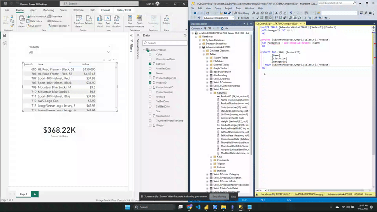
Example Below is an example of the above limitation. Here we have a Power BI table and card visual of a products table on the left and the underlying SQL database on the right. For this example we will focus on ProductID = 680 (HL Road Frame – Black, 58) with an initial ListPrice of $1,431.50.
The ListPrice is updated to a value of $150,000 in the data source. However, after the update neither the table visual nor the card showing the sum of all list prices updates.
There is generally no change detection or live streaming of the data when using DirectQuery.
When we set the ProductID slicer to a value of 680 however, we see the updated value. The interaction with the slicer sends a new query to the data source returning the updated results displayed in the filtered table.
Setting the slicer value executes a new query with the addition of a WHERE clause in the SQL query and the returned result is displayed.
Clearing the slicer shows the initial table again, without the updated value. Refreshing the report clears all caches and runs all queries required by the visuals on the page.
Power BI Desktop reports must be refreshed to reflect schema changes. Once you publish a report to the Power BI Service selecting Refresh only refreshes the visuals in the report. If the underlying schema changes Power BI will not automatically update the available field lists. Updating the data schema requires opening the .pbix file in Power BI Desktop, refresh the report, then republish the report.
Removing tables or columns from the underlying source can lead to potential query failures when refreshing a report.
Example Below is an example the limitation noted above. Here, we have the same Power BI report on the right as the example above and the SQL database on the left. We will start by executing the query which adds a new ManagerID column to the Product table, sets the value as a random number between 0 and 100, and then selects the top 100 products to view the update.
After executing the query we can refresh the columns of the Product table in SQL Server Management Studio (SSMS) to verify it was created. However, in Power BI we see that the fields available to add to the table visual does not include this new column.
To view schema updates in Power BI the .pbix file must be refreshed and the report must be republished.
As noted above if columns or tables are removed from the underlying data source Power BI queries can break. To see this we first remove the ManagerId column in the data source, and then refresh the report. After refreshing the report we can see there is an issue with the table visual.
The limit of rows returned by a query is capped at 1 million rows.
The Power BI data model cannot be switched from Import to DirectQuery mode. A DirectQuery table can be switched to Import, however once this is done it cannot be switched back.
Some Power Query (M Language) features are not supported by DirectQuery. Adding unsupported features to the Power Query Editor will result in a This step results in a query that is not supported by DirectQuery mode error message.
Some DAX functions are not supported by DirectQuery. If used results in a Function <function_name> is not supported by DirectQuery mode error message.
The limitations in support of M/DAX features and function is because DirectQuery converts M/DAX into the data source’s native language (e.g. T-SQL). Any DAX function used must support query folding.
Example For the example report we only need the ProductID, Name, and ListPrice field. However, you can see in the data pane we have all the columns present in the source data. We can modify which columns are available in Power BI be editing the query in the Power Query Editor.
After removing the unneeded columns we can view the native query that get executed against the underlying data source and see the SELECT statement includes only the required columns (i.e. column not removed by the Removed Columns step).
Other implications and considerations of DirectQuery include performance and load implications on the data source, data security implications, data-model limitations, and reporting limitations.
DirectQuery Use Cases
With its given limitations DirectQuery can still be a suitable option for the following use cases.
When report requirements include the need for near real-time data.
The report requires a large dataset, greater than what is supported by Import mode.
The underlying data source defines and applies security rules. When developing a Power BI report with DirectQuery Power BI connects to the data source by using the current user’s (report developer) credentials. DirectQuery allows a report viewer’s credentials to pass through to the underlying source, which then applies security rules.
Data sovereignty restrictions are applicable (e.g. data cannot be stored in the cloud). When using DirectQuery data is cached in the Power BI Service, however there is no long term cloud storage.
Live Connection
Live Connection is a method that lets you build a report in Power BI Desktop without having to build a dataset to under pin the report. The connectivity mode offloads as much work as possible to the underlying analysis services. When building a report in Power BI Desktop that uses Live Connection you connect to a dataset that already exists in an analysis service.
Similar to DirectQuery when Live Connection is used no data is imported or copied into the Power BI dataset. Rather Power BI stores a connection string to the existing analysis services (e.g. SSAS) or published Power BI dataset and Power BI is used as a visualization layer.
Live Connection Considerations
Can only be used with a limited number of data sources. Existing Analysis Service data model (SQL Server Analysis Services (SSAS) or Azure Analysis Services)
No data-model customizations are available, any changes required to the data-model need to be done at the data source. Report-Level measures are the one exception to this limitation.
User identity is passed through to the data source. A report is subject to row-level security and access permissions that are set on the data-model.
Composite Models
Power BI no longer limits you to choosing just Import or DirectQuery mode. With composite models the Power BI data-model can include data connections from one (or more) DirectQuery or Import data connections.
A composite model allows you to connect to different types of data sources when creating the Power BI data-model. Within a single .pbix file you can combine data from one or more DirectQuery sources and/or combine data from DirectQuery sources and Import data.
Each table within the composite model will list its storage mode which shows whether the table is based on a DirectQuery or Import source. The storage mode can be viewed and modified on the properties pane of the table.
Example The example below is a Power BI report with a table visual of a products table. We have added the ManagerID column to this table, however there is no Managers table in the underlying SQL database. Rather this information is contained within a local product_managers Excel file. With a composite model we can combine these two different data sources and connectivity modes to create a single report.
Initially the report storage mode is DirectQuery because to start we only have the Product table DirectQuery connection.
We use the Import connectivity mode to load the product_mangers data and create the relationship between the two tables.
You can check the storage mode of each table in the properties pane under Advanced. We can see the SalesLT Product table has a DirectQuery storage mode and that Sheet1 has a Import storage mode.
Once the data model is a composite model we see the report Storage Mode update to a value of Mixed.
Composite Model Considerations
Security Implications: A query sent to one data source could include data values that have been extracted from a different data source. If the extracted data is confidential the security impacts of this should be considered. You should avoid extracting data from one data source via an encrypted connection to then include this data in a query sent to a different source via an unencrypted connection.
Performance Implications: Whenever DirectQuery is used the performance of the underlying system should be considered. Ensure that it has the resources required to support the query load due to users interacting with the Power BI report. A visual in a composite model can send queries to multiple data source with the results from one query being passed to another query from a different source
Thank you for reading! Stay curious, and until next time, happy learning.
And, remember, as Albert Einstein once said, “Anyone who has never made a mistake has never tried anything new.” So, don’t be afraid of making mistakes, practice makes perfect. Continuously experiment and explore new DAX functions, and challenge yourself with real-world data scenarios.
If this sparked your curiosity, keep that spark alive and check back frequently. Better yet, be sure not to miss a post by subscribing! With each new post comes an opportunity to learn something new.
This post starts with background information on Power Apps in general, Dataverse, and Model-Driven apps. If you are looking to jump right into building a model-driven app click here Build a Model-driven App
Background Information
Power Apps is a rapid low-code application development environment consisting of apps, services, connectors, and a data platform. It provides tools to build apps that can connect to your data stored in various data sources. The data sources can be Microsoft Dataverse (i.e. the underlying data platform) or other online and on-premises data sources including SharePoint, Excel, SQL Server, etc.
Within the Power Apps development environment you build applications with visual tools and apply app logic using formulas. This approach is similar to other commonly used business tools. Meaning you can get started using skills and knowledge you already have. The Power Platform also provides the opportunity to build upon the platform with custom developed components providing a way to create enriched experiences using web development practices.
The Power Apps platform provides two different types of apps that you can create. There are Canvas Apps and Model-driven Apps. Both app types are similar and built with similar components however, the major difference lie in the amount of developer control and uses cases.
Canvas apps provide the developer with the most control when developing the app. A canvas app starts with a blank canvas and provides full control over every aspect of the app. In addition to providing full control over the app a canvas app supports a wide variety of data sources.
Model-driven apps begin with the data model and are built using a data-first approach. The data-first approach requires more technical knowledge and is best suited for more complex applications. Model-driven apps are controlled by and depend on the underlying data model. The layout and functionality of the app is determined by the data rather than the develper who is developing the app.
The use cases of canvas apps and model-driven apps are different and each are leveraged in different situations. Canvas apps provide flexibility in the appearance and data sources and excel at creating simplified apps. Model-driven apps build a user interface on top of a data model utilized for a well defined business process.
This article will focus on creating a model-driven app including the underlying data model. Check back for a follow up article on creating your first Canvas App.
Dataverse Introduction
Dataverse is a relational database and is the data layer of the Power Platform.
Dataverse was formerly known as the Common Data Services
Like other relational databases it contains tables or entities as the representation of real world objects. Relationships define how table rows relate to rows in other tables. What sets it apart from traditional relational databases are the business-oriented features. Some of these features include the set of standard tables and automatically adding columns to custom tables which support underlying processes. It also provides features such as creating views, forms, dashboards, charts, and business rules directly from the table configuration.
The components of the Dataverse include Storage, Metadata, Compute, Security, and Lifecycle Management.
The storage layer has different types of data storage available. Each type suited for different needs and types of data. These storage types include relational data, file storage, and key:value data.
The metadata component stores information about the primary data in Dataverse. A simple example of metadata for a table is the Display Name which you can customized. After applying customizations the changes in the table definition get stored in the metadata layer. The metadata layer is then available to the various components of the Power Platform. The metadata layer consists of the schema and the data catalog.
The compute layer is a set of functionalities that include Business Logic, Data Integration, and the API layer. Business rules or logic that apply across all applications for an organization get applied in a single location rather than each individual application. The single location these rules get applied is the Business Logic sub-layer. The business logic layer contains business rules, workflows, and plugins. The Data Integration layer consists of methods which bring data into the platform and integrating existing data in other data sources. The API layer provides the interface for other applications to connect to Dataverse.
The security layer of Dataverse can support enterprise-grade security for applications. Some features relevant to building applications include authorization, privilege, roles/groups, and auditing. Data in Dataverse is only available to authorized users with a security model based on the various components (e.g. table, columns, rows). A user’s privilege define what level of access they have or what they are able to do within the system (e.g. read, write, delete). Roles/groups are privileges that get bundled together. Authentication is the process of validating the identity of someone trying to access the system.
Application lifecycle management (ALM) is the process of managing the different phases of creating and maintaining an application. Such as development, maintenance, and decommissioning. The Lifecycle Management layer helps this process through implementing different environments, diagnostics, and solutions.
When working with the Power Platform, Dataverse, and multiple times in this post already you will come across the term Data Model so it is important to define. The data model is the set of tables and table metadata (e.g. relationships between tables). In the context of model-driven apps when we refer to the data model we mean Dataverse.
Model-Driven Apps Introduction
Model-driven apps build a user interface on top Dataverse. The foundation of the app is the underlying data model. Although a main requirement in any app development is setting up data sources, for model-driven apps it is the primary requirement. The first and essential step of model-driven app development is properly structuring the data and processes. The user interface and functionality of the app is dependent on the data model.
The development approach for model-driven apps has 3 focus areas:
Data Model: determining the required data and how it relates to other data
Defining Processes: defining and enforcing consistent processes is a key aspect of a model-driven app
Composing the app: using the app designer to add and configure the pages of the application
Components of Model-driven Apps
The components of a model-driven app get added through the app designer and build the appearance and functionality of the app. The components included in the app and their properties make up the app’s metadata.
There are four main types of components in the application and each has a designer used to create and edit the component.
Data Components
The data components specify the data the app builds upon.
The app design approach focuses on adding dashboards, forms, views, and charts to the application. The primary goal of a model-driven app is to provide a quick view of the data and support decision making.
Component
Description
Designer
Table
A container of related records
Power Apps table designer
Column
A property of a recorded which is associated with a table.
Power Apps table designer
Relationship
Define how data in different tables relate to one another.
Power Apps table designer
Choice
Specialized column that provides the user a set of predefined options.
Power Apps option set designer
User Interface Components
The user interface (UI) components define how the user will interact with the app.
Component
Description
Designer
App
The fundamental properties of the application specifying components, properties, client types, and URL
App designer
Site Map
Determines the navigation of the app
Site map designer
Form
A set of data-entry column for a specified table
Form designer
View
Define how a list of records for a table appear in the app
View designer
App Logic
The logic defines the processes, rules, and automation of the app.
Component
Description
Designer
Business Process Flow
A step-by-step aid guiding user through a standard process
Business process flow designer
Workflow
Automate processes without a user interface
Workflow designer
Actions
Actions are a type of process that are invoked from a workflow
Process designer
Business Rule
Apply rules or recommendation logic to a form
Business Rule Designer
Power Automate
Cloud-based service to create automated workflows between apps and services
Power Automate
Visual Components
The visual components visualize the app data.
Component
Chart
A single graphic visualization that can be displayed within a view, on a form, or added to a dashboard
Chart designer
Dashboard
A collection of one or more visualizations
Dashboard Designer
Embedded Power BI
Power BI tiles and dashboards can be embedded in an app
Chart designer, dashboard designer, Power BI
Build a Model-driven App
We will be creating an app for Dusty Bottle Brewery. Dusty Bottle Brewery is a brewery that operates multiple brewpubs and distributes products to other local businesses.
The goal of the app is to provide greater insight on brewpub locations and partners. The app should provide details on brewpub capacities, outdoor seating, food availability, pet policies, landlords, etc.
Setting Up a Development Environment
First we will set up an environment to develop the app within. An environment is a container to store, manage, and share apps, workflows, and data. Environments can separate apps by security requirements or audiences (e.g. dev, test, prod).
Environments are created and configured on the Environments page of the Power Platform Admin Center (admin.powerplatform.microsoft.com). Each tenant when created has a Default environment, although it is generally recommended not to use this environment for app development that is not intended for personal use.
We will start by creating an environment for use during this post. Types of environments include Sandbox, Trial, Developer, and Production. Choose the environment appropriate for your needs, you can review more details at the link below.
When your tenant has multiple environments it is important to note which environment you are working in. You can view the current environment on the top right of the screen. You switch between environments by clicking on the Environment area of the top menu. This will open the Select environment pane where you can switch between the available environments.
Once in the correct environment you could start creating apps with the options provided. However, before we do we will first look at solutions.
Solutions Overview
A solution is a container within an environment that holds system changes and customizations (e.g. apps). You can export a solution from an environment, as a .zip file and deploy it to other environments.
In this demo we will first create a solution to hold the customizations needed for the app we will create.
When working with solutions you will also need to be familiar with publishers. All solutions require a publisher and the publisher will provide a prefix to all the customizations (e.g. a prefix to table names).
Now that we created the DustyBottleBrewery solution we can start developing our model-driven app within this solution.
Design the Data-model
We will start creating the data model for the app first focusing on tables, columns, rows, and relationships in Dataverse. When working with Dataverse the common terminology includes table, column, row, choice, and Yes/No. You may come across the associated legacy terms entity, field/attribute, record, option set/multi-select option set, pick list and two options.
The tables that we will need for the application include BrewPub, Landlord, Accounts, and Contact tables. Here it is important to note that when we provisioned Dataverse for an environment it comes with a set of commonly used standard tables. So before creating custom tables it is helpful to evaluate the standard tables.
Although helpful to use standard tables when possible it is important to not use a standard table for something completely different than it’s intended use
For example, in Dataverse there already is a Contact table that includes columns such as address and phone number. We can use this standard table for the Brew Pub’s contact information.
Note: the contact table could also be used for the landlord information, but for demonstration purposes we will create a custom table
A summary of the tables we will work with is:
BrewPub (Custom)
Landlord (Custom)
Manager (Standard Table: Contact)
Account (Standard Table)
Street Address
Street Address
Built-in Columns
Built-in Columns
City
City
State
State
Phone Number
Phone Number
Capacity
Pets Allowed
Patio Seating
Landlord
Contact
You may have noticed that the BrewPub table contains a Landlord and Contact column. These will be created when creating the relationships between these tables and serve as the basis for the relationships we will create within the data model.
Creating Tables
You create a custom table by navigating to the environment where the app is being developed (e.g. DustyBottleBrewery). Then on the Solutions page select the solution. On the Solution Objects page you can create a new table by selecting New on the top menu and then table. For this demo we will provide the table name and leave the other options as their default values. However, there are many advanced options that you can configure if needed.
After creating the table you can view the columns and see that it comes with a number of automatically created columns. These columns support underlying system processes. We will have to add some column such as Phone Number, Street Address, City, State, and other columns listed above.
You add columns by expanding Tables on the Object pane of the solution and then expanding the specific table to show its components. Then select columns to view the columns page.
From the columns page there are two options, add a New column or Add existing column. We will add the columns below with the New column option.
Column Name
Data Type
Street Address
Text > Plain text
City
Text > Plain text
State
Text > Plain text
Phone Number
Text > Phone number
Capacity
Number > Whole number
Pets Allowed
Choice > Yes/no
Patio Seating
Choice > Yes/no
Food Available
Choice > Yes/no
After adding the columns to the newly created BrewPub table repeat the process for the Landlord table.
After creating our two custom tables we must add the existing Contacts and Accounts table to our solution. We can do this by using the Add existing option in the menu. After selecting the table there are two options to be aware of. The first is include all components. The components of the table include the columns, relationships, views, etc. If this option is not selected specific components can be explicitly selected and added to the solution. The second is include table metadata. If you include all components then this option is selected and disabled. If components are added individually this option will have to be selected to include the metadata.
Creating Table Relationships
Relationships define how tables in the database relate to other tables. When working with the Power Platform there are two main relationship types to work with.
A one-to-many relationship is when a row in the Primary Table is associated or reference many rows in the Related Table. In Power Apps there are actually three relationship types listed when creating a relationship. However, every one-to-many relationship is also a many-to-one relationship viewed from the perspective of the related table. For this type of relationship, different relationship behaviors can be defined (e.g. cascading delete). For more detail on the various behaviors and actions check out Table Relationships for more information. Power Apps does provide pre-defined behavior/action grouping that can be used. These include Referential Remove Link, Referential Restrict Delete, and Parental.
Learn about table relationships in Microsoft Dataverse
A many-to-many relationship is when many rows in one table are associated or reference many rows in another table.
Creating a one-to-many (or many-to-one) relationship can be done in two ways. The first is to create a lookup field which creates the relationship for you. The second is to manually create the relationship which creates the lookup field for you. Manually creating the relationship is the only option available for the many-to-many relationship.
We will first create the one-to-many relationship between Landlord and BrewPub by creating a lookup field. In this relationship a BrewPub can have one landlord and a Landlord can have manyBrewPubs. So the first question is on which table to add the lookup field.
When using a lookup field you are looking up a single thing. You are looking up to the one side of the relationship. This means the lookup field should be created in the table on the many side of the relationship.
Now will will create the many-to-many relationship between BrewPub and Contacts. In this relationship a BrewPub can have multiple contacts and a Contact can be associated with multiple BrewPubs. Since this relationship is many-to-many in Power Apps it does not matter which table you select to create the relationship.
Creating the App and the App Components
Now that the underlying data model is complete we can move to creating the user interface (UI). The UI resides on top of the data-model that users will interact with. Creating the app involves working with various UI components including the site map, forms, and views. In addition to the visual components we will incorporate business rules.
We create the model-driven app from within the solution under New > App > Model-driven app.
App Navigation
With the app now created we start by building out the site map or the navigation element of the app. On the left hand menu select Navigation to view the Navigation pane. Here you will see listed a few options created automatically. The Navigation bar is where you can set the options to show Home, Recent, and Pinned which are enabled by default. You can also enable collapsible groups and enable areas, both of these options are disabled by default.
We will first create an Accounts and Contacts group with two subareas. The subareas will be Accounts and Contacts linked to the associated table. Then we will repeat this process creating a second Dusty Bottle Brewery group with subareas for BrewPubs and Landlords.
Before getting to far building the app its important to mention the top right options in the menu bar. Mainly Play and the difference between Save and Publish. Within the app designer you can view a preview of the app’s UI, the app can also be viewed by pressing Play. Save saves the version of the app you are working on but does not make those changes live and viewable to users of the application. To make any changes available to users the changes must be published first.
App Forms
After building the navigation element we will add Forms to the app. Forms display a single row of data from a table. There are various elements of the form used to view associated data and carry out tasks.
Command Bar: used to take action such as saving a record or creating a new one
Tabs: easy access to grouped information
Columns: displays the column data for the specific record
Lookup Fields: specialized column to lookup a single related record
Timeline: a list of recent actions or activities associated with the record
Subgrid: displays the many side of a relationship (e.g. all the contacts associated with the account below)
Form Selector: navigate between different forms for the specific table
The form selector (#7 above) navigates to different forms. There are various types of forms that look different and offer different functionalities.
Type
description
Main
main user interface for working with table data
Quick Create
abbreviated form optimized for creating new rows
Quick View
read-only form contained within another form to show information about related data
Card
presents data in the unified interface dashboards
We will modify the main form of the BrewPub table. We locate the table in the objects viewer and navigate to Forms. All forms created automatically have a Name of Information so the main form can be identified by the Form type. Select the correct form to open the Form designer.
From here we can modify and add elements to the form. By default any required fields are included in the form (e.g. Name and Owner).
Within the form designer the default layout is 1 column and can be modified to 2 or 3 columns in the Formatting properties of the section. We will use 2 columns. Following this we will add additional table columns to the form. All available columns can be seen by selecting the Table columns in the left hand menu and then dragged and dropped on the form.
Additional sections can also be added from the Components menu. Sections here are containers for the displayed fields. We will add a new Contacts section to display the related contacts for the BrewPub record. Previously, we created a many-to-many relationship between the BrewPub and the Contact tables. Since for each BrewPub we need to display multiple contacts we will need to add a subgrid to this new section.
Following the change we Save and Publish to make the updates available. Then we can go to the Power App and add an example BrewPub and Landlord. Navigate to each in the left-hand Navigation of the app and select New.
After adding the data we can view a BrewPub record and associated contacts with that BrewPub using the subgrid. Navigate to the BrewPub Form and in the Contacts section select Add Existing Contact in the subgrid. This will open a lookup record menu, and since the dataverse was loaded with sample data, a list of contacts is presented. Select appropriate records and click Add.
Views within a model-driven app display a list of rows that are typically the same type (e.g. Active Contacts). The view definition is primarily made up of the columns that are displayed and any sorting or filter that should be applied.
There are three main types of views. Personal views are owned by an individual and only visible to them and anyone they share it with. Public views are general purpose and viewable by everyone. System views are special views used by the application (e.g. Quick Find, Lookup).
You toggle between different views from within the App. The default view can also be changed from within the app. The current default view for Contacts in My Active Contacts. We will first change the view to Inactive Contacts and then set the default to Active Contacts.
Business Rules
Business rules are utilized to dynamically update the app UI. Typical use cases for business rules include displaying error messages, setting or clearing field values, setting required fields, showing or hiding fields, and enabling or disabling fields.
It is important to note that business rules are table specific.
We will create a business rule for the Account table to set the value of a company’s Payment Terms based on the company’s Credit Limit. First we look at the details of an Account and in the Billing section we can see both of these values are blank.
The business rule we will create looks at the companies credit limit and if it is greater or equal to $125,000 then the payment terms should be set to Net 60. Otherwise, the payment terms is set to Net 30.
To create the new business rule we must go to view the objects in the solution. Expand the Account table then Business rule, and finally New business rule. After selecting New business rule the visual designer will open in a new tab.
Once the business rule is complete we must Save it and then Activate the rule.
After activating the business rule we can move back to the app UI to see it in action.
Model-Drive App Security
Before adding a user to the environment the new app resides in the user must first be a user in the Microsoft tenant. If the user does not yet exist the account must be created in the tenant before adding then to the Power Apps environment.
After creating the user in the tenant we can go to the Power Apps Admin Center, and select Environments. We then navigate to the environment we are working in. Users are added to an environment in the environment settings under Users + permissions. You can also access this on the Environment overview screen in the Access section, under Users select See all. Once on the Users page select Add user and then search for the user to add. After adding the user you are prompted to set an appropriate security role for the user.
In general a security role defines what actions a user is allowed to do and where they are allowed to do those actions. For example a user’s security role could specify they have read permissions on the Account table. The permissions provided by the security role are on a per table basis. The same role describe above could provide the user read permissions on the Account table and write permissions on the BrewPub table.
In addition, to specifying the entity within the security role definition you can also specify which rows within the table the user can read or modify. More information on the built-in security roles and configuring a custom security role can be found here: Configure user security to resources in an environment. When we added the new user to the environment we assigned them the Basic User security role. Looking at the documentation, linked above, we can get more information on the type of privileges the role has.
Learn how to configure user access to resources in a Microsoft Dataverse environment.
An important thing to notice in the description is the last note. The Basic User role’s default privileges only apply to non-custom entities. For any custom table the privileges must be explicitly assigned.
Users, by default, do not have access to Custom tables. Privileges must be explicitly granted.
Security roles are viewed, modified, and created by navigating to the environment settings > Users + permissions > security roles. In the list of roles we will locate the Basic User role and select the check mark next to it. Then on the top menu select Edit to open the security role designer. Then on the Custom Entities tab we locate the BrewPub and Landlord table and give the role basic access to these tables.
Creating, configuring, and managing security roles can be very detailed and granular which highlights the importance of having clearly defined requirements related to app security.
Sharing a Model-driven App
Sharing a model-driven app consists of three steps including setting up the security roles, sharing the app, and finally providing the app URL to the users.
To share our Dusty Bottle Brewery app, we select the check mark next to the app in our solution. Then on the top menu select Share. This opens a pane to share the app and consists of a couple different parts.
First on the top left is the security role of the app. This specifies the security roles that can be used by the app.
Second, under people we search for the users that we want to share the app with and set their security role.
Lastly, we must share the app URL with the users. The web URL is located on the app details page and provided to the users of the app. In addition, there are other ways to provide access and includes methods such as embedding an app within Microsoft Teams.
Next Steps
Now that the data-model and the app UI have been created, the security roles configured and assigned, and the app has been shared with the users the focus shifts to management of the app.
This management is simplified through the use of solutions. Remember the solution acts as a container of all the different components which can be deployed to different environments (e.g. development to testing to production).
There are many options on how the management can be carried out and involves working with unmanaged and managed solutions. The deployment of the app can be a manual process or utilize tools such as Azure DevOps pipelines to automate and incorporate source control into the deployment process.
Check back for a follow up post focused specifically on the lifecycle management of apps created in Power Apps.
Summary
This post covered the different aspects of building and deploying a Power Apps Model-driven app. We started with general background information about Power Apps. Highlighted the two types of apps that you can build in Power Apps. These app type primarily differ on the amount of user control over the app’s data sources and interface elements. Canvas apps can be used with a variety of data sources and allow full control over the app’s user interface. And Model-driven apps must be used with Dataverse and the user interface is driven by the underlying data-model.
After covering the basics of Power Apps the post provided an introduction to Dataverse. Understanding of Dataverse and its components is critical for model-driven apps.
Then the post provides more detailed background on Model-driven apps specifically. Covering the different components that make up the model-driven app.
Finally, the post provided a step-by-step to get a model-driven app up and running. This started with the development of the data-model, the creation of the app UI, defining security roles, and sharing the app with end users.
Thank you for reading! Stay curious, and until next time, happy learning.
And, remember, as Albert Einstein once said, “Anyone who has never made a mistake has never tried anything new.” So, don’t be afraid of making mistakes, practice makes perfect. Continuously experiment and explore new DAX functions, and challenge yourself with real-world data scenarios.
If this sparked your curiosity, keep that spark alive and check back frequently. Better yet, be sure not to miss a post by subscribing! With each new post comes an opportunity to learn something new.
Microsoft Power Platform is a set of tools and services used to build custom applications and automate processes. It provides a low-code development platform for building applications, business intelligence tools, and process automation. The main components of the Power Platform are Power BI, Power Apps, Power Automate, and Power Virtual Agents. You can use the main components together or individually.
Power BI is a business intelligence tool that allows for analyzing data and communicating insights. Power BI includes a desktop application for report development and a cloud service to host and share reports and dashboards.
Power Apps is a low-code platform for custom application development. Power App’s simple and approachable interface allows business users and developers to create applications.
Power Automate is a workflow automation tool that helps automate repetitive processes (e.g. data collection, and document approvals).
Power Virtual Agents is a tool to develop and deploy chatbots in a low-code environment.
Utilizing the components of the Power Platform allows organizations to Analyze data and deliver insights, Act by building low-code solutions, Automate business processes, and Assist with inquiries with chatbots.
Power BI
Power BI is a tool for analyzing data and making informed decisions. The basic parts of Power BI include Workspaces, Datasets, Reports & Dashboards, and Apps.
A workspace is a container to store related datasets, reports, dashboards, and dataflows. Workspaces come in two types either My workspace or workspaces. My workspace is a personal workspace. Workspaces is a container for collaborating and sharing content. All workspace members require a Power BI Pro license.
Datasets are the data imported, connected to, or created within Power BI. The datasets are the data that underlie Power BI reports. When creating a dataset you associate it with a workspace. You can include a dataset in multiple workspaces and use it in multiple reports.
A report is a collection of visualizations (e.g. line chart, bar chart, KPIs, etc.). Reports can consist of multiple pages each with its own set of visualizations. A Dashboard is a collection of tiles. A tile can display a single visualization pinned from a report or an entire report page. An app in Power BI is a collection of reports, dashboards, and datasets that you package together and share.
Power BI Desktop
Power BI Desktop is a free application that you can use to extract and transform data. The data can be from various sources and you build reports on this data. After extracting the data Power BI provides the option to transform the data. The data transformations can range from data cleaning operations to improving readability by clarifying column names and setting data types to more complex operations.
There are three main pages in Power BI Desktop which you can navigate between on the left menu. The first is the Report page. This is the report canvas where you add and configure visualizations.
The second is the Data page. Once you load data to the Power BI data model you can view it on this page. Also, from here you can perform additional data manipulation. This can include operations such as adding calculated columns using the Power Query Editor.
The last is the Model page. On this page, you can construct and view the data model. You can also view, configure, and add any relationships between different data tables.
Power BI Report Visuals
When viewing the report canvas you can add a variety of elements to your report from the Insert menu on the top ribbon. On the right-hand side of the Power BI Desktop application, there are panes for Filters, Visualizations, and Fields. You can add visuals to the report from the Visualizations pane. On the Field pane, you are able to add or change the data displayed on the visual. There are many built-in visualizations to add to Power BI reports. A few examples include bar and column charts, single and multi-row cards, KPIs, pie charts, and tables. In addition to the built-in visualizations, you can add custom visuals from the Power BI AppSource.
Publishing Power BI Reports
Once you complete a report you must publish it to share with others. You publish a report from the Power BI Desktop Home menu using the Publish option in the top ribbon. When publishing a report you must select the workspace to associate it with. Selecting any workplace other than My workspace requires a Power BI Pro license. Any reports published to My workspace are for personal content.
For more details on Power BI Fundamentals check out this four-part series.
Power Apps is a rapid low-code platform for custom application development. It consists of apps, connectors, and data that are all integrated providing the tools and environment required for application development.
With Power Apps, there are 3 types of apps that you can create. The first type is a Canvas app. These apps start blank and connect to various data sources. You construct the app using the low code interface. Model-driven apps are applications built on top of an existing data model. You build these apps using forms, views, and dashboards. Dataverse is the data source for model-driven apps. The last type of app is Portal. Portal creates public-facing websites. Like model-driven apps, Dataverse is the data source for Power Apps Portal.
The Build Blocks of Power Apps
The basic building blocks of Power Apps include screens, controls, and functions. Screens are the canvas of the app’s user interface. You add different components and controls to the screens. Each app can have multiple screens. Each with its own set of controls, with each screen typically serving a different purpose.
Components are reusable groupings of controls and formulas within the app. Components become helpful when creating parts of an app (e.g. navigation section) that repeat on multiple screens. Without the use of components the repeated part of the app would have to be rebuilt on each screen.
Controls are the different elements that make up the app. Controls include things such as buttons, text labels and inputs, galleries, and icons. The complete list is viewable in the Power Apps Studio on the Insert tab. Each control has its own array of properties and events which are viewable after adding it to the app.
The basic building blocks above develop the visual aspects of the app. However, typically there is a data aspect to the app. Power Apps connectors connect to and access data from various sources. There are standard connectors and there are premium connectors that require a Power Apps premium license.
Power Automate
Power Automate is a workflow engine used to improve business processes through automation. It excels at automating repetitive manual processes which consist of predefined steps. The processes automated can range in complexity. They can be as simple as sending notifications and document approvals. Or complex multi-flow processes where certain tasks are conditionally triggered.
Power Automate flows consist of the trigger, actions, and controls. The triggers available depend on the type of flow. While the actions available depend on the specific connector. Controls can create conditional evaluations and branches within the workflow.
Types of Flows
In Power Automate there are three types of flows.
Cloud flows are flows built that consist of a trigger and at least one other action. There are different types of cloud flows. Automated flows get triggered when a specific action occurs. Examples of these trigger actions include a new document in a SharePoint document library or when a new Outlook email arrives. Instant flows are triggered by a user. The trigger of instant flows can be a button click, running the flow from a Power App, or on a selected SharePoint list item.
Business Process flows provide a guided experience for the collection and entry of data. They augment the experience of a model-driven app.
Desktop flows provide robotic process automation to Power Automate. Desktop flows allow users to record their actions while completing a process. These actions and interactions with applications are then played back and automated by the flow.
For Power Automate examples see the following related posts.
Leverage flow control structures to create a flexible approval process
Power Virtual Agents
Power Virtual Agents is an app powered by AI and used to create chatbots. Power Virtual Agents is a tool to develop solutions for a specific topic where the bot will ask a series of questions. Using the responses to the questions the Power Virtual Agent will perform associated actions.
Topics
When developing a Power Virtual Agent a topic is what the person who is interacting with the bot talks to the bot about. The topic is a discrete conversation path that defines how the conversation will be processed. Each topic has phrases, keywords, or questions that act as trigger phrases. These phrases define how the bot responds and what it should do.
Entities
Entities group information. Power Virtual Agents provide prebuilt entities and the ability to create custom ones. Pre-built entities represent commonly used information. With the use of these entities, the bot recognizes relevant information from user interactions. The information is then saved and used to inform later actions. Use custom entities when developing a chatbot for a specific purpose. Creating a custom entity involves teaching the chatbot language understanding model the domain-specific information.
Canvas
The canvas is where the conversation pattern gets constructed. The conversation pattern generally consists of questions, conditions, and messages. Questions can be multiple choice, text input, or an entity. The response to questions then gets stored in variables. Conditions create flow control and branches within the conversation pattern based on the responses to questions. Messages are the blocks of text displayed on the screen and viewed by the user.
Actions
The Power Virtual Agents can perform actions by calling a Power Automate flow. The flows get passed the required information from Power Virtual Agent. Power Virtual agents can leverage flows that are already created in the Power Apps environment or can use a flow created within the Power Virtual Agent canvas.
Publishing
Once complete the chatbot can be published to multiple platforms or channels including websites, mobile apps, and Microsoft Teams. Following each update of the chatbot, it must be published again to update the bot on all channels.
Power Platform Related Components
Across each of the four apps mentioned there are cross-cutting features that enable utilizing the Power Platform to its full potential. The Power Platform products use a set of three shared services or components. The core components include AI Builder, Dataverse, and Connectors. These components allow the Power Platform apps to be closely integrated.
AI Builder is a solution that lets users add intelligence to created workflows and apps. These AI capabilities can predict outcomes and aid in improving business performance.
Dataverse is a data storage service that allows users to securely store and manage data. A Dataverse database provides the data structure supporting interconnected apps and processes.
Connectors enable users to connect apps, data, and devices. They act as an abstraction layer for APIs for other services.
Thank you for reading! Stay curious, and until next time, happy learning.
And, remember, as Albert Einstein once said, “Anyone who has never made a mistake has never tried anything new.” So, don’t be afraid of making mistakes, practice makes perfect. Continuously experiment and explore new DAX functions, and challenge yourself with real-world data scenarios.
If this sparked your curiosity, keep that spark alive and check back frequently. Better yet, be sure not to miss a post by subscribing! With each new post comes an opportunity to learn something new.
One of the early stages of creating any Power BI report is the development of the data model. The data model will consist of data tables, relationships, and calculations. There are two types of calculations: calculated columns, and measures.
Row Context — What it is, When is it available, and its Implications
One of the most powerful elements of Power BI is that all measure calculations are done in context. The evaluation context limits the values in the current scope when evaluating an expression. The filter context and/or the row context make up the evaluation context.
Power BI Row Context: Understanding the Power of Context in Calculations of this series explores the row context in depth.
Filter Context – How to create it and its impact on measures
When evaluating expressions, the row context can be transitioned into a filter context within Power BI. This transition can help create more complex measures. Row context, filter context, and context transition can be confusing when starting with DAX so visit references and documentation often.
This post is the fourth of a Power BI Fundamental series with a focus on the context transition. The example file used in this post is can be found on GitHub at the link below.
The row context by itself does not filter data. Row context iterates through a table row-by-row. Context transition is when the row context transitions into the filter context. Context transition occurs with the CALCULATE() function and when the expression of an iterator function is a DAX measure.
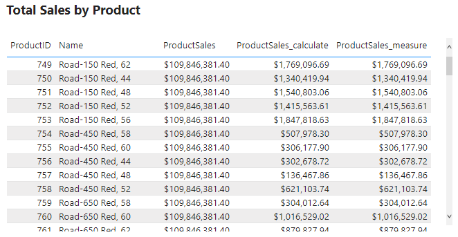
The concept of context transition can be a bit abstract so it can be easiest to learn through examples. To explore, we will create a new calculated column in the Products table. The new ProductsSales calculates the total sales for each product and we define it as:
ProductSales =
SUM(SalesOrderDetail[SalesAmount])
After evaluating ProductSales we see it repeats the same $109.85M sales value for each row. This value is the total sales amount for the entire dataset. This is not what we want ProductSales to calculate, so what happened?
ProductSales calculates the total sales of the entire data rather than the filtered per-product value because row context is not a filter. For example, the row context includes the ProductID value but this identifier is not a filter on the data during evaluation. And because the row context is not a filter DAX does not distinguish between different rows (i.e products) when evaluating ProductSales.
For example, looking at the table above while evaluating the measure DAX does not distinguish the Adjustable Race row from the LL Crankarm row. Since all rows are viewed as the same the total sales value is repeated for each row.
You may have guessed it but, the example above calculates the wrong value because it does not contain a context transition. The row context does not shift to the filter context causing the error in the calculated value. This simple example highlights why context transition is important and when it’s needed. To correct this we must force the context transition. This will convert the row values into a filter and calculate the sales for each product. There are various ways to do this, and below are two options.
Option #1: The CALCULATE() Function
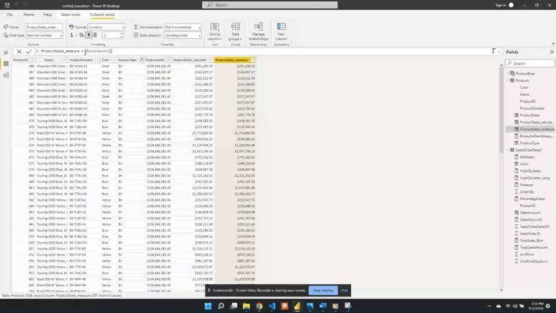
We can force context transition by wrapping ProductSales with the CALCULATE() function. To demonstrate we create a new ProductSales_calculate column. ProductSales_calculate is defined as:
This new calculated column shows the correct sales value for each product. We view the product type BK and can see now each row in the ProductSales_calculate column is different for each row.
Option #2: Using Measures
Within the data model, we have already created a measure SalesAmount2.
We can see by the expression SalesAmount2 uses the iterator function SUMX(). This measure calculates the sales amount row-by-row in the SalesOrderDetail table. As mentioned before context transition occurs within iterator functions. So rather than using CALCULATE() and SUM() we create another calculated column that references this measure.
ProductSales_measure = SalesAmount2
We add the new column to the table visual and can see that it has the same value as ProductSales_calculate. This shows that a measure defined with an iterator also forces context transition.
An important note about this new column is that the ProductsSales_measure works as expected when referencing the measure. However, it will not work if we define this column as the same expression that defines SalesAmount2.
We can see below if we update ProductSales_measure to:
The same expression used when defining SalesAmount2, will result in wrong values.
After updating ProductSales_measure we can see it returns the total sales values and not the sales per product. With this updated definition DAX is no longer able to apply the context transition. We can correct this by wrapping the expression with CALCULATE().
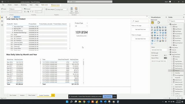
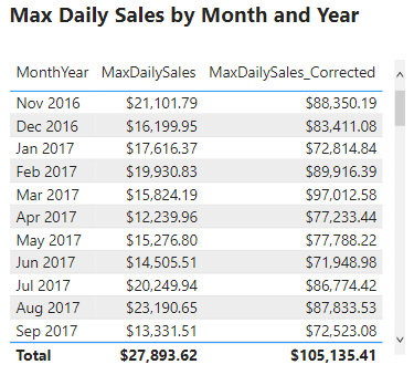
A question of interest is what is the maximum daily sales amount for each month in the dataset. In other words we would like to determine for each month what day of the month had the highest sales and what was the total daily sales value. We start by creating a new MaxDailySales measure and add it to the Max Daily Sales by Month and Year table visual.
After adding the measure to the table we can see the sales amount value for each month. For example, the table currently shows that the maximum daily sales for November 2016 is $21,202.79. This value may appear reasonable but when examined closely we can determine it is incorrect. Currently, MaxDailySales is returning the maximum sale for each month and is not accounting for multiple sales within each day. We can see this by creating a new visual with the Date, MaxSales, and SalesOrderDetailID fields.
This table shows that the MaxDailySales for November 2016 is the same value as a single sale that occurred on November 17th. Yet, there are multiple sales on this day and every other day. The desired outcome is to calculate the total sales for each day and then determined the highest daily total value for each month.
This error occurs because context transition is not being applied correctly. It is important to note that context transition is occurring while evaluating MaxDailySales because it is a measure. However, the context transition is not being applied on the correct aggregation level. The context transition is occurring on the SalesOrderDetail level, meaning for each row of this table. To correct this measure we will have to force the context transition on the correct, daily, aggregation level. We update the MaxDailySales expression using the VALUES() function.
We change the table passed to MAXX() from SalesOrderDetail to VALUES(DateTable[Date]). Using VALUES(DateTable[Date]) aggregates all the dates that are the same day shifting the context transition to the correct aggregation level. The VALUES() function in the expression provides a unique list of dates. For each day in the unique list, the SalesAmount2 measure gets evaluated and returns the maximum daily total value. We then add the new measure to the table visual and now it shows the correct maximum daily sales for each month.
The above example shows context transition at two different aggregation levels. They also highlight that the context transition can be shifted to return the specific value that is required. As well as showing why it is important to take into consideration the aggregation level when developing measures like MaxDailySales.
Context Transition Pit Falls
Context transition is when row values transition into or replace the filter context. When context transition occurs it can sometimes lead to unexpected and incorrect values. An important part of context transition to understand is that it transitions the entire row into the filter. So what occurs when a row is not unique? Let’s explore this with the following example.
We add a new SimplifiedSales table to the data model.
Then we add a TotalSales measure. TotalSales is defined as:
Viewing the two tables above, we can confirm that the TotalSales values are correctly aggregating the sales data. Now we add another measure to the table which references the measure TotalSales. Referencing this measure will force context transition due to the implicit CALCULATE() added to measures. See above for details.
In the new column we can see that the values for Road-350-W Yellow, 48 and Touring-3000 Blue, 44 have not changed and are correct. However, Mountain-500 Silver, 52 did update, and TotalSales_ContextT column shows an incorrect value. So what happened?
The issue is the context transition. Viewing the SimplifiedSales table we can see that Mountain-500 Silver, 52 appears twice in the table. With both records having identical values for each field. Remember, context transition utilizes the entire row. Meaning the table gets filtered on Mountain-500 Silver, 52/ 1/$450.00. Because of this, the result gets summed up in the TotalSales measure returning a value of $900.00. This value is then evaluated twice, once for each identical row.
This behavior is not seen for the Road-350-W, 48 records because they are unique. One row has a UnitPriceDiscount of 0.0% and the other has a value of 5.0%. This difference makes each row unique when context transition is applied.
When context transition occurs it is important to have some sort of unique identifier creating unique rows
Knowing what context transition is and when it occurs is important to identifying when this issue may occur. When context transition is applied it is important to check the table and verify calculations to ensure it is applied correctly.
Thank you for reading! Stay curious, and until next time, happy learning.
And, remember, as Albert Einstein once said, “Anyone who has never made a mistake has never tried anything new.” So, don’t be afraid of making mistakes, practice makes perfect. Continuously experiment and explore new DAX functions, and challenge yourself with real-world data scenarios.
If this sparked your curiosity, keep that spark alive and check back frequently. Better yet, be sure not to miss a post by subscribing! With each new post comes an opportunity to learn something new.