From Sketch to Screen: Bringing your Power BI report navigation to life for an enhanced user experience.
In the world of data visualization, we are constantly seeking ways to convey information and captivate our audience. Our goal is to enhance the aesthetic appeal of our Power BI reports, making them more than just vehicles for data—they become compelling narratives. By leveraging Figma, we aim to infuse our reports with design elements that elevate the overall user experience, transforming complex data into interactive stories that engage and enlighten.
A cornerstone of impactful multi-page reports is effective navigation. Well-designed navigation is a beacon that guides our users through the sea of data, ensuring they can uncover the insights they seek without feeling overwhelmed or lost. This post serves as a guide on how we can use Figma to enhance our Power BI report navigation beyond the use of just Power BI shapes, buttons, and bookmarks to create interactive report navigation that boosts the user experience of our reports.
In this guide, we will explore how to go beyond using the page navigator button option in Power BI and craft a report navigation that is intuitive, interactive, and elevates the visual aspects of our report. We will dive into how we can use Figma’s design capabilities combined with the interactive features of Power BI to create such an experience.
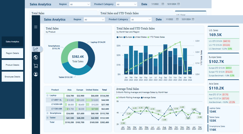
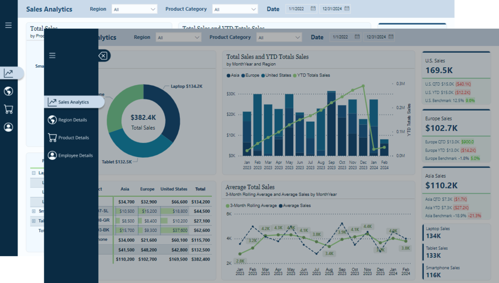
The navigation we will create is a vertical and minimalistic navigation displaying visual icons for each of the report’s pages. This allows our users to focus on the data and the report visuals and not be distracted by the navigation. However, when our users require details on the navigation options, we will provide an interactive experience to expand and collapse the menu.
Keep reading to get all the details on leveraging the design functionality offered by Figma and the interactive elements, including buttons and bookmarks in Power BI. By the end, we will have all we need to craft report navigation elements that captivate and guide our audience, making every report an insightful and enjoyable experience.
Get Started with Power BI Templates: For those interested in crafting a similar navigation experience using Power BI built-in tools, visit the follow-up post below. Plus, get started immediately with downloadable Power BI templates!

Design Meets Data: Crafting Interactive Navigations in Power BI
User-Centric Design: Next level reporting with interactive navigation for an enhanced user experience
Also, check out the latest guide on using Power BI’s page navigator for a streamlined, engaging, and easy-to-maintain navigational experience.
Design Meets Data: A Guide to Building Engaging Power BI Report Navigation
Streamlined report navigation with built-in tools to achieve functional, maintainable, and engaging navigation in Power BI reports.
Diving Into Figma: Designing Our Navigation
Starting the journey of enhancing our Power BI reports with Figma begins with understanding why Figma is a powerful design tool. The beauty of Figma lies in its simplicity and power. It is a web-based tool that allows designers to create fluid and dynamic UI elements without a steep learning curve associated with some other design software. Another great aspect of Figma is the community that provides thousands of free and paid templates, plugins, and UI kits to get our design kickstarted.
Explore thousands of free and paid templates, plugins, and UI kits to kickstart your next big idea.
To get started with Figma, we will need to create an account. Figma offers various account options, including a free version. The free version provides access to the most important aspects of Figma but limits the number of files we can collaborate on with others. Here is a helpful guide on getting started.
Welcome to Figma. Start your learning journey with beginner-friendly resources that will have you creating in no time.
For our Power BI reports, using Figma means designing elements that are aesthetic and functional. Reducing the number of shapes and design elements required in our Power BI reports aids in performance.
Crafting the Report Navigation
Once logged into Figma, we will start by selecting Drafts from the left side menu, then Design File in the upper right to open a new design file in Figma.
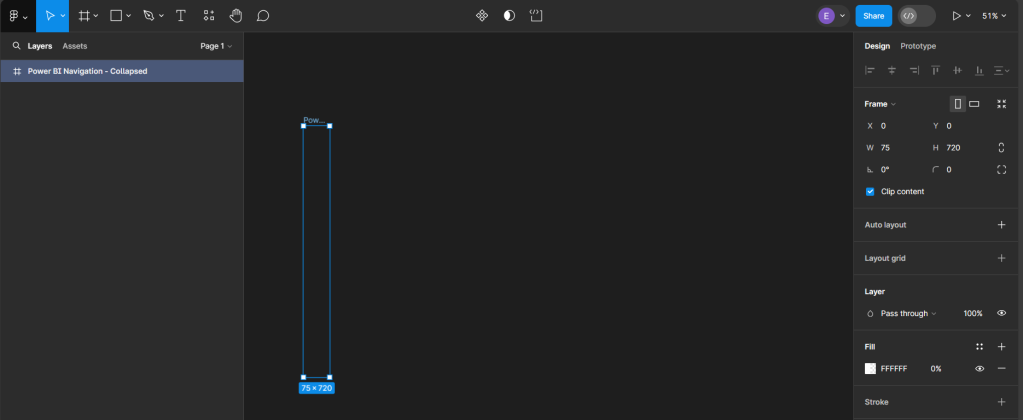
To get started with our new design we will add a frame to our design file and define the shape and size of our design.
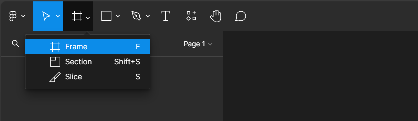
After selecting Frame, a properties panel will open to set the size of the Frame. For a standard Power BI report, the canvas size is typically 1280 x 720. We can use the pre-established size option for TV (under Desktop). We then rename the Frame by double-clicking on the Frame name in the Layers Panel and entering the new name, here we will use Power BI Navigation Collapsed. Then modify the width, since the navigation won’t occupy the entire report, to 75, and set the fill to transparent. This will act as the background or a container for our navigation when collapsed.
Creating Local Variables and Base Elements
Before getting started adding elements to our navigation we will create local variables to store the theme colors of our navigation. On the Design pane, locate local variables and then select open variables.
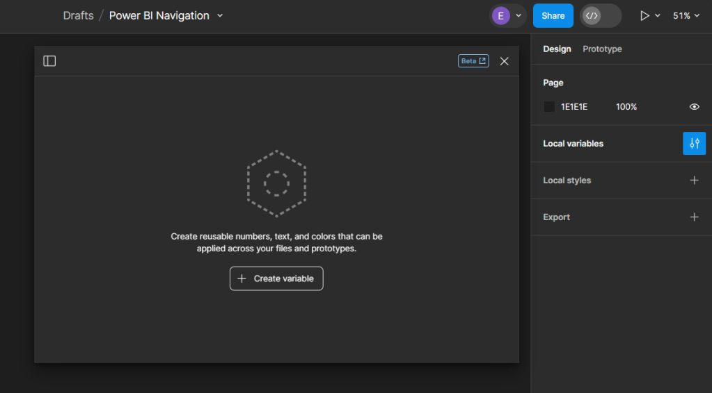
Select Create variable and then Color to get started. For the navigation, we will create two color variables, one corresponding to the background element color and the other the first-level element color of our Power BI theme. If we are using Figma to design wireframes or mock-ups of our Power BI report, we can easily expand the number of variables to include all the colors used within the Power BI theme.
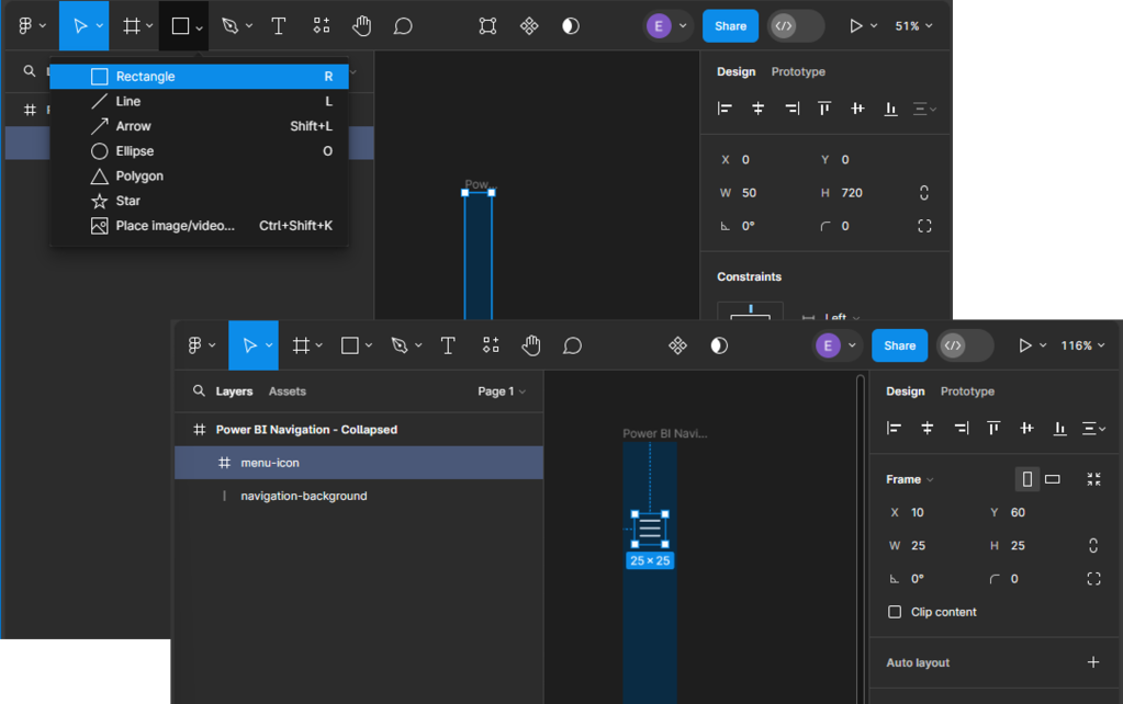
We start building our navigation by adding the base elements. This design includes the dark blue rectangle that will contain our navigation icons and the menu icon that, when clicked, will expand the navigation menu. Under the Shape tools menu select rectangle to add it to our Power BI Navigation - Collapsed frame, then set the width to 45.
Next, we will add the menu icon that will act as a button to expand and collapse the navigation menu. For this navigation, we will use a list or hamburger menu icon with a height and width of 25 that is centered and set towards the top within our navigation background. Then, set the color of the icon to our background-element variable. When searching for icons that fit the report’s styling, the Figma community has a wide range of options to offer.
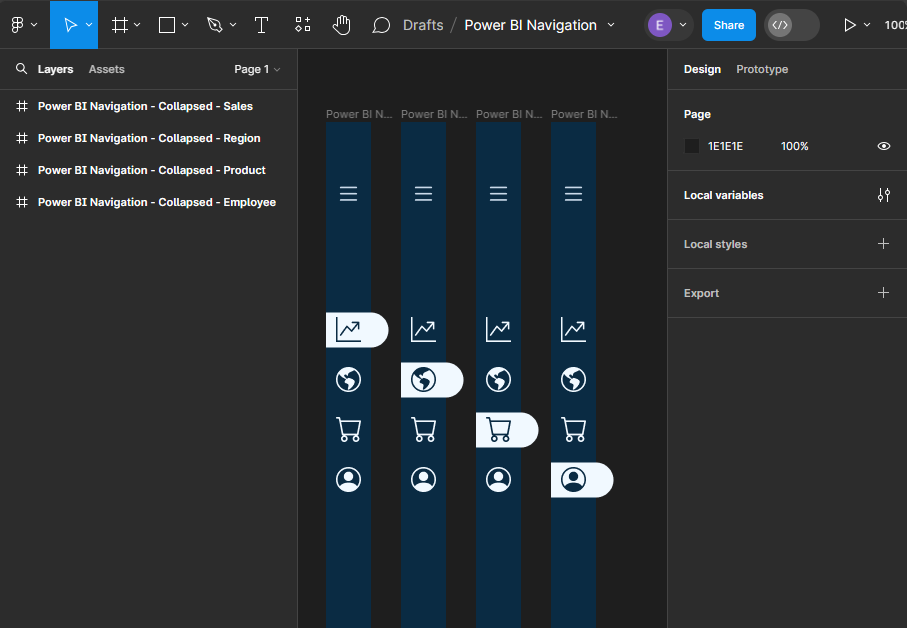
Adding Page Navigation Icons
Once our base elements are set, we can move on to adding our page icons that will act as the page navigation buttons when the menu is collapsed. In the final report, we will add this navigation menu to contain four pages, so we will add an icon for each page. All icons will be the same size as the menu icon (height and width set to 25), centered horizontally in the navigation background, positioned vertically towards the top, and their color set to our background-element color.
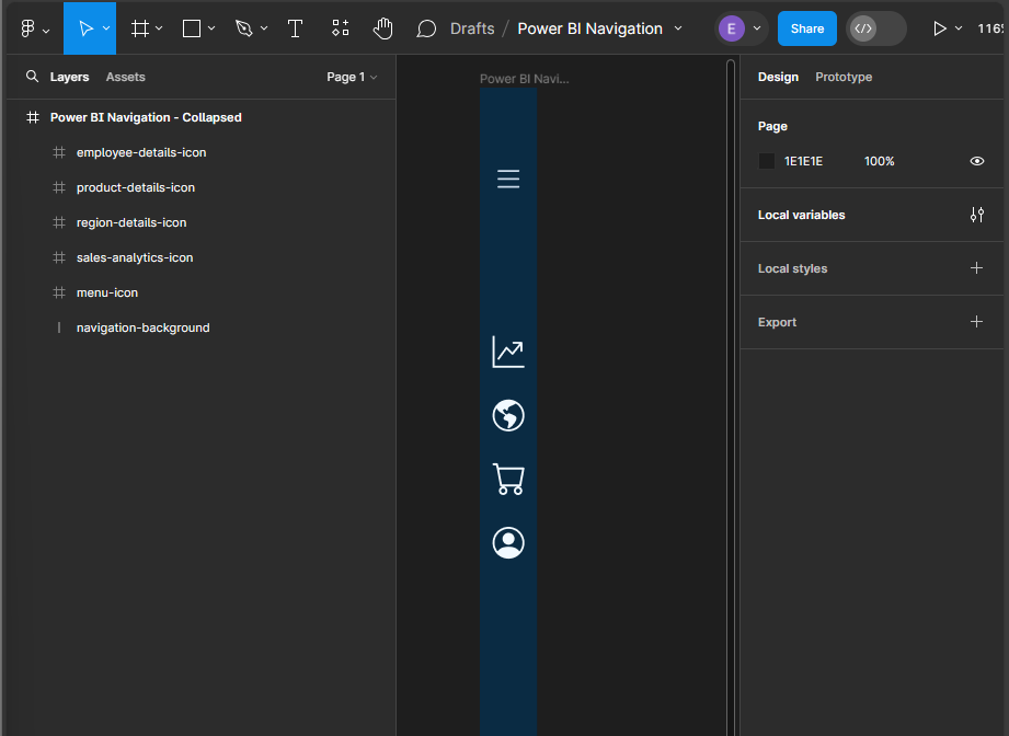
This will serve as our base or template navigation menu for all pages. Next, we will copy this for each page in our report and modify it to indicate the current page.
To do this, we first add a line (under the Shape tools) with a width of 45, a stroke color of our background element, a stroke size of 35, and a round end point. Then, position it in the layers pane directly above the navigation so that it appears under the page icons. Once created, align it horizontally with the navigation background, and vertically centered under the current page icon. Update the color of the icon to the first-level-element variable, and then add a drop shadow. Repeat this process for each page icon, creating a navigation menu that can be added to each page of our report.
Creating the Expanded Menu
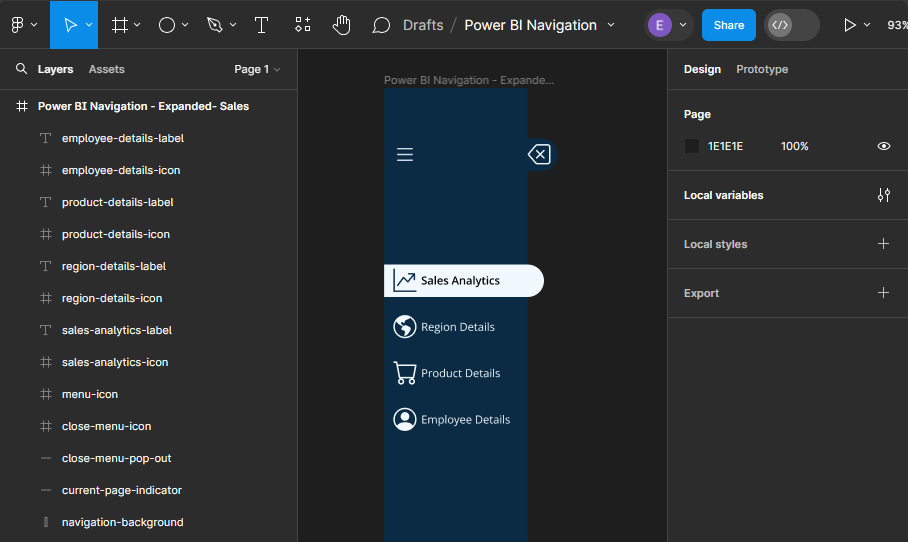
Now that we have completed the collapsed menu design elements, we will use these as the base to create the expanded menu. Creating the expanded menu starts by duplicating each of the collapsed menus. Once duplicated, we will rename each of the Power BI Navigation Frames to replace Collapsed with Expanded and then carry out a few steps for each.
First, we increase the width of the Frame from 75 to 190, the width of the navigation-background rectangle, and the current-page indicator from 45 to 155.
Next, add new Text components for each page icon in the menu. The font color for each text component will match the icon’s color, and the font weight for the selected page text will be set to semi-bold.
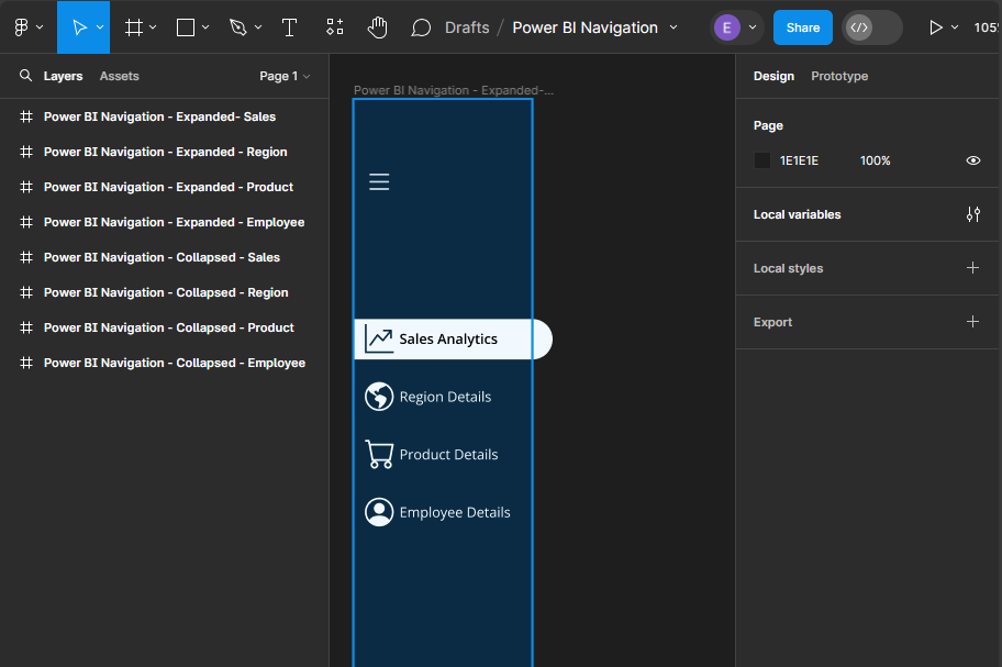
In addition to being able to use the menu icon to toggle the navigation between collapsed and expanded, we will also add a specific collapse menu icon to the expanded menu. We first add a new line element to the expanded menu frame, with a width of 15, stroke size 35, and stroke color first-level-element. We position this on the right side of our navigation background and align it vertically centered with the menu icon. Then add a close icon with the same dimensions as all of our other icons and position it centered on this new line component.
By following these steps, we have taken the first step towards creating a visually appealing, dynamic, and interactive navigation element that will make our Power BI reports more engaging and user-friendly.
Exporting Figma Designs and Importing in Power BI
Once our navigation element is finished in Figma, the next step is bringing it to life within our Power BI Report. This involves exporting the designs from Figma and importing them into Power BI.
Preparing Our Figma Design for Export
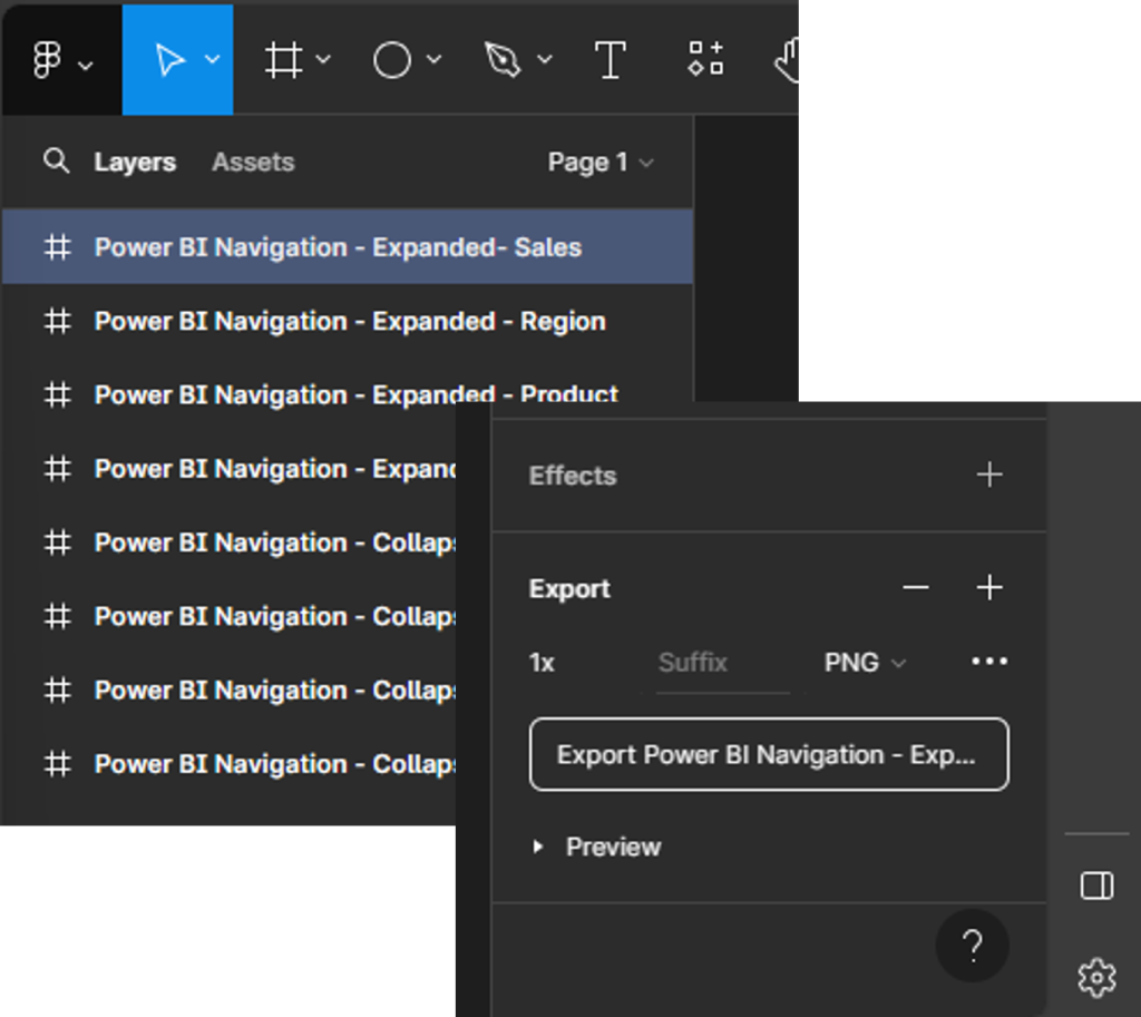
Before exporting our design, it is always a good idea to double-check the size of the different components to ensure they are exactly what we want, and so they integrate with our Power BI report seamlessly. Figma allows us to export our designs in various formats, but for Power BI, PNG or SVG files are a common choice.
To export our designs, select the Frame from the layers pane (e.g., Power BI Navigation—Expanded—Sales), and then locate export at the bottom of the design pane on the right. Select the desired output file type, then select Export.
Importing and Aligning Figma Designs within Power BI
Once our designs are exported, importing them into Power BI is straightforward. We can add images through the Insert menu, selecting Image and navigating to our exported design files.
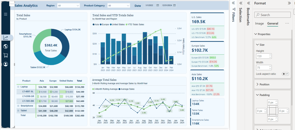
Once imported, we adjust a few property settings on the image so it integrates with our report, creating a cohesive look and feel. First, select the image, and in the Format pane under General > Properties, we turn off the Lock aspect ratio option and then set the height to 720 and width to the width of the Figma frame (e.g., 75). Then we set the padding on all sides to zero. This ensures that our navigation is the same height as our report and appears properly.
Repeat the above process for the expanded navigation design.
Bringing Our Navigation to Life with Power BI Interactivity
When we merge our design elements with the functionality of interactivity of Power BI, we elevate our Power BI reports into dynamic, user-centric journeys through the data. This fusion is achieved through the strategic use of Power BI’s buttons and bookmarks, paired with the aesthetic finesse of our Figma-designed navigation.
Understanding the Role of Buttons and Bookmarks
Buttons in Power BI serve as the interactive element that users engage with, leading to actions such as page navigation, data filtering, or launching external links. The key to leveraging buttons effectively is to design them in a way that they are intuitive and aligned with the overall design of our report.
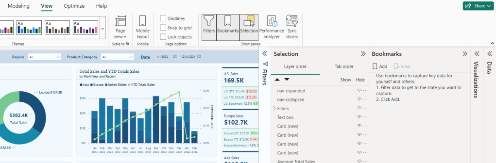
Bookmarks capture and recall specific states of a report, and most importantly for our navigation, this includes the visibility of objects. To create a bookmark first go to the View menu and select bookmarks to show the Bookmarks pane. Then we set our report how we want it to appear, then click Add, or if the bookmark already exists, we can right-click and select Update.
Step-by-Step Guide
- First from the
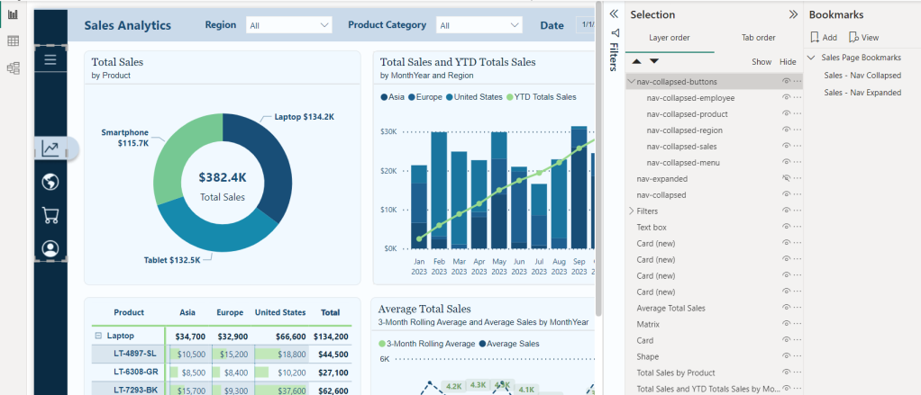
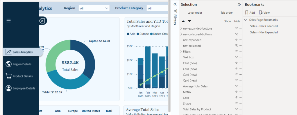
Viewmenu we will turn on the Selection and Bookmarks pane to get our report objects and bookmarks set for our navigation. We will see the image object in our Selection pane, which will be the two navigation images we previously imported. Rename these to give descriptive names, so we can tell them apart. For examplenav-collapsedandnav-expanded.
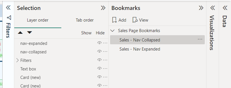
- We will add two bookmarks to this page of the report, one corresponding to the collapsed navigation and one for the expanded navigation. To keep our bookmarks organized, we will give them a descriptive name (
<page-name>- Nav Collapsedand<page-name>-Nav Expanded) and if needed we can use groups to further organize them.
- Now we will add buttons that overlay our navigation design element to add interactivity for our users. We will a blank button to our report with a width of 45 and a height of 35.
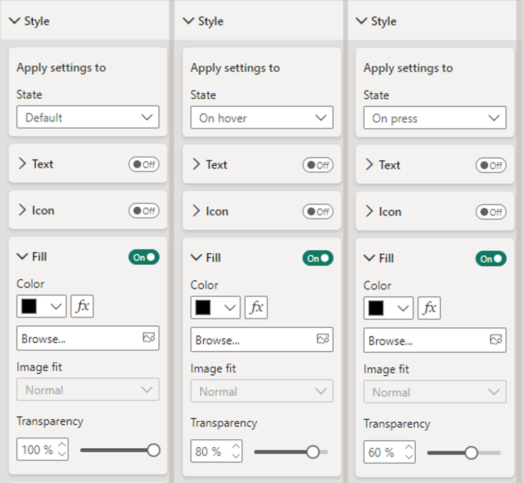
- Then on the Format pane under Style, locate the Fill option for the button toggle it on, and set the following for the Default, On Hover, and On Press states.
- Default: Fill: Black, Transparency: 100%
- On Hover: Fill: Black, Transparency: 80%
- On Press: Fill: Blank, Transparency: 60%
- Then on the Format pane under Style, locate the Fill option for the button toggle it on, and set the following for the Default, On Hover, and On Press states.
Duplicate this button for each page icon and position the buttons so that they overly each icon in the navigation menu. In the Selection pane double-click each button to rename the object providing it a description name (e.g. nav-collapsed-menu). Then select all and group them, providing the group a name as well (e.g. nav-collapsed-buttons).
- Now that our buttons are created, styled, and positioned, we will set the specific actions required by each.
- Navigation menu icon
- Action
- Type: Bookmark
- Bookmark: Sales – Nav Expanded
- Tooltip text: Expand Navigation Menu
- Action
- The current page icon button
- Action
- Type: Page navigation
- Destination: None
- Tooltip text: Sales Analytics
- Style
- Fill: Toggle off (this will remove the darkening effect when hovered over since this page is active)
- Action
- All other page icon buttons
- Action
- Type: Page navigation
- Destination: Select the appropriate page for the icon
- Tooltip text: Name of the destination page
- Action
- Navigation menu icon
- Next, we copy and paste the
nav-collapsed-buttonsgroup to duplicate the buttons so we can modify them for our expanded navigation menu. After pasting thenav-collapsed-buttonsgroup ensure to set the position to the same position as the initial grouping.- Rename this group with a descriptive name such as
nav-expanded-buttons. - Additionally, rename all the buttons objects within the group to keep all our objects well organized and clearly named (e.g.
nav-expanded-menu). - Adjust the visibility of our object so that the
nav-collapsed-buttonsgroup andnav-collapsedimage are not visible, and theirexpandedcounterparts are visible.
- Rename this group with a descriptive name such as
- Set the width for all the page navigation buttons to 155. This will match our navigation background, which we created in Figma. No other properties should have to be set for these buttons.
- Update the action of the
nav-expanded-menubutton and select theSales - Nav Collapsedbookmark we created previously.- Copy and paste this button, then rename the new button as
nav-expanded-close. - Resize and position this button over the close icon in our expanded navigation.
- In the Selection pane drag and drop this button into the
nav-expanded-buttonsgrouping.
- Copy and paste this button, then rename the new button as
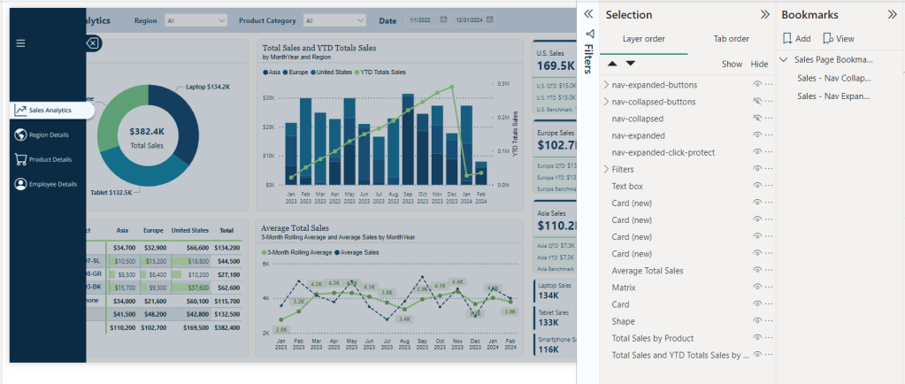
- When the navigation is expanded, we want to prevent interaction with report visuals. To do this, we will add a new blank button to the report and size it to cover the entire report canvas.
- In the Selection pane, place this button directly following the navigation images so it is below
nav-expanded. - In the Format pane for the new button, under the General tab turn on the background and set the color to black with 80% transparency.
- Turn on the action for this button, set it to a Bookmark type, and set the bookmark to our Sales—Nav Collapsed bookmark. This will ensure that if a user selects outside of the navigation options when the navigation is expanded, they are returned to the collapsed navigation state, where they can interact with the report visuals.
- In the Selection pane, place this button directly following the navigation images so it is below
- Lastly, we will set our bookmarks, so the correct navigation objects are shown for the expanded and collapsed bookmarks.
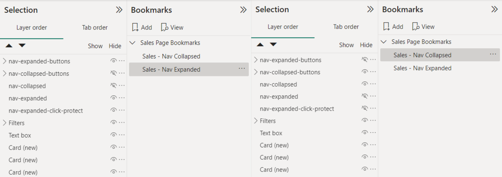
- Right-click each bookmark and uncheck the
Dataoption, so this bookmark will not maintain the current data state. When a user expands or collapses the menu or moves to a different page, we do not want to impact any selected slicers or filters they have selected. - Ensure the
nav-collapsed-buttonsgrouping andnav-collapsedimages are hidden while their expanded counterparts are visible. Then right-click the expanded bookmark and select update. - Select the collapsed bookmark, unhide the collapsed objects, and hide the expanded objects. Right-click the collapsed bookmark and select update.
- Right-click each bookmark and uncheck the
Now that we have created all the interactivity for our navigation in Power BI for our Sales Analytics page, we can easily copy and move these objects (e.g., the button groupings) to each page in our report. Then, on each page, we will import the 2 Figma navigation designs specific to that page and then size and align them. After this we can add two new bookmarks for that page to store the collapsed and expanded state, using the same process we used in step #9. Finally, update the current page button to toggle off the styling fill and toggle on styling fill for the sales icon buttons (See step #4).
By blending Figma’s design capabilities with Power BI’s interactive features, we can create a navigation experience that elevates the appearance of our report and feels intuitive and engaging. This approach ensures our reports are not just viewed but interacted with, providing deep insights and a more enjoyable user experience.
Bringing It All Together: A Complete Navigation Experience
After creating our navigation visual elements in Figma and integrating them with the interactive powers of Power BI buttons and bookmarks, it’s time to bring it all together and see it in action.
Testing and Refining the Navigation
The key to a successful navigation experience for our users lies in its usability. It is important to conduct user testing sessions to gather feedback on the intuitiveness of the navigation. During these sessions, we can note areas where users hesitate or get lost. Then, using this feedback, we can further refine our navigation, making adjustments to ensure users can effortlessly find the information they need within our reports.
User Experience (UX) Tips for Power BI Reports
Well-designed navigation is just one piece of the UX puzzle. To further enhance our Power BI reports, we should also consider the following.
- Clarity: ensure our reports are clear and easy to understand at a glance. We should use consistent labeling and avoid cluttering a page with too much information.
- Consistency: apply the same navigation layout and style throughout our reports, and perhaps even across different reports. This consistency helps users learn how to navigate our reports more quickly.
- Feedback: Provide visual and textual feedback when users interact with our report elements. For example, we could set the on hover and on pressed options for our buttons or use tooltips to explain what a button does.
Elevating Power BI Reports
By embracing the fusion of Figma’s design capabilities, UX tips, and Power BI’s interaction and analytical power, we can unlock new potential in our reports and user engagement. This journey from design to functionality has enhanced the aesthetic appeal, usability, and functionality of our report. Remember the goal of our reports is to tell the data’s story in an insightful and engaging way. Let’s continue to explore, iterate, and enhance our reports as we work towards achieving this goal while crafting reports that are beyond just tools for analysis but experiences that inform, engage, and fuel data-driven decisions.
If you found this step-by-step guide useful, check out the quick start on creating interactive navigation solely using Power BI’s built-in tools. It provides details on where and how to get downloadable templates to begin implementing this navigational framework for 2-, 3-, 4-, and 5-page reports!
Design Meets Data: Crafting Interactive Navigations in Power BI
User-Centric Design: Next level reporting with interactive navigation for an enhanced user experience
Also, check out the latest guide on using Power BI’s page navigator for a streamlined, engaging, and easy-to-maintain navigational experience.
Design Meets Data: A Guide to Building Engaging Power BI Report Navigation
Streamlined report navigation with built-in tools to achieve functional, maintainable, and engaging navigation in Power BI reports.
Thank you for reading! Stay curious, and until next time, happy learning.

And, remember, as Albert Einstein once said, “Anyone who has never made a mistake has never tried anything new.” So, don’t be afraid of making mistakes, practice makes perfect. Continuously experiment, explore, and challenge yourself with real-world scenarios.
If this sparked your curiosity, keep that spark alive and check back frequently. Better yet, be sure not to miss a post by subscribing! With each new post comes an opportunity to learn something new.


 Ethan Guyant