Stay ahead of the latest features with a focused look at Power BI’s latest features, their benefits, and use cases. Dive into walkthroughs and tips to enhance your reports.
The Power BI November 2024 update introduced several exciting enhancements and preview features.
I was particularly interested in the new text slicer preview feature and the quick query option for defining measures in DAX query view. Both of these improvements have the potential to enhance data filtering flexibility, simplify workflows, and increase overall efficiency.
The New Text Slicer: Customized Filtering for Power BI
The new text slicer visual preview feature, introduced in the November 2024 Power BI update, is a versatile tool designed to enhance interactivity and filtering based on text input. This feature allows users to enter specific text, making it easier to explore data and quickly find relevant information.
Benefits of the Text Slicer: Improved Usability and Customization
The text slicer offers a user-friendly and adaptable filtering option with straightforward functionality. Its advantages are particularly evident when filtering datasets that contain high-cardinality fields, such as customer names, product IDs, or order numbers.
Additionally, the slicer features customization options that allow us to adjust its design to fit our report. We can set placeholder text to guide users on what input is expected, and its properties enable us to customize the font and color of various elements, ensuring both readability and visual appeal.
After updating to the latest version of Power BI Desktop, you can enable the new feature by navigating to Options and Settings > Options > Preview features and then checking the box next to the Text Slicer visual.
Once enabled, you will find the new slicer in the Build menu, allowing you to add the visual to your report canvas.
After adding the visual to the report canvas, drag the text field from the data model that you want the slicer to filter on into the slicer’s Field property. Then, type your desired text into the slicer’s input box and click the apply icon to filter the results instantly.
Use Cases: Applying the Text Slicer in Reports
Filtering by Product Category– Exploring the basics
My sample dataset includes product sales, with each product assigned to a specific category. We can use the text slicer to filter the data by product category, such as “Laptop.”
After entering and applying the desired input, the text slicer quickly filters the report page to display only the specified product category. Once the filter is applied, clicking the dismiss (“X”) button will remove it and return to the full dataset.
Filtering our dataset using the text filter alongside the product category yields the same results as using the standard slicer. However, unlike the standard slicer, which displays all categories, the text slicer allows users to type and filter to the desired category directly.
This feature is handy when there are numerous categories to choose from, as scrolling through the list can be time-consuming. Additionally, the text slicer does not require users to toggle on a search functionality like the standard dropdown-styled slicer. With the text slicer, users can enter the category, apply the filter, and quickly narrow the report to the relevant sales data.
This application serves as a good introduction to the functionality of the text slicer and provides a useful comparison with the standard slicer.
Filter on Parts of a Product Code – Explore data without a standalone field
The Products table in the dataset contains product codes that have embedded information, such as the product’s color code. The text slicer offers a quick and effective solution for filtering on this embedded information.
For instance, a product code like SM-5933-BK includes the color code “BK,” which signifies the color black. Using a text slicer on the product code field with the input “BK,” we can filter all products linked to the color black without needing a separate product color filtering dimension in the data model.
The text slicer in this scenario helps us better utilize the data in our dataset to analyze sales data.
Removing the need to extract the color code and add extra filtering dimensions to the data model can be beneficial, especially in cases where changes to the data model are not allowed.
Search and Filter Product Review – Analyze long-form text fields
The sample dataset includes a table of product reviews. The text slicer allows us to filter by keywords, enabling exploration and analysis of specific feedback. For instance, entering the keyword “battery” filters the report page to only the reviews that mention battery across all products.
This allows decision-makers to concentrate on relevant reviews, recognize trends, and extract insights regarding common issues or exceptional features.
Since the text slicer is currently a preview feature, I am not prepared to incorporate it into any production reports just yet. However, I find the potential it offers for our reports intriguing. A current limitation of the text slicer is it only allows us to input a single text input, limiting our ability to search a variety of related terms. I look forward to seeing how it develops with the introduction of new properties and functionalities.
DAX Query View Quick Queries: Define new measure
With the November 2024 update, the DAX query view quick queries options were updated and now include a define new measure option. Quick queries boost productivity for common tasks and can be further modified. Adding the ability to define a new measure to the quick queries options will aid in streamlining workflows in Power BI.
This option, available through the context menu of tables and columns, generates a query-scoped DAX measure formula framework, allowing us to modify and execute custom measures with minimal setup.
For instance, the Review Count visual utilizes the implicit count of Review IDs to show the number of reviews for each product category. We can quickly and easily use the Define a new measure option to create our DAX formula syntax to get started creating an explicit summary measure to add to this visual. After customizing the formula for our specific measure, we can view the results and update the data model accordingly.
This simple and clear example demonstrates how quick queries can assist us in starting common tasks. We can easily expand on this foundation to develop more complex calculations and measures to enhance our data model.
To learn more about working with DAX query view, check out the Work with DAX query view documentation.
Wrapping Up
The new text slicer preview feature in the November 2024 Power BI update is an exciting addition. It will be interesting to see how this feature develops over time. Once fully implemented, its ability to provide quick and intuitive filtering will enhance user interactivity, making it a valuable tool for dynamic and user-friendly reporting.
The new “Define a new measure” quick query option in DAX query view is a helpful addition. This feature allows us to quickly create new measures by providing a starting point for the syntax needed to create a query-scoped measure DAX formula.
Power BI updates continually transform how we explore and analyze data, enabling us to create more compelling and interactive reports. By experimenting with the text slicer and other new features, we can gain a better understanding of how to fully utilize them in our reports.
Thank you for reading! Stay curious, and until next time, happy learning.
And, remember, as Albert Einstein once said, “Anyone who has never made a mistake has never tried anything new.” So, don’t be afraid of making mistakes, practice makes perfect. Continuously experiment, explore, and challenge yourself with real-world scenarios.
If this sparked your curiosity, keep that spark alive and check back frequently. Better yet, be sure not to miss a post by subscribing! With each new post comes an opportunity to learn something new.
Stay ahead of the latest features with a focused look at Power BI’s latest features, their benefits, and use cases. Dive into walkthroughs and tips to enhance your reports.
With each update, Power BI continues to grow its feature set, offering more options to improve how we present our data to our report viewers. The October 2024 update included enhancements to data markers in our line and scatter visuals.
Data markers can easily be overlooked, but they effectively draw the report viewer’s attention to critical data within our visuals. This update introduces new options and flexibility to customize these data point markers within our line and scatter visuals.
In this post, we will examine these new options and their benefits, providing practical examples to demonstrate how to maximize these updates in your Power BI reports.
What’s New with Marker Enhancements
The enhancements to the markers provide us with a broader toolkit to emphasize specific data points and series. The updates allow us to customize markers for individual categories as well as for the entire series, opening up new opportunities to highlight trends, make comparisons, and showcase key insights.
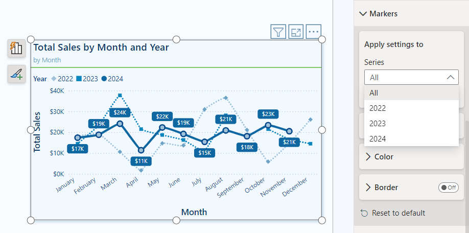
Our markers for line and scatter charts can be customized in two ways.
Categories: When our visual does not include individual series, the Markers dropdown menu shows the categories represented on the x-axis. This feature allows us to adjust the markers for each data point based on its category. We can use this option to highlight specific time periods or product categories within our dataset.
Series: When our visual includes a series legend, the Markers dropdown menu displays the available series. By selecting a series, we can customize the markers for the entire series. This modification enables us to create more cohesive visual indicators that distinguish between different series, rather than relying solely on color differences.
New Formatting & Customization Options
Our line and scatter visuals now include three additional formatting options for our data markers.
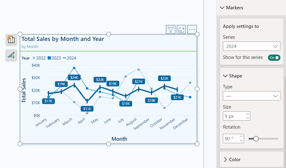
Shape: We can modify the shape and size of our markers, and now we can also rotate the shape (with the exception of circle markers) within our line and scatter marker properties. This added feature allows us to create unique shapes for different data series, offering greater variety in representation.
Color: Alongside the new shape properties, we now have improved color options for our markers. We can adjust the transparency of markers on a per-category or per-series basis. This flexibility enables us to present details subtly without overwhelming the visual impact.
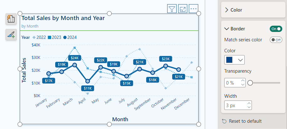
Border: Marker borders are a new customization feature that lets us tailor our markers according to our preferences. We can add borders to specific categories, series, or to all markers within the visual. These border options are excellent for adding depth to our visuals and for highlighting specific data points.
Practical Applications: Marker Customization
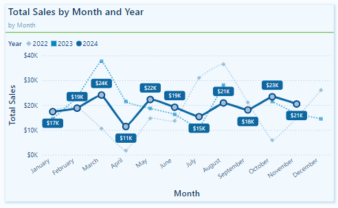
These new marker customizations offer a wide range of possibilities for enhancing visuals in our Power BI reports. Below is a visual representing Total Sales by Month, showcasing various options for using markers to highlight specific trends and series.
In this example, the marker properties are adjusted for each series to ensure they are visually distinct from one another, not just by color.
The markers for the 2022 and 2023 series are displayed with a transparency level set to 40%. This subtle adjustment allows viewers to see historical data without overshadowing the 2024 data, making it easier to focus on the current year’s trends while still retaining reference to past data when necessary.
For the 2024 series, the markers have a border that matches the line series color and a lighter blue fill. This combination draws attention to each data point, emphasizing it against the more muted markers of the previous years.
Recommendations for Using Markers in Power BI Visuals
With the expanded marker customization options in Power BI, it can be easy to overdo it. To use these enhancements effectively, it’s important to follow some recommended best practices.
Markers are useful tools for emphasizing data; however, overusing or misapplying them can lead to visual clutter, negatively affecting the clarity of our reports. Here are some guidelines for using markers in Power BI visuals:
Use sparingly: Avoid placing markers on every data point unless necessary. Instead, use markers to highlight the most critical data series or points.
Consistency is key: When using markers across multiple visuals in a report, keep the sizes, shapes, and colors consistent. This creates a cohesive visual experience and makes it easier for viewers to interpret data across different visuals.
Accessibility: To ensure our visuals are accessible to all users, choose marker colors, sizes, and shapes that stand out clearly. Do not rely solely on color to differentiate data point markers. Utilizing the new shape rotation and border properties can help make markers more distinguishable.
Transparency and emphasis: Carefully adjust the transparency properties to emphasize certain data points while minimizing visual noise.
Borders for added contrast: Using borders can effectively create contrast between data points. Contrasting border colors can help them stand out, drawing viewers’ attention to the most critical data.
Wrapping Up: Power BI Marker Enhancements
The recent marker enhancement update in Power BI introduces greater customization and flexibility for line and scatter charts. With increased control over marker shapes, transparency, borders, and settings specific to each series, we can better highlight key data points.
While these marker enhancements are beneficial, an additional feature that could improve our marker customization is the ability to apply conditional formatting directly within the marker properties. This would streamline the process of highlighting specific data points that meet certain conditions, eliminating the need for separate DAX measures or other workarounds.
Power BI updates continue to empower us to craft compelling data stories. By experimenting with the new marker options, we can fully leverage the customization capabilities that Power BI provides. For more details and additional updates, check out the Power BI October 2024 Feature Summary.
Thank you for reading! Stay curious, and until next time, happy learning.
And, remember, as Albert Einstein once said, “Anyone who has never made a mistake has never tried anything new.” So, don’t be afraid of making mistakes, practice makes perfect. Continuously experiment, explore, and challenge yourself with real-world scenarios.
If this sparked your curiosity, keep that spark alive and check back frequently. Better yet, be sure not to miss a post by subscribing! With each new post comes an opportunity to learn something new.
Learn how to create a dynamic failure notification framework across Teams channels with a centralized SharePoint setup
Handling errors in Power Automate workflows can be challenging, especially when managing notifications across multiple flows. Adding contact details to each flow can become inefficient and difficult to maintain.
The Microsoft ecosystem offers various options and integrations to address these inefficiencies. In this approach, we will use a SharePoint list to centralize contact information, such as Teams Channel IDs and Teams Tag IDs. This method simplifies management and enhances our failure notification framework.
We will explore two methods. The first involves using Teams shared channels with @mentioning Teams tags to notify a specific group of users within our Power Automate Failure Notifications Teams team. The second method utilizes direct user @mentions in private Teams channels. Both methods employ a solution-aware flow, providing a reusable failure notification framework.
Power Automate Error Handling Best Practices
Before we can send failure notifications using our reusable framework, we first need to identify and handle errors within our workflows. It is essential to incorporate error handling into all our business-critical workflows to ensure that our Power Automate flows are resilient and reliable.
The configure run after setting is crucial for identifying the outcomes of actions within a workflow. It lets us know which actions were successful, failed, skipped, or timed out. By utilizing this feature, we can control how subsequent actions will behave based on the result of prior actions. Customizing these settings allows us to develop flexible and robust error-handling strategies.
Beyond using configure run after, there are important patterns that support effective error management in Power Automate:
Scoped Control (Try-Catch blocks): Grouping actions within the Scope control object aids in managing the outcomes of that set of actions. This method is valuable for isolating distinct parts of our workflow and handling errors effectively.
Parallel Branching: Establishing parallel branches enables certain workflow actions to continue even if others encounter errors. This approach allows us to run error-handling notifications or fallback actions concurrently with the primary process, enhancing the resilience of our flow and preventing interruptions.
Do Until Loop: For situations where actions may need multiple attempts to succeed, the Do Until control object permits us to execute actions until a specified success condition is met or a failure condition triggers our error-handling process.
These patterns collectively improve the reliability of our workflows by incorporating structured and consistent error handling. Identifying errors is just the first step; we must also notify the relevant individuals when a workflow encounters an issue so they can determine if further action or bug fixes are necessary.
Managing error notifications across multiple workflows can be difficult when contact information, such as an email address, is hardcoded into each individual flow. To address this, we will explore centralizing error notification details using a SharePoint list. This approach allows us to separate contact management from the flow logic and definitions.
The Final Solution in Action
Using Teams and Shared Channels with @mentioning Teams tags offers a practical and flexible solution. Teams tags enable us to group team members by their responsibilities, such as Development Team or workflow-specific groups. Using Teams tags makes it easy to alert an entire group using a single @mention tag.
In this example, we implement the Scoped Control (Try-Catch blocks) error handling pattern. This pattern groups a related set of actions into a scope, so if any action fails, we can handle the errors using an associated catch scope.
Here’s a basic flow that is triggered manually and attempts to list the members of a Teams Group chat.
When a non-existent Group chat ID is provided, the List members action will fail. This failure triggers the CATCH scope to execute. The CATCH scope is configured to run only when the TRY scope fails or times out.
When the CATCH scope executes, the flow filters the result of the TRY scope to identify which action failed or timed out using the following expressions:
Next, the flow utilizes the reusable notification framework to send a notification to Teams identifying that an error has occurred and providing details of the error message. We use the Run a Child Flow action and select our reusable error notification workflow for this purpose. This workflow requires three inputs:
When this workflow is triggered, and the TRY scope fails, we receive a Teams notification dynamically sent to the appropriate channel within our Power Automate Failure Notification Team, alerting the necessary individuals using the Dev Team Teams tag and direct @mentioning the technical contact.
The advantage of this approach and framework is that the notification solution only needs to be built once, allowing it to be reused by any of our solution-aware and business-critical workflows that require error notifications.
Additionally, we can manage the individuals alerted by managing the members assigned to each Teams tag or by updating the technical and functional contact details within our SharePoint list. All these updates can be made without altering the underlying workflow.
Continue reading for more details on how to set up and build this error notification framework. This post will cover how the Power Automate Failure Notifications Teams team was set up, provide resources on Teams tags, demonstrate how to create and populate a centralized SharePoint list for the required notification details, and finally, outline the construction of the failure notification workflow.
Setting Up Teams
Our error notification solution utilizes a private Microsoft Team, which can consist of both shared and private channels.
Shared channels are a convenient and flexible option for workflows that are not sensitive in nature. By using shared channels, we can take advantage of the List all tags Teams action to notify a group with a single @mention in our error notifications.
For additional information on managing and using Teams tags, see the resources below:
Private channels should be used when the workflow involves more sensitive information or when error notifications need to be restricted to a specific subset of team members. In this case, the error notifications target specific individuals by using direct user @mentions.
Centralized Error Notifications Details with SharePoint
To improve the maintainability of our error notifications, we will centralize the storage of key information using a SharePoint list. This approach enables us to store essential details, such as functional and technical contacts, Teams channel IDs, Teams Tag IDs, workflow IDs, and workflow names in one location, making it easy to reference this information in our error notification workflow.
The SharePoint list will serve as a single source for all required flow-related details for our notification system. Each entry in the list corresponds to a specific flow. This centralized repository minimizes the need for hardcoded values. When teams or contact details change, we can simply update the SharePoint list without the need to modify each individual flow.
Steps to Create the SharePoint List
Create a New List: In SharePoint, create a new list with a descriptive name and an appropriate description.
Add Required Columns: Include all necessary required and optional columns to the new SharePoint list.
FlowDisplayName: identifies the specific flow that utilizes the error notification system we are creating.
FlowId: unique identifier for the workflow associated with the error notification system.
Technical Contact: the primary person responsible for technical oversight who will be notified of any errors.
Functional Contact: secondary contact, usually involved in business processes or operational roles.
TeamsChannelName: name of the Teams Channel where error notifications will be sent.
TeamsChannelId: unique identifier for the Teams Channel that the flow uses to direct notifications.
TeamsTagId: this field is relevant only for shared channel notifications and contains the ID of the Teams Tag used to notify specific groups or individuals.
Populate the List with Flow Details
Our failure notification system will send alerts using the Post message in a chat or channel action. When we add this action to our flow, we can use the drop-down menus to manually select which channel within our Power Automate Failure Notifications team should receive the message.
However, it’s important to note that the Channel selection displays the channel name for convenience. Using the peak code option, we can see that the action utilizes the Channel ID.
The same applies when using the Get a @mention token for a tag. To dynamically retrieve the token, we need the Tag ID, not just the Tag name.
These key pieces of information are essential for our Failure Notification solution to dynamically post messages to different channels or @mention different tags within our Failure Notification team.
While there are various methods, such as peek code, to manually find the required values, this can become inefficient as the number of flows increases. We can streamline this process by creating a SharePoint Setup workflow within our Failure Notification solution.
This workflow is designed to populate the SharePoint list with the details necessary for the dynamic error notification framework. By automatically retrieving the relevant Teams channel information and Teams tag IDs, it ensures that all the required data is captured and stored in the SharePoint list for use in error notification flows.
SharePoint Set Up Workflow
This workflow has a manual trigger and allows us to run the setup as needed by calling it using the Run a Child Flow action when we want to add our error notifications to a workflow.
The inputs consist of 6 required string inputs and 1 optional string input.
channelDisplayName (required): the channel display name that appears in Teams. workflowId (required): the flow ID to which we add our error notifications. We can use the expression: workflow()?['name']. workflowDisplayName(required): the display name of the flow to which we are adding our error notifications. We can manually type in the name or use the expression: workflow()?['flowDisplayName']. technicalContact(required): the email for the technical contact. functionalContact (required): the email for the functional contact. workflowEnvironment (required): the environment the flow we are adding the error handling notifications to is running in. We can use the expression: workflow()?['tags']?['environmentName'] tagName (optional): the display name of the Teams tag, which is manually entered. This input is optional because the error notification solution can be used for Shared or Private Teams channels. However, @mentioning a Teams tag is only utilized for Shared channels.
Following the trigger, we initialize two string variables. The first ChannelId and the second TagId.
Get the Teams Channel ID
The next set of actions lists all the channels for a specified Team and uses the channelDisplayName input to extract the ID for the channel and set the ChannelId variable.
The Teams List channels action retrieves a list of all available channels in our Power Automate Failure Notifications Teams team. The Filter array action then filters this list based on the channelDisplayName input parameter.
The flow then attempts to set the ChannelId variable using the expression: outputs('Filter_array_to_input_teams_channel')['body'][0]?['id'].
However, if the output body of the Filter array action is empty, setting the variable will fail. To address this, we add an action to handle this failure and set the ChannelId to “NOT FOUND”. This indicates that no channel within our Power Automate Failure Notifications team matches the provided input value.
To achieve this, we use the Configure run after setting mentioned earlier in the post and set this action to execute only when the TRY Set ChannelId action fails.
Get the Teams Tag ID
After extracting the Teams Channel ID, the flow has a series of similar actions to extract the Tag ID.
Create an item on the SharePoint List
Lastly, the flow creates a new item on our supporting SharePoint list using the flow-specific inputs to store all the required information for our error notification solution.
Reusable Error Notification Flow Architecture
As the number of our workflows increases, a common challenge is developing a consistent and scalable error notification system. Instead of creating a new notification process for each workflow, we can leverage reusable solution-aware flows across multiple workflows within our environment. This approach minimizes duplication and streamlines our error notification processes.
Flow Structure for Reusable Notifications
The reusable notification flow is triggered when an error occurs in another workflow using the Run a Child Flow action and providing the required inputs.
The notification workflow parses the details of the workflow that encounters an error, creates an HTML table containing the details of the error that occurred, and then sends the notification using the centralized SharePoint list created in the previous section and dynamically alerts the appropriate individuals.
Trigger Inputs & Data Operations
We can catch and notify responsible parties that an error occurred in a workflow by calling this notification flow, using the Run a Child Flow action, and providing the workflowDetails, errorMessage, and scropeName.
After the trigger, we carry out two data operations. First, we parse the workflowDetails using the Parse JSON action and the expression json(triggerBody()?['text']) for the Content. Then, we create an HTML table using the information provided by our errorMessage input.
For the Create HTML table action, we use the following expressions for the inputs:
The notification flow queries the centralized SharePoint list to retrieve the necessary contact details and Teams information associated with the workflow that encountered the error.
We begin this subprocess by using the SharePoint Get items action with the Filter Query: FlowId eq 'body('Parse_workflowDetails_JSON')?['name']'.
Since each FlowID on our list should have only 1 record, we set the Top Count to 1.
Then, if our Power Automate Failure Notification Teams team uses Shared Channels, we use the Teams Get an @mention token for a tag and pass it the TagId stored within our SharePoint list using: outputs('Get_SharePoint_list_record_for_flow')?['body/value'][0]?['TagId'].
If the notification team uses private channels, this action can be excluded.
Lastly, for both Shared and Private channel notifications, we use the Teams Get an @mention token for user action to get the token for the technical contact stored within our SharePoint list using: outputs('Get_SharePoint_list_record_for_flow')?['body/value'][0]?['TechnicalContact']?['Email']
Send Teams Notification
Once we have retrieved the required contact details from SharePoint and Teams, the flow sends a notification to the appropriate Teams channel, notifying the relevant individuals. For Shared Channels, the message uses the @mention token for a Teams tag. If Private Channels are utilized, this should be removed from the flow and message.
Additionally, the message can be posted as the Flow bot when using Shared channels. However, when using Private channels, the message must be posted as User.
The flow dynamically sets the Channel using the ChannelId stored within our SharePoint list with the expression: outputs('Get_SharePoint_list_record_for_flow')?['body/value'][0]?['ChannelId'].
The message begins by identifying the workflow in which an error was encountered and the environment in which it is running.
Error reported in workflow: body('Parse_workflowDetails_JSON')?['tags']?['flowDisplayName'] {body('Parse_workflowDetails_JSON')?['tags']?['environmentName']}
Then, the message adds the HTML table created with the error message details using the following expression: body('Create_HTML_table_with_error_action_and_message').
Finally, it notifies the contacts for the workflow by using the @mention tokens for the Teams tag and/or the technical contact. The message also provides the details on the functional contact using the expression: outputs('Get_SharePoint_list_record_for_flow')?['body/value'][0]?['FunctionalContact']?['Email']
The notification process sends an informative and targeted message, ensuring all the appropriate individuals are alerted that an error has occurred within a workflow.
Reusability
This architecture enables us to develop a single workflow that can trigger error notifications for any new workflows, making our error handling and notification process scalable and more efficient.
By using this approach, we can avoid hardcoding notification logic and contact details in each of our workflows. Instead, we can centrally manage all error notifications. This reduces the time and effort needed to maintain consistent error notifications across multiple workflows.
Wrapping Up
This Power Automate error notification framework provides a scalable solution for managing notifications by centralizing contact information in a SharePoint list and leveraging solution-aware flows. Setting up a single, reusable notification flow eliminates the need to hardcode contact details within each workflow, making maintenance and updates more efficient.
The framework targeted two notification methods: Shared Teams channels with tags and Private Teams channels with direct mentions. This system ensures error notifications are delivered to the right individuals based on context and need.
Shared Channels with Teams Tags
This approach sends notifications to a shared Teams channel, with Teams tags allowing us to notify a group of individuals (such as a “Dev Team”) using a single @mention.
How It Works: The notification flow retrieves tag and channel details from the SharePoint list. It then posts the error notification to the shared channel, @mentioning the relevant Teams tag to ensure all tag members are alerted.
Advantages: This method is scalable and easy to manage. Team members can be added or removed from tags within Teams, so updates don’t require changes to the flow definition. This is ideal for notifying larger groups or managing frequent role changes.
Private Channels with Direct @Mentions
Private channels are used to send notifications directly alerting a technical contact when workflow and error details should not be visible to the entire Team.
How It Works: The flow dynamically retrieves contact details from the SharePoint list and posts the error notification to the private channel, mentioning the designated technical contact.
Advantages: This approach provides greater control over the visibility of the notifications, as access is restricted to only those users included in the private channel.
Each of these approaches is flexible and reusable across multiple workflows, simplifying the process of managing error notifications while ensuring messages reach the appropriate individuals based on the notification requirements.
Thank you for reading! Stay curious, and until next time, happy learning.
And, remember, as Albert Einstein once said, “Anyone who has never made a mistake has never tried anything new.” So, don’t be afraid of making mistakes, practice makes perfect. Continuously experiment, explore, and challenge yourself with real-world scenarios.
If this sparked your curiosity, keep that spark alive and check back frequently. Better yet, be sure not to miss a post by subscribing! With each new post comes an opportunity to learn something new.
Streamlined report navigation with built-in tools to achieve functional, maintainable, and engaging navigation in Power BI reports.
Before we begin developing the navigational element of our reports, we must decide what tools to use. The Design Meets Data series started with two previous posts in which we explored two approaches: using Figma to design and customize our navigation and using Power BI’s built-in shapes, bookmarks, and buttons to create a similar experience with native tools.
User-Centric Design: Next level reporting with interactive navigation for an enhanced user experience
This post will explore using Power BI’s Page Navigator to simplify our navigation setup. Each approach has its own level of flexibility and ease of maintenance, so it’s important to choose the right method based on the project’s requirements.
The Power BI Page Navigator
Power BI’s Page Navigator lets us create a dynamic and interactive navigation menu in our reports. It is an out-of-the-box solution that simplifies the navigation experience.
Since the Page Navigator is a native feature, it requires minimal setup and automatically adjusts when new pages are added to the report. However, some adjustments may still be needed, such as resizing or formatting changes to accommodate report updates.
To add a Page Navigator to our report, we go to the Insert tab in Power BI Desktop, then select Navigator > Page navigator under the Buttons dropdown.
Customization Options
Power BI provides various options to customize the appearance of our Page Navigator, such as changing the font, colors, shapes, borders, and even what pages are listed. This allows us to create a navigational element that fits seamlessly within our report’s aesthetic.
Although the design flexibility is not as extensive as in our previous example using Figma, the Page Navigator option strikes a balance between ease of use and visual appeal.
Building the Navigation Pane
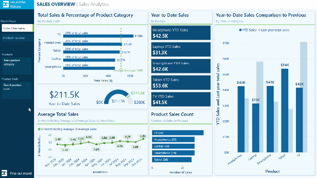
Now that we have covered the basics of the Page Navigator, we can begin building the navigation pane for our report. The navigation pane will be located on the left-hand side of our report and will serve as both the page navigation and container for our page slicers.
Below, is the final product. Follow the detailed step-by-step guide provided to create your own navigation pane
Building the navigation pane
We begin building the navigational pane on the left-hand side of our report canvas. First, we add a rectangle to the report canvas and style it to meet our needs. The navigation pane has a height equal to the report canvas and a width of 140. We set the fill color to dark blue, which is our Theme 1, 50% darker.
Next, we add a rectangle at the top of the navigation pane to provide an accent and space for displaying an organizational logo within our report. This rectangle has a height of 40 and a width of 140, and its fill color is set to the accent color of our report theme.
With the basic structure of our navigation pane in place, we then move on to adding the Page Navigator.
Formatting the Page Navigator
We begin by selecting the Insert tab on the main ribbon. Then, under the Button dropdown, select Navigator > Page navigator.
Once the Page Navigator is added to the report canvas, go to the Format pane and select Vertical from the Orientation dropdown under the Grid layout property.
Under the Pages property, we find options to control what pages are displayed within our report navigation. In the Options group, we can set general options such as Show hidden pages, Show tooltip pages, and Show all by default. Additionally, in the Show group, we can explicitly set which pages are shown in the navigation by using the toggles next to each report page.
Once our navigation displays the required pages, we adjust the width of the navigator object to 130 and the height to 105. Note that the height should be adjusted based on the number of pages in the navigation. In this example, we use a basic calculation to calculate the height by multiplying the number of pages by 35 ( 3 pages x 35 = 105).
Lastly, we set the horizontal position of the navigator object to 10 and the vertical position to 100.
Styling the Page Navigator
Once we finish the basic formatting, we customize the navigator to match the look of our report. Our aim with the styling is to make it easier to identify the current page.
We do this by adjusting the Style properties of the Page Navigator and using the Apply settings to State dropdown.
Below are the key differences between our page navigator’s Default, Hover, Press, and Selected states.
Default Text > Font: Segoe UI Text > Font Color: light blue, Theme color 1, 60% lighter Text > Horizontal alignment: left Text > Padding: left 5 px Fill > Color: dark blue (#06435F) Border: off Shadow: off Glow: off Accent bar: off
Hover Text > Font: Segoe UI Semibold Text > Font Color: white Text >Horizontal alignment: left Text> Padding: left 5 px Fill > Color: dark blue, Theme color 1, 25% darker Border: off Shadow: off Glow: off Accent bar: off
Press Text > Font: Segoe UI Semibold Text > Font Color: dark blue, Theme color 1, 50% darker Text >Horizontal alignment: left Text> Padding: left 5 px Fill > Color: white Border: off Shadow: off Glow: off Accent bar: off
Selected Text > Font: Segoe UI Semibold Text > Font Color: dark blue, Theme color 1, 50% darker Text >Horizontal alignment: left Text> Padding: left 5 px Fill > Color: white Border: off Shadow: off Glow: off Accent bar > Position: right Accent bar > Color: accent green (#6CBE4B) Accent bar > Width: 6px
After configuring all the styling options, our report page will have an engaging and interactive navigation panel.
Comparing the Approaches
When building a navigational component within our reports, we have a wide variety of options and approaches to choose from. Each report has unique requirements, so it’s important to compare and contrast these different approaches based on performance, ease of maintenance, and design flexibility.
Performance Comparison
Figma: Our Figma-based designs require importing images into Power BI. This can improve the load time of our reports because the report does not have to render each shape and component independently.
Power BI Native Shapes and Buttons: This option has the advantage of only requiring our development work to occur in Power BI. However, each shape and component added to build our navigation pane has to be loaded each time our report page is viewed.
Page Navigator: This offers a fully integrated approach with minimal overhead. However, we lose full control over design and aesthetics.
Ease of Maintenance
Figma: Our Figma-based approach is the most complex to maintain. Every design update requires going back to Figma, redesigning, re-exporting from Figma, and re-importing and integrating into our Power BI report.
Power BI Native Shapes and Buttons: This approach has the advantage of only using Power BI to maintain our navigational element but still requires manual updates when adding or removing pages from our report.
Page Navigator: This is the easiest option to maintain because the page navigator updates with any page additions or changes. However, the size of the object may still need to be adjusted.
Design Flexibility
Figma: Offers the highest level of design customization. We can create any design we can think up, however, this comes with added complexity and time requirements.
Power BI Native Shapes and Buttons: Provides us more flexibility than the page navigator, allowing us to customize our design and layout. However, we may still encounter design limitations depending on the options provided by Power BI.
Page Navigator: The most straightforward to implement but offers limited customization options, which restricts design flexibility. It prioritizes ease of maintenance over complex designs.
Final Thoughts
Deciding on the proper navigation for our Power BI reports depends on balancing design flexibility, ease of maintenance, and performance. Leveraging Figma allows for fully custom designs but comes with more complex maintenance. Power BI offers various native tools to help design navigational elements, although building a custom navigational pane will still require manual updates. Power BI’s Page Navigator stands out for its simplicity, dynamic updating, and minimal maintenance effort. However, the cost of the simplicity is limited customization and design flexibility.
The Design Meets Data series explored three approaches to building a Power BI report navigational pane.
User-Centric Design: Next level reporting with interactive navigation for an enhanced user experience
There are seemingly endless other approaches to creating this critical part of our Power reports. How do you approach your report’s navigation?
Thank you for reading! Stay curious, and until next time, happy learning.
And, remember, as Albert Einstein once said, “Anyone who has never made a mistake has never tried anything new.” So, don’t be afraid of making mistakes, practice makes perfect. Continuously experiment, explore, and challenge yourself with real-world scenarios.
If this sparked your curiosity, keep that spark alive and check back frequently. Better yet, be sure not to miss a post by subscribing! With each new post comes an opportunity to learn something new.
Chart your data journey! Transform data into insights with Power BI core visualizations.
Pie, Donut, and Treemap charts can be helpful tools when we need to show how different parts contribute to a whole. Pie charts represent data as slices of a circle and show the relationship of parts to a whole. Donut charts are similar to pie charts. However, their center is blank, providing space to add a label or other icon. Treemap charts use nested rectangles to visualize each level of hierarchy in our data.
These charts can be helpful for specific visualizations, but it is important to recognize their limitations. As with all of our data visualization tasks, choosing the right type of visual is essential. To explore bar and column charts, visit Part #1 of this series, and to learn more about line and area charts, check out Part #2.
Chart your data journey! Transform data into insights with Power BI core visualizations.
Customizing Pie Charts
Customizing our pie charts enhances their clarity, making it easier for our report viewers to interpret the data.
Adjusting Colors
The color choices used in our pie charts play a crucial role in their readability. Within the Slices property of our Pie chart, we can customize the colors used for each slice. When selecting colors, we should ensure they are visually distinct and that the colors used for our data categories are consistent across all visuals on the page and within the report.
We set the color of our slices in the Format pane, under the slices section. Here, we will find each data category included in the chart, and we can explicitly see the color.
Formatting Data Labels
The data labels on our pie charts help convey important insights to our viewers. Within the Data label properties of our pie chart we find several options to edit and format our data labels. We have options to set the position of our data labels (e.g. outside, prefer inside), what information to display such as category name, values, or percent of total, and under the Value grouping, we can format the text of the data labels.
Using a combination of these properties, we can make our charts more informative at a glance. For example, we can improve the above plot by displaying the category name and percent of total directly on our chart.
It is important to be cautious when using data labels. We want to provide essential information without overcrowding the chart with too much text. Adjusting the font size, background, font color, and label position can help us maintain a clean and organized look.
Using Legends Effectively
Our data labels display information directly on our charts, while legends offer a clean way to display what data category corresponds to which chart slice. Within the Legend properties we can set the position of the legend, set the title, and format the text and title of the legend.
We can update the Pie chart above to display the legend and then update the data label to display the total sales value and the percent of total value.
When using pie charts, it is important to limit the number of categories to ensure clarity. Pie charts are most effective when displaying data with no more than a few slices. If this cannot be accomplished, it’s best to consider other visuals to provide our insights.
Customizing Donut Charts
Donut charts provide an alternative to pie charts, with the added benefit of a central blank space. This space can be used for a variety of purposes or left blank. By customizing our donut charts, we can enhance their effectiveness and make them more informative and engaging.
Like pie charts, donut charts allow us to set the color of each chart slice, use data labels to provide additional information and position the legend to provide additional context.
Donut charts also offer additional properties we can customize to enhance these charts even further.
Modifying the Inner Radius
One of the main differences between our pie and donut charts is the open area in the center. Within the Slices property grouping, we will find a Spacing option. Here, we can adjust the inner radius, controlling how wide or narrow the chart’s ring appears.
Increasing this value creates a more pronounced donut shape, which can help draw viewers’ attention to the center of the chart. Decreasing this value makes the chart look more like a traditional pie chart.
Donut charts can be helpful when we need to compare proportions while also displaying an aggregate metric that we can place in the open center of the visual. However, like pie charts it is important to only use these charts when there is a small and manageable number of segments. When there are too many segments, donut and pie charts become cluttered and difficult to interpret.
When using these comparison charts, we should aim for simplicity and clarity.
Customizing Treemap Charts
Treemap charts are useful when visualizing hierarchical data. They allow us to display a large amount of information in a compact space. Each category in the visual is represented by a rectangle, the size of which reflects the category’s value.
Treemap charts offer various properties that we can customize to enhance their clarity, ensuring they effectively convey complex data structures and insights.
Adjusting the Colors
In our treemap visuals, colors distinguish between our different categories. Like in our other charts, we can set the color for each category, and it is important that this color selection is consistent across all visuals within our report. For example, we can create a treemap of our Total Sales by product category and product code and set the colors for each category to ensure visual consistency.
Setting Labels and Viewing Tooltips
Like many of our other Power BI visuals, Treemap visuals allow us to customize visual labels and tooltip properties to improve the readability of our visuals. Labels on our visuals provide context by displaying category names and values directly within each rectangle. By using the options available under the data labels and categories labels we can adjust the font size, color, display units, and the number of decimal places to improve the clarity of our visual.
We will use these properties to improve the treemap above by increasing the font size and weight of the category labels so they are easily identifiable. We will also turn on data labels to provide our viewers with precise information for the largest contributors.
Tooltips are another feature common across our Power BI visuals that adds an interactive element to our reports and can provide our viewers with additional information. When a user hovers over a rectangle, a tooltip appears, providing them with information about that category. Additionally, the information included within the tooltip can be customized to provide further context, such as percentages or other metrics.
In treemaps, some rectangles may be too small to display the data label, and tooltips become a valuable asset for delivering details without cluttering the visual.
Using Drill-Down Features
One strength of treemaps is their ability to represent hierarchical data. Power BI’s drill-down functionality lets us explore these hierarchies in detail. A user can use the drill-down feature to drill into the next level of the hierarchy, focusing on the subcategories or finer details of the data.
Drill-down features provide our viewers with another interactive element, allowing them to explore the dataset at multiple levels without overwhelming them with too much information upfront.
In our example treemap above, the first-level category is Product, and the second is Region. This allows our viewers to drill into a product category to view the distribution of product sales across sales regions.
Treemap charts can be a helpful tool for comparing proportions within hierarchical data. However, they are most effective when the differences in value between categories are significant. When all categories are similar in size, the visual can be difficult to interpret, so it is important to evaluate whether a treemap is appropriate for each use case.
Advanced Techniques and Customizations
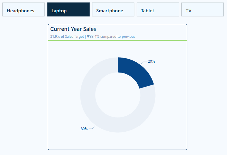
Current Year Sales by Product Selection
The Current Year Sales donut chart helps visualize how a selected product contributes to the total current year sales.
To build this visual, we first, create two measures: Total Sales CY and Remaining CY Sales.
The Total Sales CY measure calculates the current year’s total sales, and the Remaining CY Sales calculates the difference between the total sales of all products and the selected product’s sales.
Total Sales CY = TOTALYTD([Total Sales], DateTable[Date])
We then add these two measures to our donut chart’s Values property and set the color of the Total Sales CY to a dark blue and Remaining CY Sales to a light gray.
We then turn off the legend, and update the data labels to show only the percent of total value.
Next, we create a new measure that will be used for the visual subtitle. The subtitle provides additional context by showing how close the product’s sales are to hitting a sales target, and how this year’s sales compare to last year’s sales for the same period of time.
Lastly, we use the empty center of the donut chart to provide additional details to our viewers. Here, we display the total sales value for the selected product and add a dynamic label to clearly show what the sales value represents.
To do this we create another measure to dynamically update based on user selections. The Selected Product measure shows “All Products” when there is no product selection; otherwise, it displays the selected product name, or when there are multiple selections, it displays a list of all the selected products.
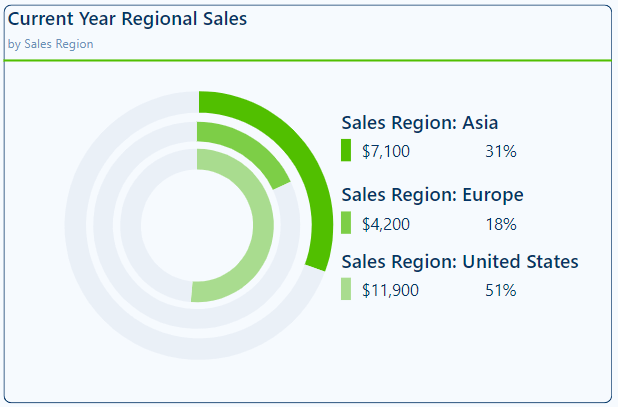
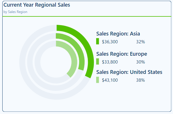
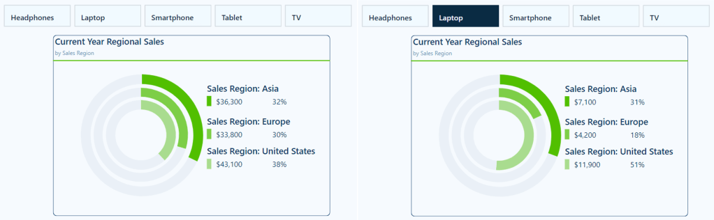
Similar to the visual above, we add the region-specific measures to a donut chart and format them to appear as concentric donut charts. This is done by turning off the border and background of the two inner donut charts and resizing them.
Next, we build a customized legend element that not only shows the total sales for each region but also the percentage that each region contributes to the overall sales. The percentage of overall sales is calculated using 3 new measures.
This visual is also dynamic based on the user interaction and selections made on the product slicer.
This visual provides our viewers with a quick comparison of regional sales. It clearly shows the sales distribution across our regions, allowing our viewers to identify which regions have the highest or lowest sales.
Wrapping Up
In this part of the series, we explored Pie, Donut, and Treemap charts and how to effectively use and customize these visuals in our Power BI reports. Pie and Donut charts can be helpful tools when displaying proportions but should be used selectively when comparing only a few categories. Treemap charts excel at displaying hierarchical data and provide us with a compact and insightful way to visualize this data.
While these visuals can prove to be just the right fit for a given requirement, they must only be used in the right scenarios, with an emphasis on simplicity and clarity.
In the next part of the series, we will explore Power BI’s Gauge, Card, and KPI visuals. These visuals help us display metrics and provide at-a-glance insights into key data points.
Thank you for reading! Stay curious, and until next time, happy learning.
And, remember, as Albert Einstein once said, “Anyone who has never made a mistake has never tried anything new.” So, don’t be afraid of making mistakes, practice makes perfect. Continuously experiment, explore, and challenge yourself with real-world scenarios.
If this sparked your curiosity, keep that spark alive and check back frequently. Better yet, be sure not to miss a post by subscribing! With each new post comes an opportunity to learn something new.


 Ethan Guyant