Navigate Data Complexities with Ease and Accuracy
In data analytics effectively navigating, understanding, and interpreting our data can be the difference between data-driven insights and being lost in a sea of data. In this post we will focus on a subset of DAX functions that help us explore our data – the Information Functions.
These functions are our key to unlocking deeper insights, ensuring data integrity, and enhancing the interactivity of our reports. Let’s embark on a journey to not only elevate our understanding of Power BI and DAX but also to harness the full potential of our data.
The Role of Information Functions in DAX
Information functions play a crucial role in DAX. They are like the detective of our Power BI data analysis, helping us identify data types, understand relationships, handling errors, and much more. Whether we are checking for blank values, understanding the data type, or handling various data scenarios, information functions are our go-to tools.
Diving deep into information functions goes beyond today’s problems and help prepare for tomorrow’s challenges. Mastering these functions enables us to clean and transform our data efficiently, making our analytics more reliable and our insights more accurate. It empowers us to build robust models that stand the test of time and data volatility.
In our exploration through the world of DAX Information Functions, we will explore how these functions work, why they are important, and how we can use them to unlock the full potential of our data. Ready to dive in?
For those of you eager to start experimenting there is a Power BI report pre-loaded with the same data used in this post ready for you. So don’t just read, follow along and get hands-on with DAX in Power BI. Get a copy of the sample data file here:

GitHub – Power BI DAX Function Series: Mastering Data Analysis
This dynamic repository is the perfect place to enhance your learning journey.
The Heartbeat of Our Data: Understanding ISBLANK and ISEMPTY
In data analysis knowing when our data is missing, or blank is key. The ISBLANK and ISEMPTY functions in DAX help us identify missing or incomplete data.
ISBLANK is our go-to tool to identify voids within our data. We can use this function to locate and handle this missing data either to report on it or to manage it, so it does not unintentionally impact our analysis. The syntax is straightforward.
ISBLANK(value)
Here, value is the value or expression we want to check.
Let’s use this function to create a new calculated column to check if our sales amount is blank. This calculated column can then be used to flag and identify these records with missing data, and ensure they are accounted for in our analysis.
MissingSalesAmount = ISBLANK(Sales[Amount])
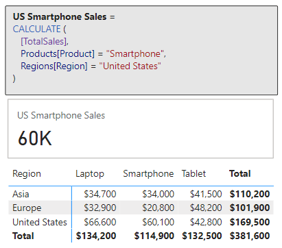
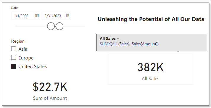
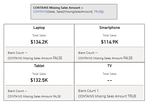
We can now use this calculated column to provide a bit more context to card visuals showing our total sales for each of our products.
In this example we can see the total sales for each product category. However, if we only show the total sales value it could lead our viewers to believe that the TV category has no sales. By adding a count of TV Sales records that have a blank sales amount we can inform our viewers this is not the case and that there is an underlying data issue.
While ISBLANK focuses on the individual values, ISEMPTY takes a step back to consider the table as a whole. We can use this function to check whether the table we pass to this DAX expression contains data. Its syntax is also simple.
ISEMPTY(table_expression)
The table_expression parameter can be a table reference or a DAX expression that returns a table. ISEMPTY will return a value of true if the table has no rows, otherwise it returns false.
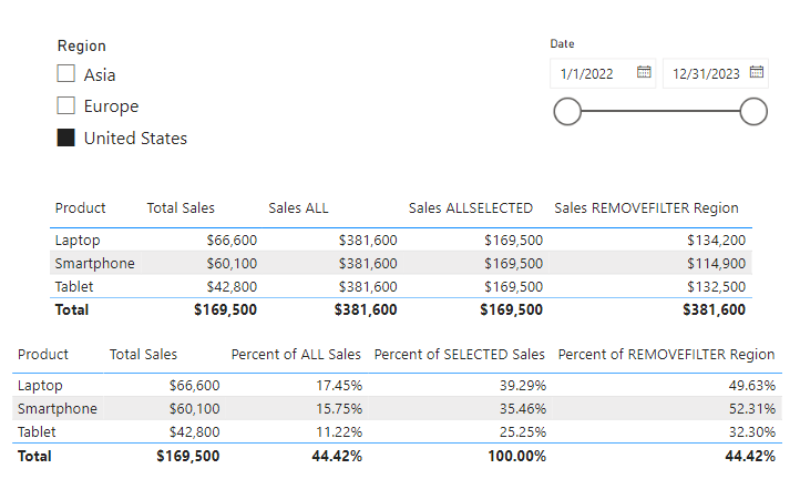
Let’s use ISEMPTY in combination with ISBLANK to check if any of our sales records have a missing or blank employee Id. Then we can use this information, to display the count of records (if any) and the total sales value of these records.
In this example we see that Sales with No EmployeeId returns a value of false, indicating that the table resulting from filtering our sales records to sales with a blank employee Id is not empty and contains records. We can then also make use of this function to help display the total sales of these records and a count.
These two functions are the tools to use when investigating our datasets for potentially incomplete data. ISBLANK can help us identify rows that need attention or consideration in our analysis and ISEMPTY helps validate if a subset of data exists in our datasets. To effectively utilize these two functions, it is important to remember their differences. Remember ISBLANK checks if an individual value is missing data, while ISEMPTY examines if a table contains rows.
The Data Type Detectives: ISTEXT, ISNONTEXT, ISLOGICAL and ISNUMBER
In the world of data, not every value is as it seems and that is where this set of helpful DAX expressions come into play. These functions help identify the data types of the data we use within our analysis.
All of these functions follow the same syntax.
ISTEXT(value)
ISNONTEXT(value)
ISLOGICAL(value)
ISNUMBER(value)
Each function checks the value and returns true or false. We will use a series of values to explore how each of these functions work. To do this we will create a new table which uses each of these functions to check the values: TRUE(), 1.5, “String”, “1.5”, and BLANK(). Here is how we can do it.
TestValues =
VAR _logical = TRUE()
VAR _number = 1.5
VAR _text = "String"
VAR _stringNumber = "1.5"

VAR _testTable =
{
   ("ISLOGICAL", ISLOGICAL(_logical), ISLOGICAL(_number), ISLOGICAL(_text), ISLOGICAL(_stringNumber), ISLOGICAL(BLANK())),
   ("ISNUMBER", ISNUMBER(_logical), ISNUMBER(_number), ISNUMBER(_text), ISNUMBER(_stringNumber), ISNUMBER(BLANK())),
   ("ISTEXT", ISTEXT(_logical), ISTEXT(_number), ISTEXT(_text), ISTEXT(_stringNumber), ISTEXT(BLANK())),
   ("ISNONTEXT", ISNONTEXT(_logical), ISNONTEXT(_number), ISNONTEXT(_text), ISNONTEXT(_stringNumber), ISNONTEXT(BLANK()))
}

RETURN
SELECTCOLUMNS(
   _testTable,
   "Function", [Value1],
   "Test Value: TRUE", [Value2],
   "Test Value: 1.5", [Value3],
   "Test Value: String", [Value4],
   "Test Value: '1.5'", [Value5],
   "Test Value: BLANK", [Value6]
)
An then we can add a table visual to our report to see the results and better understand how each function treats our test values.

The power of these functions lies in their simplicity, the clarity they can bring to our data preparation process, and their ability to be used in combination with other expressions to handle complex data scenarios.
DAX offers a number of other functions that are similar to the ones explored here such as ISEVEN, ISERROR, and ISAFTER. Visit the DAX reference guide for all the details.

DAX Reference Guide – Information Functions
Learn more about: DAX Information Functions
A common issue we can run into in our analysis is assuming data types based on a value’s appearance or context, leading to errors in our analysis. Mistakenly performing a numerical operation on a text field that appear numeric can easily throw our results into disarray. Using these functions early in our process to understand our data paves the way for clean, error-free data processing.
The Art of Data Discovery: CONTAINS & CONTAINSSTRING
When diving into our data, pinpointing the information we need can be a daunting task. This is where DAX steps in and provides us CONTAINS and CONTAINSSTRING. These functions help us uncover the specifics hidden within our data.
CONTAINS can help us identify whether a table contains a row that matches our criteria. Its syntax is as follows.
CONTAINS(table, columnName, value[, columnName, value]...)
The table parameter can be any DAX expression that returns a table of data, columnName is the name of an existing column, and value is any DAX expression that returns a scalar value that we are searching for in columnName.
CONTAINS will return a value of true if each specified value can be found in the corresponding columnName (i.e. columnName contains value), otherwise it will return false.
In our previous ISBLANK example we created a Blank Count measure to help us identify how many sales records for our product categories are missing sales amounts.
Blank Count =
COUNTROWS(
   FILTER(Sales, Sales[MissingSalesAmount]=true)
)
Now, if we are interested in knowing just if there are missing sales amounts, we could update this expression to return true if COUNTROWS returns a value greater than 0, however this is where we can use CONTAINS to create a more effective measure.
Missing Sales Amount =
CONTAINS(Sales, Sales[MissingSalesAmount], TRUE())
CONTAINS can be a helpful tool, however, it is essential to distinguish when it is the best tool for the task versus when an alternative might offer a more streamlined approach. Alternatives to consider include functions such as IN, FILTER, or TREATAS depending on the need.
For example, CONTAINS can be used to establish a virtual relationship between our data model tables, but functions such as TREATAS may provide better efficiency and clarity. For details on this function and its use check out this post for an in-depth dive into DAX Table Manipulation Functions.

DAX Table Manipulation Functions: Transforming Your Data Analysis
Discover how to Reshape, Manipulate, and Transform your data into dynamic insights.
For searches based on textual content, CONTAINSTRING is our go to tool. It specializes in revealing rows where text columns contain specific substrings. The syntax is straightforward.
CONTAINSSTRING(within_text, find_text)
The within_text parameter is the text we want to search for the text passed to the find_text parameter. This function will return a value of true if find_text is found, otherwise it will return false.
We can use CONTAINSSTRING to dissect our Product Code and enrich our dataset by adding a calculated column containing a user-friendly color value of the product. Here is how.
Color = SWITCH(
    TRUE(),
    CONTAINSSTRING(Products[Product Code], "BK"), "Black",
    CONTAINSSTRING(Products[Product Code], "rd"), "Red",
    CONTAINSSTRING(Products[Product Code], "GR"), "Gray",
    CONTAINSSTRING(Products[Product Code], "SL"), "Silver",
    CONTAINSSTRING(Products[Product Code], "BL"), "Blue"
)
This new calculated column provides us the color of each product that we can use in a slicer, or we can visualize our totals sales by the product color.
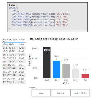
CONSTAINSSTRING is case-insensitive, as shown in the red color statement above. When we require case-sensitivity CONSTAINSSTRINGEXACT provides us this functionality.
CONTAINSSTRING just begins to scratch the surface of the DAX functions available to use for in-depth textual analysis, to continue exploring visit this post that focuses solely on DAX Text Functions.

Mastering DAX Text Expressions: Making Sense of Your Data One String at a Time
Stringing Along with DAX: Dive Deep into Text Expressions
By leveraging CONTAINS and CONTAINSTRING – alongside understanding when to employ their alternatives – we are equipped with the tools required for precise data discovery within our data analysis.
Deciphering Data Relationships: ISFILTERED & ISCROSSFILTERED
Understanding the dynamics of data relationships is critical for effective analysis. In the world of DAX, there are two functions we commonly turn to that guide us through the relationship network of our datasets: ISFILTERED and ISCROSSFILTERED. These functions provide insights into how filters are applied within our data model, offering a deeper understanding of the context in which our data operates.
ISFILTERED offers a window into the filtering status of a table or column, allowing us to determine whether a filter has been applied directly to that table or column. This insight is valuable for creating responsive measures that adjust based on user selections or filter context. The syntax is as follows.
ISFILTERED(tableName_or_columnName)
A column or table is filtered directly when a filter is applied to any column of tableName or specifically to columnName.
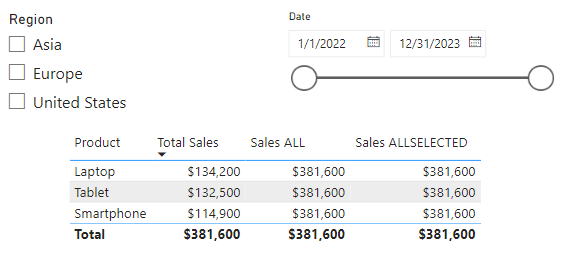
Let’s create a dynamic measure that leverages ISFILTERED and reacts to user selections. In our data model we have a measure that calculates the product sales percentage of our overall total sales. This measure is defined by the following expression.
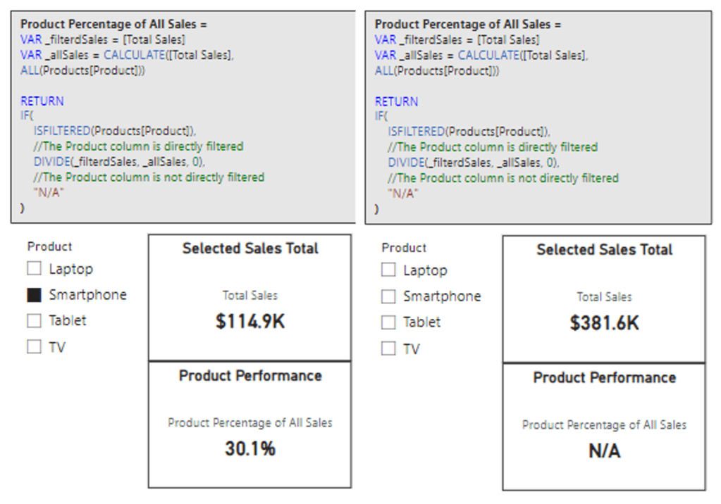
Product Percentage of All Sales =
VAR _filterdSales = [Total Sales]
VAR _allSales = CALCULATE([Total Sales], ALL(Products[Product]))

RETURN
DIVIDE(_filterdSales, _allSales, 0)
We can see this measure displays the percentage of sales for the selected product. However, when no product is selected it displays 100%, although this is expected and correct, we would rather not display the percentage calculation when there is no product selected in our slicer.
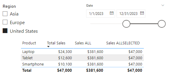
This is a perfect case to leverage ISFILTERED to first check if our Products[Product] column is filtered, and if so, we can display the calculation, and if not, we will display “N/A”. We will update the measure’s definition to the following.
Product Percentage of All Sales =
VAR _filterdSales = [Total Sales]
VAR _allSales = CALCULATE([Total Sales], ALL(Products[Product]))

RETURN
IF(
    ISFILTERED(Products[Product]),
    //The Product column is directly filtered
    DIVIDE(_filterdSales, _allSales, 0),
    //The Product column is not directly filtered
    "N/A"
)
And here are the updated results, we can now see when no product is selected in the slicer the measure displays “N/A”, and when the user selects a product, the measure displays the calculated percentage.
While ISFILTERED focuses on direct filter application, understanding the impact of cross-filtering, or how filters on one table affect another related table, is just as essential in our analysis. ISCROSSFILTERED goes beyond ISFILTERED and helps us identify if a table or column has been filtered directly or indirectly. Here’s its syntax.
ISCROSSFILTERED(tableName_or_columnName)
ISCROSSFILTERED will return a value of true when the specified table or column is cross-filtered. The table or column is cross-filtered when a filter is applied to columnName, any column of tableName, or any column of a related table.
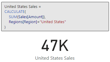
Let’s explore ISCROSSFILTERED and how it differs from ISFILTERED with a new measure similar to the one we just created. We define the new measure as the following.
Product Percentage of All Sales CROSSFILTER =
VAR _filterdSales = [Total Sales]
VAR _allSales = CALCULATE([Total Sales], ALL(Sales))

RETURN
IF(
    ISCROSSFILTERED(Sales),
    //Sales table is cross-filtered
    DIVIDE(_filterdSales, _allSales, 0),
    //The Sales table is not cross-filterd
    "N/A"
)
In this measure we utilize ISCROSSFILTERED to check if our Sales table is cross-filtered, and if it is we calculate the proportion of filtered sales to all sales, otherwise the expression returns “N/A”. With this measure we can gain a nuanced view of product performance within the broader sales context.
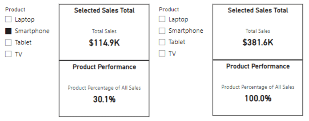
When our Sales table is only filtered by our Product slicer, we see that the ISFILTERED measure and the ISCROSSFILTERED measure return the same value (below on the left). This is because as before the column Products[Product] is directly filtered by our Product slicer, so the ISFILTERED measure carries out the calculation and returns the percentage.
But also, since our data model has a relationship between our Product and Sales table, the selection of a product in the slicer indirectly filters, or cross-filters, our Sales table leading to our CROSSFILTER measure returning the same value.
We start to see the difference in these functions when we start to incorporate other slicers, such as our region slicer. In the middle image, we can see if no product is selected our Product Performance card display “N/A”, because our Products[Product] column is not being directly filtered.
However, the Sales Performance card that uses our CROSSFILTER measure is dynamically updated to now display the percentage of sales associated with the selected region. Again, this is because our data model has a relationship between our Region and Sales table, so the selection of a region is cross-filtering our sales data.
Lastly, we can see both measures in action when a Product and Region are selected (below on the right).

Using ISFILTERED, we can create reports that dynamically adjust to user interactions, offering tailored insights based on specific filters. ISCROSSFILTERED takes this a step further by allowing us to understand and leverage the nuances of cross-filtering impacts within our data, enabling an even more sophisticated analytical approach.
Applying these two functions within our reports allows us to enhance data model interactivity and depth of analysis. This helps us ensure our reports respond intelligently to user interactions and reflect the complex interdependencies within our data.
Wrapping Up
Compared to other function groups DAX Information Functions may be overlooked, however these functions can hold the key to unlocking insights, providing a deeper understanding of our data’s structure, quality, and context. Effectively leveraging these functions can elevate our data analysis and integrating them with other DAX function categories can lead to the creation of dynamic and insightful solutions.
As we continue to explore the synergies between different DAX functions, we pave the way for innovative solutions that can transform raw data into meaningful stories and actionable insights. For more details on Information Functions and other DAX Functions visit the DAX Reference documentation.
Learn more about: DAX Functions
Thank you for reading! Stay curious, and until next time, happy learning.

And, remember, as Albert Einstein once said, “Anyone who has never made a mistake has never tried anything new.” So, don’t be afraid of making mistakes, practice makes perfect. Continuously experiment and explore new DAX functions, and challenge yourself with real-world data scenarios.
If this sparked your curiosity, keep that spark alive and check back frequently. Better yet, be sure not to miss a post by subscribing! With each new post comes an opportunity to learn something new.