Power BI Object-Level Security Explained: Control Table and Column Access by Role


This is the third part of a series on security and design approaches in Power BI.

In the article Power BI Row-Level Security Explained: Protect Data by User Role, we examined Row-Level Security (RLS) and how to restrict access to specific rows of data based on the user’s identity.

Discover how to personalize your reports and show each user only the data they require in just a few clicks.

In the article Partial RLS Explained: Let Users See the Bigger Picture, we explored Partial RLS, a design pattern that allows users to view high-level context, such as company-wide totals, while still enforcing Row-Level Security (RLS) on detailed sales data.

Explore how to deliver personalized insights without losing the bigger picture.

We will now focus on another important aspect of data model security: Object-Level Security (OLS).

While RLS controls which rows within a table a user can access, OLS restricts visibility and interaction with specific tables and columns within the data model.

In this post, we will cover the following topics:

  • An overview of Object-Level Security (OLS)
  • A use case demonstrating how different user roles can view different data model objects
  • A step-by-step guide to implementing OLS
  • Key considerations and limitations

What is Object-Level Security

In Power BI, Object-Level Security (OLS) enables data modelers to restrict access to specific tables or columns based on the roles assigned to report viewers.

The key difference between RLS and OLS lies in what they restrict:

  • RLS controls which rows of data a user can access within a table.
  • OLS determines whether a user can see the table or specific columns.

OLS cannot be used to secure or hide measures directly. However, measures are impacted by OLS. If a measure references a column or table that is hidden for a specific role, the measure will also be automatically hidden for that role. It is important to consider this when designing experiences tailored to specific roles.

Power BI manages these data dependencies for us, ensuring that calculations based on secured data remain safe from exposure. However, there is a potential risk that some visuals in our report may not display correctly for viewers who do not have access to specific measures.


Use Case: Hide Reviews Tables and Sensitive Customer Columns

To examine and understand the value of OLS, let’s go through a scenario using a sample report.

Interested in following along? The Power BI sample report is available here: EMGuyant GitHub – Power BI Security Patterns.

We are developing a Power BI report for a sales organization. The data model includes two restricted areas:

  1. The Reviews table contains product reviews from customers and their demographic information.
  2. The Customers table includes several columns with customer details that should only be accessible to specific roles.

Access Requirements
Access to the report is structured around four user roles.

The Regional Sales Basic role serves as the foundational level, providing minimal access. Users assigned this role can view sales data related to their sales region and basic customer information. They are restricted from viewing the Reviews table and the detailed customer information columns.

Next is the Regional Sales Advanced role. Users in this role have all the same access as Regional Sales Basic users but this role is able view the detailed customer information columns.

The Product Analyst role has access to the Reviews table but cannot view the detailed customer information columns. They can also view the sales and review data for any region they are assigned to.

Finally, there is the Leadership role. These users can see all the data for any region they are assigned.


Step-by-Step: Configure OLS in Power BI

After creating our data model and defining the tables and columns to which we plan to restrict access, we can begin configuring OLS.

To configure OLS, we will use the Tabular Editor Power BI external tool. There are many external tools for Power BI Desktop; visit Featured open-source tools to view a list of common and popular external tools.

Tabular Editor is a lightweight tool that allows us to build, maintain, and manage tabular models efficiently.

1) Create Roles in Power BI Desktop
In Power BI Desktop, we navigate to the Modeling tab and select “Manage Roles.” We then create the four roles using the following DAX expression for RLS filtering on the User Access table. This table contains the user’s User Principal Name (UPN), region ID, and role for that region.

'User Access'[UPN] = USERPRINCIPALNAME()

2) Open Tabular Editor and Configure OLS
We navigate to External tools in Power BI Desktop and then open Tabular Editor. Under Model, select Roles. The roles we created in Step 1 will appear.

We expand the Table Permissions to set the permissions for each role we want to configure OLS for.

  • None: OLS is enforced, and the table or column is hidden from that role.
  • Read: The table or column is visible to the role.

3) Secure Specific Tables
To configure OLS for the Reviews table, we need to ensure that only users with the Product Analyst or Leadership roles have access to this table.

First, select the Reviews table and navigate to Object Level Security options under Translations, Perspectives, and Security. Set the permissions to “None” for the Regional Sales Basic and Regional Sales Advanced roles.

4) Secure Specific Columns
Next, we secure the Address, PreferredContactMethod, and ContactInformation columns within the Customers table. To do this, we locate the Customers table and expand it to view its columns.

Then, we select each column we want to secure and set each role’s permissions under Object Level Security. For each column above, we set the permissions for the Regional Sales Basic and Product Analyst roles to None.

Once we finish configuring our OLS rules, we save the changes in Tabular Editor and then publish the semantic model to the Power BI service. Depending on our combination of RLS and OLS, testing within Power BI Desktop using the View as > Other user will not function as expected. We will test and validate our OLS rules in the Power BI Service.

Note: If using the sample report, before testing in the Power BI Service the UPN column within the User Access table will have to contain valid user UPNs.

5) Assign Users to Roles in the Power BI Service
To add users to a role in the Power BI Service, we need to navigate to the workspace where the semantic model has been published. First, locate the semantic model, click on the “More options” ellipsis (…), and then select “Security.”

In the Row-Level Security screen, we can add users or security groups to each role we’ve created.

We have four users to test the OLS (with RLS) implementation:

  1. Talia Norridge: Leadership role for all regions
  2. Lena Marwood: Product Analyst for Europe and Asia regions
  3. Jasper Kellin: Regional Sales Advanced for North America
  4. Elara Voss: Regional Sales Basic for Asia

6) Test OLS Implementation
On the Security screen, we select the More options ellipsis (…) next to a role and then Test as role.

Then, at the top, we select Now viewing as and then Select a person to validate that the OLS rules function as expected.
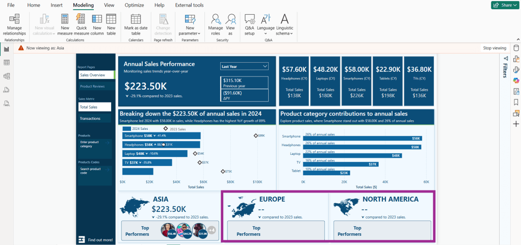
Leadership Role
When we view the report as Talia Norridge in the Leadership role, we can see that all the regional sales information is displayed in the data cards at the bottom.

We confirm that Talia also has access to the Reviews table by hovering over the sales by product bar chart. The tooltip for this visual contains measures based on the product review data (e.g. average review rating).

Next, we verify that Talia has access to detailed customer information by hovering over a customer in the sales by customer bar chart. The tooltip for this visual shows the customer’s name and contact information (ContactInformation is a secured column).

Product Analyst Role
Reviewing the report as Lena Marwood in the Product Analyst role, we see that her assignment is limited to the Asia and Europe sales regions. As a result, the total sales value reflects only these regions, and the top performers on the North America data card are hidden.

We confirm that Lena can access the Reviews table by checking the sales by product tooltip, and we see that, like the Leadership role, the data appears as expected.

We confirm that Lena should not have access to detailed customer information. When we hover over the sales by customer visual, the tooltip shows an error when displaying the customer’s contact information.

The customer’s name is displayed without issue because this is not a secured column. However, Lena’s role does not have permission to access the ContactInformation column, which prevents the report from retrieving this data.

Regional Sales Advanced
When we view the report as Jasper Kellin, who holds the Regional Sales Advanced role, we confirm that the sales data only reflects his assigned region.

Next, we check the tooltips that display the review data and detailed customer information.

We verify that the review data produces the expected error because Jasper cannot access the Reviews table. As a result, he is unable to access the entire table and any measures that depend on it, such as the Average Score.

The Average Score measure is defined using the following DAX expression.

Average Score = AVERAGE(Reviews[SatisfactionScore])

After reviewing the customer sales data, we confirm that the contact information is presented in the tooltip to Jasper without any errors.

Regional Sales Basic
When we view the report as Elara Voss, who holds the Regional Sales Basic role, we confirm that the sales data only reflects their assigned region.

Next, we check the tooltips that display the review data and detailed customer information.

Both tooltips display the expected error since Elara does not have permissions to the Reviews table or the detailed customer information columns.


Considerations and Limitations

OLS in Power BI offers a robust layer of protection, but there are important limitations to consider before deploying it.

1) OLS applies only to users with the Viewer workspace role. Workspace members with Admin, Member, or Contributor roles have edit permissions on the semantic model, and OLS does not apply to them.

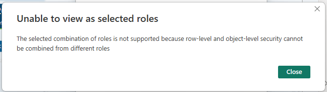
2) Combining OLS and RLS from different roles is not allowed; doing so may cause unintended access and generate an error.

3) Power BI automatically hides measures referencing a column or table restricted by OLS. Although Power BI does not offer a direct way to secure a measure, measures can be implicitly secured if they reference a secure table or column.

4) When users attempt to view visualizations dependent on a secured object with OLS configured, they encounter an error message. As a result, the report seems broken to these users. However, for specific roles this is expected. For example, the Regional Sales Basic role does not have permissions to the Reviews table, so it should not be available in the data set for these viewers.


BONUS: Mask Visual Errors and Control Page Navigation

When OLS hides a table or column, any visual that relies on that data will become unusable for users without access (refer to error message #4 above). While this error is anticipated, it may confuse users who might think the report is broken.

One possible workaround is to use a DAX measure and conditionally formatted shapes to cover the visual for users who cannot access the data.

In our sample report, we can create the following DAX measures to manage the visibility of the data on our tooltips.

Customer Detail Visible =
If([UserRole] <> "Regional Sales Basic", "#FFFFFF00","#f1f9ff")

Rating Detail Visible =
If([UserRole] = "Product Analyst" || [UserRole] = "Leadership", "#FFFFFF00","#f1f9ff")

We place a rectangle shape over the visuals that certain users cannot access, and then we conditionally format the fill color based on the measures.

It’s important to note that this is not an additional security layer or a replacement for OLS. This method only hides the error message to create a cleaner user experience.

However, this approach has a significant limitation. Our example works because the visuals underneath the shapes are not intended for user interaction. If the visuals are interactive for users with access to the data, the transparent shape overlay will prevent them from selecting or interacting with the visual. This means this workaround has a limited use case.

Certain design approaches can help manage which pages users can navigate to within a report. DAX-driven navigation buttons can create a user-friendly navigation experience, allowing users to navigate to the pages with data they have permission to view.

It’s important to note again that this approach does not provide security. However, it can help reduce the chances of users encountering error messages related to their access level based on typical report usage. Here is a brief walkthrough on this approach: RLS and OLS—Page Navigation.

While various design methods can enhance the user experience, OLS and RLS remain the only secure methods for controlling data access.


Wrapping Up

OLS in Power BI gives us a model-driven way to control access to specific tables and columns. Unlike Row-Level Security (RLS), which filters rows for authorized users, OLS prevents users from seeing certain objects of the model, removing entire tables and columns from the data experience.

When creating reports for broad audiences with different access needs, OLS can become essential to meet the requirements.


Thank you for reading! Stay curious, and until next time, happy learning.

And, remember, as Albert Einstein once said, “Anyone who has never made a mistake has never tried anything new.” So, don’t be afraid of making mistakes, practice makes perfect. Continuously experiment, explore, and challenge yourself with real-world scenarios.

If this sparked your curiosity, keep that spark alive and check back frequently. Better yet, be sure not to miss a post by subscribing! With each new post comes an opportunity to learn something new.

Power BI Partial RLS Explained: Let Users See the Bigger Picture


This post is part two of a series on Power BI security patterns. Check out part one for a beginner-friendly overview of row-level security in Power BI.

Discover how to personalize your reports and show each user only the data they require in just a few clicks.

This post will take our security design pattern one step further.

While row-level security (RLS) allows us to restrict data based on user roles and identities, there are times when we don’t want everything locked down. Occasionally, users need to see their data in relation to broader metrics, such as company-wide totals or averages.

In the sample report, regional sales teams should see detailed information only about their assigned region and the total sales for other regions.

In the previous post, we noted that standard RLS filters out other regional sales, preventing the totals from other regions from being displayed. This is where partial RLS becomes useful and can fulfill this requirement.

In this post, we will walk through:

  • What Partial RLS is and when to use it
  • A real-world scenario that calls for it
  • Key limitations and design tips

What is Partial Row-Level Security

Row-Level Security (RLS) applies filters at the dataset level throughout the entire datamodel for a user. This means that if RLS restricts a user to view only sales data for the North America region, every visual and measure in the report will be automatically limited to data associated with the North America region.

Using RLS is effective for data protection, but it can be a limitation when a report needs to provide a broader context to the user.

With report-level filters and slicers, DAX provides functions like ALL() and REMOVEFILTERS(), which can bypass data filtering. However, DAX expressions cannot bypass RLS.

Partial RLS is a design approach in Power BI that helps mitigate RLS’s limitations when necessary. The concept involves separating secured data from summary data, allowing users to view filtered and unfiltered insights side by side.

To achieve this, we will create a summary table (Annual Sales Summary (Regional)) within our datamodel. This summary table will aggregate the total sales across all regions and will not be affected by RLS filters. It provides overall totals that offer essential context when needed, while the RLS still restricts access to detailed sales information within our sales table.

In our sample report, RLS is applied to the Region table, and the RLS filter propagates to the Sales table.

In the datamodel, filters applied to the Region table do not directly impact the rows in our summary table. This means that users can see the total aggregated sales for all regions while still having RLS filters applied to the detailed sales data.


Use Case: Display Regional Total Sales and Percentage of Company-Wide Sales

We are designing a Power BI report for a global sales team. Each regional sales team member should only be able to:

  • View detailed transaction-level data for their assigned region
  • See key metrics, like total sales for all regions, to provide a broader context

Step 1: Apply RLS rules to the Region table

First, we define our RLS rules in Power BI Desktop, see Power BI Row-Level Security Explained: Protect Data by User Role.

The implemented RLS rules filter the Sales table and limits access to the appropriate region per user.

A challenge arises when we implement RLS while also trying to meet the second requirement. As shown in the image above, the total sales figures for Asia and North America appear blank when viewing the report with the Europe role.

This is because the measure used to calculate the totals uses the following expression.

Total Sales = SUM(Sales[Amount])

When RLS is implemented, users only have access to data specific to their region. For instance, when the Total Sales measure is evaluated, the Sales table is filtered to include only the sales data associated with the Europe sales region. As a result, the Total Sales measure reflects the total sales relevant to the user’s region rather than the entire dataset.

Step 2: Create a summary table

To address this issue and meet our requirements, we will create a calculated summary table in our data model. This table will store pre-aggregated total sales and total transactions by year and region.

Annual Sales Summary (Regional) =       
   SUMMARIZECOLUMNS(
      Sales[SalesDate].[Year],
      Regions[Region],
      "TotalRegionalSales", SUM(Sales[Amount]),   
      "TotalRegionalTransactions", COUNTROWS(Sales),
      "DateKey", FORMAT(DATE(MAX(Sales[SalesDate].[Year]), 12, 31), "YYYYMMDD")
)

This table does not have a direct relationship with the Region table, which is under RLS control, and our RLS roles will not filter it.

Step 3: Build dynamic DAX measures

We can now utilize this table in our measures to establish company-wide or cross-region metrics while ensuring the security of the underlying transactional data.

We first create two new measures within our datamodel to calculate the entire company’s total sales and transaction counts.

Total Sales (nonRLS) =
SUM('Annual Sales Summary (Regional)'[TotalRegionalSales])

Transaction Count (nonRLS) =
SUM('Annual Sales Summary (Regional)'[TotalRegionalTransactions])

We can use these base measures to dynamically display total sales or total transactions for all regions in the data cards at the bottom of the report, utilizing the following expression and visual filters.

Regional Total Sales =
VAR _currentYear = YEAR(MAX(Sales[SalesDate]))
VAR _selectedMetric = SELECTEDVALUE('Sales Metric'[Sales Metric Fields])

RETURN
If(
    _selectedMetric = "'_Measures'[Total Sales]",
    CALCULATE(
        [Total Sales (nonRLS)], 
        'Annual Sales Summary (Regional)'[Year]=_currentYear),
    CALCULATE(
        [Transation Count (nonRLS)], 
        'Annual Sales Summary (Regional)'[Year]=_currentYear)
)

Note: we can also use the fact that RLS filters the region table and expressions such as COUNTROWS() or SELECTEDVALUE() to hide or show the top performers data card.

RLS still applies to the top-row visuals and bar charts, which provide detailed breakdowns of regional sales. However, the summary table enables us to present the total sales for all regions within the data card along the bottom of our report.

Step 4: Combine RLS-filtered and unfiltered measures

The non-RLS base measures can also compare regional total sales or transactions based on the current user (RLS-filtered) as a percentage of the company-wide measure (unfiltered).

% of CompanyWide Sales =
DIVIDE([Total Sales], [Total Sales (nonRLS)])

Considerations and Limitations

While the partial RLS pattern can enhance the usability and insightfulness of our Power BI report, we must consider its capabilities and limitations, as well as the associated technical and design trade-offs.

Partial RLS does not override existing RLS filters; instead, it isolates high-level summary data in a separate table unaffected by these filters. This allows partial RLS to be used for comparisons or to add additional global context without exposing detailed row-level information.

1) When implementing partial RLS, it’s important to remember that datamodel relationships matter. The summary table must be included in the datamodel to ensure that cross-filtering from tables affected by RLS does not impact it. If the summary table is related to a table with RLS filters applied at the datamodel level, it will also be subject to the RLS filters.

2) When combining measures filtered by RLS with unfiltered measures, users may need assistance interpreting the visuals associated with these measures. Visual cues or proper labeling, such as Total Sales Across All Regions versus Your Regional Sales may be necessary to help clarify what users are seeing.

3) Partial RLS can be implemented efficiently when the summary table is small and pre-aggregated without complex DAX filtering. However, keep in mind that if the summary table grows too large or includes too much granularity, it may negatively impact the performance of our reports.

4) Implementing partial RLS can add complexity when creating DAX measures. Since RLS is enforced on our Sales table, any attempts to calculate totals, even when using functions like ALL() or REMOVEFILTER(), will still be subject to our RLS rules. While partial RLS offers additional insights into our data, it does not grant any additional access.

5) We must assess edge cases, such as data gaps or undefined user roles. If a user is assigned a role that is not properly mapped in our datamodel, they may encounter an empty report or access to detailed data. We should always validate our RLS roles to ensure they function as expected.


Wrapping Up

Partial RLS is a design approach used in cases where RLS filtering restricts our ability to give users a broader context for their data. This approach allows us to ensure secure access to detailed, role-specific data while providing users insight into the overall picture and how their data fits into a larger context.

We can provide contextual insights without revealing specific row details by utilizing partial row-level security, enabling us to create more comprehensive and insightful reports.

Row-Level Security (RLS) enables us to filter data at the row level, but it does not allow us to secure entire tables or columns within our datamodel. Make sure to check back for the next post, or better yet, subscribe so you don’t miss it!

In the next post, we will explore Object-Level Security (OLS) in Power BI. OLS is essential because it allows us to secure specific tables and columns from report viewers.

If you’d like to follow along and practice these techniques, Power BI sample reports are available here: EMGuyant GitHub – Power BI Security Patterns.


Thank you for reading! Stay curious, and until next time, happy learning.

And, remember, as Albert Einstein once said, “Anyone who has never made a mistake has never tried anything new.” So, don’t be afraid of making mistakes, practice makes perfect. Continuously experiment, explore, and challenge yourself with real-world scenarios.

If this sparked your curiosity, keep that spark alive and check back frequently. Better yet, be sure not to miss a post by subscribing! With each new post comes an opportunity to learn something new.

Explore Power BI Core Visualizations: Part 4 – Table and Matrix Visuals


Table and Matrix visuals in Power BI are essential for presenting detailed and structured data. Both visuals excel at displaying large amounts of information while highlighting trends, relationships, and hierarchies.

Tables offer a simple way to present data in a straightforward tabular format and are best for displaying detailed row-level data, such as sales records, inventory lists, or customer information. Unlike other visuals that summarize data at a high level, tables retain all details, making them an excellent tool for deep-dive analysis.

Matrix visuals enhance this capability by grouping and summarizing data hierarchically. Unlike tables that present data in a flat structure, matrix visuals allow for expandable rows. Users can then collapse or expand these groupings interactively to meet their needs.

Table and Matrix visuals are excellent for presenting data and hierarchical summaries, but they may not be suitable for every situation. It’s important to choose the right visual for effective reporting. To discover other essential visuals, check out Parts #1, #2, and #3 of the Explore Power BI Core Visualizations series.

Chart your data journey! Transform data into insights with Power BI core visualizations. 

Chart your data journey! Transform data into insights with Power BI core visualizations. 

Chart your data journey! Transform data into insights with Power BI core visualizations. 


Customizing Table Visuals

Table visuals in Power BI can be challenging to read and may become overwhelming if not formatted properly. Power BI offers a range of properties that allow us to customize our table visuals, enhancing readability, improving structure, and dynamically highlighting key insights.

Formatting the Table Layout

The fundamentals of formatting our table visuals involve customizing the grid, values, column headers, and totals properties. By adjusting these elements, we can enhance the appearance and clarity of our table visuals, making them more readable for our viewers.

The grid properties of our table visuals dictate how rows and columns are separated, providing a structured appearance.

We can toggle the horizontal and vertical gridlines on or off based on the requirements of the visual and the desired level of separation between rows and columns. Enabling the gridlines results in a structured layout, while disabling them offers a more minimalist design.

Additionally, the borders property allows us to define and apply borders to various sections of the table visual, including the column header, values section, and totals section.

In this example, we enable both the horizontal and vertical gridlines and set the bottom border of the column header section to an accent green color.

Next, we will focus on the Values property section. This area allows us to customize text styles and background colors, essential for ensuring our tables are readable and visually engaging.

We can specify the primary text color, background color, and alternate colors to differentiate between alternating rows in the visual. Alternating the styles of the rows improves readability and makes it easier to track values across each row.

The final basic formatting properties to consider are the column headers and totals. The column header properties allow us to adjust the font size, background color, and text alignment, which helps create a structured and easy-to-read table.

When we enable the Totals property, our table will include a row that aggregates the values from each column. We can customize this row’s font style, text color, and background color to distinguish it from the standard data rows.

In our example, we set the column headers to white with a dark blue background, making the header row easily identifiable. Additionally, we activate the totals row, giving it dark blue text, a gray background, and top and bottom borders to further differentiate it from the other data rows.

Enhancing Tables with Advanced and Conditional Formatting

In addition to basic formatting, Power BI provides multiple settings and options for advanced and conditional formatting, allowing for greater control over the appearance of table visuals. These options enable targeted formatting for specific columns and dynamic styling for key data points and trends.

We can utilize the specific column properties to apply unique formatting to individual columns, offering the flexibility to adjust the styling of headers, values, and total values for different series.

For example, we can include the count of transactions alongside our sales data in the table. Using the specific column properties, we can set the text color of the values and totals to visually distinguish them from the primary focus of the sales amounts.

The cell elements properties offer additional customization options and enable dynamic formatting. These customizations enhance our ability to highlight trends and identify key values.

For instance, using these properties, we can conditionally format the background and text color of the Sales Year-over-Year (YoY) series. This lets us quickly see which products have experienced growth or decline compared to the previous year.

We enable data bars for the current and last year’s sales series, visually comparing sales values across different products.

We also activate the icons feature for the current year’s sales values. We add a trending upward arrow for products whose current-year sales exceed those of the previous year and a downward arrow for products whose current-year sales are lower than last year’s. This visual representation quickly indicates product sales growth next to each product category and complements the Sales Year-over-Year series.

By integrating fundamental concepts, specific column formatting, cell elements, and conditional formatting, our Power BI table visuals can become dynamic and intuitive report elements that lead users to insights.


Customize Matrix Visuals

The Matrix visual in Power BI shares many of the same formatting options as the Table visual, including Grid, Values, Column headers, Specific column, and Cell elements formatting. However, Matrix visuals introduce additional formatting options for the hierarchical data structure.

Row Headers

Row headers are a key feature of Matrix visuals, allowing viewers to group and drill into the data. Power BI lets us define the font styling, text alignment, text color, and background color. We can also customize the size and color of the expand and collapse (+/-) buttons, or not show them all together.

Subtotals and Grand Totals

Row subtotals summarize data at each hierarchical level, allowing viewers to see how individual categories contribute to the overall total.

By toggling a setting in the Format options, we can enable or disable row subtotals. When row subtotals are enabled, we can customize the font and background styling and define the total label and its position.

In our example, we enable row subtitles and adjust the styling to ensure consistency with other visual elements. We then set the position of the subtotal to the bottom and activate the row-level settings. Under these settings, we select Product Code and label it as “Subtotal.” Next, we choose Product and label it “Grand Total.”

Grand totals display the final sum of all row and column values in our Matrix visuals. Proper formatting ensures these totals remain distinct and easy to locate.

The formatting options include font styling, font color, and background color.


Advanced Techniques and Customizations

The table and matrix visuals in Power BI provide a range of options for creating unique presentations that enhance data visualization, interactivity, and analytical depth. By designing these visuals thoughtfully, we can highlight key insights, delve deeper into our data, and create dynamic reports tailored to the viewers’ needs. Let’s explore some advanced examples that go beyond the basics.

Clean and Straightforward Sales Totals

This matrix visual presents a structured overview of our sales totals across different regions, product categories, and years. The clear and straightforward presentation makes analyzing trends over time and across regions easy.

We add a matrix visual to our report canvas to create this visual. Next, we place the Region and Product data into the Rows field, the Year into the Columns field, and a Total Sales measure into the Values field. After that, we expand all rows by one level and position the row subtotals at the bottom. Finally, we change the label for the Product row level label to Subtotal.

In the Layouts and Style Presets options, we set the Style to “None” and the Layout to “Outline.” We also toggled off the Repeat Row Headers option.

Under the Values properties, we adjust the background color and alternate background color to match the color of the matrix background.

Next, we format our column headers and the grand total section.

Column Headers:

  • Background color: matrix background color
  • Font color: dark blue font color
  • Font style: semi-bold and font size 11

Row/Column Grand Total:

  • Background color: a darker tone of the matrix background color
  • Font color: the same dark blue used for the values

To complete the visual, under the Cell elements properties, we enable data bars and set the positive bar color to a tone of the matrix background, ensuring that the bars and values are easy to read.

Month and Day of Week Sales Heat Map

We can use the Power BI matrix visual to create a heat map that visually displays sales performance across different days of the week and months. This heat map is created using the conditional formatting feature for cell elements, effectively highlighting patterns in our sales distribution.

We place a month name series in the rows field, a weekday name abbreviation series in the columns field, and a total sales measure in the values field.

Then, we toggle off the row and column subtotals.

To create a heat map, we start by enabling the background color property under the Cell elements section.

In the Background Color dialog box, we set the Format Style to gradient based on our Total Sales measure. Next, we add a middle color and set the colors for both the minimum and center values to match the matrix background, while the color for the maximum value is set to a dark blue. Including a middle color helps emphasize the top performances in the heat map.

Next, we enable the font color property under Cell elements.

In the Font Color dialog box, we set the Format Style to gradient based on our Total Sales measure. We then add a middle color and set both the minimum and maximum values to match the background color of the matrix. For the center value, we select a slightly darker shade. By setting these colors, we can hide values close to the minimum, gradually reveal values as they approach the maximum, and ensure that the light color of the maximum stands out against the dark blue background.

Product Review Ratings with Custom SVG Icons

This matrix visual uses custom SVG icons to show average product ratings by region, product, and product code.

We start by adding the Product and Product Code columns to the Rows fields, the Region column to the Columns field, three measures to the Values fields, and applying general formatting to the column headers.

The measures are:

Score SVG = 
VAR prefix = MAXX(FILTER(Icons, Icons[Name]="prefix"), Icons[SVGIcon])
VAR _00 = MAXX(FILTER(Icons, Icons[Name]="Satisfaction0.0"), Icons[SVGIcon])
VAR _05 = MAXX(FILTER(Icons, Icons[Name]="Satisfaction0.5"), Icons[SVGIcon])
VAR _10= MAXX(FILTER(Icons, Icons[Name]="Satisfaction1.0"), Icons[SVGIcon])
VAR _15= MAXX(FILTER(Icons, Icons[Name]="Satisfaction1.5"), Icons[SVGIcon])
VAR _20= MAXX(FILTER(Icons, Icons[Name]="Satisfaction2.0"), Icons[SVGIcon])
VAR _25= MAXX(FILTER(Icons, Icons[Name]="Satisfaction2.5"), Icons[SVGIcon])
VAR _30= MAXX(FILTER(Icons, Icons[Name]="Satisfaction3.0"), Icons[SVGIcon])
VAR _35= MAXX(FILTER(Icons, Icons[Name]="Satisfaction3.5"), Icons[SVGIcon])
VAR _40= MAXX(FILTER(Icons, Icons[Name]="Satisfaction4.0"), Icons[SVGIcon])
VAR _45= MAXX(FILTER(Icons, Icons[Name]="Satisfaction4.5"), Icons[SVGIcon])
VAR _50= MAXX(FILTER(Icons, Icons[Name]="Satisfaction5.0"), Icons[SVGIcon])

RETURN
SWITCH(
    TRUE(),
    [Average Score]<0.5, prefix&_00,
    [Average Score]>=0.5 && [Average Score]<1.0, prefix&_05,
    [Average Score]>=1.0 && [Average Score]<1.5, prefix&_10,
    [Average Score]>=1.5 && [Average Score]<2.0, prefix&_15,
    [Average Score]>=2.0 && [Average Score]<2.5, prefix&_20,
    [Average Score]>=2.5 && [Average Score]<3.0, prefix&_25,
    [Average Score]>=3.0 && [Average Score]<3.5, prefix&_30,
    [Average Score]>=3.5 && [Average Score]<4.0, prefix&_35,
    [Average Score]>=4.0 && [Average Score]<4.5, prefix&_40,
    [Average Score]>=4.5 && [Average Score]<=5.0, prefix&_50
)
Average Score = 
AVERAGE(Reviews[SatisfactionScore])
Review Count = 
COALESCE(COUNTROWS(Reviews), 0)

We enable column and row subtotals and format the grand totals section to visually distinguish it from the main data.

This visual enhances the user experience by making the review score data more intuitive to explore and understand.

These examples demonstrate how Power BI’s Table and Matrix visuals can be used and customized to improve our reports. By leveraging these visuals and the customization options they offer, we can create engaging, insightful, and easy-to-interpret reports.


Wrapping Up

Table and Matrix visuals in Power BI are effective tools for presenting structured data, whether through detailed tables or hierarchical matrices. By applying formatting and customization techniques, these visuals can transform our data and provide clear and intuitive insights.

Advanced features such as drill-down capabilities, cell element customization, and conditional formatting enhance these visuals beyond merely presenting numbers, making them more interactive and visually engaging. Table and Matrix visuals offer the flexibility to meet a variety of our reporting needs.

If you’d like to follow along and practice these techniques, sample data, and a Power BI report template file are available here: GitHub – EMGuyant Power BI Core Visuals.


Thank you for reading! Stay curious, and until next time, happy learning.

And, remember, as Albert Einstein once said, “Anyone who has never made a mistake has never tried anything new.” So, don’t be afraid of making mistakes, practice makes perfect. Continuously experiment, explore, and challenge yourself with real-world scenarios.

If this sparked your curiosity, keep that spark alive and check back frequently. Better yet, be sure not to miss a post by subscribing! With each new post comes an opportunity to learn something new.

Power BI Feature Spotlight: Data Filtering and Modeling


The Power BI November 2024 update introduced several exciting enhancements and preview features.

I was particularly interested in the new text slicer preview feature and the quick query option for defining measures in DAX query view. Both of these improvements have the potential to enhance data filtering flexibility, simplify workflows, and increase overall efficiency.


The New Text Slicer: Customized Filtering for Power BI

The new text slicer visual preview feature, introduced in the November 2024 Power BI update, is a versatile tool designed to enhance interactivity and filtering based on text input. This feature allows users to enter specific text, making it easier to explore data and quickly find relevant information.

Benefits of the Text Slicer: Improved Usability and Customization

The text slicer offers a user-friendly and adaptable filtering option with straightforward functionality. Its advantages are particularly evident when filtering datasets that contain high-cardinality fields, such as customer names, product IDs, or order numbers.

Additionally, the slicer features customization options that allow us to adjust its design to fit our report. We can set placeholder text to guide users on what input is expected, and its properties enable us to customize the font and color of various elements, ensuring both readability and visual appeal.

Check out this post for a good explanation of the new text slicer’s options and properties: Drumroll please! The new Text slicer is here!

Getting Started with the Text Slicer

After updating to the latest version of Power BI Desktop, you can enable the new feature by navigating to Options and Settings > Options > Preview features and then checking the box next to the Text Slicer visual.

Once enabled, you will find the new slicer in the Build menu, allowing you to add the visual to your report canvas.

After adding the visual to the report canvas, drag the text field from the data model that you want the slicer to filter on into the slicer’s Field property. Then, type your desired text into the slicer’s input box and click the apply icon to filter the results instantly.

Use Cases: Applying the Text Slicer in Reports

Filtering by Product Category – Exploring the basics

My sample dataset includes product sales, with each product assigned to a specific category. We can use the text slicer to filter the data by product category, such as “Laptop.”

After entering and applying the desired input, the text slicer quickly filters the report page to display only the specified product category. Once the filter is applied, clicking the dismiss (“X”) button will remove it and return to the full dataset.

Filtering our dataset using the text filter alongside the product category yields the same results as using the standard slicer. However, unlike the standard slicer, which displays all categories, the text slicer allows users to type and filter to the desired category directly.

This feature is handy when there are numerous categories to choose from, as scrolling through the list can be time-consuming. Additionally, the text slicer does not require users to toggle on a search functionality like the standard dropdown-styled slicer. With the text slicer, users can enter the category, apply the filter, and quickly narrow the report to the relevant sales data.

This application serves as a good introduction to the functionality of the text slicer and provides a useful comparison with the standard slicer.

Filter on Parts of a Product CodeExplore data without a standalone field

The Products table in the dataset contains product codes that have embedded information, such as the product’s color code. The text slicer offers a quick and effective solution for filtering on this embedded information.

For instance, a product code like SM-5933-BK includes the color code “BK,” which signifies the color black. Using a text slicer on the product code field with the input “BK,” we can filter all products linked to the color black without needing a separate product color filtering dimension in the data model.

The text slicer in this scenario helps us better utilize the data in our dataset to analyze sales data.

Removing the need to extract the color code and add extra filtering dimensions to the data model can be beneficial, especially in cases where changes to the data model are not allowed.

Search and Filter Product Review – Analyze long-form text fields

The sample dataset includes a table of product reviews. The text slicer allows us to filter by keywords, enabling exploration and analysis of specific feedback. For instance, entering the keyword “battery” filters the report page to only the reviews that mention battery across all products.

This allows decision-makers to concentrate on relevant reviews, recognize trends, and extract insights regarding common issues or exceptional features.

Since the text slicer is currently a preview feature, I am not prepared to incorporate it into any production reports just yet. However, I find the potential it offers for our reports intriguing. A current limitation of the text slicer is it only allows us to input a single text input, limiting our ability to search a variety of related terms. I look forward to seeing how it develops with the introduction of new properties and functionalities.


DAX Query View Quick Queries: Define new measure

With the November 2024 update, the DAX query view quick queries options were updated and now include a define new measure option. Quick queries boost productivity for common tasks and can be further modified. Adding the ability to define a new measure to the quick queries options will aid in streamlining workflows in Power BI.

This option, available through the context menu of tables and columns, generates a query-scoped DAX measure formula framework, allowing us to modify and execute custom measures with minimal setup.

For instance, the Review Count visual utilizes the implicit count of Review IDs to show the number of reviews for each product category. We can quickly and easily use the Define a new measure option to create our DAX formula syntax to get started creating an explicit summary measure to add to this visual. After customizing the formula for our specific measure, we can view the results and update the data model accordingly.

This simple and clear example demonstrates how quick queries can assist us in starting common tasks. We can easily expand on this foundation to develop more complex calculations and measures to enhance our data model.

To learn more about working with DAX query view, check out the Work with DAX query view documentation.


Wrapping Up

The new text slicer preview feature in the November 2024 Power BI update is an exciting addition. It will be interesting to see how this feature develops over time. Once fully implemented, its ability to provide quick and intuitive filtering will enhance user interactivity, making it a valuable tool for dynamic and user-friendly reporting.

The new “Define a new measure” quick query option in DAX query view is a helpful addition. This feature allows us to quickly create new measures by providing a starting point for the syntax needed to create a query-scoped measure DAX formula.

Power BI updates continually transform how we explore and analyze data, enabling us to create more compelling and interactive reports. By experimenting with the text slicer and other new features, we can gain a better understanding of how to fully utilize them in our reports.

Check out the Power BI November 2024 Feature Summary for more details and updates.


Thank you for reading! Stay curious, and until next time, happy learning.

And, remember, as Albert Einstein once said, “Anyone who has never made a mistake has never tried anything new.” So, don’t be afraid of making mistakes, practice makes perfect. Continuously experiment, explore, and challenge yourself with real-world scenarios.

If this sparked your curiosity, keep that spark alive and check back frequently. Better yet, be sure not to miss a post by subscribing! With each new post comes an opportunity to learn something new.

Power BI Feature Spotlight: Marker Enhancements


With each update, Power BI continues to grow its feature set, offering more options to improve how we present our data to our report viewers. The October 2024 update included enhancements to data markers in our line and scatter visuals.

Data markers can easily be overlooked, but they effectively draw the report viewer’s attention to critical data within our visuals. This update introduces new options and flexibility to customize these data point markers within our line and scatter visuals.

In this post, we will examine these new options and their benefits, providing practical examples to demonstrate how to maximize these updates in your Power BI reports.


What’s New with Marker Enhancements

The enhancements to the markers provide us with a broader toolkit to emphasize specific data points and series. The updates allow us to customize markers for individual categories as well as for the entire series, opening up new opportunities to highlight trends, make comparisons, and showcase key insights.

Our markers for line and scatter charts can be customized in two ways.

Categories: When our visual does not include individual series, the Markers dropdown menu shows the categories represented on the x-axis. This feature allows us to adjust the markers for each data point based on its category. We can use this option to highlight specific time periods or product categories within our dataset.

Series: When our visual includes a series legend, the Markers dropdown menu displays the available series. By selecting a series, we can customize the markers for the entire series. This modification enables us to create more cohesive visual indicators that distinguish between different series, rather than relying solely on color differences.

New Formatting & Customization Options

Our line and scatter visuals now include three additional formatting options for our data markers.

Shape: We can modify the shape and size of our markers, and now we can also rotate the shape (with the exception of circle markers) within our line and scatter marker properties. This added feature allows us to create unique shapes for different data series, offering greater variety in representation.

Color: Alongside the new shape properties, we now have improved color options for our markers. We can adjust the transparency of markers on a per-category or per-series basis. This flexibility enables us to present details subtly without overwhelming the visual impact.

Border: Marker borders are a new customization feature that lets us tailor our markers according to our preferences. We can add borders to specific categories, series, or to all markers within the visual. These border options are excellent for adding depth to our visuals and for highlighting specific data points.

Practical Applications: Marker Customization

These new marker customizations offer a wide range of possibilities for enhancing visuals in our Power BI reports. Below is a visual representing Total Sales by Month, showcasing various options for using markers to highlight specific trends and series.

In this example, the marker properties are adjusted for each series to ensure they are visually distinct from one another, not just by color.

The markers for the 2022 and 2023 series are displayed with a transparency level set to 40%. This subtle adjustment allows viewers to see historical data without overshadowing the 2024 data, making it easier to focus on the current year’s trends while still retaining reference to past data when necessary.

For the 2024 series, the markers have a border that matches the line series color and a lighter blue fill. This combination draws attention to each data point, emphasizing it against the more muted markers of the previous years.


Recommendations for Using Markers in Power BI Visuals

With the expanded marker customization options in Power BI, it can be easy to overdo it. To use these enhancements effectively, it’s important to follow some recommended best practices.

Markers are useful tools for emphasizing data; however, overusing or misapplying them can lead to visual clutter, negatively affecting the clarity of our reports. Here are some guidelines for using markers in Power BI visuals:

Use sparingly: Avoid placing markers on every data point unless necessary. Instead, use markers to highlight the most critical data series or points.

Consistency is key: When using markers across multiple visuals in a report, keep the sizes, shapes, and colors consistent. This creates a cohesive visual experience and makes it easier for viewers to interpret data across different visuals.

Accessibility: To ensure our visuals are accessible to all users, choose marker colors, sizes, and shapes that stand out clearly. Do not rely solely on color to differentiate data point markers. Utilizing the new shape rotation and border properties can help make markers more distinguishable.

Transparency and emphasis: Carefully adjust the transparency properties to emphasize certain data points while minimizing visual noise.

Borders for added contrast: Using borders can effectively create contrast between data points. Contrasting border colors can help them stand out, drawing viewers’ attention to the most critical data.


Wrapping Up: Power BI Marker Enhancements

The recent marker enhancement update in Power BI introduces greater customization and flexibility for line and scatter charts. With increased control over marker shapes, transparency, borders, and settings specific to each series, we can better highlight key data points.

While these marker enhancements are beneficial, an additional feature that could improve our marker customization is the ability to apply conditional formatting directly within the marker properties. This would streamline the process of highlighting specific data points that meet certain conditions, eliminating the need for separate DAX measures or other workarounds.

Power BI updates continue to empower us to craft compelling data stories. By experimenting with the new marker options, we can fully leverage the customization capabilities that Power BI provides. For more details and additional updates, check out the Power BI October 2024 Feature Summary.


Thank you for reading! Stay curious, and until next time, happy learning.

And, remember, as Albert Einstein once said, “Anyone who has never made a mistake has never tried anything new.” So, don’t be afraid of making mistakes, practice makes perfect. Continuously experiment, explore, and challenge yourself with real-world scenarios.

If this sparked your curiosity, keep that spark alive and check back frequently. Better yet, be sure not to miss a post by subscribing! With each new post comes an opportunity to learn something new.