Explore Power BI Core Visualizations: Part 1 – Bar and Column Charts


Overview of the blog series

This series is designed to explore and better understand the core visuals in Power BI. These visuals act as the bridge between data and decision making. They provide the means to turn our numbers into data stories, making it easier to identify trends, patterns, and outliers.

Each post in the series will focus on a different group of the Power BI core visuals and we will be covering everything from the basics to advanced customizations ensuring we have the skills and knowledge needed to create stunning and informative visuals.

Bar and Column Charts

Bar and column charts are some of the most commonly used visuals in Power BI, and for good reason. They are the perfect tool for comparing categorical data, making it easy to spot trends and differences at a glance. In any analysis these charts can help us present our data clearly and effectively.

The key difference between bar and column charts is the orientation of the bars. When we refer to bar charts in Power BI the data is displayed with horizontal bars, while column charts use vertical bars. Both types allow us to compare different categories side by side.

These charts can be used in a variety of ways and can be customized to fit our specific needs. In this post we will explore the different types of bar and column charts, how to customize them, and some recommendations on using them effectively.

Let’s dive in!


Types of Bar and Column Charts

Stacked Charts

Stacked charts help us show the composition of a whole across different categories. Power BI offers both bar and column stacked charts. Each bar or column is divided into segments that represent different sub-categories, stacked on top of each other.

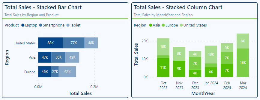
  • Stacked Bar Charts: display horizontal bars where each bar is divided into sub-categories. They are ideal for comparing total values across categories and understanding the breakdown within each category.
  • Stacked Column Charts: display vertical bars divided into sub-categories. They can be the perfect tools for showing changes over time such as yearly or monthly sales or comparing the composition of different categories such as sales regions.

Stacked charts excel in highlighting part-to-whole relationships, making it easy to see both the overall totals and individual contributions. However, they can become cluttered if there are too many sub-categories, so it is best to use them with a limited number of segments.

100% Stacked Charts

100% stacked charts show the relative percentages of sub-categories within each category. Each bar or column represents 100%, and the segments show the contribution of each sub-category.

  • 100% Stacked Bar Chart: these charts can be useful for comparing the relative distribution of parts to the who across different categories. Each horizontal bar represents the total 100%, with each segment indicating that categories contribution shown as percentage.
  • 100% Stacked Column Chart: these charts are similar to the 100% Stacked Bar Charts but display the data with vertical columns.

100% Stacked charts help us focus on the proportions rather than absolute values. They can help visualize how sub-categories contribute to the whole, allowing quick insights into how proportions change over time or between categories. However, it can be challenging to compare the actual value of sub-categories across different bars or columns because the focus in on percentages.

Clustered Charts

Clustered charts display the bar or columns grouped by category, each group contains individual bars or columns for each different subcategory.

  • Clustered Bar Chart: display horizontal bars grouped by category and like the previous charts are a good choice when comparing multiple series of data across categories. Each cluster of bars makes it easy to understand and compare the same subcategory across the different categories.
  • Clustered Column Chart: these charts are similar to clustered bar charts but display the data using vertical columns with each subcategory displayed side by side.

Clustered charts are effective for highlighting similarities and differences across categories. They help us identify patterns and variations within and across the categories of our data. However, they can quickly become overwhelming if they include too many bars or columns, so it is essential to balance the number of categories and subcategories


Customization and Formatting Options

Colors and Themes

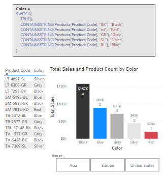
Deliberate choices in the colors used when making our bar and column charts can help elevate our visuals improving the visual appeal and ease of understanding.

A key aspect of color selection is choosing visually distinct colors for each of the categories and subcategories. This helps our users quickly and easily identify and understand the visual. Just as important is to ensure we maintain consistency with our color selections across all visuals on the page and within the report.

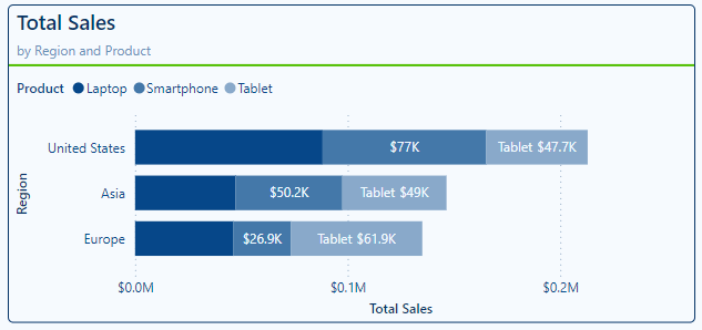
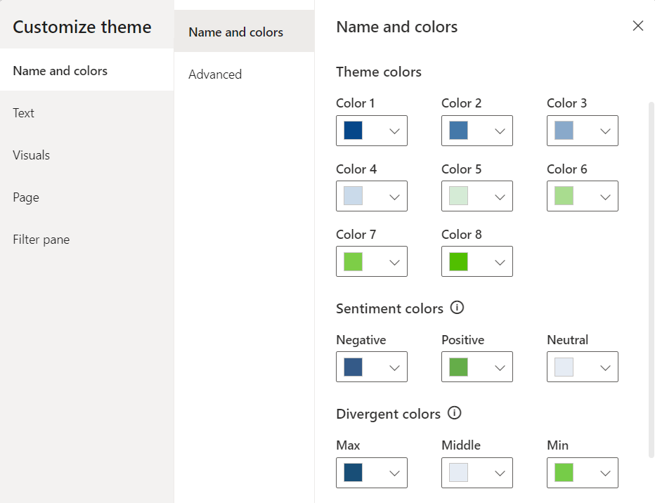
For example, in the visuals above the Product category is always represented by a monochromatic blue color scheme, while the Region category uses a monochromatic green color scheme. Consistently applying color schemes to our visuals greatly improve the readability of our reports.

The color of each bar in the visual can be explicitly set in the Visual properties under the Bar or Column section. We can choose the series we want to set the color for and apply formatting options such as color, transparency, or adding a border.

Colors can also be used to highlight specific data points or be applied conditionally based on business logic. See the Advanced Techniques and Customizations section for more details on how we can use and apply colors to improve our data visualizations.

Data Labels

Data labels provide our users precise information on our bar and column charts. Adding data labels to our charts helps display the exact values for each bar or column providing an extra layer of context.

Power BI provides us a variety of ways to format and customize our data labels to ensure they provide the required information without cluttering our visuals. In the advanced techniques section, we will explore how to leverage our data labels to enhance our visuals beyond just static text labels.

Let’s take a look and the data label properties available to us in Power BI.

Apply to settings: select All to apply the data label customizations to all series or select a specific series

With this we can apply a data label setting for all the data series included in our visual or pinpoint and customize the label for specific series. For example, we can continue to modify the Totals Sales by Region and Product stacked bar chart by turning off the data labels for our Laptop product category, turning on the title property for our Tablet product category, and leaving the Smartphone category with the setting applied to All series.

Options: under the options section we will find the ability to set the position of our data labels and for column charts we also have the option to set the orientation of labels.

The available positions depend on the type of visual we are adding our labels to. For example, stacked charts the options include Auto, inside end, inside center, or inside base. When working with clustered bar or column charts, we will see the addition of the outside end positing option.

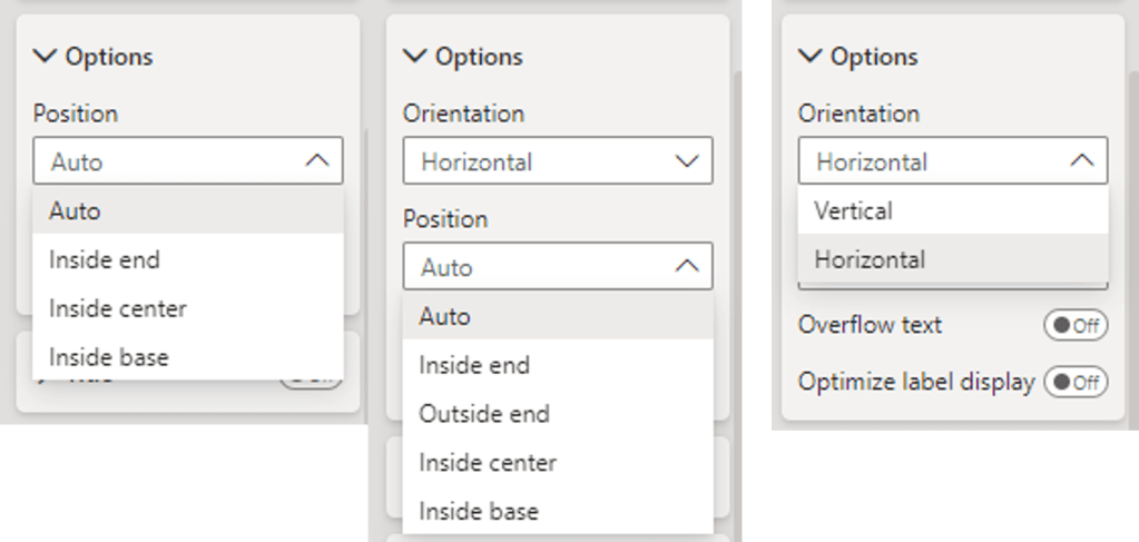
Let’s explore these options by continuing to work with the Total Sales by Region and Product visual. Here, the Laptop category labels are set to inside end, smartphone labels are set to inside center, and the tablet labels are set to the inside base.

Title: the title setting allows us to toggle on and off the data label titles for all and specific data categories within out bar and column charts. The Title properties include the ability to set the title to the series name or a custom value, as well as general formatting options (e.g. font, font size, font color).

Value: within the value section are the settings available to display (or not display) the data label values and how these values should be formatted. With these options we can format the data label font and colors as well as set the display units and the number of decimal places to show.

For example, we can set the data labels for our Laptop category to display the value to the nearest thousand dollars by setting the value decimal places to 0, and we can set the display units for the Smartphone sales to Millions to adjust how the values are displayed.

Detail: the detail section of our data label properties allows us to provide additional context to our bar and column visuals and can be used by itself or in tandem with the Value property. We can control these details for each individual series or apply the customization to all data series on the visual.

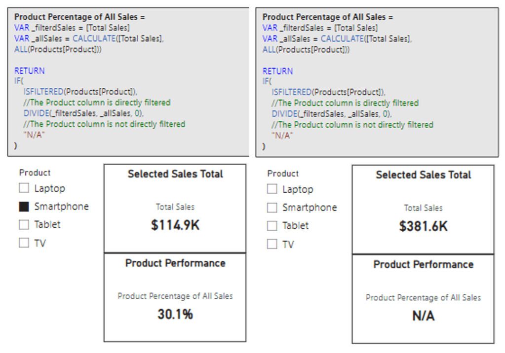
Let’s explore how we can improve a 100% Stacked column chart by leveraging the Value and Details property of our data labels. A noted limitation of the 100% Stacked charts is the focus on percentage rather than the actual value. By default, if we turn on data labels, they will show each categories percentage of the whole.

We can add an additional layer of information for our viewers by using the Detail property to show the percent of total for each sub-category and use the Value property to display the total sales amount for the category. This can help provide our report viewers a more complete picture.

Background: our data labels have a background property we can use to ensure they are easy to read for our viewers. Above we can see we added a slightly transparent and darker background to the visual on the right. This improves the readability on the lighter color segments of the visual.

Layout: the layout property lets us specify if we want our data labels to appear in a single line or multi-line layout and set the horizontal alignment of the data label text. We can see this property used in the visual on the right above. Setting the layout to multi-line ensures the Value and Detail values are displayed on different lines improving the readability of the label.

By effectively using data labels, we can enhance the clarity and the information provided on our visuals.

Axes and Gridlines

Axes and gridlines are another component of our bar and column chart we can customize to improve the readability of our visuals.

X- and Y-axis: the options to customize our visual’s axes will vary depending on the data visualized and the type of visual used. Some common properties between the x- and y-axis across the bar and column charts include formatting of the values and customization of the axis title.

In addition to formatting the appearance of the value, on the categorical axis we will also see options to set the maximum height/width and a toggle to concatenate labels for hierarchies.

On the numeric axis we see the options to set the display units, how many decimal places should be shown, and the ability to set the axis range.

For each type of chart in the y-axis properties we can switch the axis position to display it on the right- or the left-hand side.

Let’s explore some of these additional options.

We can see in the column chart on the left the default displays the hierarchy of the dates (Year > Quarter > Month). Using the concatenate labels x-axis option we can change this behavior.

Below we see the set axis position property in action.

Gridlines: adding gridlines can help our viewers trace data points back to the axis, making it easier to read values accurately. We can customize the appearance of our visual’s gridlines including their color, line style, transparency, and width, to suite our design needs.

The color of the gridlines can be set to one of our report theme colors or using conditional formatting. Line styles available include solid, dashed, dotted, or custom.

Using the axis and gridline options available we can update our Total Sales by Product and Region visual to ensure our viewers can easily read and understand the visual.

Tooltips

Tooltips provide us a great way to provide additional contextual information and detail when required by the user without cluttering the overall visual.

When a user hovers over a data point, a tooltip displays extra details, and these tooltips can be customized to meet our needs. Tooltips can go beyond just displaying text and values, and display additional visuals based on report pages created in our Power BI report.

By default, the tooltip displays the data point’s value and category, we can enhance this information by customizing the tooltip.

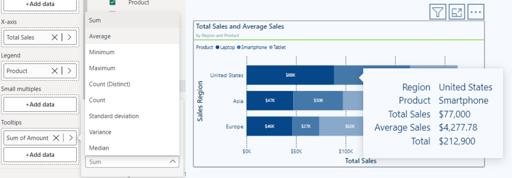
For basic customization, we can drag additional fields into the tooltips bucket on the Build pane. We can further customize our tooltip by selecting an aggregation function for a selected field.

Let’s continue to improve our Total Sales by Region and Product visual by customizing the tooltip.

We would like to include the Average Sales Amount to the tool tip to provide additional information to our viewers. We achieve this by adding our Amount field from our Sales table to the tooltip bucket of our visual then we select the arrow next to the field to view the available aggregation functions, and finally select Average. By default, the name will be Average of Amount, we can rename this for the visual as Average Sales.

Now when we hover over a segment of our visual, we can see the newly added Average Sales value.

Using tooltips effectively can enhance the interactivity of our reports and provide deeper insights and important contextual details without overwhelming our visuals.

Sorting

On the visual within the more options pane, we can set the sort axis options. Using these options, we define what field to sort by and the sorting ordering.

The sort axis options help use ensure our bar and column charts are easily understandable and that the viewers can easily interpret the trends and comparisons the visual provides.

By default, we can see that our Total Sales by Region and Product visual sorts our Regions by descending Total Sales. Although this sorting makes it clear the order of our sales region by Total Sales it could lead to confusion if this ordering frequently changes. Additionally, it can improve readability to sort our categories in a logical alphabetical order.


Advanced Techniques and Customizations

Highlight Key Performers with Conditional Formatting

Conditional formatting is a powerful tool in Power BI that lets us apply specific formatting to data within our visuals based on their values. The specific formatting helps highlight key insights and makes our bar and column charts more informative and visually engaging.

When examining our total sales across product categories it can be helpful to add a reference line to visualize a benchmark that the sales values can be compared to.

We can use conditional formatting and some advanced techniques to improve this visual to draw our viewer’s attention to the categories that exceed the average total sales values. We will conditionally format each product category bar based on whether its total sales are above the average sales across all product categories (i.e. above or below the reference line).

To do this we will create a new measure to help format our visual.

This measure first creates a _summaryTable variable the generates a table with each product and its total sales. Then the variable _ProductTotalSalesAverage is calculated which is the average total sales across all product categories. The last variable, _comparison, is then calculated and stores a boolean value indicating whether the totals sales of the current product is above the average total sales.

Lastly, in the return statement the measure uses IF to return a color code based on whether the product category’s total sales are above or below the average total sales.

Product Code Above Average Sales Conditional Format = 

VAR _summaryTable = 
   SUMMARIZE(
      ALL(Sales), 
      Products[Product], 
      "Product Total", 
      [Total Sales]
)
VAR _ProductTotalSalesAverage = 
   AVERAGEX(
      _summaryTable, 
      [Product Total]
)
VAR _comparison = 
   [Total Sales] > _ProductTotalSalesAverage

RETURN
IF(
   _comparison, 
   "#064789", 
   "#B4C9DD"
)

In the Color and Theme section we discussed using the bar or column section of the visual properties to set the colors of each bar or column. We can also use this property to conditionally format our bars or columns.

In the Bars section, we set the Apply setting to option to All, then next to the Color dropdown we use the fx option to conditionally format our bars. In the Color – Categories dialog box we set the Format style to Field value and then in the What field should we base this on? dropdown we select our newly create measure.

After clicking Ok, we see the conditional formatting applied and our visual gets an instant improvement by highlighting the key performers in our sales data.

Using Clustered Bar/Column to Add Context

We can use a different technique to enhance the Total Sales & Average Sales Comparison visual in a different way. Rather than conditionally formatting the bars, we wish to add additional context to the visual and indicate the percentage of the total sales each category contributes.

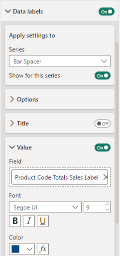
To do this we will add an empty series to our x-axis. We will create a new Bar Spacer measure and simply set the value of it to 0. This will add a series to our visual but since the value is 0, it will not display a bar on the visual. We can then leverage its data labels properties to add additional information to our visual.

First, we will create a new measure to calculate and return the percentage of total sales that a product category contributes. The measure calculates the total sales value of the entire Sales table, ignoring any filters that are applied. Then calculates the percent contribution of the current product category in context, and finally returns the label text we will use within out visual.

Product Code Totals Sales Label = 
VAR _allSales = CALCULATE([Total Sales], ALL(Sales))
VAR _percentage = Round(([Total Sales]/_allSales)*100, 0)
RETURN
_percentage & "% of total sales"

We now can make the updates to our clustered bar chart. We start by adding in our placeholder series which is a measure set to 0.

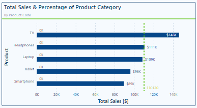
Then we go to the Data label properties of our clustered bar chart and in the Apply settings to drop down we select our Bar Spacer series. Once selected we update the Field to our newly created label measure.

Our visual will now display and provide our viewers additional contextual information. With this our viewer not only gets insights into each product’s total sales amount, but also what percentage of the overall sales each product category contributes.

Year-to-Date Sales & Previous Year Total Sales

Another important piece of information to provide our viewers is how the total sales of each product category vary through time. We have a requirement to incorporate the year-to-date sales, the total sales of the previous year, and how the previous year’s sale compare to the prior year (i.e. current 2024 sales, 2023 total sales, and how does 2023 sales compare to 2022 sales).

Including all the required information may seem like an impossible task. However, using some advanced techniques and customizations we can meet these requirements and create a visual that is both visually appealing and informative.

Here is the final visualization we will be creating.

In order to create a visual with these various components we create 4 sales measures. The first two measures calculate the previous year’s total sales and the second calculates the annual total of the year prior to this.

Total Sales (-1 years) = 
VAR _offset = 1
VAR _year = YEAR(TODAY()) - _offset
VAR _periodStart = DATE(_year, 1, 1)
VAR _periodEnd = DATE(_year, 12, 31)
RETURN
CALCULATE([Total Sales], DATESBETWEEN(DateTable[Date], _periodStart, _periodEnd))
Total Sales (-2 years) = 
VAR _offset = 2
VAR _year = YEAR(TODAY()) - _offset
VAR _periodStart = DATE(_year, 1, 1)
VAR _periodEnd = DATE(_year, 12, 31)
RETURN
CALCULATE([Total Sales], DATESBETWEEN(DateTable[Date], _periodStart, _periodEnd))

We then create a measure calculating the difference between these two sales amounts.

Total Sales (-1) vs Total Sales (-2) = 
[Total Sales (-1 years)] - [Total Sales (-2 years)]

The last sales measure calculates the year-to-date total sales of the current year.

Total Sales CY = 
TOTALYTD([Total Sales], DateTable[Date])

We start building this visualization by creating a field parameter to dynamically name our Total Sales (-1) and Total Sales (-2) measures to show the year they represent (currently 2023 Totals Sales and 2022 Total Sales).

Previous Years Sales = {
    (YEAR(TODAY())-1 & " Total Sales", NAMEOF('_Measures'[Total Sales (-1 years)]), 0),
    (YEAR(TODAY())-2 & " Total Sales", NAMEOF('_Measures'[Total Sales (-2 years)]), 1)
}

Then we can add this parameter to a clustered column chart to start building the dumbbell comparison of these two sales values.

Under the Columns grouping of properties we expand the Layout properties, with All selected in the series drop down we turn on Overlap and set the Space between series to 100%. Then under the Color properties we set the transparency applied to the 2023 Total Sales to 80% and applied to the 2022 Total Sales series to 100%.

The next step is to create the end point markers of the dumbbell comparison. To do this we use the error bar functionality of the column chart.

Select the 2023 Total Sales series in the drop down, then under Options we enable the error bars and set the Upper and Lower bound to our Total Sales (-1 years) measure. Under the Bar properties we then format the error bar, setting the color to a medium to dark blue, the marker shape to a circle, the marker size to 8, the border color to a dark blue, and the border size to 1.

We repeat this process for the 2022 Total Sales error bar using the Total Sales (-2 years) measure and formatting the bar with a lighter color blue and a marker size of 6.

We now need to connect the two endpoints of our dumbbell which represent our 2022 and 2023 totals sales. To do this we create a new Total Sales Dumbbell Connector measure and set it equal to the Total Sales (-2 years) measure.

We add this to the Y-axis of our column chart and position it above the Parameter data. We rename the measure for this visual and clear the name and set the color of the column to the background of our visual, so it does not appear in the legend.

Then similar to the 2023 and 2022 series we enable error bars. We set the Upper bound to the Total Sales (-1) vs Total Sales (-2) we previously created and then in the Relationship to measure drop down select Relative.

Under the Bar properties we format this error bar with a medium to dark gray color, width of 2, marker shape set to none and a border size of 0.

Now, we want to label these endpoints with the total sales values. The labeling of these endpoints has 4 different scenarios we must account for. For each annual sales data point we need to be able to dynamically position the label above or below the point depending on if 2022 sales are higher or lower than 2023 sales.

To do this we add another series to the plot to help us with addressing this labeling challenge. For this series we create a new measure similar to the Total Sales Dumbbell Connector measure. The Total Sales Dumbbell Label Help measure is set equal to the Total Sales (-1 year) measure and formatted the same way as the Total Sales Dumbbell Connector series. We do not need to enable error bars for this new helper series since we will just be leveraging its data label properties.

Next, we create 4 new measures to assist with displaying and formatting our data labels.

Dumbbell Above Label (-1) = 
IF(
    [Total Sales (-1 years)] > [Total Sales (-2 years)],
    [Total Sales (-1 years)]
)

Dumbbell Below Label (-1) = 
IF(
    [Total Sales (-1 years)] < [Total Sales (-2 years)],
    [Total Sales (-1 years)]
)

Dumbbell Above Label (-2) = 
IF(
    [Total Sales (-1 years)] < [Total Sales (-2 years)],
    [Total Sales (-2 years)]
)
Dumbbell Below Label (-2) = 
IF(
    [Total Sales (-1 years)]  > [Total Sales (-2 years)],
    [Total Sales (-2 years)]
)

After creating the formatting measures, we turn on Data labels for our clustered column chart and start formatting the labels, so they display as we need them. For example, if 2023 Sales are higher than 2022 Sales, we want the label for the 2023 Sales value to be above the data point.

To start, in the Data labels apply settings to we select our 2023 Total Sales, then we set the position to Outside End. This will show our 2023 Total Sales value above each of the 2023 Sales points.

To show the label only when 2023 sales are greater than 2022 sales in the Value property, we set the Field value to the Dumbbell Above Label (-1) measure and format the label by setting the font size to 14 and the color to green indicating from 2022 to 2023 sales of the product category increased.

Next, in the apply settings to dropdown we select the helper series, which is equal to our 2023 Sales value. For this label we set the position to Inside end and the field to the Dumbbell Below Label (-1). Then format the label by setting the font size to 14 and the color to red indicating from 2022 to 2023 sales of the product category decreased.

We then repeat this process for the 2022 Total Sales and the Total Sales Dumbbell Connector series. Using the “(-2)” formatting measures for the field values and formatting the data labels with a font size of 12 and their color set to a dark gray.

Now for that last couple of finishing touches. We also want to display the current year-to-date sales and we do this by adding our Total Sales CY to the clustered column chart. We format this column by setting the column color to a dark blue and position the data labels to the Inside end of the column with a font size of 12. Then sort the Product Category axis alphabetically by the product category name.

By implementing some advanced techniques to format and customize our cluster column chart we now present our viewers with a clean and simple visualization that is easy to read and packs in all the information required. This visual now provides key insights into how each category is performing in the current year alongside historical context of the category’s performance.


Wrapping Up

Bar and column charts are a common and powerful tool in Power BI. These charts offer us a versatile visualization option with seemingly endless opportunities to format, customize, and tailor them to our specific needs.

We have explored how basic and advanced customizations in Power BI can help us create bar and column charts that are visually appealing and highly informative. By using features such as conditional formatting, dynamic labels, and interactive elements we can significantly enhance the user experience and insights our reports provide.

Subscribe below to stay tuned in as we continue to explore the other core visuals in Power BI as part of this series, helping to grow our skills and expand our data visualization capabilities.


Thank you for reading! Stay curious, and until next time, happy learning.

And, remember, as Albert Einstein once said, “Anyone who has never made a mistake has never tried anything new.” So, don’t be afraid of making mistakes, practice makes perfect. Continuously experiment, explore, and challenge yourself with real-world scenarios.

If this sparked your curiosity, keep that spark alive and check back frequently. Better yet, be sure not to miss a post by subscribing! With each new post comes an opportunity to learn something new.

Dive into DAX: Decoding Data with Power BI Logical Functions


The missing piece to decoding our data and unlocking its full potential is often the strategic application of DAX Logical Functions. These functions are pivotal in dissecting complex datasets, applying business logic, and enabling a nuanced approach to data analysis that goes beyond surface-level insights. Better understanding DAX Logical Functions allows us to create more sophisticated data models that respond with agility to analytical queries, turning abstract numbers into actionable insights.

In this post we will explore this group of functions and how we can leverage them within Power BI. We will dive in and see how we can transform our data analysis from a mere task into an insightful journey, ensuring that every decision is informed, every strategy is data-driven, and every report illuminates a path to action.


The Logical Side of DAX: Unveiling Power BI’s Brain

Diving into the logical side of DAX is where everything begins to become clear. Logical functions are the logical brain behind Power BI’s ability to make decisions. Just like we process information to decide between right and wrong, DAX logical functions sift through our data to determine truth values: true or false.

Functions such as IF, AND, OR, NOT, and TRUE/FALSE, are the building blocks for creating dynamic reports. These functions allow us to set up conditions that our data must meet, enabling a level of interaction and decision-making that is both powerful and nuanced. Whether we are determining if sales targets were hit or filtering data based on specific criteria, logical functions are our go-to tools for making sense of the numbers.

For details on these functions and many others visit the DAX Function Reference documentation.

Learn more about: DAX Logical Functions

The logical functions in DAX can go far beyond the basics. The real power happens when we start combining these functions to reflect complex business logic. Each function plays its role and when used in combination correctly we can implement complex logic scenarios.

For those eager to start experimenting there is a Power BI report pre-loaded with the same data used in this post ready for you! So don’t just read, follow along and get hands-on with DAX in Power BI. Get a copy of the sample data report here:

This dynamic repository is the perfect place to enhance your learning journey.


Understanding DAX Logical Functions: A Beginner’s Guide

When starting our journey with DAX logical functions we will begin to understand the unique role of each function within our DAX expressions. Among these functions, the IF function stands out as the decision-making cornerstone.

The IF function tests a condition, returning one result if the condition is TRUE, and another if FALSE. Here is its syntax.

IF(logical_test, value_if_true, value_if_false)

The logical_test parameter is any value or expression that can be evaluated to TRUE or FALSE, and then the value_if_true is the value that is returned if logical_test is TRUE, and the value_if_false is optional and is the value returned when logical_test is FALSE. When value_if_false is omitted, BLANK is returned when the logical_test is FALSE.

Let’s say we want to identify which sales have an amount that exceeds $5,000. To do this we can add a new calculated column to our Sales table with the following expression.

Sales Target Categorization = 
IF(
  Sales[Amount] &gt; 5000, 
  "Above Target", 
  "Below Target"
)

This expression will evaluate each sale in our Sales table, labeling each sale as either “Above Target” or “Below Target” based on the Sales[Amount].

The beauty of starting our journey with IF lies in its simplicity and versatility. While we continue to explore logical functions, it won’t be long before we encounter TRUE/FALSE.

As we saw with the IF function these values help guide our DAX expressions, they are also their own DAX function. These two functions are the DAX way of saying yes (TRUE) or no (FALSE), often used within other logical functions or conditions to express a clear binary choice.

These functions are as straightforward as they sound and do not require any parameters. When used with other functions or conditional expressions we typically use these to explicitly return TRUE or FALSE values.

For example, we can create another calculated column to check if a sale is a high value sale with an amount greater than $9,000.

High Value Sale = 
IF(
  Sales[Amount] &gt; 9000, 
  TRUE, 
  FALSE
)

This simple expression checks if the sales amount exceeds $9,000, marking each record as TRUE if so, or FALSE otherwise.

Together IF and TRUE/FALSE form the foundation of logical expressions in DAX, setting the stage for more complex decision-making analysis. Think of these functions as essential for our logical analysis, but just the beginning of what is possible.


The Gateway to DAX Logic: Exploring IF with AND, OR, and NOT

The IF function is much more than just making simple true or false distinctions; it helps us unlock the nuanced layers of our data, guiding us through the paths our analysis can take. By effectively leveraging this function we can craft detailed narratives from our datasets.

We are tasked with setting sales targets for each region. The goal is to base these targets on a percent change seen in the previous year. Depending on whether a region experienced a growth or decline, the sales target for the current year is set accordingly.

Region Specific Sales Target = 
IF(
    HASONEVALUE(Regions[Region]),
    IF(
        [Percent Change(CY-1/CY-2)] &lt; 0, 
        [Total Sales (CY-1)]*1.1, 
        [Total Sales (CY-1)]*1.2
    ),
    BLANK()
)

In this measure we make use of three other measures within our model. We calculate the total sales for the previous year (Total Sales (CY-1)), and the year before that (Total Sales (CY-2)). We then determine the percentage change between these two values.

If there is a decline (negative percent change), we set the current year’s sales target to be 10% higher than the previous year’s sales, indicating a more conservative goal. Conversely, if there was growth (positive percent change), we set the current year target 20% higher to keep the momentum going.

As we dive deeper, combining IF with functions like AND, OR, and NOT we begin to see the true flexibility of these functions in DAX. These logical operators allow us to construct more intricate conditions, tailoring our analysis to very specific scenarios.

The operator functions are used to combine multiple conditions:

  • AND returns TRUE if all conditions are true
  • OR returns TRUE if any condition is true
  • NOT returns TRUE if the condition is false

Let’s craft a measure to determine which employees are eligible for a quarterly bonus. The criterion for eligibility is twofold: the employee must have made at least one sale in the current quarter, and their average sale amount during this period must exceed the overall average sale amount.

To implement this, we first need to calculate the average sales and compare each employee’s average sale against this benchmark. Additionally, we check if the employee has sales recorded in the current quarter to qualify for the bonus.

Employee Bonus Eligibility = 
VAR CurrentQuarterStart = DATE(YEAR(TODAY()), QUARTER(TODAY()) * 3 - 2, 1)
VAR CurrentQuarterEnd = EOMONTH(DATE(YEAR(TODAY()), QUARTER(TODAY()) * 3, 1), 0)
VAR OverallAverageSale = CALCULATE(AVERAGE(Sales[Amount]), ALL(Sales))
VAR EmployeeAverageSale = CALCULATE(AVERAGE(Sales[Amount]), FILTER(Sales, Sales[SalesDate] &gt;= CurrentQuarterStart &amp;&amp; Sales[SalesDate] = CurrentQuarterStart &amp;&amp; Sales[SalesDate]  0

RETURN
IF(
    AND(HasSalesCurrentQuarter, EmployeeAverageSale &gt; OverallAverageSale),
    "Eligible for Bonus",
    "Not Eligible for Bonus"
)

In this measure we define the start and end dates of the current quarter, then we calculate the overall average sale across all data for comparison. We then determine each employee’s average sale amount and check if the employee has made any sales in the current quarter to qualify for evaluation.

If an employee has active sales and their average sale amount during the period is above the overall average, they are deemed “Eligible for Bonus”. Otherwise, they are “Not Eligible for Bonus”.

This example begins to explore how we can use IF in conjunction with AND to streamline business logic into actionable insights. These logical functions provide a robust framework for asking detailed questions about our data and receiving precise answers, allowing us to uncover the insights hidden within the numbers.


Beyond the Basics: Advanced Logical Functions in DAX

As we venture beyond the foundational logical functions we step into a world where DAX’s versatility shines, especially when dealing with complex data models in Power BI. More advanced logical functions such as SWITCH and COALESCE bring a level of clarity and efficiency that is hard to match with just basic IF statements.

SWITCH Function: Simplifying Complex Logic

The SWITCH function is a more powerful version of the IF function and is ideal for scenarios where we need to compare a single expression against multiple potential values and return one of multiple possible result expressions. This function helps us provide clarity by avoiding multiple nested IF statements. Here is its syntax.

SWITCH(expression, value, result[, value, result]...[, else])

The expression parameter is a DAX expression that returns a single scalar value and is evaluated multiple times depending on the context. The value parameter is a constant value that is matched with the results of expression, the result is any scalar expression to be evaluated if the result of expression matches the corresponding value. Finally, the else parameter is an expression to be evaluated if the result of expression does not match any value arguments.

Let’s explore. We have a scenario where we want to apply different discount rates to products based on their categories (Smartphone, Laptop, Tablet). We could achieve this by using the following expression for a new calculated column, which uses nested IFs.

Product Discount Rate (IF) = 
IF(
    Products[Product]="Smartphone", 0.10,
    IF(Products[Product]="Laptop", 0.15,
        IF(Products[Product]="Tablet", 0.20,
            0.05
        )
    )
)

Although this would achieve our goal, the use of nested if statements can make the logic of the calculated column hard to read, understand, and most importantly hard to troubleshoot.

Now, let’s see how we can improve the readability and clarity by implementing SWITCH to replace the nested IF statements.

Product Discount Rate = 
SWITCH(
    Products[Product],
    "Smartphone", 0.10,
    "Laptop", 0.15,
    "Tablet", 0.20,
    0.05
)

The expression simplifies the mapping of each Product to its corresponding discount rate and provides a default rate for categories that are not explicitly listed.

COALESCE Function: Handling Blank or Null Values

The COALESCE function offers a straightforward way to deal with BLANK values within our data, returning the first non-blank value in a list of expressions. If all expressions evaluate to BLANK, then a BLANK value is returned. Its syntax is also straightforward.

COALESCE(expression, expression[, expression]...)

Here, expression can be any DAX expression that returns a scalar value. These expressions are evaluated in the order they are passed to the COALESCE function.

When reporting on our sales data, encountering blanks can sometimes communicate the wrong message. Using COALESCE we can address this by providing a more informative value when there are no associated sales.

Product Sales = COALESCE([Total Sales], "No Sales")

With this new measure if our Total Sales measure returns a blank, for example due to filters applied in the report, COALESCE ensures this is communicated with a value of “No Sales”. This approach can be beneficial for maintaining meaningful communication in our reports. It ensures that our viewers understand the lack of sales being reported, rather than interpreting a blank space as missing or erroneous data.

These logical functions enrich our DAX toolkit, enabling more elegant solutions to complex problems. By efficiently managing multiple conditions and safeguarding against potential errors, SWITCH and COALESCE not only optimize our Power BI models but also enhance our ability to extract meaningful insights from our data.

With these functions, our journey into DAX’s logical capabilities becomes even more exciting, revealing the depth and breadth of analysis we can achieve. Let’s continue to unlock the potential within our data, leveraging these tools to craft insightful, dynamic reports.


Logical Comparisons and Conditions: Crafting Complex DAX Logic

Delving deeper into DAX, we encounter scenarios that demand a blend of logical comparisons and conditions. This complexity arises from weaving together multiple criteria to craft intricate logic that precisely targets our analytical goals.

We touched on logical operators briefly in a previous section, the AND, OR, and NOT functions are crucial for building complex logical structures. Let’s continue to dive deeper into these with some more hands-on and practical examples.

Multi-Condition Sales Analysis

We want to identify and count the number Sales transactions that meet specific criteria: sales above a threshold and within a particular region. To achieve this, we create a new measure using the AND operator to count the rows in our sales table that meet our criteria.

High Value Sales in US (Count) = 
COUNTROWS(
    FILTER(
        Sales,
        AND(
            Sales[Amount] &gt; 5500,
            RELATED(Regions[Region]) = "United States"
        )
    )
)

This measure filters our Sales table to sales that have an amount greater than our threshold of $5,500 and have a sales region of United States.

Excluding Specific Conditions

We need to calculate total year-to-date sales while excluding sales from a particular region or below a certain amount. We can leverage the NOT function to achieve this.

Sales Excluding Asia and Low Values = 
CALCULATE(
    SUM(Sales[Amount]),
    AND(
        NOT(Sales[RegionID] = 3), // RegionID=3 (Asia)
        Sales[Amount] &gt; 5500
    ),
    Sales[IsCurrentYear]=TRUE()
)

This measure calculates the sum of the sales amount that are not within our Asia sales region and are above $5,500. Using NOT we exclude sales from the Asia region and we us the AND function to also impose the minimum sales amount threshold.

Special Incentive Qualifying Sales

Our goal is to identify sales transactions eligible for a special incentive based on multiple criteria: sales amount, region, employee involvement, and a temporal aspect of the sales data. Here is how we can achieve this.

Special Incentive Qualifying Sales = 
CALCULATE(
    SUM(Sales[Amount]),
    OR(
        Sales[Amount] &gt; 7500,
        Sales[RegionID] = 2
    ),
    NOT(
        Sales[EmployeeID] = 4
    ),
    Sales[IsCurrentYear] = TRUE()
)

The OR function is used to include sales transactions that either exceed $7,500 or are made in Europe (RegionID = 2) and the NOT function excludes transaction made by an employee (EmployeeID = 4), who is a manager and exempt from the incentive program. The final condition is that the sale occurred in the current year.

The new measure combines logical tests to filter our sales data, identifying the specific transactions that qualify for a special incentive under detailed conditions.

By leveraging DAX’s logical functions to construct complex conditional logic, we can precisely target specific segments of our data, uncover nuanced insights, and tailor our analysis to meet specific business needs. These examples showcase just the beginning of what is possible when we combine logical functions in creative ways, highlighting DAX’s robustness and flexibly in tackling intricate data challenges.


Wrapping Up: From Logic to Action

Our journey through the world of DAX logical functions underscores their transformative power within our data analysis. By harnessing IF, SWITCH, AND, OR, and more, we’ve seen how data can be sculpted into actionable insights, guiding strategic decisions with precision. To explore other DAX Logical Functions or get more details visit the DAX Function Reference.

Learn more about: DAX Logical Functions

Logical reasoning in data analysis is fundamental. It allows us to uncover hidden patterns and respond to business needs effectively, demonstrating that the true value of data lies in its interpretation and application. DAX logical functions are the keys to unlocking this potential, offering clarity and direction in our sea of numbers.

As we continue to delve deeper into DAX and Power BI, let the insights derived from logical functions inspire action and drive decision-making. To explore other functions groups that elevate our data analysis check out the Dive into DAX series, with each post comes the opportunity to enhance your data analytics and Power BI reports.

Explore the intricate landscape of DAX in Power BI, revealing the potential to enhance your data analytics with every post. 


Thank you for reading! Stay curious, and until next time, happy learning.

And, remember, as Albert Einstein once said, “Anyone who has never made a mistake has never tried anything new.” So, don’t be afraid of making mistakes, practice makes perfect. Continuously experiment and explore new DAX functions, and challenge yourself with real-world data scenarios.

If this sparked your curiosity, keep that spark alive and check back frequently. Better yet, be sure not to miss a post by subscribing! With each new post comes an opportunity to learn something new.

Design Meets Data: The Art of Crafting Captivating Power BI Themes


At the intersection of design and data, crafting Power BI themes emerges as a crucial skill for effective and impactful reports that provide a clear and consistent experience. Through thoughtful design choices in color, font, and layout, we can elevate our report development strategy.

Let’s dive into the details of Power BI theme creation and unlock the potential to make our reports informative, impactful, and remembered. Keep reading to explore the blend of design and data, where every detail in our report is under our control.

Throughout this post we will be creating a Power BI theme file and a Power BI report to test our theme, both the file and report are available at the end of the post. Here is what we will explore.

  1. Introduction to Power BI Themes
  2. The Anatomy of a Power BI Theme
  3. Step-by-Step Guide to Creating Our First Power BI Theme
  4. Advanced Customization
  5. Implementing Custom Themes in Power BI Reports
  6. Creating a Template Report to Test Our Theme

Introduction to Power BI Themes

Have you ever stared at one of your Power BI reports and thought, “This could look so much better”? Well, you are not alone. Power BI themes and templates help us turn bland data visualizations into eye-catching reports that keep everyone engaged.

Themes in Power BI focus on the colors, fonts, and visual styles that give our reports a consistent look. Imagine having a signature style that runs through all your reports – that is what themes can help us do. They ensure that every chart, visual, or table aligns with our brand or a project’s aesthetic, making our report both informational and visually appealing.

No matter your Power BI role or skill level furthering our understanding of Power BI themes can significantly impact the quality of reports we create. So, let’s dive in and explore how we can create our own Power BI custom theme. Ready to transform our reports from meh to magnificent?


The Anatomy of a Power BI Theme

Let’s dive into some details and take a peek under the hood of a Power BI theme. If you have ever opened a JSON and immediately closed, again, you are not alone. But once you get the hang of it, it becomes more and more like reading a recipe of the visual aspects of our Power BI report.

Remember, as complex as the Power BI theme file may seem at its core it is structured text used to define properties like colors, fonts, and visual styles in a way Power BI can understand and apply across our reports.

Key Elements to Customize

Theme Colors:
These colors are the heart of our theme. The theme colors determine the colors that represent data in our report visuals. When customizing our theme through Power BI Desktop or setting colors of a visual element we will see Color 1 – Color 8 listed, however the list of theme colors in our theme file can have as many colors as we require for automatically assigning colors in our visualizations.

In the theme color section is also where we find our sentiment and divergent colors as well. Sentiment colors are those used in visuals such as the KPI visual to indicate positive, negative, or neutral results. While the divergent colors are used in conditional formatting to show where a data point falls in a range and we define the colors for the maximum, middle, minimum, and null values.

Structural Colors:
While theme colors focus on the data visualizations, structural colors deal with the non-data components of our report, such as the background, label colors, and axis gridline colors. These colors help to enhance the overall aesthetic of our reports.

Structural colors can be found in the Advanced subsection of the Name and Colors tab in the Customize theme dialog box.

We can find all the details on what each color class formats in the table at the link below.

Learn more about: What each structural color formats in our Power BI reports

Text Classes:
Next, we can specify the font styles for different types of text within our report including defining the font size, color, and font family for things such as titles, headers, and labels.

Within our Power BI theme there are 4 primary classes out of a total of 12 that need to be set. Each of the four primary classes can be found under the Text section of the Customize theme dialog box. The 4 primary classes are the general class which covers most text within each of our visuals, the title class to format the main title and axis titles, the cards and KPIs class to format the callout values in card and KPIs visuals, and the tab headers class to format the tab headers in the key influencers visual.

The other text classes are secondary classes and derive their properties from the primary class they are associated with. For example, a secondary class may select a lighter shade of the font color, or a percentage larger or smaller font size based on the primary class properties.

For details on what each class formats view the table at the link below.

Learn more about: Power BI Theme Text Classes

Visual Styles:
To define and fine-tune the appearance of various visuals with detailed and granular control we can add or update the visual styles section of our Power BI theme JSON file.

The Power BI Customize theme dialog box offers a start into setting and modify visual styles. On the Visuals tab we will see options to set background, border, header and tooltip colors. It also provides options to set the colors or our report wallpaper and page background on the Page tab, and set the appearance of the filter pane on the Filter pane tab.

The visuals styles offer us the ability to get granular and ensure every visual matches the aesthetics of our report. However, with this comes a lot of details to work through, we will explore just some of the basics later in this post when customizing the Power BI Theme file.

By focusing on these components, the blueprint for crafting a Power BI theme begins to come together. Helping us create reports that resonate with our brand and elevates user experience by creating a clear and consistent Power BI appearance. As we get more comfortable with the nuances and details of what goes into a Power BI theme, we become better equipped to create a theme that brings our reports to life.


Step-by-Step Guide to Creating Our First Power BI Theme

Creating a custom Power BI theme might initially seem like an unattainable task and we may not even know where to start. The good news is that starting from scratch is not necessary. Let’s make the creation of our theme as smooth as possible by leveraging some handy tools and resources to get us started.

Starting Point: Customize Theme in Power BI Desktop

Starting to create our first Power BI theme does not mean we have to start from scratch. In fact, diving headfirst into a blank JSON file might not be the best way to start. Power BI offers a more user-friendly entry point through the Customize theme dialog box. As we saw in the previous section this user-friendly interface lets us adjust and set many of the core elements of our theme.

The beauty of starting here is not only its simplicity, but also the fact that Power BI allows us to save our adjustments as a JSON file. This file can serve as a great starting point for further customization, giving us a solid foundation to customize and build upon.

First, we will start by selecting a built-in theme that is close to what we want our end result to look like. If none of the built-in themes are close, don’t overlook the resources available right from the Theme dropdown menu in Power BI Desktop. Near the bottom we can find a link to the Theme gallery.

This is also where we find the Customize current theme option to get started crafting our Power BI Theme.

Selecting the Customize current theme will open the Customize theme dialog box where we are able to make adjustments to the current theme, and then we can save the theme as a JSON file for further customizations.

For those looking to tailor their theme further, there are numerous online theme generators that might be helpful. These can range from free basic tools to paid for advanced tools.

Crafting Our Theme

We will be creating a light color theme with the core theme colors ranging from blue to green, similar to the one applied to the report seen in the post below.

From Sketch to Screen: Bringing your Power BI report navigation to life for an enhanced user experience.

Theme Name and Colors

First, from the View ribbon we start by selecting the Theme drop down. From here we will start with the built-in Accessible Tidal theme. Once we select the built-in theme to apply it to the report, we navigate back to the Theme dropdown and select Customize current theme near the bottom.

Then we start our customizations on the Name and color tab of the Customize theme dialog box. We set our theme colors, with colors 1-4 ranging from a dark blue to a light blue (#064789, #4478A9, #89A9CA, #CADAEA) and colors 5-8 ranging from a light green to dark green (#D5EBD6, #A9DC8F, #7DCE47, #51BF00). Next, we set the sentiment colors and divergent colors using blue and green as the end points and gray for the midpoint.

Then we hit apply and see how the selected theme colors are reflected in our report. On the left and the bar chart across the top we can see the 8 theme colors. The waterfall chart shows the sentiment colors with green representing an increase and the blue a decrease. Lastly, the divergent colors are utilized in the bottom right bar chart where the bar’s color is based on there percent difference from the average monthly sales values.

After setting the theme, sentiment, and divergent colors we can go back to the Customize theme dialog box and navigate to the Name and colors Advanced section to set our 1st-4th level element colors and our background element colors.

These color elements may not be as straightforward or as easy to identify compared to our core theme colors. Let’s explore some examples of each element.

Here are some of our report elements that are set by the first-, second-, third-, and fourth-level elements color of our customized theme.

And then here are some of our report elements that are set by the background and secondary background colors of our customized theme.

After we have set all of our theme and structural colors, we save our customizations and check in on our Power BI theme JSON file. To save our theme navigate to the Theme dropdown in Power BI and select Save current theme near the bottom. In this file we can see our theme colors listed in the dataColors array, followed by the color elements we set in the advanced section, and then our divergent and sentiment colors.

{
    "name": "Blue Green Light Theme",
    "$schema": "https://raw.githubusercontent.com/microsoft/powerbi-desktop-samples/main/Report%20Theme%20JSON%20Schema/reportThemeSchema-2.126.json",
    "dataColors": [
        "#064789",
        "#4478A9",
        "#89A9CA",
        "#CADAEA",
        "#D5EBD6",
        "#A9DC8F",
        "#7DCE47",
        "#51BF00"
    ],
    "firstLevelElements": "#0A2B43",
    "secondLevelElements": "#064789",
    "thirdLevelElements": "#E5E9ED",
    "fourthLevelElements": "#C0C7CD",
    "background": "#F1F9FF",
    "secondaryBackground": "#96AEC7",
    "tableAccent": "#4E9466",
    "maximum": "#184E77",
    "center": "#E6ECF4",
    "minimum": "#76CC48",
    "bad": "#345A88",
    "neutral": "#E6ECF4",
    "good": "#65AD49"
    
}

We can also see a remanent of the built-in theme we selected to start building our custom Power BI theme: tableAccent. We can see this color in our matrix visual, and it is used to set the grid border color.

Let’s use this to complete our first customization of our Power BI theme by editing the theme JSON file and loading the updated theme in Power BI Desktop. To do this, we first update the tableAccent property of the JSON file to the following and save the changes.

"tableAccent": "#51BF00"

Then back in our Power BI report, within the Theme dropdown we select Browse for themes and select our updated Power BI theme JSON file. Power BI will validate our theme file, and once applied we see a dialog box informing us the file was successfully added. And just like that we updated our Power BI custom theme by editing the JSON file.

Now that our theme colors are set, let’s move onto setting our text classes.

Theme Text Classes

In the Customize Theme dialog box we will now shift our focus to the Text tab to set the font styles for various text elements. Within Power BI Desktop we can set the general text, title text, card and KPIs, and tab headers.

Let’s add some more elements to our previous report so we can explore and see more of our theme components in action. Here are some examples of what the different text classes format.

For the theme we are building here is how we will set our text classes:

  • General – Font family: Segoe UI, Font size: 10, Font color: a dark blue (#053567)
  • Title – Font family: Segoe UI Semibold, Font size: 12, Font color: a dark blue (#053567)
  • Cards and KPIs – Font family: Segoe UI, Font size: 26, Font color: our theme color #1 (#064789)
  • Tab headers – Font family: Segoe UI Semibold: Font size 12, Font color: a dark blue (#053567)

Here is the updated report with our text classes defined in our Power BI theme.

Now we can save the report theme to update the Power BI theme JSON file and check in on the new text classes sections that has been added to it. To save our theme navigate to the Theme dropdown in Power BI and select Save current theme near the bottom.

    "textClasses": {
        "label": {
            "color": "#053567",
            "fontFace": "'Segoe UI', wf_segoe-ui_normal, helvetica, arial, sans-serif",
            "fontSize": 10
        },
        "callout": {
            "color": "#064789",
            "fontFace": "'Segoe UI', wf_segoe-ui_normal, helvetica, arial, sans-serif",
            "fontSize": 26
        },
        "title": {
            "color": "#053567",
            "fontFace": "'Segoe UI Semibold', wf_segoe-ui_semibold, helvetica, arial, sans-serif",
            "fontSize": 12
        },
        "header": {
            "color": "#053567",
            "fontFace": "'Segoe UI Semibold', wf_segoe-ui_semibold, helvetica, arial, sans-serif",
            "fontSize": 12
        }
    }

Visual Styles

Let’s continue working through the Customize Theme dialog box and move to the Visuals tab. The Visuals tab allows us to customize the appearance of charts, graphs, and other data visualization components. On this tab we can set the background, border, header, and tooltip property of our visualizations.

Our visual background will be set to a light blue (#F6FAFE).

Then we will move to the next section to turn on and set our visual boarder color to the same dark blue color we used for our text classes (#053567) with a radius of 5.

Next, the header of our visualizations. We will use the same background color as we did in the Background section. For the border and icon color, we will set them to the same color we used in the Border section.

Lastly, we finish up with formatting our Tooltips by setting the label text color and value text color to the same dark blue we have been using for our text elements and the same light blue for the background that we used for the other Visual sections.

Then let’s hit apply and check our report page we are creating to see the different aspects of our theme.

We can also see these updates reflected in the addition of the "visualStyles" property to our Power BI theme file. Before we take a look at the details of our "visualStyles", lets first examine an example of the section.

The visualName and cardName sections are used to specify a visual and card name. Currently, the styleName is always an asterisk ("*").

The propertyName is a formatting option (e.g. color), and the propertyValue is the value used for that formatting option.

For the visualName and cardName we can use an asterisk in quotes ("*") when we want the specified setting to apply to all visuals that have the specific property. When we use "*" for both the visual and card name we can think of this as setting a global setting similar to how our text classes font family and font size is applied across all visuals.

Below is our updated Power BI JSON theme file where we can see the "*" used for the visual and card name, meaning these settings are applied to all our visuals that have the property.

"visualStyles": {
        "*": {
            "*": {
                "background": [
                    {
                        "color": { "solid": { "color": "#F6FAFE" } }
                    }
                ],
                "border": [
                    {
                        "color": { "solid": { "color": "#053567" } },
                        "show": true,
                        "radius": 5
                    }
                ],
                "visualHeader": [
                    {
                        "background": { "solid": { "color": "#F6FAFE" } },
                        "foreground": { "solid": { "color": "#053567" } },
                        "border": { "solid": { "color": "#053567" } }
                    }
                ],
                "visualTooltip": [
                    {
                        "titleFontColor": { "solid": { "color": "#053567" } },
                        "valueFontColor": { "solid": { "color": "#053567" } },
                        "background": { "solid": { "color": "#F6FAFE" } }
                    }
                ],
                "visualHeaderTooltip": [
                    {
                        "titleFontColor": { "solid": { "color": "#053567" } },
                        "background": { "solid": { "color": "#F6FAFE" }}
                    }
                ]
            }
        }
    }

To wrap up our starting point of our customized theme we will move onto the Page and Filter pane tabs of the Customize theme dialog box.

On the page tab we set the wallpaper color to a light blue gray (#F1F4F7) and the page background a slightly lighter shade (#F6FAFE).

On the Filter pane tab, we set the background color to the same color used for the page background, the font and icon color a dark blue similar to our other font and icon colors (#0A2B43), and the same for checkbox and apply color (#053567). The available color background color is set to the same color used for a visual background (#F1F9FF), and the font and icon is set to the same dark blue used in the Filter pane section (#0A2B43). The applied filter card background is set to a gray color (#E5E9ED), and the font and icon color set to the same dark blue (#0A2B43) used in the other filter pane sections.

The Result

And then the final Power BI theme file.

{
    "name": "Blue Green Light Theme",
    "$schema": "https://raw.githubusercontent.com/microsoft/powerbi-desktop-samples/main/Report%20Theme%20JSON%20Schema/reportThemeSchema-2.126.json",
    "dataColors": [
        "#064789",
        "#4478A9",
        "#89A9CA",
        "#CADAEA",
        "#D5EBD6",
        "#A9DC8F",
        "#7DCE47",
        "#51BF00"
    ],
    "firstLevelElements": "#0A2B43",
    "secondLevelElements": "#064789",
    "thirdLevelElements": "#E5E9ED",
    "fourthLevelElements": "#C0C7CD",
    "background": "#F1F9FF",
    "secondaryBackground": "#96AEC7",
    "tableAccent": "#51BF00",
    "maximum": "#184E77",
    "center": "#E6ECF4",
    "minimum": "#76CC48",
    "bad": "#345A88",
    "neutral": "#E6ECF4",
    "good": "#65AD49",
    "textClasses": {
        "label": {
            "color": "#053567",
            "fontFace": "'Segoe UI', wf_segoe-ui_normal, helvetica, arial, sans-serif",
            "fontSize": 10
        },
        "callout": {
            "color": "#064789",
            "fontFace": "'Segoe UI', wf_segoe-ui_normal, helvetica, arial, sans-serif",
            "fontSize": 26
        },
        "title": {
            "color": "#053567",
            "fontFace": "'Segoe UI Semibold', wf_segoe-ui_semibold, helvetica, arial, sans-serif",
            "fontSize": 12
        },
        "header": {
            "color": "#053567",
            "fontFace": "'Segoe UI Semibold', wf_segoe-ui_semibold, helvetica, arial, sans-serif",
            "fontSize": 12
        }
    },
    "visualStyles": {
        "*": {
            "*": {
                "background": [
                    {
                        "color": { "solid": { "color": "#F6FAFE" } }
                    }
                ],
                "border": [
                    {
                        "color": { "solid": { "color": "#053567" } },
                        "show": true,
                        "radius": 5
                    }
                ],
                "visualHeader": [
                    {
                        "background": { "solid": { "color": "#F6FAFE" } },
                        "foreground": { "solid": { "color": "#053567" } },
                        "border": { "solid": { "color": "#053567" } }
                    }
                ],
                "visualTooltip": [
                    {
                        "titleFontColor": { "solid": { "color": "#053567" } },
                        "valueFontColor": { "solid": { "color": "#053567" } },
                        "background": { "solid": { "color": "#F6FAFE" } }
                    }
                ],
                "visualHeaderTooltip": [
                    {
                        "titleFontColor": { "solid": { "color": "#053567" } },
                        "background": { "solid": { "color": "#F6FAFE" }}
                    }
                ],
                "outspacePane": [
                    {
                        "backgroundColor": { "solid": { "color": "#F6FAFE" } },
                        "checkboxAndApplyColor": { "solid": { "color": "#053567" } }
                    }
                ],
                "filterCard": [
                    {
                        "$id": "Applied",
                        "foregroundColor": { "solid": { "color": "#0A2B43" } }
                    },
                    {
                        "$id": "Available",
                        "foregroundColor": { "solid": { "color": "#0A2B43" } }
                    }
                ]
            }
        },
        "page": {
            "*": {
                "outspace": [
                    {
                        "color": { "solid": { "color": "#F1F4F7" } }
                    }
                ],
                "background": [
                    {
                        "transparency": 0
                    }
                ]
            }
        }
    }
}

This resulting theme servers as a great starting point for further customizations and we can edit it directly to add more detailed and granular control of our theme. We will begin to make these granular updates in the next section.

By using the Customize theme dialog box, we streamline the initial steps of theme creation, making it an accessible and less intimidating process. This hands-on approach not only simplifies the creation of our custom theme but also provides a visual and interactive way to see our theme come to life in real-time.

With this foundation set, we are now ready to explore the full potential of our theme by venturing into editing our theme JSON file for more advanced customizations.


Advanced Customization

Once we get the hang of creating, updating, and applying custom themes in Power BI, we might encounter scenarios that require a deeper dive into customizations.

Customize Report Theme JSON File

When we are editing our theme JSON file, we can add the properties we want to add additional formatting to. That is, in our theme file we only have to specify the formatting options that we want to change, any setting that is not specified will revert to the default settings of our theme.

After making our edits we can import our file and Power BI will validate that it can successfully be applied, if there are properties that cannot be validated Power BI will show us a message that the theme file is not valid. The schema used to check our file is updated and available to download here. This report schema can also help us identify properties that we have available to style within our theme file.

To start the journey into advanced customization through editing the JSON file we will focus on our table and matrix visuals, slicers, and the new card visual.

Here is what our default table and matrix visuals look like when our theme is applied.

We will start by updating the formatting of our table visual by adding the tableEx property to our theme file. We will then apply a dark blue fill to our column headers with a light-colored font, set the primary and secondary background colors, and set the totals formatting to match the headers.

Here is the JSON element added to the visualStyles section of our theme file.

"tableEx": {
    "*": {
        "columnHeaders": [
            {
                "fontColor": { "solid": { "color": "#F6FAFE" }},
                "backColor": { "solid": { "color": "#053567" }},
                "wordWrap": false
            }
        ],
        "values": [
            {
                "fontColorPrimary": { "solid": { "color": "#053567"}},
                "backColorPrimary": { "solid": { "color": "#F1F9FF"}},
                "fontColorSecondary": { "solid": { "color": "#053567"}},
                "backColorSecondary": { "solid": { "color": "#DFE9F0"}}
            }
        ],
        "total": [
            {
                "totals": true,
                "fontColor": { "solid": { "color": "#F6FAFE" }},
                "backColor": { "solid": { "color": "#053567" }}
            }
        ],
        "grid": [
            {
                "outlineWeight": 2
            }
        ]
    }
}

And here is the update to our table visuals.

Now if we look at background (backcolor) of our columnHeaders we can see that it is hard set to the color value #053567. And depending on our requirements this may work, but it might be preferred (or beneficial) to define this color value in a more dynamic way. The color property can also be defined using expr and reference a theme color (e.g. theme colors 1-8).

Let’s see how this works by updating the backcolor property using a color 25% darker than Color #1 we defined previously in our theme.

"columnHeaders": [
    {
        "fontColor": { "solid": { "color": "#F6FAFE" }},
        "backColor": {
            "solid": {
                "color": {
                    "expr": {
                        "ThemeDataColor": {
                            "ColorId": 2,
                            "Percent": -0.25
                        }
                    }
                }
            }
        },
        "wordWrap": false
    }
]

The benefit of defining the header background color this way is if we change our primary theme colors our table column header background will update automatically to a darker shade of our Color #1 in our theme. We can do the same with the font color.

Next, we turn our focus to the matrix visual by adding the pivotTable section to our theme file and we will style it similar to our table visual. Here is the pivotTable section added to our theme file.

"pivotTable": {
    "*": {
        "columnHeaders": [
            {
                "fontColor": { "solid": { "color": "#F6FAFE" }},
                "backColor": {
                    "solid": {
                        "color": {
                            "expr": {
                                "ThemeDataColor": {
                                    "ColorId": 2,
                                    "Percent": -0.25
                                }
                            }
                        }
                    }
                },
                "wordWrap": false
            }
        ],
        "values": [
            {
                "fontColorPrimary": {
                    "solid": {
                        "color": {
                            "expr": {
                                "ThemeDataColor": {
                                    "ColorId": 2,
                                    "Percent": -0.25
                                }
                            }
                        }
                    }
                },
                "backColorPrimary": { "solid": { "color": "#F1F9FF"}},
                "fontColorSecondary": {
                    "solid": {
                        "color": {
                            "expr": {
                                "ThemeDataColor": {
                                    "ColorId": 2,
                                    "Percent": -0.25
                                }
                            }
                        }
                    }
                },
                "backColorSecondary": { "solid": { "color": "#DFE9F0"}}
            }
        ],
        "rowTotal": [
            {
                "fontColor": { "solid": { "color": "#F6FAFE" }},
                "backColor": {
                    "solid": {
                        "color": {
                            "expr": {
                                "ThemeDataColor": {
                                    "ColorId": 2,
                                    "Percent": -0.25
                                }
                            }
                        }
                    }
                },
                "applyToHeaders": true
            }
        ],
        "columnTotal": [
            {
                "fontColor": { "solid": { "color": "#F6FAFE" }},
                "backColor": {
                    "solid": {
                        "color": {
                            "expr": {
                                "ThemeDataColor": {
                                    "ColorId": 2,
                                    "Percent": -0.25
                                }
                            }
                        }
                    }
                },
                "bold": false,
                "applyToHeaders": false
            }
        ],
        "grid": [
            {
                "outlineWeight": 2
            }
        ]
    }
}

And then the final results for our table and matrix visual.

Next, we will make some updates to our default slicers. By default, our slicer inherits the same background color and outline as all are other visuals. Since we have the slicers sectioned off in a header we are going to format them slightly differently. We will remove the background and visual boarder for these elements.

Here are our initial slicers for product, region, and year/quarter.

We can add a slicer property to our theme file and then specify we want to set the background transparency to 100% and set the show property of the border to false.

"slicer": {
    "*": {
        "background": [
            {
                "transparency": 100
            }
        ],
        "border": [
            {
                "show": false
            }
        ]
    }
}

After updating our theme file with these updates and applying them to our report we can see the updated formatting of our slicers.

Now we will shift our focus to the Card (new) visual, specifically we will format the reference label portion of this visualization. By default, the background and divider are gray, we will bring these colors more in line with our theme by setting the background color to a lighter green and the divider to Color #8 of our theme colors. To format this visual we add a cardVisual section to our theme file with the referenceLabel style name specify the backgroundColor and divider properties that we want to format. Here is the cardVisual section added to our theme file.

"cardVisual": {
    "*": {
        "referenceLabel": [
            {
                "backgroundColor": {
                    "solid": {
                        "color": {
                            "expr": {
                                "ThemeDataColor": {
                                    "ColorId": 6,
                                    "Percent": 0.65
                                }
                            }
                        }
                    }
                },
                "$id": "default"
            }
        ],
        "divider": [
            {
                "dividerColor": {
                    "solid": {
                        "color": {
                            "expr": {
                                "ThemeDataColor": {
                                    "ColorId": 8,
                                    "Percent": 0
                                }
                            }
                        }
                    }
                },
                "dividerWidth": 2,
                "$id": "default"
            }
        ]
    }
}

And then here are the changes to the visualization.

Formatting our table, matrix, slicer, and card (new) visualizations is just the start of the options available to us once we are familiar with customizing our theme file. Piece by piece we can add to this file to continue to fine-tune our theme.

Checkout the final theme file and report at the end to see all the customization made including formatting our visual titles, subtitles, dividers and much more.


Implementing Custom Themes in Power BI Reports

After pouring over the details and meticulously updating our custom theme for our Power BI reports, it is time to bring it to life. Implementing our custom theme helps transform our report from the standard look to something uniquely ours.

How to Apply Our Custom Theme to a Report

First, we must have our report open in Power BI Desktop. Then we can go the View tab, and we will find the Theme dropdown menu. In the Theme menu we scroll to the bottom and select Browse for themes. In the file explorer navigate to our custom theme JSON file and select it. Once selected, Power BI automatically applies the theme to the entire report, giving it an instant new look based on the colors, fonts, and styles we have defined.

Adjusting visuals individually: while our theme sets a global standard for our report, we still have the option to customize individual visuals if it is required. This can be done using the Format pane to make the required adjustments that override the theme setting for that specific element.

Experiment with Colors and Styles: if something does not look quite right, or we find ourselves making the same adjustments to individual visuals over and over, we cannot be afraid to go back to the drawing board. Adjusting our theme file and reapplying it to our report is a quick process that can lead to significant improvements.

Gather Feedback: once our theme is implemented, gather feedback from end-users. They might offer valuable insights into how our theme performs in real-world scenarios and suggest further improvement.

Implementing a custom theme in Power BI improves the aesthetics of our reports while also enhancing the way information is presented and consumed. With our custom theme applied, our reports will not only align with our visual identity but also offer a more engaging and coherent experience for our users.


Creating a Template Report to Test Our Theme

After mastering custom themes in Power BI, taking the next step to create a template report can significantly streamline our workflow. A template report serves as a sandbox for testing our theme and any updates we make.

Having a template report will enable us to see how our theme performs across a variety of visuals and report elements before rolling it out to our actual reports.

How to Create a Template Report: A Step-by-Step Approach

Selecting Visuals and Layouts:
We start by creating a new report in Power BI Desktop. In the report include a wide range of visuals that are commonly used. This diversity ensures that our theme is thoroughly tested across different data representations.

Incorporating Various Data Visualization Types for Comprehensive Testing:
To truly test our theme, beyond the commonly used visuals, also mix in and experiment with other visuals that Power BI offers. Apply conditional formatting where applicable to see how our theme handles dynamically changing visuals elements.

Tips for Efficient Template Report Design:

  • Use sample data that reflects the complexity and diversity of real datasets. This ensures that our theme is tested in conditions that closely mimic actual reporting scenarios.
  • Label our visuals clearly to identify them easily when reviewing how the theme applies to different elements. This can help us spot inconsistencies or areas for improvement in our theme.
  • Iterate and refine. As we apply our theme to the template report, we might find areas where adjustments are necessary. Use this as an opportunity to refine our theme before deploying it widely.

Creating a template report is an invaluable step in theme development. It offers a controlled environment to experiment with design choices and see firsthand how they translate into actual reports. By taking the time to craft and utilize a template report, we ensure that our custom theme meets our aesthetic expectations while enhancing the readability and effectiveness of our Power BI reports.

Leveraging Power BI Themes and Templates

Let’s build a report to view and test our themes. The first page we add is meant to mimic the spacing and visualization balance of a report page, while also including elements that utilize the theme colors, sentiment colors, and divergent colors.

On this page we can see the main colors of our theme on the Product and Region bar charts, the sentiment colors on the waterfall chart, and the divergent colors on the Totals Sales by MonthYear bar chart on the bottom right. Additionally, we can see the detailed updates we made to the matrix visual and slicers.

The other pages of the report focus on displaying the theme colors and their variations, and specific elements or visualization groups available to us in Power BI. Take a look at each page in the gallery below.

Eager to dive into the details?

The final report and JSON theme created throughout this post can found on my GitHub at the link below.

This dynamic repository is the perfect place to enhance your learning journey.


Wrapping Up

As we begin to learn and understand more about Power BI themes and how to efficiently leverage them, we start to unlock a new level of data visualization and report development.

We have navigated the intricacies of creating a custom theme, from understanding the fundamental components to implementing advanced customization techniques. Along the way, we also discovered the value of a template report in testing and refining our Power BI themes. Having a go to report to test our theme development helps us ensuring they not only meet our aesthetic standards but also enhance the readability and accessibility of our reports.

As we complete this exploration of Power BI themes, it becomes clear that the journey does not end here, in fact it is only just the starting point. The field of data visualization is dynamic, with new trends, tools, and best practices emerging regularly. Meaning, the ongoing refinement of our Power BI themes is not just a static task to mark as complete, it is an opportunity to continuously enhance the effectiveness and impact of our Power BI reports.

Armed with our new understanding of Power BI themes, it is time to go explore more, experiment with updates, and continue to transform our reports into even more powerful tools.


Thank you for reading! Stay curious, and until next time, happy learning.

And, remember, as Albert Einstein once said, “Anyone who has never made a mistake has never tried anything new.” So, don’t be afraid of making mistakes, practice makes perfect. Continuously experiment, explore, and challenge yourself with real-world scenarios.

If this sparked your curiosity, keep that spark alive and check back frequently. Better yet, be sure not to miss a post by subscribing! With each new post comes an opportunity to learn something new.

Dive into DAX: Elevated Insights with Information Functions


In data analytics effectively navigating, understanding, and interpreting our data can be the difference between data-driven insights and being lost in a sea of data. In this post we will focus on a subset of DAX functions that help us explore our data – the Information Functions.

These functions are our key to unlocking deeper insights, ensuring data integrity, and enhancing the interactivity of our reports. Let’s embark on a journey to not only elevate our understanding of Power BI and DAX but also to harness the full potential of our data.

The Role of Information Functions in DAX

Information functions play a crucial role in DAX. They are like the detective of our Power BI data analysis, helping us identify data types, understand relationships, handling errors, and much more. Whether we are checking for blank values, understanding the data type, or handling various data scenarios, information functions are our go-to tools.

Diving deep into information functions goes beyond today’s problems and help prepare for tomorrow’s challenges. Mastering these functions enables us to clean and transform our data efficiently, making our analytics more reliable and our insights more accurate. It empowers us to build robust models that stand the test of time and data volatility.

In our exploration through the world of DAX Information Functions, we will explore how these functions work, why they are important, and how we can use them to unlock the full potential of our data. Ready to dive in?

For those of you eager to start experimenting there is a Power BI report pre-loaded with the same data used in this post ready for you. So don’t just read, follow along and get hands-on with DAX in Power BI. Get a copy of the sample data file here:

This dynamic repository is the perfect place to enhance your learning journey.


The Heartbeat of Our Data: Understanding ISBLANK and ISEMPTY

In data analysis knowing when our data is missing, or blank is key. The ISBLANK and ISEMPTY functions in DAX help us identify missing or incomplete data.

ISBLANK is our go-to tool to identify voids within our data. We can use this function to locate and handle this missing data either to report on it or to manage it, so it does not unintentionally impact our analysis. The syntax is straightforward.

ISBLANK(value)

Here, value is the value or expression we want to check.

Let’s use this function to create a new calculated column to check if our sales amount is blank. This calculated column can then be used to flag and identify these records with missing data, and ensure they are accounted for in our analysis.

MissingSalesAmount = ISBLANK(Sales[Amount])

We can now use this calculated column to provide a bit more context to card visuals showing our total sales for each of our products.

In this example we can see the total sales for each product category. However, if we only show the total sales value it could lead our viewers to believe that the TV category has no sales. By adding a count of TV Sales records that have a blank sales amount we can inform our viewers this is not the case and that there is an underlying data issue.

While ISBLANK focuses on the individual values, ISEMPTY takes a step back to consider the table as a whole. We can use this function to check whether the table we pass to this DAX expression contains data. Its syntax is also simple.

ISEMPTY(table_expression)

The table_expression parameter can be a table reference or a DAX expression that returns a table. ISEMPTY will return a value of true if the table has no rows, otherwise it returns false.

Let’s use ISEMPTY in combination with ISBLANK to check if any of our sales records have a missing or blank employee Id. Then we can use this information, to display the count of records (if any) and the total sales value of these records.

In this example we see that Sales with No EmployeeId returns a value of false, indicating that the table resulting from filtering our sales records to sales with a blank employee Id is not empty and contains records. We can then also make use of this function to help display the total sales of these records and a count.

These two functions are the tools to use when investigating our datasets for potentially incomplete data. ISBLANK can help us identify rows that need attention or consideration in our analysis and ISEMPTY helps validate if a subset of data exists in our datasets. To effectively utilize these two functions, it is important to remember their differences. Remember ISBLANK checks if an individual value is missing data, while ISEMPTY examines if a table contains rows.


The Data Type Detectives: ISTEXT, ISNONTEXT, ISLOGICAL and ISNUMBER

In the world of data, not every value is as it seems and that is where this set of helpful DAX expressions come into play. These functions help identify the data types of the data we use within our analysis.

All of these functions follow the same syntax.

ISTEXT(value)
ISNONTEXT(value)
ISLOGICAL(value)
ISNUMBER(value)

Each function checks the value and returns true or false. We will use a series of values to explore how each of these functions work. To do this we will create a new table which uses each of these functions to check the values: TRUE(), 1.5, “String”, “1.5”, and BLANK(). Here is how we can do it.

TestValues = 
VAR _logical = TRUE()
VAR _number = 1.5
VAR _text = "String"
VAR _stringNumber = "1.5"

VAR _testTable =
{
   ("ISLOGICAL", ISLOGICAL(_logical), ISLOGICAL(_number), ISLOGICAL(_text), ISLOGICAL(_stringNumber), ISLOGICAL(BLANK())),
   ("ISNUMBER", ISNUMBER(_logical), ISNUMBER(_number), ISNUMBER(_text), ISNUMBER(_stringNumber), ISNUMBER(BLANK())),
   ("ISTEXT", ISTEXT(_logical), ISTEXT(_number), ISTEXT(_text), ISTEXT(_stringNumber), ISTEXT(BLANK())),
   ("ISNONTEXT", ISNONTEXT(_logical), ISNONTEXT(_number), ISNONTEXT(_text), ISNONTEXT(_stringNumber), ISNONTEXT(BLANK()))
}

RETURN
SELECTCOLUMNS(
   _testTable,
   "Function", [Value1],
   "Test Value: TRUE", [Value2],
   "Test Value: 1.5", [Value3],
   "Test Value: String", [Value4],
   "Test Value: '1.5'", [Value5],
   "Test Value: BLANK", [Value6]
)

An then we can add a table visual to our report to see the results and better understand how each function treats our test values.

The power of these functions lies in their simplicity, the clarity they can bring to our data preparation process, and their ability to be used in combination with other expressions to handle complex data scenarios.

DAX offers a number of other functions that are similar to the ones explored here such as ISEVEN, ISERROR, and ISAFTER. Visit the DAX reference guide for all the details.

Learn more about: DAX Information Functions

A common issue we can run into in our analysis is assuming data types based on a value’s appearance or context, leading to errors in our analysis. Mistakenly performing a numerical operation on a text field that appear numeric can easily throw our results into disarray. Using these functions early in our process to understand our data paves the way for clean, error-free data processing.


The Art of Data Discovery: CONTAINS & CONTAINSSTRING

When diving into our data, pinpointing the information we need can be a daunting task. This is where DAX steps in and provides us CONTAINS and CONTAINSSTRING. These functions help us uncover the specifics hidden within our data.

CONTAINS can help us identify whether a table contains a row that matches our criteria. Its syntax is as follows.

CONTAINS(table, columnName, value[, columnName, value]...)

The table parameter can be any DAX expression that returns a table of data, columnName is the name of an existing column, and value is any DAX expression that returns a scalar value that we are searching for in columnName.

CONTAINS will return a value of true if each specified value can be found in the corresponding columnName (i.e. columnName contains value), otherwise it will return false.

In our previous ISBLANK example we created a Blank Count measure to help us identify how many sales records for our product categories are missing sales amounts.

Blank Count = 
COUNTROWS(
   FILTER(Sales, Sales[MissingSalesAmount]=true)
)

Now, if we are interested in knowing just if there are missing sales amounts, we could update this expression to return true if COUNTROWS returns a value greater than 0, however this is where we can use CONTAINS to create a more effective measure.

Missing Sales Amount = 
CONTAINS(Sales, Sales[MissingSalesAmount], TRUE())

CONTAINS can be a helpful tool, however, it is essential to distinguish when it is the best tool for the task versus when an alternative might offer a more streamlined approach. Alternatives to consider include functions such as IN, FILTER, or TREATAS depending on the need.

For example, CONTAINS can be used to establish a virtual relationship between our data model tables, but functions such as TREATAS may provide better efficiency and clarity. For details on this function and its use check out this post for an in-depth dive into DAX Table Manipulation Functions.

Discover how to Reshape, Manipulate, and Transform your data into dynamic insights.

For searches based on textual content, CONTAINSTRING is our go to tool. It specializes in revealing rows where text columns contain specific substrings. The syntax is straightforward.

CONTAINSSTRING(within_text, find_text)

The within_text parameter is the text we want to search for the text passed to the find_text parameter. This function will return a value of true if find_text is found, otherwise it will return false.

We can use CONTAINSSTRING to dissect our Product Code and enrich our dataset by adding a calculated column containing a user-friendly color value of the product. Here is how.

Color = SWITCH(
    TRUE(),
    CONTAINSSTRING(Products[Product Code], "BK"), "Black",
    CONTAINSSTRING(Products[Product Code], "rd"), "Red",
    CONTAINSSTRING(Products[Product Code], "GR"), "Gray",
    CONTAINSSTRING(Products[Product Code], "SL"), "Silver",
    CONTAINSSTRING(Products[Product Code], "BL"), "Blue"
)

This new calculated column provides us the color of each product that we can use in a slicer, or we can visualize our totals sales by the product color.

CONSTAINSSTRING is case-insensitive, as shown in the red color statement above. When we require case-sensitivity CONSTAINSSTRINGEXACT provides us this functionality.

CONTAINSSTRING just begins to scratch the surface of the DAX functions available to use for in-depth textual analysis, to continue exploring visit this post that focuses solely on DAX Text Functions.

Stringing Along with DAX: Dive Deep into Text Expressions

By leveraging CONTAINS and CONTAINSTRING – alongside understanding when to employ their alternatives – we are equipped with the tools required for precise data discovery within our data analysis.


Deciphering Data Relationships: ISFILTERED & ISCROSSFILTERED

Understanding the dynamics of data relationships is critical for effective analysis. In the world of DAX, there are two functions we commonly turn to that guide us through the relationship network of our datasets: ISFILTERED and ISCROSSFILTERED. These functions provide insights into how filters are applied within our data model, offering a deeper understanding of the context in which our data operates.

ISFILTERED offers a window into the filtering status of a table or column, allowing us to determine whether a filter has been applied directly to that table or column. This insight is valuable for creating responsive measures that adjust based on user selections or filter context. The syntax is as follows.

ISFILTERED(tableName_or_columnName)

A column or table is filtered directly when a filter is applied to any column of tableName or specifically to columnName.

Let’s create a dynamic measure that leverages ISFILTERED and reacts to user selections. In our data model we have a measure that calculates the product sales percentage of our overall total sales. This measure is defined by the following expression.

Product Percentage of All Sales = 
VAR _filterdSales = [Total Sales]
VAR _allSales = CALCULATE([Total Sales], ALL(Products[Product]))

RETURN
DIVIDE(_filterdSales, _allSales, 0)

We can see this measure displays the percentage of sales for the selected product. However, when no product is selected it displays 100%, although this is expected and correct, we would rather not display the percentage calculation when there is no product selected in our slicer.

This is a perfect case to leverage ISFILTERED to first check if our Products[Product] column is filtered, and if so, we can display the calculation, and if not, we will display “N/A”. We will update the measure’s definition to the following.

Product Percentage of All Sales = 
VAR _filterdSales = [Total Sales]
VAR _allSales = CALCULATE([Total Sales], ALL(Products[Product]))

RETURN
IF(
    ISFILTERED(Products[Product]),
    //The Product column is directly filtered
    DIVIDE(_filterdSales, _allSales, 0),
    //The Product column is not directly filtered
    "N/A"
)

And here are the updated results, we can now see when no product is selected in the slicer the measure displays “N/A”, and when the user selects a product, the measure displays the calculated percentage.

While ISFILTERED focuses on direct filter application, understanding the impact of cross-filtering, or how filters on one table affect another related table, is just as essential in our analysis. ISCROSSFILTERED goes beyond ISFILTERED and helps us identify if a table or column has been filtered directly or indirectly. Here’s its syntax.

ISCROSSFILTERED(tableName_or_columnName)

ISCROSSFILTERED will return a value of true when the specified table or column is cross-filtered. The table or column is cross-filtered when a filter is applied to columnName, any column of tableName, or any column of a related table.

Let’s explore ISCROSSFILTERED and how it differs from ISFILTERED with a new measure similar to the one we just created. We define the new measure as the following.

Product Percentage of All Sales CROSSFILTER = 
VAR _filterdSales = [Total Sales]
VAR _allSales = CALCULATE([Total Sales], ALL(Sales))

RETURN
IF(
    ISCROSSFILTERED(Sales),
    //Sales table is cross-filtered
    DIVIDE(_filterdSales, _allSales, 0),
    //The Sales table is not cross-filterd
    "N/A"
)

In this measure we utilize ISCROSSFILTERED to check if our Sales table is cross-filtered, and if it is we calculate the proportion of filtered sales to all sales, otherwise the expression returns “N/A”. With this measure we can gain a nuanced view of product performance within the broader sales context.

When our Sales table is only filtered by our Product slicer, we see that the ISFILTERED measure and the ISCROSSFILTERED measure return the same value (below on the left). This is because as before the column Products[Product] is directly filtered by our Product slicer, so the ISFILTERED measure carries out the calculation and returns the percentage.

But also, since our data model has a relationship between our Product and Sales table, the selection of a product in the slicer indirectly filters, or cross-filters, our Sales table leading to our CROSSFILTER measure returning the same value.

We start to see the difference in these functions when we start to incorporate other slicers, such as our region slicer. In the middle image, we can see if no product is selected our Product Performance card display “N/A”, because our Products[Product] column is not being directly filtered.

However, the Sales Performance card that uses our CROSSFILTER measure is dynamically updated to now display the percentage of sales associated with the selected region. Again, this is because our data model has a relationship between our Region and Sales table, so the selection of a region is cross-filtering our sales data.

Lastly, we can see both measures in action when a Product and Region are selected (below on the right).

Using ISFILTERED, we can create reports that dynamically adjust to user interactions, offering tailored insights based on specific filters. ISCROSSFILTERED takes this a step further by allowing us to understand and leverage the nuances of cross-filtering impacts within our data, enabling an even more sophisticated analytical approach.

Applying these two functions within our reports allows us to enhance data model interactivity and depth of analysis. This helps us ensure our reports respond intelligently to user interactions and reflect the complex interdependencies within our data.


Wrapping Up

Compared to other function groups DAX Information Functions may be overlooked, however these functions can hold the key to unlocking insights, providing a deeper understanding of our data’s structure, quality, and context. Effectively leveraging these functions can elevate our data analysis and integrating them with other DAX function categories can lead to the creation of dynamic and insightful solutions.

As we continue to explore the synergies between different DAX functions, we pave the way for innovative solutions that can transform raw data into meaningful stories and actionable insights. For more details on Information Functions and other DAX Functions visit the DAX Reference documentation.

Learn more about: DAX Functions


Thank you for reading! Stay curious, and until next time, happy learning.

And, remember, as Albert Einstein once said, “Anyone who has never made a mistake has never tried anything new.” So, don’t be afraid of making mistakes, practice makes perfect. Continuously experiment and explore new DAX functions, and challenge yourself with real-world data scenarios.

If this sparked your curiosity, keep that spark alive and check back frequently. Better yet, be sure not to miss a post by subscribing! With each new post comes an opportunity to learn something new.

Design Meets Data: A Guide to Building Interactive Power BI Report Navigation


In the world of data visualization, we are constantly seeking ways to convey information and captivate our audience. Our goal is to enhance the aesthetic appeal of our Power BI reports, making them more than just vehicles for data—they become compelling narratives. By leveraging Figma, we aim to infuse our reports with design elements that elevate the overall user experience, transforming complex data into interactive stories that engage and enlighten.

A cornerstone of impactful multi-page reports is effective navigation. Well-designed navigation is a beacon that guides our users through the sea of data, ensuring they can uncover the insights they seek without feeling overwhelmed or lost. This post serves as a guide on how we can use Figma to enhance our Power BI report navigation beyond the use of just Power BI shapes, buttons, and bookmarks to create interactive report navigation that boosts the user experience of our reports.

In this guide, we will explore how to go beyond using the page navigator button option in Power BI and craft a report navigation that is intuitive, interactive, and elevates the visual aspects of our report. We will dive into how we can use Figma’s design capabilities combined with the interactive features of Power BI to create such an experience.

The navigation we will create is a vertical and minimalistic navigation displaying visual icons for each of the report’s pages. This allows our users to focus on the data and the report visuals and not be distracted by the navigation. However, when our users require details on the navigation options, we will provide an interactive experience to expand and collapse the menu.

Keep reading to get all the details on leveraging the design functionality offered by Figma and the interactive elements, including buttons and bookmarks in Power BI. By the end, we will have all we need to craft report navigation elements that captivate and guide our audience, making every report an insightful and enjoyable experience.

Get Started with Power BI Templates: For those interested in crafting a similar navigation experience using Power BI built-in tools, visit the follow-up post below. Plus, get started immediately with downloadable Power BI templates!

User-Centric Design: Next level reporting with interactive navigation for an enhanced user experience

Also, check out the latest guide on using Power BI’s page navigator for a streamlined, engaging, and easy-to-maintain navigational experience.

Streamlined report navigation with built-in tools to achieve functional, maintainable, and engaging navigation in Power BI reports.

Diving Into Figma: Designing Our Navigation

Starting the journey of enhancing our Power BI reports with Figma begins with understanding why Figma is a powerful design tool. The beauty of Figma lies in its simplicity and power. It is a web-based tool that allows designers to create fluid and dynamic UI elements without a steep learning curve associated with some other design software. Another great aspect of Figma is the community that provides thousands of free and paid templates, plugins, and UI kits to get our design kickstarted.

Explore thousands of free and paid templates, plugins, and UI kits to kickstart your next big idea.

To get started with Figma, we will need to create an account. Figma offers various account options, including a free version. The free version provides access to the most important aspects of Figma but limits the number of files we can collaborate on with others. Here is a helpful guide on getting started.

Welcome to Figma. Start your learning journey with beginner-friendly resources that will have you creating in no time.

For our Power BI reports, using Figma means designing elements that are aesthetic and functional. Reducing the number of shapes and design elements required in our Power BI reports aids in performance.

Crafting the Report Navigation

Once logged into Figma, we will start by selecting Drafts from the left side menu, then Design File in the upper right to open a new design file in Figma.

To get started with our new design we will add a frame to our design file and define the shape and size of our design.

After selecting Frame, a properties panel will open to set the size of the Frame. For a standard Power BI report, the canvas size is typically 1280 x 720. We can use the pre-established size option for TV (under Desktop). We then rename the Frame by double-clicking on the Frame name in the Layers Panel and entering the new name, here we will use Power BI Navigation Collapsed. Then modify the width, since the navigation won’t occupy the entire report, to 75, and set the fill to transparent. This will act as the background or a container for our navigation when collapsed.

Creating Local Variables and Base Elements

Before getting started adding elements to our navigation we will create local variables to store the theme colors of our navigation. On the Design pane, locate local variables and then select open variables.

Select Create variable and then Color to get started. For the navigation, we will create two color variables, one corresponding to the background element color and the other the first-level element color of our Power BI theme. If we are using Figma to design wireframes or mock-ups of our Power BI report, we can easily expand the number of variables to include all the colors used within the Power BI theme.

We start building our navigation by adding the base elements. This design includes the dark blue rectangle that will contain our navigation icons and the menu icon that, when clicked, will expand the navigation menu. Under the Shape tools menu select rectangle to add it to our Power BI Navigation - Collapsed frame, then set the width to 45.

Next, we will add the menu icon that will act as a button to expand and collapse the navigation menu. For this navigation, we will use a list or hamburger menu icon with a height and width of 25 that is centered and set towards the top within our navigation background. Then, set the color of the icon to our background-element variable. When searching for icons that fit the report’s styling, the Figma community has a wide range of options to offer.

Adding Page Navigation Icons

Once our base elements are set, we can move on to adding our page icons that will act as the page navigation buttons when the menu is collapsed. In the final report, we will add this navigation menu to contain four pages, so we will add an icon for each page. All icons will be the same size as the menu icon (height and width set to 25), centered horizontally in the navigation background, positioned vertically towards the top, and their color set to our background-element color.

This will serve as our base or template navigation menu for all pages. Next, we will copy this for each page in our report and modify it to indicate the current page.

To do this, we first add a line (under the Shape tools) with a width of 45, a stroke color of our background element, a stroke size of 35, and a round end point. Then, position it in the layers pane directly above the navigation so that it appears under the page icons. Once created, align it horizontally with the navigation background, and vertically centered under the current page icon. Update the color of the icon to the first-level-element variable, and then add a drop shadow. Repeat this process for each page icon, creating a navigation menu that can be added to each page of our report.

Creating the Expanded Menu

Now that we have completed the collapsed menu design elements, we will use these as the base to create the expanded menu. Creating the expanded menu starts by duplicating each of the collapsed menus. Once duplicated, we will rename each of the Power BI Navigation Frames to replace Collapsed with Expanded and then carry out a few steps for each.

First, we increase the width of the Frame from 75 to 190, the width of the navigation-background rectangle, and the current-page indicator from 45 to 155.

Next, add new Text components for each page icon in the menu. The font color for each text component will match the icon’s color, and the font weight for the selected page text will be set to semi-bold.

In addition to being able to use the menu icon to toggle the navigation between collapsed and expanded, we will also add a specific collapse menu icon to the expanded menu. We first add a new line element to the expanded menu frame, with a width of 15, stroke size 35, and stroke color first-level-element. We position this on the right side of our navigation background and align it vertically centered with the menu icon. Then add a close icon with the same dimensions as all of our other icons and position it centered on this new line component.

By following these steps, we have taken the first step towards creating a visually appealing, dynamic, and interactive navigation element that will make our Power BI reports more engaging and user-friendly.

Exporting Figma Designs and Importing in Power BI

Once our navigation element is finished in Figma, the next step is bringing it to life within our Power BI Report. This involves exporting the designs from Figma and importing them into Power BI.

Preparing Our Figma Design for Export

Before exporting our design, it is always a good idea to double-check the size of the different components to ensure they are exactly what we want, and so they integrate with our Power BI report seamlessly. Figma allows us to export our designs in various formats, but for Power BI, PNG or SVG files are a common choice.

To export our designs, select the Frame from the layers pane (e.g., Power BI Navigation—Expanded—Sales), and then locate export at the bottom of the design pane on the right. Select the desired output file type, then select Export.

Importing and Aligning Figma Designs within Power BI

Once our designs are exported, importing them into Power BI is straightforward. We can add images through the Insert menu, selecting Image and navigating to our exported design files.

Once imported, we adjust a few property settings on the image so it integrates with our report, creating a cohesive look and feel. First, select the image, and in the Format pane under General > Properties, we turn off the Lock aspect ratio option and then set the height to 720 and width to the width of the Figma frame (e.g., 75). Then we set the padding on all sides to zero. This ensures that our navigation is the same height as our report and appears properly.

Repeat the above process for the expanded navigation design.

Bringing Our Navigation to Life with Power BI Interactivity

When we merge our design elements with the functionality of interactivity of Power BI, we elevate our Power BI reports into dynamic, user-centric journeys through the data. This fusion is achieved through the strategic use of Power BI’s buttons and bookmarks, paired with the aesthetic finesse of our Figma-designed navigation.

Understanding the Role of Buttons and Bookmarks

Buttons in Power BI serve as the interactive element that users engage with, leading to actions such as page navigation, data filtering, or launching external links. The key to leveraging buttons effectively is to design them in a way that they are intuitive and aligned with the overall design of our report.

Bookmarks capture and recall specific states of a report, and most importantly for our navigation, this includes the visibility of objects. To create a bookmark first go to the View menu and select bookmarks to show the Bookmarks pane. Then we set our report how we want it to appear, then click Add, or if the bookmark already exists, we can right-click and select Update.

Step-by-Step Guide

  1. First from the View menu we will turn on the Selection and Bookmarks pane to get our report objects and bookmarks set for our navigation. We will see the image object in our Selection pane, which will be the two navigation images we previously imported. Rename these to give descriptive names, so we can tell them apart. For example nav-collapsed and nav-expanded.
  1. We will add two bookmarks to this page of the report, one corresponding to the collapsed navigation and one for the expanded navigation. To keep our bookmarks organized, we will give them a descriptive name (<page-name>- Nav Collapsed and <page-name>-Nav Expanded) and if needed we can use groups to further organize them.
  1. Now we will add buttons that overlay our navigation design element to add interactivity for our users. We will a blank button to our report with a width of 45 and a height of 35.
    • Then on the Format pane under Style, locate the Fill option for the button toggle it on, and set the following for the Default, On Hover, and On Press states.
      • Default: Fill: Black, Transparency: 100%
      • On Hover: Fill: Black, Transparency: 80%
      • On Press: Fill: Blank, Transparency: 60%

Duplicate this button for each page icon and position the buttons so that they overly each icon in the navigation menu. In the Selection pane double-click each button to rename the object providing it a description name (e.g. nav-collapsed-menu). Then select all and group them, providing the group a name as well (e.g. nav-collapsed-buttons).

  1. Now that our buttons are created, styled, and positioned, we will set the specific actions required by each.
    • Navigation menu icon
      • Action
        • Type: Bookmark
        • Bookmark: Sales – Nav Expanded
        • Tooltip text: Expand Navigation Menu
    • The current page icon button
      • Action
        • Type: Page navigation
        • Destination: None
        • Tooltip text: Sales Analytics
      • Style
        • Fill: Toggle off (this will remove the darkening effect when hovered over since this page is active)
    • All other page icon buttons
      • Action
        • Type: Page navigation
        • Destination: Select the appropriate page for the icon
        • Tooltip text: Name of the destination page
  1. Next, we copy and paste the nav-collapsed-buttons group to duplicate the buttons so we can modify them for our expanded navigation menu. After pasting the nav-collapsed-buttons group ensure to set the position to the same position as the initial grouping.
    • Rename this group with a descriptive name such as nav-expanded-buttons.
    • Additionally, rename all the buttons objects within the group to keep all our objects well organized and clearly named (e.g. nav-expanded-menu).
    • Adjust the visibility of our object so that the nav-collapsed-buttons group and nav-collapsed image are not visible, and their expanded counterparts are visible.
  1. Set the width for all the page navigation buttons to 155. This will match our navigation background, which we created in Figma. No other properties should have to be set for these buttons.
  2. Update the action of the nav-expanded-menu button and select the Sales - Nav Collapsed bookmark we created previously.
    • Copy and paste this button, then rename the new button as nav-expanded-close.
    • Resize and position this button over the close icon in our expanded navigation.
    • In the Selection pane drag and drop this button into the nav-expanded-buttons grouping.
  3. When the navigation is expanded, we want to prevent interaction with report visuals. To do this, we will add a new blank button to the report and size it to cover the entire report canvas.
    • In the Selection pane, place this button directly following the navigation images so it is below nav-expanded.
    • In the Format pane for the new button, under the General tab turn on the background and set the color to black with 80% transparency.
    • Turn on the action for this button, set it to a Bookmark type, and set the bookmark to our Sales—Nav Collapsed bookmark. This will ensure that if a user selects outside of the navigation options when the navigation is expanded, they are returned to the collapsed navigation state, where they can interact with the report visuals.
  1. Lastly, we will set our bookmarks, so the correct navigation objects are shown for the expanded and collapsed bookmarks.
    • Right-click each bookmark and uncheck the Data option, so this bookmark will not maintain the current data state. When a user expands or collapses the menu or moves to a different page, we do not want to impact any selected slicers or filters they have selected.
    • Ensure the nav-collapsed-buttons grouping and nav-collapsed images are hidden while their expanded counterparts are visible. Then right-click the expanded bookmark and select update.
    • Select the collapsed bookmark, unhide the collapsed objects, and hide the expanded objects. Right-click the collapsed bookmark and select update.

Now that we have created all the interactivity for our navigation in Power BI for our Sales Analytics page, we can easily copy and move these objects (e.g., the button groupings) to each page in our report. Then, on each page, we will import the 2 Figma navigation designs specific to that page and then size and align them. After this we can add two new bookmarks for that page to store the collapsed and expanded state, using the same process we used in step #9. Finally, update the current page button to toggle off the styling fill and toggle on styling fill for the sales icon buttons (See step #4).

By blending Figma’s design capabilities with Power BI’s interactive features, we can create a navigation experience that elevates the appearance of our report and feels intuitive and engaging. This approach ensures our reports are not just viewed but interacted with, providing deep insights and a more enjoyable user experience.

Bringing It All Together: A Complete Navigation Experience

After creating our navigation visual elements in Figma and integrating them with the interactive powers of Power BI buttons and bookmarks, it’s time to bring it all together and see it in action.

Testing and Refining the Navigation

The key to a successful navigation experience for our users lies in its usability. It is important to conduct user testing sessions to gather feedback on the intuitiveness of the navigation. During these sessions, we can note areas where users hesitate or get lost. Then, using this feedback, we can further refine our navigation, making adjustments to ensure users can effortlessly find the information they need within our reports.

User Experience (UX) Tips for Power BI Reports

Well-designed navigation is just one piece of the UX puzzle. To further enhance our Power BI reports, we should also consider the following.

  • Clarity: ensure our reports are clear and easy to understand at a glance. We should use consistent labeling and avoid cluttering a page with too much information.
  • Consistency: apply the same navigation layout and style throughout our reports, and perhaps even across different reports. This consistency helps users learn how to navigate our reports more quickly.
  • Feedback: Provide visual and textual feedback when users interact with our report elements. For example, we could set the on hover and on pressed options for our buttons or use tooltips to explain what a button does.

Elevating Power BI Reports

By embracing the fusion of Figma’s design capabilities, UX tips, and Power BI’s interaction and analytical power, we can unlock new potential in our reports and user engagement. This journey from design to functionality has enhanced the aesthetic appeal, usability, and functionality of our report. Remember the goal of our reports is to tell the data’s story in an insightful and engaging way. Let’s continue to explore, iterate, and enhance our reports as we work towards achieving this goal while crafting reports that are beyond just tools for analysis but experiences that inform, engage, and fuel data-driven decisions.

If you found this step-by-step guide useful, check out the quick start on creating interactive navigation solely using Power BI’s built-in tools. It provides details on where and how to get downloadable templates to begin implementing this navigational framework for 2-, 3-, 4-, and 5-page reports!

User-Centric Design: Next level reporting with interactive navigation for an enhanced user experience

Also, check out the latest guide on using Power BI’s page navigator for a streamlined, engaging, and easy-to-maintain navigational experience.

Streamlined report navigation with built-in tools to achieve functional, maintainable, and engaging navigation in Power BI reports.


Thank you for reading! Stay curious, and until next time, happy learning.

And, remember, as Albert Einstein once said, “Anyone who has never made a mistake has never tried anything new.” So, don’t be afraid of making mistakes, practice makes perfect. Continuously experiment, explore, and challenge yourself with real-world scenarios.

If this sparked your curiosity, keep that spark alive and check back frequently. Better yet, be sure not to miss a post by subscribing! With each new post comes an opportunity to learn something new.