Dive Into DAX: Data Aggregation Made Easy


Welcome to another insightful journey of data analysis with Power BI. This guide is crafted to assist you in enhancing your skills no matter where you are in your DAX and Power BI journey through practical DAX function examples.

As you explore this content, you will discover valuable insights into effective Power BI reporting and develop strategies that optimize your data analysis processes. So, prepare to dive into the realm of DAX Aggregation functions.

  1. Unraveling the Mystery of Aggregation in DAX
  2. SUMming It Up: The Power of Basic Aggregations
    1. SUM
  3. Understanding DAX Iterators: The X Factor in Aggregations
  4. AVERAGEx Marks the Spot: Advanced Insights with Average Functions
    1. AVERAGEX
  5. COUNTing on Data: The Role of Count Functions in DAX
    1. COUNT
    2. COUNTA
    3. COUNTROWS
    4. DISTINCTCOUNT
  6. MAXimum Impact: Extracting Peak Value with MAX and MAXX
    1. MAX
    2. MAXX
  7. MINing for Gold: Uncovering Minimum Values with DAX
    1. MIN
    2. MINX
  8. Blending Aggregates and Filters: The Power Duo
  9. Navigating Pitfalls: Common Mistakes and How to Avoid Them
  10. Mastering Aggregation for Impactful Analysis

Unraveling the Mystery of Aggregation in DAX

Aggregation functions in DAX are essential tools for data analysis. They allow us to summarize and interpret large amounts of data efficiently. Let’s start by first defining what we mean when we talk about aggregation.

Aggregation is the process of combining multiple values to yield a single summarizing result. In the realms of data analysis, this typically involves calculating sums, averages, counts, and more to extract meaningful patterns and trends from our data.

Why is aggregation so important? The goal of our analysis and repots is to facilitate data-driven decision-making and quick and accurate data summarization is key. Whether we are analyzing sales data, customer behavior, or employee productivity, aggregation functions in DAX provide us a streamlined path to the insights we require. These functions enable us to distil complex datasets into actionable information, enhancing the effectiveness of our analysis.

As we explore various aggregation functions in DAX throughout this post, we will discover how to leverage these tools to transform data into knowledge. Get ready to dive deep into each function to first understand it and then explore practical examples and applications.

For those of you eager to start experimenting there is a Power BI report-preloaded with the same data used in this post ready for you. So don’t just read, follow along and get hands-on with DAX in Power BI. Get a copy of the sample data file here:

This dynamic repository is the perfect place to enhance your learning journey.


SUMming It Up: The Power of Basic Aggregations

SUM

When it comes to aggregation functions, SUM is the foundational member. It is straightforward and common but don’t underestimate its power. The SUM function syntax is simple as well.

SUM(column)

The argument column is the column of values that we want to sum.

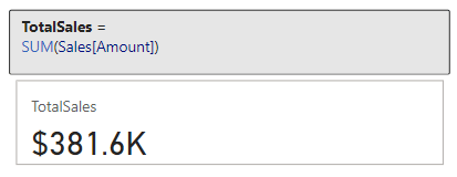
Let’s put this function to work with our sample dataset. Suppose we need to know the total sales amount. We can use the SUM function and the Amount column within our Sales Table to create a new TotalSales measure.

TotalSales = 
SUM(Sales[Amount])

This measure quickly calculates the total sales across the entire dataset.

However, the utility of SUM goes beyond just tallying totals. It can be instrumental in uncovering deeper insights within our data. For a more advanced application, let’s analyze the total sales for a specific product category in a specific sales region. We can do this by combining SUM with the CALCULATE function, here is how the measure would look.

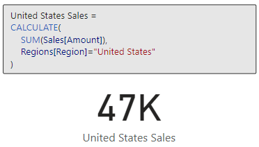
US Smartphone Sales = 
CALCULATE (
   [TotalSales],
   Products[Product] = "Smartphone",
   Regions[Region] = "United States"
)

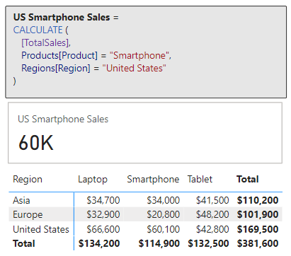
The measure sums up sales amounts exclusively for smartphones in the United Sales. For additional and more complex practical applications of SUM, for example calculating cumulative sales over time, continue your exploration with the examples in the following posts.

Demystifying CALCULATE: An exploration of advanced data manipulation. 

Discover how to effortlessly navigate through intricate data landscapes using DAX Filter Functions in Power BI.

The beauty and power of SUM lies in its simplicity and versatility. It is a starting point for deeper analysis, and commonly serves as a steppingstone towards more complex functions and insights. As we get more comfortable with SUM we will soon find it to be an indispensable part of our analytical approach in Power BI.


Understanding DAX Iterators: The X Factor in Aggregations

Before we continue diving deeper, if we review the aggregation function reference, we will notice several aggregation functions ending with X.

Learn more about: Aggregation Functions

These are examples of iterator functions in DAX and include functions such as SUMX, AVERAGEX, MAXX, MINX, and COUNTX. Understanding the distinction between these functions and their non-iterative counterparts like SUM is crucial for advanced data analysis.

Iterator functions are designed to perform row-by-row computations over a table (i.e. iterate over the table). In contrast to standard aggregations that operate on a column, iterators apply a specific calculation to each row, making them more flexible and powerful in certain scenarios.

In other words, SUM will provide us the total of a column while SUMX provides the total of an expression evaluated for each row. This distinction is key in scenarios where each row’s data needs individual consideration before aggregating to a final result.

For more in-depth insights into the powerful capabilities of DAX iterator functions, explore this in-depth post.

Iterator Functions — What they are and What they do


AVERAGEx Marks the Spot: Advanced Insights with Average Functions

AVERAGEX

Let’s explore an aggregation iterator function with AVERAGEX. This function is a step up from our basic average. As mentioned above, since it is an iterator function it calculates an expression for each row in a table and then calculates the average (arithmetic mean) of these results. The syntax for AVERAGEX is as follows:

AVERAGEX(table, expression)  

Here, table is the table or an expression that specifies the table over which the aggregation is performed. The expression argument is the expression which will be evaluated for each row of the table. When there are no rows in the table, AVERAGEX will return a blank value, while when there are rows but non meet the specified criteria, the function returns a value of 0.

Time to see it in action with an example. We are interested in finding the average sales made by each employee. We can create the following measure to display this information.

Employee Average Total Sales = 
AVERAGEX(
   Employee, 
   [TotalSales]
)

This measure evaluates our TotalSales measure for each employee. The sales table is filtered by the EmployeeID, the employee’s total sales is calculated, then finally after all the employees totals sales are calculated the expression calculates the average.

In this above example, we can see the difference between AVERAGE and AVERAGEX. When we use the AVERAGE function this calculates the average of all the individual sale values for each employee, which is $3,855. The Employee Average Total Sales measure uses AVERAGEX and first calculates the total sales for each employee (Sum of Amount column), and then averages these total sales values returning an average total sales amount of $95,400.

What makes AVERAGEX particularly useful is its ability to handle complex calculations within the averaging process. It helps us understand the average result of a specific calculation for each row in our data. This can reveal patterns and insights that might be missed with basic averaging methods. AVERAGEX, and other iterators, are powerful tools in our DAX toolkit, offering nuanced insights into our data.


COUNTing on Data: The Role of Count Functions in DAX

The COUNT functions in DAX, such as COUNT, COUNTA, and DISTINCTCOUNT, are indispensable when it comes to understanding the frequency and occurrence of data in our dataset. These functions provide various ways to count items, helping us to quantify our data effectively.

COUNT

For our exploration of DAX counting functions, we will start with COUNT. As the name suggests, this function counts the number of non-blank values within the specified column. To count the number of blank values in a column check out the reference document for COUNTBLANK. The syntax for COUNT is shown below, where column is the column that contains the values to be counted.

COUNT(column)

If we want to get a count of how many sales transactions are recorded, we can create a measure with the expression below.

Sale Transaction Count = 
COUNT(Sales[SalesID])

This new measure will provide the total number of sales transactions that have a sales id recorded (i.e. not blank).

The COUNT function counts rows that contain numbers, dates, or strings and when there are no rows to count the function will return a blank. COUNT does not support true/false data type columns, if this is required, we should use COUNTA instead.

When our goal is to count the rows in a table, it is typically better and clearer to use COUNTROWS. Keep reading to explore and learn more about COUNTA and COUNTROWS.

COUNTA

COUNTA expands on COUNT by counting all non-blank values in a column regardless of datatype. This DAX expression follows the same syntax as COUNT shown above.

In our Employee tables there is a true/false value indicating if the employee is a current or active employee. We need to get a count of this column, and if we use COUNT we will see the following error when we try to visual the Employee Active Column Count measure.

Employee Active Column Count = 
COUNT(Employee[Active])

Since the Active column contains true/false values (i.e. boolean data type) we must use COUNTA to get a count of non-blank values in this column.

Employee Active Column Count = 
COUNTA(Employee[Active])

Building on this measure we can use COUNTAX to get a current count of our active employees. We will create a new measure shown here.

Active Employee Count = 
COUNTAX(
   FILTER(
      Employee, 
      Employee[Active]=TRUE()
   ), 
   Employee[Active]
)

Here we use COUNTAX, and for the table argument we use the FILTER function to filter the Employee table to only include employees whose Active status is true.

COUNTROWS

Next, we will look at COUNTROWS, which counts the number of rows in a table or table expression. The syntax is:

COUNTROWS([table])

Here, table is the table that contains the rows to be counted or an expression that returns a table. This argument is optional, and when it is not provided the default value is the home table of the current expression.

It is typically best to use COUNT when we are specifically interested in the count of values in the specified column, when it is our intention to count the rows of a table, we can use COUNTROWS. This function is more efficient and indicates the intention of the measure in a clearer manner.

A common use of COUNTROWS is to count the number of rows that result from filtering a table or applying context to a table. Let’s use this to improve our Active Employee Count measure.

Active Employee CountRows = 
COUNTROWS(
   FILTER(
      Employee, 
      Employee[Active]=TRUE()
   )
)

In this example it is recommended to use COUNTROWS because we are not specifically interested in the count of values in the Active column. Rather, we are interested in the number of rows in the Employee table when we filter the table to only include Active=true employees.

DISTINCTCOUNT

Adding to these, DISTINCTCOUNT is particularly useful for identifying the number of unique values in a column, with the following syntax.

DISTINCTCOUNT(column)

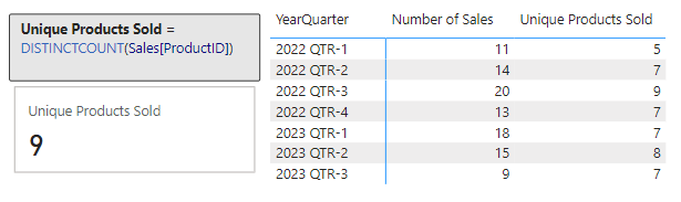
In our report we would like to examine the number of unique products sold within our dataset. To do this we create a new measure.

Unique Products Sold = 
DISTINCTCOUNT(Sales[ProductID])

We can then use this to visual the number of unique Product Ids within our Sales table, and we can use this new measure to further examine the unique products sold broken down by year and quarter.

Together, DAX count functions provide a comprehensive toolkit for measuring and understanding the dimensions of our data in various ways.


MAXimum Impact: Extracting Peak Value with MAX and MAXX

In DAX, the MAX and MAXX functions are the tools to use for pinpointing peak performances, maximum sales, or any other type of highest value within in our dataset.

MAX

The MAX function is simple to use. It finds the highest numeric value in a specified column.

MAX(column)

The column argument is the column in which we want to find the largest value. The MAX function can also be used to return the largest value between to scalar expressions.

MAX(expression1, expression2)

Each expression argument is a DAX expression which returns a single value. When we are using MAX to compare two expressions, a blank value is treated as 0, and if both expressions return a blank value, MAX will also return a blank value. Similar to COUNT, true/false data types are not supported, and if we need to evaluate a column of true/false values we should use MAXA.

Let’s use MAX to find our highest sale amount.

Max Sale Amount = 
MAX(Sales[Amount])

This new measures scans through the Amount column in our Sales table and returns the maximum value.

MAXX

MAXX builds on the functionality of MAX and offers more flexibility. It calculates the maximum value of an expression evaluated for each row in a table. The syntax follows the similar pattern as the other aggregation iterators.

MAXX(table, expression, [variant])

The table and expression arguments are the table containing the rows for which the expression will be evaluated, and the expression specifies what will be evaluated. The optional argument variant can be used when the expression has a variant or mixed value type, by default MAXX will only consider numbers. If variant is set to true, the highest value is based on ordering the column in descending order.

Let’s add some more insight to our Max Sale Amount measure. We will use MAXX to find the highest sales amount per product across all sales regions.

Max Product Total Sales = 
MAXX(
   Products, 
   [TotalSales]
)

This measure iterates over each product and calculates the totals sales amount for that product by evaluating our previously created TotalSales measure. After the total sales for each product is calculated the measure returns the highest total found across all products.

These functions provide us the tools to explore the maximum value within specific columns and also across different segments and criteria, enabling a more detailed and insightful understanding of our data’s maximum values.


MINing for Gold: Uncovering Minimum Values with DAX

The MIN and MINX functions help us discover the minimums in various scenarios, whether we are looking for the smallest sale or quantity, or any other type of lowest value.

MIN

MIN is straightforward, it finds the smallest numeric value in a column or, similar to MAX, the smallest value between two scalar expressions.

MIN(column)
MIN(expression1, expression2)

When comparing expressions, a blank value is handled the same as how the MAX function handles a blank value.

We have already identified the highest sale value, let’s use MIN to find our lowest sale amount.

Min Sale Amount = 
MIN(Sales[Amount])

This measure checks all the values in the Amount column of the Sales table and returns the smallest value.

MINX

MINX, on the other hand, offers more complex analysis capabilities. It calculates the minimum value of an expression evaluated for each row in a table. Its syntax will look familiar and follows the same pattern as MAXX.

MINX(table, expression, [variant])

The arguments to MINX are the same as MAXX, see the previous section for details on each argument.

We used MAXX to find the maximum total product sales, in a similar manner let’s use MINX to find the lowest total sales by region.

Min Region Total Sales = 
MINX(
   Regions, 
   [TotalSales]
)

The Min Region Total Sales measure iterates over each region and calculates its total sales, then it identifies and returns the lowest totals sales value.

These functions are powerful and prove to be helpful in our data analysis. They allow us to find minimum values and explore these values across various segments and conditions. This helps us better understand the lower-end spectrum of our data.


Blending Aggregates and Filters: The Power Duo

Blending aggregation functions with filters in DAX allows for more targeted and nuanced data analysis. The combination of functions like CALCULATE and FILTER can provide a deeper understanding of specific subsets in our data.

CALCULATE is a transformative function in DAX that modifies the filter context of a calculation, making it possible to perform aggregated calculations over a filtered subset of data. CALCULATE is crucial to understand and proves to be helpful in many data analysis scenarios. For details on this function and plenty of examples blending aggregations functions with CALCULATE take a look at this in-depth post focused solely on this essential function.

Demystifying CALCULATE: An exploration of advanced data manipulation. 

FILTER is another critical function that allows us to filter a table based on a given conditions. We used this function along with COUNTROWS to count the number of active employees. For additional examples and more details on FILTER and other filter functions see the post below.

Discover how to effortlessly navigate through intricate data landscapes using DAX Filter Functions in Power BI.


Working with DAX in Power BI can be incredibly powerful, but it is not without its pitfalls. Being aware of common mistakes and understanding how to avoid them can save us time and help ensure our data analysis is as accurate and effective as possible.

One frequent mistake is misunderstanding context in DAX calculations. Remember, DAX functions operate within a specific context, which could be row context or filter context. Misinterpreting or not accounting for this can lead to incorrect results. For instance, using an aggregate function without proper consideration of the filter context can yield misleading totals or averages.

Another common issue is overlooking the differences between similar functions. For example, SUM and SUMX might seem interchangeable, but they operate quite differently. SUM aggregates values in a column, while SUMX performs row-by-row calculations before aggregating. Understanding these subtleties is crucial for accurate data analysis.

Lastly, we should always beware of performance issues with our reports. As our datasets grow, complex DAX expression can slow down our reports. We should look to optimize our DAX expressions by using appropriate functions and minimizing the use of iterative functions (like aggregations functions ending in X) when a simpler aggregation function would suffice.


Mastering Aggregation for Impactful Analysis

As we reach the conclusion of our exploration into DAX aggregation functions, it’s clear that mastering these tools is essential for impactful data analysis in Power BI. Aggregation functions can be the key to unlocking meaningful insights and making informed decisions.

Remember, the journey from raw data to actionable insights involves understanding not just the functions themselves, but also the context in which they are used. From the basic SUM to the more complex SUMX, each function has its place and purpose. The versatility of AVERAGEX and the precision of COUNT functions demonstrate the depth and flexibility of DAX.

Incorporating MAX and MIN functions helps us identify extremes in our datasets. Blending aggregations with the power of CALCULATE and FILTER shows the potential of context-driven analysis, enabling targeted investigations within our data.

The journey through DAX aggregation functions is one of continuous learning and application. As we become more comfortable with these tools, we will find ourselves able to handle increasingly complex data scenarios, making our insights all the more powerful and our decisions more data driven. Continue exploring DAX aggregation functions with the DAX Reference.

Learn more about: Aggregation Functions


Thank you for reading! Stay curious, and until next time, happy learning.

And, remember, as Albert Einstein once said, “Anyone who has never made a mistake has never tried anything new.” So, don’t be afraid of making mistakes, practice makes perfect. Continuously experiment and explore new DAX functions, and challenge yourself with real-world data scenarios.

If this sparked your curiosity, keep that spark alive and check back frequently. Better yet, be sure not to miss a post by subscribing! With each new post comes an opportunity to learn something new.

Power Apps Dynamic Design: Explore Dynamic UI Strategies


Setting the Stage for Dynamic Interfaces

If you are new to the world of Power Apps, it is where we blend our creativity with technology to build some seriously powerful and helpful applications. In this particular exploration we will be diving into an inventory management application for Dusty Bottle Brewery.

Our focus? Dynamic user interfaces (UI). It is all about making an app that is not only functional but also engaging and intuitive. Imagine an inventory app that adapts in real-time, showcasing inventory updates, new arrivals, and even alerts when a popular brew or item is running low. That is the power of dynamic UI in action, it makes our app come alive.

Join me as we explore Power Apps and learn how to transform a standard inventory management application into an interactive and responsive tool. We will dive into leveraging visible properties, integrating role-based elements, and much more. Whether you are an expert or just starting, come along on this exciting journey to create a dynamic and vibrant app.


The Magic of Visible: More Than Meets the Eye

The Visible property in Power Apps is crucial for creating a dynamic app at Dusty Bottle Brewery and forms the cornerstone of creating an engaging user experience. Using this property effectively is focused on displaying the right information at the right time for a sleek yet informative interface.

Here’s how it works in action: when we open our Inventory App, we are brought to a dashboard showing current stock levels. This main dashboard uses the visible property of various elements to dynamically show additional information for each item.

For example, each item shows a stock status badge indicating if the stock level is good, average, low, or extremely low. This is all made possible leveraging the visible property of these objects. It’s more than just hiding and showing object, we are creating a responsive experience that adapts to user interactions.

Let’s dive into the information (i) icon and the details it has to offer. By selecting the i icon for a product, we reveal additional information like the recommended order amount, cost per unit, and total cost for the recommended order.

Time to see how it works with some practical expressions. Below is the main dashboard. Notice how the information (i) icon appears on the selected item. This is accomplished by setting the visible property of the icon to ThisItem.IsSelected.

Additionally, by selecting this icon the user can display additional information. This information provides just in time insights. Providing for a responsive experience that displays all the required information at just the right time leaving a clean and simple dashboard with hidden power that is revealed through user interactions.

We use a variable to set the Visible property of the informational items. For the informational icons OnSelect property we use:

UpdateContext({locInfoVisible:!locInfoVisible});

The locInfoVisible variable toggles between true and false, acting as a switch. The pattern of using ! (i.e. not) and a boolean variable is helpful for flipping the variable’s value between true and false.

We are not limited to boolean variables to control our app objects visibility. Any expression that evaluates to true or false will work. An example of this within our app is the stock status badges. Each icon has its own specific condition controlling its visibility.

For each product we calculate the percentage of our target stock count. In the app we store this value in the text label lbl_Main_StockEval.

For example, the Extremely Low icon’s visible property is set to

Value(lbl_Main_StockEval.Text)<=20

This results in the icon showing only when the expression evaluates to true, that is if the item stock is less than or equal to 20% of the target amount.

Effectively pairing expressions with the visible property streamlines our app’s interface, focusing attention on what is most relevant. This elevates our apps from functional to intuitive and powerful.


User Roles and UI Elements: A Match Made in Heaven

Customizing apps based on user roles is crucial for any organization. Although this type of customizing includes things such as access control, it can go way beyond just that. Customizing our apps for different user roles is focused on making our apps more intuitive and user-friendly while recognizing what that means may differ for each individual or for each user role.

Let’s, examine a scenario with our Dusty Bottle Brewery inventory app where personnel should see a simplified dashboard focused on just their area of responsibility. Staff in the Brewing department should only see brewery related inventory, staff in the Sales and Marketing should only see merchandise related inventory, while staff in Logistics and Supply Chain should be able to view all items. This is where the flexibility of Power Apps shines, allowing us to tailor our apps based on the current user.

We first need to add the Office 365 Users data connector which then allows us to set UserProfile to the current user’s profile. In the Formulas property of the App object we add the following Named Formula:

UserProfile = Office365Users.MyProfileV2();

Note: This can also be done with a global variable by adding the following to the OnStart property of the App object.

Set(gblUserProfile, Office365Users.MyProfileV2());

The user profile provides the required information to personalize the user experience for our app. For example, we use UserProfile to welcome the current user in the top right of the app.

Next, we use the user’s department to control the data presented on the dashboard, ensuring relevant information is highlighted.

To add this role-based feature we add the following to the App OnStart property to pre-load the appropriate data.

Switch(
    true,
    UserProfile.department = "Brewing",
    ClearCollect(
        colSpInventory,
        Filter(
            Inventory,
            Category.Value = "Beer"
        )
    ),
    UserProfile.department = "Sales and Marketing",
    ClearCollect(
        colSpInventory,
        Filter(
            Inventory,
            Category.Value = "Merchandise"
        )
    ),
    UserProfile.department = "Logistics and Supply Chain",
    ClearCollect(
        colSpInventory,
        Inventory
    )
);

Here we filter the collection of inventory items (colSpInventory) based on the user’s department. This collection is then used in the Items property of the gallery displaying the inventory items. This approach enhances the efficiency and reducing clutter within our app.

For instance, Dusty Bottle’s Lead Brewer, Adele Vance, sees only brewery items, streamlining her experience. This helps Adele identify brewery items that are low in stock and provides all the information she requires without cluttering the dashboard with irrelevant information.

What is the most exciting about this level of control is the possibilities of the personalization aspect.

For example, let’s build on this role-based feature by expanding it beyond the user’s department. Dusty Bottle Brewery has a management team containing members of all departments and the members of this group should be able to see all inventory items. This group of users is defined by a Microsoft 365 group, and we will leverage the group’s membership to add this functionality to our app.

First, we add the Office 365 Group data connector to our app. Similar to Office 365 Users, this allows us to use Office365Group.ListGroupMembers to get all the members of our Management group.

Then we add another Named Formula to the Formulas property of the App.

ManagementMember = !IsBlank(
    LookUp(
        Office365Groups.ListGroupMembers("<group_object_id").value,
        displayName = UserProfile.displayName
    )
);

Let’s break this down, starting from the inside working out. We provide Office365Groups.ListGroupMembers the object id of the required group, this then provides a record. The record property value contains the membership user information we are looking for. We then use LookUp to see if the current user’s display name is within the group members. If the returned record from LookUp is not (!) blank, then the user is a member of the management group, and ManagementMember returns a value of true, otherwise false.

Finally, we update the OnStart property of our app to the following.

Switch(
    true,
    UserProfile.department = "Brewing",
    ClearCollect(
        colSpInventory,
        Filter(
            Inventory,
            Category.Value = "Beer"
        )
    ),
    UserProfile.department = "Sales and Marketing",
    ClearCollect(
        colSpInventory,
        Filter(
            Inventory,
            Category.Value = "Merchandise"
        )
    ),
    ManagementMember || UserProfile.department = "Logistics and Supply Chain",
    ClearCollect(
        colSpInventory,
        Inventory
    )
);

Providing each user or group a tailored interface that feels like it is made just for them. Using these role-based approaches we can deliver the right tools and information to the right people at the right time.


Input-Driven Interfaces: Reacting in Real-Time

In the dynamic environment of any organization, an input-driven interface can significantly improve the user experience by responding to user actions in real-time. This approach makes the app both intuitive and interactive.

For example, updating inventory involves selecting an item from the main dashboard to access its restocking screen. On the restocking screen the user is provided all the essential information for restocking an item.

This screen shows the cost, stock status indicator, stock count, and the target stock count on the left. On the right, is a dynamic input control and what the stock indicator would be if the input quantity is restocked. The default of this control is the difference between the current stock and the target stock value.

The input-driven interface updates information based on user input, ensuring accuracy and responsiveness. For instance, changing the restock quantity automatically updates the related information (e.g. Restock Total Cost).

What if the user is only able to restock 10 of these baseball caps. After updating the Restock Quantity input, we see the change reflected in the Restock Total Cost.

We achieve this by referencing the restock quantity (txt_Restock_QuantityAdded) in the text label displaying the total cost and the visible property fields of the stock indicator badges. The total cost label’s text property is set to the following.

Text(
    Value(txt_Restock_QuantyAdded.Text * gblSelectedItem.Cost),
    "$#,##0.00"
)

But the possibilities don’t have to end there. The app could integrate sliders or dropdown menus for inventory updates. As the user adjusts these controls, the interface could dynamically show the impact of these changes.

This approach can be extended to handle complex scenarios, like entering a new item, where the app reveals additional fields based on the item category or other properties. This can help keep the interface clean while also guiding the user through data entry in a logical, step-by-step manner.

Harnessing the power of input-driven interfaces transforms our apps into responsive companions, adapting to user needs and simplifying tasks.


Buttons and Actions: Bringing Our Interfaces to Life

Interactive buttons and actions play a pivotal role in bringing the user interface to life. They create engaging and interactive experiences for our users.

Consider our simple action of updating stock levels in our inventory app. Selecting the Restock button updates the stock value and, if successful, presents a success message to the user. This immediate feedback reassures users and enhances their interaction with the app.

Additionally, we can tailor buttons and actions for different user roles. For example, enabling the Restock button only for management staff. Using the ManagementMember named formula created previously, we set the DisplayMode of the Restock button to the following.

If(ManagementMember, DisplayMode.Edit, DisplayMode.Disabled)

By thoughtfully integrating these elements, we turn mundane tasks into engaging interactions, making our apps an integral part of the daily workflow.


Tying It All Together: Crafting a Seamless Navigation Menu

As our apps grow in complexity and expand, easy navigation becomes crucial. A well-crafted navigation menu integrates all the dynamic UI features we have discussed into one cohesive, user-friendly package.

First, the navigation menu’s visibility is a key aspect and is controlled by the Visible property. We can make the navigation menu appear and disappear with a simple button click. This approach keeps the interface clean and uncluttered, allowing users to access the menu when needed and hide it when focusing on other tasks. We us a hamburger menu icon to launch the menu when selected using the following for its OnSelect property.

UpdateContext({locNavigationVisible: true})

Additionally, we will set the Visible property of the hamburger icon to !locNavigationVisible. This will hide the icon after it is selected allowing us to show a cancel icon that when selected will hide the navigation menu. The Cancel icon’s OnSelect property is set to the following.

UpdateContext({locNavigationVisible: false})

While its Visible property is set to locNavigationVisible.

Next, we enrich the navigation with selectable icons and actions that allow users to effortlessly navigate between the different screens of our app. Each icon in the navigation menu is linked to a different screen in the app. Using the Power Apps Navigate function and the OnSelect property of the icons seamlessly transports the users to the desired screen, enhancing the app’s overall usability and flow.

Lastly, we tailor the navigation experience to different user roles. For instance, links to admin-specific screens. Above, we can see the navigation menu includes a button to navigate to the Admin screen. This screen should only be accessible to staff within the Logistics and Supply Chain department. To do this we add the following named formula to our App’s Formulas property.

AdminUser = UserProfile.department = "Logistics and Supply Chain"

We can then set the Visible property of the Admin button within the navigation menu to AdminUser. This will make this navigation button visible if the current user is within the Logistics and Supply Chain department and hide this option for all other staff.

Now, we can see that the Admin navigation icon is visible to Grady, who is within the Logistics and Supply Chain department.

However, when Adele uses this app, who is not in this department, the navigation icon is not shown.

By integrating these elements, the Inventory Management app’s navigation becomes a central hub that intelligently adapts to user needs and roles.


Wrapping Up: The Future of Dynamic UI in Power Apps

As we wrap up our journey through Dusty Bottle Brewer’s Inventory App, it is clear that the future of dynamic UI in Power Apps is here and now. Harnessing the power of features like the Visible property, role-based UI elements, input-driven interfaces, and more, we have seen how an app can transform from a simple tool into an essential part of the organizational ecosystem.

The power of Power Apps lies in its ability to continuously evolve allowing us to iterate on our apps, enhancing their responsiveness and efficiency. This inventory app showcases how technology meets business needs and enhances user experiences.

As we build upon our apps the possibilities are varied and exciting. We can incorporate more advanced integrations, AI-driven functionalities, and even more user-friendly designs. The goal will always remain the same: to create applications that are not just functional, but intuitive, responsive, and easy to use.

Here’s to the future of dynamic UI in Power Apps – a future where technology meets user needs in the most seamless and engaging ways possible. Cheers to that!


Thank you for reading! Stay curious, and until next time, happy learning.

And, remember, as Albert Einstein once said, “Anyone who has never made a mistake has never tried anything new.” So, don’t be afraid of making mistakes, practice makes perfect. Continuously experiment, explore, and challenge yourself with real-world scenarios.

If this sparked your curiosity, keep that spark alive and check back frequently. Better yet, be sure not to miss a post by subscribing! With each new post comes an opportunity to learn something new.

DAX Filter Functions: Navigating the Data Maze with Ease


In the intricate world of Power BI, the ability to skillfully navigate through complex data models is not just a skill, but an art form. This is where DAX Filter Functions come into play, serving as our compass in the often-overwhelming maze of data analysis. These functions give us the power to sift through layers of data with intent and precision, uncovering insights that are pivotal to informed decision-making.

Our journey through data analysis should not be a daunting task. With the right tools and know-how, it can become an adventure in discovering hidden patterns and valuable insights. DAX Filter Functions are the keys to unlocking this information, allowing us to filter, dissect, and examine our data in ways we never thought possible.

Now, let’s embark on a journey to master these powerful functions. Transform our approach to data analysis in Power BI, making it more intuitive, efficient, and insightful. Let DAX Filter Functions guide us through the data maze with ease, leading us to clarity and success in our data analysis endeavors. The path to elevating our Power BI skills starts here, and it starts with mastering DAX Filter Functions.

For those of you eager to start experimenting there is a Power BI report-preloaded with the same data used in this post read for you. So don’t just read, follow along and get hands-on with DAX in Power BI. Get a copy of the sample data file here:

This dynamic repository is the perfect place to enhance your learning journey.


What are DAX Filter Functions

DAX filter functions are a set of functions in Power BI that allow us to filter data based on specific conditions. These functions help in reducing the number of rows in a table and allows us to focus on specific data for calculations and analysis. By applying well defined filters, we can extract meaningful insights from large datasets and make informed business decisions. Get all the details on DAX Filter Functions here.

Learn more about: Filter functions

In our Power BI report, we can use filter functions in conjunction with other DAX functions that require a table as an argument. By embedding these functions, we can filter data dynamically to ensure our analysis and calculation are using exactly the right data. Let’s dive into some of the commonly used DAX filter functions and explore their syntax and usage.


The ALL Function: Unleashing the Potential of All Our Data

At its core, the ALL function is a powerhouse of simplicity and efficiency. It essentially removes all filters from a column or table, allowing us to view our data in its most unaltered form. This function is our go to tool when we need to clear all filters to create calculation using all the rows in a table The syntax is straightforward:

ALL([table | column[, column[, column[,...]]]])

The arguments to the ALL function must either reference a base table or a base column of the data model, we cannot use table or column expressions with the ALL function. This function serves as a intermediate function that we can use to change the set of results over which a calculation is performed.

ALL can be used in a variety of ways when referencing base tables or columns. Using ALL() will remove filters everywhere and can only be used to clear filters but does not return a table. When referencing a table, ALL(<table>), the function removes all the filters from the specified table and returns all the values in the table. Similarly, when referencing columns, ALL([, [, ...]]), the function removes all filters from the specified column(s) in the table, while all other filters on other column in the table still apply. When referencing columns, all the column argument must come from the same table.

While, we can use ALL to remove all context filters from specified columns, there is another function that can be helpful. ALLEXCEPT is a DAX function that removes all context filters in the table except filters that have been applied to the specified columns. For more details check out the Microsoft documentation on ALLEXCEPT.

Learn more about: ALLEXCEPT

Practical Examples: Navigating Data with the ALL Function

Considering the dataset in our sample report, suppose we want to analyze the overall sales performance, irrespective of any specific regions or dates. Using the following formula, we can provide the total sales amount across all regions and times by removing any existing filters on the Sales table.

All Sales = 
SUMX(
   ALL(Sales), 
   Sales[Amount]
)

In the above example we can see the card visual on the bottom left is the default sum aggregation of the Amount column in our sales table. Specifically, with the slicers on the report, this card shows the total sales within the United States region during the period between 1/1/2023 and 3/31/2023. We can use the ALL function to display to total sales amount across all regions and irrespective of time, shown on the card visual on the right.

This functionality is particularly useful when making comparative analyses. For instance, we could use this to determine a region’s contribution to total sales. We can compare the sales in a specific region (with filters applied) to the overall sales calculated using ALL. This comparison offers valuable insights into the performance of different segments relative to the total context.


ALLSELECTED Decoded: Interactive Reporting’s Best Friend

The ALLSELECTED function in DAX takes the capabilities of ALL a step further. It is particularly useful in interactive reports where our users apply filters. This function respects the filters applied by our report users but disregards any filter context imposed by report objects like visuals or calculations. The syntax is:

ALLSELECTED([tableName | columnName[, columnName[, columnName[,…]]]] )

Similar to ALL the tableName and columnName parameters are optional and reference an existing table or column, an expression cannot be used. When we provide ALLSELECTED a single argument it can either be tableName or columnName, and when we provide the function more than one argument, they must be columns from the same table.

ALLSELECTED differs from ALL because it retains all filters explicitly set within the query, and it retains all context filters other than row and column filters.

Practical Examples: Exploring ALLSELECTED and How it Differs From ALL

At first glance it may seem as if ALL and ALLSELECTED perform the same task. Although, these two functions are similar there is an important difference between them. ALLSELECTED will ignore filters applied by report visuals, while ALL will ignore any filters applied within the report. Let’s explore this difference with an example.

We will use three measures to explore ALLSELECTED. First a measure that simply calculates the sum of our Sales Amount, here is its definition.

Total Sales = SUM(Sales[Amount])

Second a measure using the function explored in the previous section ALL.

Sales ALL = CALCULATE(
    SUM(Sales[Amount]),
    ALL(Sales)
)

Lastly, a measure that uses ALLSELECTED.

Sales ALLSELECTED = 
CALCULATE(
    SUM(Sales[Amount]),
    ALLSELECTED(Sales)
)

After creating the measures, we can add a table visual including the Product field and these three measures. When the report has no filters due to interacting with the slicers on the report, we can see that the Total Sales measure gets filtered by the Product column and shows the total sales for each product. However, the other two measure show the overall total sales.

The inclusion of the Product column in the table visual is filtering the values and impacting the calculation of the Total Sales measure, while the other two measure are using all of the sales records in their calculation.

Next let’s use the Region and Date slicers to explore the differences between ALL and ALLSELECTED. As expected, all the additional filtering due to the slicer selections continues to impact our Total Sales measure.

Additionally, we see the ALLSELECTED measure gets filtered based on the external slicer selections but continues to not be impacted by the internal filtering of the table visual. This differs from our measure that uses the ALL function, which continues to show the grand total sales value. This is because the ALL function ignores any filter implicit from the visual or explicit from external slicers.

The difference between ALL and ALLSELECTED boils down to ALL will ignore any filter applied, while ALLSELECTED will ignore just the filter applied by the visual.

The necessity of ALLSELECTED is its ability to respect user’s interactions and filtering choices on slicers or other interactive elements. Unlike ALL, which disregards all filters, ALLSELECTED maintains the interactive nature or our reports, ensuring that the calculations dynamically adapt to user inputs.

So, what is a use case for ALLSELECTED? A common use is calculating percentages, based on a total value that is dependent on user interaction with report slicers. Check out this post, on how this function can be used along with ISINSCOPE to calculate context aware insights.

Elevate Your Power BI Report with Context-Aware Insights


CALCULATE: The Engine for Transforming Data Dynamically

CALCULATE is one of the most versatile and powerful functions in DAX, acting as a cornerstone for many complex data operations in Power BI. It allows us to manipulate the filter context of a calculation, letting us perform dynamic and complex calculations with ease. CALCULATE follows a simple structure.

CALCULATE(expression[, filter1[, filter2[, …]]])

The expression parameter is the calculation we want to perform, and the filter parameters are optional boolean expressions or table expression that define our filters or filter modifier functions. Boolean filter expressions are expressions that evaluate to true or false, and when used with CALCULATE there are certain rules that must be followed, see the link below for details. Table filter expressions apply to a table, and we can use the FILTER function to apply more complex filtering conditions, such as those that cannot be defined by using a boolean filter expression. Finally, filter modifier functions provide us even more control when modifying the filter context within the CALCULATE function. Filter modifier functions include functions such as REMOVEFILTERS, KEEPFILTERS, and the ALL function discussed in the previous section.

Find all the required details in the documentation.

Learn more about: CALCULATE

Practical Examples: Using CALCULATE for Dynamic Data Analysis

Let’s say that for our report we are required to calculate the total sales in the United States region. We can use CALCULATE and this expression to meet this requirement.

United States Sales = 
CALCULATE(
   SUM(Sales[Amount]), 
   Regions[Region]="United States"
)

We can continue to build on the previous example to further examine sales in the United States. For this example, we will compare the average sales of smartphones in the United States against the benchmark of average sales of smartphones across all regions.

US Smartphone Sales vs. Average Smartphone Sales =
    CALCULATE(
        AVERAGE(Sales[Amount]),
        Products[Product] = "Smartphone",
        Regions[Region] = "United States"
    )
    - AVERAGEX(
        FILTER(
            Sales,
            RELATED(Products[Product]) = "Smartphone"
        ),
        Sales[Amount]
)

These two examples just begin to scratch the surface of what is possible when we utilize the CALCULATE function. For more examples and more details on CALCULATE check out this post that provides a deep dive into the CALCULATE function.

Demystifying CALCULATE: An exploration of advanced data manipulation. 

CALCULATE proves indispensable for redefining the filter context impacting our calculations. It empowers us to perform targeted analysis that goes beyond the standard filter constraints of a report, making it an essential tool in our DAX toolbox.


Mastering FILTER: The Art of Precision in Data Selection

The FILTER function in DAX is a precision tool for refining data selection within Power BI. It allows us to apply specific conditions to a table or column, creating a subset of data that meets the criteria. The FILTER function returns a table that represents a subset of another table or expression, and the syntax is as follows.

FILTER(table, filter)

The table argument is the table, or an expression that results in a table, that we want to apply the filter to. The filter argument is a boolean expression that should be evaluated for each row of the table.

FILTER is used to limit the number of rows in a table allowing for us to create specific and precise calculations. When we use the FILTER function we embed it within other functions, we typically do not use it independently.

When developing our Power BI reports a common requirement is to develop DAX expressions that need to be evaluated within a modified filter context. As we saw in the previous section CALCULATE is a helpful function to modify the filter context, and accepts filter arguments as either boolean expressions, table expression or filter modification functions. Meaning CALCULATE, will accept the table returned by FILTER as one of its filtering parameters, however it is generally best practice to avoid using the FILTER function as a filter argument when a boolean expression can be used. The FILTER function should be used when the filter criteria cannot be achieved with a boolean expression. Here is an article that details this recommended best practice.

Best practices for using the FILTER function as a filter argument.

For example, we have two measures below that calculate the total sales amount for the United States. Both of these measures correctly filter our data and calculate the same value for the total sales. When possible, the best practice is to use the expression on the left which passes the filter arguments to CALCULATE as a boolean expression. This is because when working with Import model tables that are store in-memory column stores, they are explicitly optimized to filter column in this way.

Practical Examples: FILTER Functions Illustrated

Let’s now see how FILTER can help us build on our analysis of US Smartphone Sales. In the previous section we created a US Smartphone Sales vs Average Smartphone Sales measure to visualize US sales against a benchmark. Now we are interested in the total sales amount for each quarter that average US smartphones sales is below the benchmark. FILTER can help us do this with the following expression.

United States Sales FILTER = 
   CALCULATE(
      SUM(Sales[Amount]), 
      FILTER(
         VALUES(DateTable[YearQuarter]), 
         [US Smartphone Sales vs. Average Smartphone Sales] &lt; 0
      )
   )

FILTER is particularly useful when we require a detailed and specific data subset. It is a function that brings granular control to our data analysis, allowing for a deeper and more focused exploration of our data.


Dynamic Table Creation with CALCULATETABLE

The CALCULATETABLE function in DAX is a powerful tool for creating dynamic tables based on specific conditions. This function performs provides us the same functionality that CALCULATE provides, however rather than returning a singular scalar value CALCULATETABLE returns a table. Here is the function’s syntax:

CALCULATETABLE(expression[, filter1[, filter2[, …]]])

This may look familiar, CALCULATETABLE has the same structure as CALCULATE for details on the expression and filter arguments check out the previous section focused on the CALCULATE function.

Practical Examples: Apply CALCULATETABLE

Let’s say we want to calculate the total sales for the current year so we can readily visualize the current year’s sale broken down by product, region and employee. CALCULATETABLE can help us achieve this with the following expression.

Current Year Total Sales = 
SUMX(
   CALCULATETABLE(
      Sales, 
      YEAR(Sales[SalesDate]) = YEAR(TODAY())
   ), 
   Sales[Amount]
)

CALCULATETABLE proves to be invaluable when we need to work with a subset of data based on dynamic conditions. It’s flexibility to reshape our data on the fly makes it an essential function for nuanced and specific data explorations in Power BI.


Resetting the Scene with REMOVEFILTERS

The REMOVEFILTERS function in DAX is crucial for when we need to reset or remove specific filters applied to our data. It allows for recalibration of the filter context, either entirely or partially. The syntax for this function is:

REMOVEFILTERS([table | column[, column[, column[,…]]]])

Looking at the structure of REMOVEFILTERS, we can see it is similar to that of ALL and ALLSELECTED. Although these functions are similar it is important to differentiate them. While ALL removes all filters from a column or table and ALLSELECTED respects user-applied filter but ignores other filter contexts, REMOVEFILTERS specifically targets and removes filters from the specified columns or tables, offering us more control and precision.

Practical Examples: Implementing REMOVEFILTERS

Let’s start by adding a new measure to our previous table visual where we explored the difference between ALL and ALLSELECTED to highlight the difference between these functions.

We will create a new measure and add it to the table visual, the new measure is:

Sales REMOVEFILTER Region = 
CALCULATE(
   SUM(Sales[Amount]), 
   REMOVEFILTERS(Regions[Region])
)

This expression will calculate the total sales disregarding any Region filter that might be in place.

Here we can see this new Sales REMOVEFILTER Region measure shows the total sales respecting the row context of Product on the table visual and the selected dates on the date slicer, however, removes the Region filter that would apply due to the Region slicer.

Let’s take a look at how we can apply and leverage the differences between these functions. We can use our Total Sales and the other three measures to calculate various percentages to provide additional insights.

REMOVEFILTERS offers a tailored approach to filter removal, differing from ALL which disregards all filters unconditionally, and ALLSELECTED which adapts to user selections. This makes REMOVEFILTERS an essential function for creating more nuanced and specific measures in our Power BI reports.


LOOKUPVALUE: Bridging Tables in Analysis

The LOOKUPVALUE function in DAX is a powerful feature for cross-referencing data between tables. It allows us to find a value in a table based on matching a value in another table or column.

LOOKUPVALUE (
    result_columnName,
    search_columnName,
    search_value
    [, search2_columnName, search2_value]…
    [, alternateResult]
)

Here result_columnName is the name of an existing column that contains the value we want to be returned by the function; it cannot be an expression. The search_columnName argument is the name of an existing column and can be in the same table as the result_columnName or in a related table, the search_value is the value to search for within the search_columnName. Finally, the alternativeResult is an optional argument that will be returned when the context for result_columnName has been filter down to zero or more than one district value, when not specified LOOKUPVALUE will return BLANK.

LOOKUPVALUE is essential for scenarios where data relationships are not directly defined through relationships in the data model. If there is a relationship between the table that contains the result column and tables that contain the search column, typically using the RELATED function rather than LOOKUPVALUE is more efficient.

Practical Examples: LOOKUPVALUES Explored

Let’s use LOOKUPVALUE to connect sales data with the respective sales managers. We need to identify the manager for each sale in our Sales table for our report. We can use a formula that first finds the manager’s ID related to each sale. For details on how we can user Parent and Child Functions to work with hierarchical data check out the Parent and Child Functions: Managing Hierarchical Data section of this post.

Unlock the Full Potential of Your Data with DAX: From Basic Aggregations to Advanced Time Intelligence

In the example in the post above we use PATH and PATHITMEREVERSE to navigate the organizational hierarchy to identify the manager’s ID of each employee. Then utilizing REALTED and LOOKUPVALUE we can add a new calculated column to our Sales table listing the Sales Manager for each sale. We can use the following formula that first finds the manager’s ID related to each sale and then fetches the manager’s name using the LOOKUPVALUE function.

Sales Manager Name = 
VAR ManagerID = RELATED(Employee[ManagerID])

RETURN
LOOKUPVALUE(Employee[EmployeeName], Employee[EmployeeID], ManagerID)

In this example, the RELATED function retrieves the ManagerID for each sale from the Employees table. Then, LOOKUPVALUE is used to find the corresponding EmployeeName (the manager’s name) in the same table based on the ManagerID. This approach is particulariy beneficial in scenarios where understanding hierarchical relationships or indirect associations between data points is crucial.

By using LOOKUPVALUE in this manner, we add significant value to our reports, offering insights into the managerial oversight of sales activities, which can be pivotal for performance analysis and strategic planning.


Mastering DAX Filter Functions for Advanced Analysis

Now that we have finished our exploration of DAX Filter Functions in Power BI, it is clear that these tools are not just functions, they are the building blocks for sophisticated data analysis. From the comprehensive clearing of contexts with ALL to dynamic and context-sensitive capabilities of CALCULATE and FILTER, each function offers a unique approach to data manipulation and analysis.

Understanding and applying functions like ALLSELECTED, REMOVEFILTERS and LOOKUPVALUE enable us to create reports that are not only insightful but also interactive and responsive to user inputs. They allow use to navigate through complex data relationships with ease, bringing clarity and depth to our analyses.

As we continue our journey in data analytics, remember that mastering these functions can significantly enhance our ability to derive meaningful insights from our data. Each function has its place and purpose, and knowing when and how to use them will set us apart as proficient Power BI analyst.

Embrace these functions as we delve deeper into our data and watch as they transform our approach to business intelligence and data storytelling. Happy analyzing!


Thank you for reading! Stay curious, and until next time, happy learning.

And, remember, as Albert Einstein once said, “Anyone who has never made a mistake has never tried anything new.” So, don’t be afraid of making mistakes, practice makes perfect. Continuously experiment and explore new DAX functions, and challenge yourself with real-world data scenarios.

If this sparked your curiosity, keep that spark alive and check back frequently. Better yet, be sure not to miss a post by subscribing! With each new post comes an opportunity to learn something new.

Elevate Your Productivity with Planner and Power Automate


Introduction to Power Automate and Microsoft Planner

In today’s fast-paced business environment, mastering the art of productivity is not just an option, but a necessity. The dynamic duo of Microsoft Planner and Power Automate are our allies in the realm of project and task management. Imagine a world where our projects flow seamlessly, where every task aligns perfectly with your goals, and efficiency is not just a buzzword but a daily reality. This is all achievable with the integrations of Microsoft Planner and Power Automate in your corner.

Microsoft Planner, is our go-to task management tool, that allows us and our teams to effortlessly create, assign, and monitor tasks. It provides a central hub where tasks aren’t just written down but are actively managed and collaborated on. Its strength lies in its visual organization of tasks, with dashboard and progress indicators providing an bird’s-eye view of our project, making organization and prioritization a breeze. It is about managing the chaos of to-dos into an organized methodology of productivity, with each task moving smoothly from To Do to Done.

On the other side of this partnership we have Power Automate, the powerhouse of process automation. It bridges the gap between our various applications and services, automating the mundane so we can focus on what is important. Power Automate is our behind the scenes tool for productivity, connecting our favorite apps and automating workflows whether that’s collecting data, managing notifications, sending approvals, and so much more all without us lifting a finger, after the initial setup of course.

Together, these tools don’t just manage tasks; they redefine the way we approach project management. They promise a future where deadlines are met with ease, collaboration is effortless, and productivity peaks are the norm.

Ready to transform your workday and elevate your productivity? Let Microsoft Planner and Power Automate streamline your task management.

Here’s an overview of what is explored within this post. Start with an overview of Power Automate triggers and actions specific to Microsoft Planner or jump right to some example workflows.

  1. Introduction to Power Automate and Microsoft Planner
  2. Unveiling the Power of Planner Triggers in Power Automate
    1. When a new task is created
    2. When a task is assigned to me
    3. When a task is completed
  3. Navigating Planner Actions in Power Automate
    1. Adding and Removing assignees
    2. Creating and Deleting tasks
    3. Getting and Updating tasks
    4. Getting and Updating task details
    5. List buckets
    6. List Tasks
  4. Basic Workflows: Simplifying Task Management with Planner and Power Automate
    1. Weekly Summary of Completed Tasks
    2. Post a Teams message for Completed High Priority Tasks
  5. Advanced Workflows: Leveraging Planner with Excel and GitHub Integrations
    1. Excel Integration for Reporting Planner Tasks
    2. GitHub Integration for Automated Task Creation
  6. Unleashing New Dimensions in Project Management with Planner and Power Automate

Unveiling the Power of Planner Triggers in Power Automate

Exploring Planner triggers in Power Automate reveals a world of automation that streamlines task management and enhances productivity. Let’s dive into three key triggers and their functionalities.

When a new task is created

This trigger jumps into action as soon as a new task is created in Planner. It requires the Group Id and Plan Id to target the specific Planner board. This trigger can set a series of automated actions into motion, such as sending notifications to relevant team members, logging the task in an Excel reporting workbook, or triggering parallel tasks in a related project.

When a task is assigned to me

This trigger personalizes your task management experience. It activates when a task in Planner is assigned to you. This trigger can automate personal notifications, update your calendar with the new tasks, or prepare necessary documents or templates associated with the task. Simply select this Planner trigger and it is all set, there is no additional information required by the trigger. It’s an excellent way to stay on top of personal responsibilities and manage your workload efficiently.

When a task is completed

The completion of a task in Planner can signal the start of various subsequent actions, hinging on the completion status of a task in a specified plan. The required inputs are the Group Id and the Plan Id to identify the target Planner board. This trigger is instrumental in automating post-task processes like updating project status reports, notifying team members or stakeholders of the task completion, or archiving task details for accountability and future reference.

By leveraging these Planner triggers in Power Automate, we can not only automate but also streamline our workflows. Each trigger offers a unique avenue to enhance productivity and ensures that our focus remains on strategic and high-value tasks.


Navigating the complexities of project management requires tools that offer both flexibility and control. The integration of Microsoft Planner actions within Power Automate provides a robust solution for managing tasks efficiently. By leveraging Planner actions in Power Automate, we can automate and refine our task management processes. Let’s dive into some of the different Planner actions.

Adding and Removing assignees

Task assignment is a critical aspect of project management. These actions in Power Automate facilitate flexible and dynamic assignment and reassignment of team members to tasks in Planner, adapting to the ever-changing project landscape.

Add assignees to a task
This action allows us to assign team members to specific tasks, with inputs including the task ID and the user ID(s) of the assignee(s). It’s particularly useful for quickly adapting to changes in project scope or team availability, ensuring that tasks are always in the right hands.

Remove assignees from a task
Inputs for this action are the task ID and the user ID(s) of the assignee(s) to be removed. It’s essential for reorganizing task assignments when priorities shift or when team members need to be reallocated to different tasks, maintaining optimal efficiency.

Creating and Deleting tasks

The lifecycle of a task within any project involves its creation and eventual completion or removal. These actions in Power Automate streamline these essential stages, ensuring seamless task management within Planner.

Create a task
Every project begins with a single step, or in the case of our Planner board, a single task. To create a task we must provide the essentials, including Group Id, Plan Id, and Title. This action is invaluable for initiating tasks in response to various Power Automate triggers, such as email requests or meeting outcomes, ensuring timely task setup.

When using the new Power Automate designer (pictured above), be sure to provide all optional details of the task by exploring the Advanced parameters dropdown. Under the advanced parameters we will find task details to set in order to create a task specific to what our project requires. We can set the newly created task’s Bucket Id, Start Date Time, Due Date Time, Assigned User Id, as well as applying any tags needed to create a detailed and well defined task. When using the classic designer we will see all these options listed within the action block.

Delete a task
Keeping our Planner task list updated and relevant is equally important to successful project lifecycle management. Removing completed, outdated, or irrelevant tasks can help us maintain clarity and focus on the overall project plan. This action just requires us to provide the Task Id of the task we want deleted from our Planner board.

Getting and Updating tasks

Accessing and updating task information are key aspects of maintaining project momentum. These actions provide the means to efficiently manage task within Planner.

Get a task
Understanding each task’s status is crucial for effective management, and the Get a task action offers a window into the life of any task in our Planner board. By providing the Task Id, this action fetches the task returning information about the specific task. It is vital for our workflows that require current information about a task’s status, priority, assignees, or other details before proceeding to subsequent steps. This insight is invaluable for keeping a pulse on our projects progress.

Update a task
This action, requires the Task Id and the task properties to be updated, allowing for real-time modifications of task properties. It is key for adapting tasks to new deadlines, changing assignees, or updating a task’s progress. Using this action we can ensure that our Planner board always reflects the most current state of our tasks providing a current overview of the overall project status.

Getting and Updating task details

Detailed task management is often necessary for complex projects. These actions cater to this need by providing and updating in-depth information about tasks in Planner.

Get task details
Each task in a project has its own story, filled with specific details and nuances. This action offers a comprehensive view of a task, including its description, checklist items, and more. It is an essential action for workflows that require a deep understanding of task specifics for reporting, analysis, or decision making.

Update task details
With inputs for detailed aspects of our tasks, such as its descriptions and checklist items, this action allows for precise and thorough updates to our task information. It is particularly useful for keeping tasks fully aligned with project developments and team discussions.

List buckets

Effective task categorization is vital for clear project visualization and management. The List buckets action in Power Automate is designed to provide a comprehensive overview of task categories or buckets within our Planner board. We provide this action the Group Id and Plan Id and it returns a list of all the buckets within the specified plan, including details like bucket Id, name, and an order hint.

This information can aid in our subsequent actions, such as creating a new task within a specific bucket on our Planner board.

List Tasks

Keeping a tab on all tasks within a project is essential for effective project tracking, reporting, and management. The List tasks action in Power Automate offers a detailed view of tasks within a specific planner board.

We need to provide this action the Group Id and Plan Id, and it provides a detailed list of all tasks. The details provided for each task include the title, start date, due date, status, priority, how many active checklist items the task has, categories applied to the task, who created the task, and who the task is assigned to. This functionality is invaluable for teams to gain insights into task distribution, progress, and pending actions, ensuring that no task is overlooked and that project milestones are met.


Basic Workflows: Simplifying Task Management with Planner and Power Automate

Before diving into some more advanced examples and integrations, it is essential to understand how Planner and Power Automate can simplify everyday task management through some basic workflows. These workflows will provide a glimpse into the potential of combining these two powerful tools.

Weekly Summary of Completed Tasks

This workflow automates the process of summarizing completed tasks in Planner, sending a weekly email to project managers so they can keep their finger on the pulse of project progress.

The flow has a reoccurrence trigger which is set to run the workflow on a weekly basis. The workflow then starts by gathering all the tasks from the planner board using the List tasks action. This action provides two helpful task properties that we can use to pinpoint the task that have been completed in the last week.

The first is percentComplete, we add a filter data operation action to our workflow and filter to only tasks that have a percentComplete equal to 100 (i.e. are marked completed). We set the From input to the value output of the List task action and define our Filter Query.

The second property we can use from List tasks is the completedDateTime, we can use this to further filter our completed task to just those completed within the last week. Here we use the body of our Filter array: Completed tasks action and use an expression to calculated the difference between when the task was completed and when the flow is ran, in days.

The expression used in the filter query is:

int(split(dateDifference(startOfDay(getPastTime(1, 'Week')), item()?['completedDateTime']), '.')[0])

This expression starts by getting the start of the day 1 week ago using getPastTime and startOfDay. Then we calculate the difference using dateDifference. The date difference function will return a string value in the form of 7.00:00:00.0000000, representing Days.Hours:Minutes:Seconds. For our purposes we are only interested in the number of days, specifically whether the value is positive or negative, that is was it completed before or after the date 1 week ago. To extract just the days as an integer we first use split to split the string based on periods, and then we use the first item in the resulting array ([0]), and pass this to the int function, to get a final integer value.

We then use the Create HTML table action to create a summary table of the Planner tasks that were completed in the past week.

Then we can send out an email to those that require the weekly summary of completed tasks, using the output of the Create HTML table: Create summary table action.

Here is an overview of the entire Power Automate workflow that automates our process of summarizing our Planner tasks that have been completed in the past week.

This automated summary is invaluable for keeping track of progress and upcoming responsibilities, ensuring that our team is always aligned and informed about the week’s achievements and ready to plan for what is next.

Post a Teams message for Completed High Priority Tasks

This workflow is tailored to enhance team awareness and acknowledgement of completed high-priority tasks. It automatically sends a Teams notification when a high-priority task in Planner is marked as completed.

The workflow triggers when a Planner task on the specified board is marked complete. The workflow then examines the priority property of the task to determine if a notification should be sent. For the workflow a high-priority task is categorized as a task marked as Important or Urgent in Planner.

The workflow uses a condition flow control to evaluate each task’s priority property. An important note here is that, although in Planner the priorities are shown as Low, Medium, Important, and Urgent, the property values associated with these values are stored in the task property as 9, 5, 3, 1, respectively. So the condition used evaluates to true if the priority value is less than or equal to 3, that is the task is Important or Urgent.

When the condition is true, the workflow gathers more details about the task and then sends a notification to keep the team informed about these critical tasks.

Let’s break down the three actions used to compose and send the Teams notification. First, we use the List buckets action to provide a list of all the buckets contained within our Planner board. We need this to get the user friendly bucket name, because the task item only provides us the bucket id.

Then we can use use the Filter data operation to filter the list of all the buckets to the specific bucket the complete task resides in.

Here, value is the output of our List bucket action, id is the current bucket list item, and bucketId is the id of the current task item of the For each: Completed task loop. We can then use the dynamic content from the output of this action to provide a bit more detail to our Teams notification.

Now we can piece together helpful information and notify our team when high-priority tasks are completed using the Teams Post a message in a chat or channel action, shown above. Providing our team details like the task name, the bucket name, and a link to the Planner board.

These basic yet impactful workflows illustrate the seamless integration of Planner with Power Automate, setting the stage for more advanced and interconnected workflows. They highlight how simple automations can significantly enhance productivity and team communication.


Advanced Workflows: Leveraging Planner with Excel and GitHub Integrations

The integration of Microsoft Planner with other services through Power Automate unlocks new dimensions in project management, offering innovative ways to manage tasks and enhance collaboration.

Excel Integration for Reporting Planner Tasks

A standout application of this integration is the reporting of Planner tasks in Excel. By establishing a flow in Power Automate, task updates from Planner can be seamlessly merged to an Excel workbook. This setup is invaluable for generating detailed reports, tracking project progress, and providing more in-depth insights.

For an in-depth walkthrough of a workflow, leveraging this integration check out this post that covers the specifics of setting up and utilizing this integration.

Explore the Detailed Workflow for Seamless Task Management and Enhanced Reporting Capabilities.

GitHub Integration for Automated Task Creation

Combining Planner with GitHub through Power Automate creates a streamlined process for managing software development tasks. A key workflow in this integration is the generation of Planner tasks in response to new GitHub issues assigned to you. When an issue is reported in GitHub, a corresponding task is automatically created in Planner, complete with essential details from the GitHub issue. This integration ensures prompt attention to issues and their incorporation into the broader project management plan.

Check back, for a follow up post focus specifically on providing a detailed guide on implementing this workflow.

These advanced workflows exemplify the power and flexibility of integrating Planner with other services. By automating interactions across different platforms, teams can achieve greater efficiency and synergy in their project management practices.


Unleashing New Dimensions in Project Management with Planner and Power Automate

Finishing our exploration of Microsoft Planner and Power Automate, it’s evident that these tools are more than mere facilitators of task management and workflow automation. They embody a transformative approach to project management, blending efficiency, collaboration, and innovation in a unique and powerful way.

The synergy between Planner and Power Automate opens up a realm of possibilities, enabling teams and individuals to streamline their workflows, integrate with a variety of services, and automate processes in ways that were previously unimaginable. From basic task management to complex, cross-platform integrations with services like Excel and GitHub, these tools offer a comprehensive solution to the challenges of modern project management.

The journey through the functionalities of Planner and Power Automate is a testament to the ever-evolving landscape of digital tools and their impact on our work lives. As these tools continue to evolve, they offer fresh opportunities for enhancing productivity, fostering team collaboration, and driving innovative project management strategies.

Experiment with these tools and explore the myriad of features they have to offer, and discover new ways to optimize your workflows. The combination of Planner and Power Automate isn’t just a method for managing tasks; it’s a pathway to redefining project management in the digital age, empowering teams to achieve greater success and efficiency.


Thank you for reading! Stay curious, and until next time, happy learning.

And, remember, as Albert Einstein once said, “Anyone who has never made a mistake has never tried anything new.” So, don’t be afraid of making mistakes, practice makes perfect. Continuously experiment, explore, and challenge yourself with real-world scenarios.

If this sparked your curiosity, keep that spark alive and check back frequently. Better yet, be sure not to miss a post by subscribing! With each new post comes an opportunity to learn something new.