Make your Power BI reports more impactful—learn how to highlight key data points in a bar chart!
Workout Wednesday is a weekly challenge series designed to help develop Power BI skills through hands-on exercises.
This guide outlines my solution for the Power BI 2025 Week 5 challenge, which focused on adding an All category to a bar chart in Power BI. The challenge emphasized data transformation, visualization, and dynamic formatting to enhance insights.
The Challenge Requirements
The 2025 Week 5 Power BI challenge involved creating a bar chart that displays the unadjusted percent change in the consumer price index from December 2023 to December 2024 across various categories. Here are the challenge requirements:
- Add a “total average” row to the data that contains the average of the unadjusted_percent_change values in the original data set.
- Plot the items and associated percent increase in a bar chart. Sort the items by descending value of unadjusted_percent_change.
- Add data labels to the bar chart to show the exact percent change for each item.
- Use a different bar color for eggs to make it stand out. Also, use a different color for your total average to make it look distinct from the other items.
- Use a canvas background color or image related to eggs.
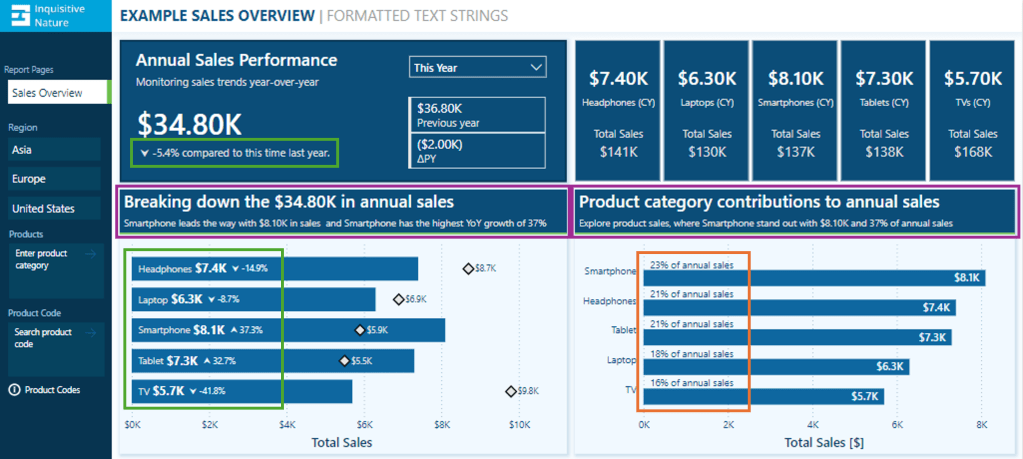
The Final Result
Before we start the step-by-step guide, let’s look at the final result.

The original data sources are BLS and USDA, and the data used for this challenge is hosted on Data.World. The background image is a photo by Gaelle Marcel on Unsplash.
Adding a Total Average Row in Power Query
The initial step involved loading and transforming the raw dataset in the Power Query Editor, where a total average row was added. This row calculates the average unadjusted percent change values and acts as a benchmark for comparison.

Here is the Power Query used to complete this step.
let
    Source = Excel.Workbook(File.Contents("C:\temp\PBIWoW2025W5.xlsx"), null, true),
    data = Source{[Item="Sheet1",Kind="Sheet"]}[Data],
    setHeaders = Table.PromoteHeaders(data, [PromoteAllScalars=true]),

    // Adjust "Unadjusted Percent Change" by converting values to percentages
    adjustPercentages = Table.TransformColumns(setHeaders, {{"Unadjusted Percent Change", each _*0.01}}),

    // Calculate the total average and create a new row
    totalAverage = List.Average(adjustPercentages[Unadjusted Percent Change]),
    averageRow = #table(
        Table.ColumnNames(setHeaders),
        {{"Total average", totalAverage}}
    ),

    //Append Total Average to the initial dataset
    finalTable = Table.Combine({adjustPercentages, averageRow}),

    setDataTypes = Table.TransformColumnTypes(finalTable,{{"Item", type text}, {"Unadjusted Percent Change", Percentage.Type}})
in
    setDataTypes
Once the data is loaded, Power Query converts the percent values so they display correctly when the data type is set to Percentage.Type.
It then calculates the average of the unadjusted percent change data using the List.Average() function, which computes the average of all the values in the unadjusted percent change column. Once calculated, we create a single-row table using #table() to ensure the structure matches the initial dataset. In this table, Total Average is set for the Item column, and the calculated average is in the Unadjusted Percent Change column.
Lastly, the Power Query appends this row to our initial dataset using Table.Combine() and sets the column data types.
Creating the Bar Chart and Sorting the Data
With the Total Average data now included in the dataset, the next step was creating the Power BI bar chart to visualize the data.
The visual is a clustered bar chart, where Item is set for the y-axis and Unadjusted Percent Change is set for the x-axis.
The axis is sorted in descending order by Unadjusted Percent Change and data labels are enabled.
Additional formatting steps included disabling the titles for the x- and y-axes, darkening the vertical gridlines, and removing the visual background.

At this point, the bar chart displays all categories, including the Total Average row, but the colors are uniform. The next step is to apply conditional formatting using DAX to highlight key insights to improve clarity.
Applying Conditional Formatting Using DAX
The bar colors differentiate key categories to make the visualization more insightful.
- Values above the average should be highlighted to stand out*.
- The average value should have a distinct color to serve as a benchmark.
- Values below the average should have a uniform color.
* This only applies to the Eggs category in the current data set. Although this doesn’t strictly meet the requirement of explicitly making the Eggs category stand out, it remains dynamic. It will highlight any value in the future that would be above the average.
Here is the DAX measure:
Bar Color =
VAR _totalAverage =
    COALESCE(
        LOOKUPVALUE(
            pbiwow2025w5[Unadjusted Percent Change],
            pbiwow2025w5[Item],
            "Total average"
        ),
        0
    )
VAR _value =
    COALESCE(
        SELECTEDVALUE(pbiwow2025w5[Unadjusted Percent Change]),
        0
    )
RETURN
SWITCH(
    TRUE(),
    _value < _totalAverage, "#ecc88f",
    _value > _totalAverage, "#183348",
    _value = _totalAverage, "#ad6b1f"
)
The measure looks up the total average value and retrieves the Unadjusted Percent Change value of the category within the current evaluation context.
Then, using the SWITCH() function, the color code is set based on whether the current _value is less than, equal to, or greater than the total average.
Applying the DAX Measure to the Bar Chart
- Select the visual on the report canvas.
- In the Format pane, locate the Bars sections.
- Click the
fx(Conditional Formatting) button next to the Bar Color property. - In the
Format styledrop-down, selectField value, and in theWhat field should we base this on?select the newly createdBar Colormeasure.
To also have the data label match the bar color, locate the data labels section in the Format pane and the Values section. Follow the same steps to set the color of the data label value.

The visual is now structured to highlight key categories based on their relationship to the Total Average value.
BONUS: Creating Dynamic Titles with DAX
To improve the visualization, a dynamic subtitle can be added. This subtitle automatically updates based on the dataset, providing insights at a glance.
I start by creating the DAX measure:
Subtitle =
VAR _topPercentChange =
    TOPN(1, pbiwow2025w5, pbiwow2025w5[Unadjusted Percent Change], DESC)
VAR _topItem =
    MAXX(_topPercentChange, pbiwow2025w5[Item])
VAR _topValue =
    MAXX(_topPercentChange, pbiwow2025w5[Unadjusted Percent Change])
VAR _average =
    COALESCE(
        LOOKUPVALUE(
            pbiwow2025w5[Unadjusted Percent Change],
            pbiwow2025w5[Item],
            "Total average"
        ),
        0
    )
VAR _belowAverage =
    ROUNDUP(
        MAXX(
            FILTER(pbiwow2025w5, pbiwow2025w5[Unadjusted Percent Change] < _average),
            pbiwow2025w5[Unadjusted Percent Change]
        ),
        2
    )

RETURN
_topItem & " prices have increased by "
& FORMAT(_topValue, "0.0%") & ", exceeding the average of "
& FORMAT(_average, "0.00%") & ", while other categories remain under "
& FORMAT(_belowAverage, "0%") & "."
The measure identifies the category with the highest percentage change, extracting both the item name and the percent change value. It then retrieves the total average value to incorporate into the title. Next, it finds the highest percent change value for all the items that fall below the average and rounds the value up.
Finally, the RETURN statement constructs a text summary that displays the category with the highest price change, its percentage change, a comparison to the total average, and a summarized value for all items below the average.
Applying the Dynamic Subtitle
- Select the visual on the report canvas.
- In the Format pane, locate the Title section.
- Under the Subtitle section, select the
fxbutton next to the Text property. - In the
Format styledrop-down, selectField value, and in theWhat field should we base this on?select the newly createdSubtitlemeasure.
This subtitle provides quick insights for our viewers.
Wrapping Up
This guide outlines my approach to completing the Workout Wednesday 2025 Week 5 Power BI Challenge, focusing on essential data transformation and visualization techniques.
Now that you have seen my approach, how would you tackle this challenge? Would you use a different Power Query transformation method, a different visualization style, or an alternative approach to dynamic formatting?
For complete challenge details, visit Workout Wednesday – 2025 Week 5.
If you’re looking to grow your Power BI skills further, be sure to check out the Workout Wednesday Challenges and give them a try!
Thank you for reading! Stay curious, and until next time, happy learning.

And, remember, as Albert Einstein once said, “Anyone who has never made a mistake has never tried anything new.” So, don’t be afraid of making mistakes, practice makes perfect. Continuously experiment, explore, and challenge yourself with real-world scenarios.
If this sparked your curiosity, keep that spark alive and check back frequently. Better yet, be sure not to miss a post by subscribing! With each new post comes an opportunity to learn something new.