
Learn how to create interactive, audience-friendly visuals with custom formatting and dynamic insights
I recently participated in a data challenge and used it to explore dynamic titles and subtitles in the final report. Dynamic titles provide context, guide users to key insights, and create a more interactive experience.
Dynamic titles were created by developing DAX measures that utilized various DAX functions, including FORMAT. The DAX FORMAT function proved to be a valuable tool in crafting these dynamic elements. FORMAT enables us to produce polished and audience-friendly text, all while leveraging the power of DAX measures.
This guide dives deep into the capabilities of the FORMAT function. We will explore how to use predefined numeric and date formats for quick wins, uncover the secrets of custom numeric and date/time formats, and highlight practical examples that bring clarity to our Power BI visualizations.
The Basics of FORMAT
The FORMAT function in DAX is a valuable tool for customizing the display of data. Its syntax is straightforward:
FORMAT(<value>, <format_string>[, <locale_name>])In this syntax, <value> represents a value or expression that evaluates to a single value we want to format. The <format_string> is a string that defines the formatting template and <locale_name> is an optional parameter that specifies the locale for the function.
The FORMAT function enables us to format dates, numbers, or durations into standardized, localized, or customized textual formats. This function allows us to define how the <value> is visually represented without changing the underlying data.
It’s important to note that when we use FORMAT, the resulting value is converted to a string (i.e. text data type). As a result, we cannot use the formatted value in visuals that require a numeric data type or in additional numerical calculations.
Power BI offers a Dynamic Format Strings for measures preview feature that allows us to specify a conditional format string that maintains the numeric data type of the measure.

Create dynamic format strings for measures
Learn more about: Dynamic Format strings for measures
Since FORMAT converts the value to a string, it easily combines with other textual elements, making it ideal for creating dynamic titles.
Numeric Formats
The predefined numeric formats allow for quick and consistent formatting of numerical data.

General Number: Displays the value without thousand separators.
Currency: Displays the value with thousand separators and two decimal places. The output is based on system locale settings unless we provide the <locale_name> parameter.
Fixed: Displays the value with at least one digit to the left and two digits to the right of the decimal place.
Standard: Displays the value with thousand separators, at least one digit to the left and two to the right of the decimal place.
Percent: Displays the value multiplied by 100 with two digits to the right of the decimal place and a percent sign appended to the end.
Scientific: Displays the value using standard scientific notation.
Yes/No: Displays the value as No if the value is 0; otherwise, displays Yes.
True/False: Displays the value as False if the value is 0; otherwise, displays True.
On/Off: Displays the value as Off if the value is 0; otherwise, displays On.
Predefined formats are ideal for quick, standardized formatting without requiring custom format strings.
Custom Numeric Formats
Predefined numeric formats work well for standard situations, but sometimes, we need more control over how data is displayed. Custom numeric formats enable us to specify exactly how a numeric value appears, providing the flexibility to meet unique scenarios and requirements.
Custom numeric formats use special characters and patterns to define how numbers are displayed. The custom format expression may consist of one to three format strings, separated by semicolons.
When a custom format expression contains only one section, that format is applied to all values. However, if a second section is added, the first section formats positive values, while the second formats negative values. Finally, if a third section is included, it determines how to format zero values.

Here is a summary of various characters that can be used to define custom numeric formats.
0 Digit placeholder: Displays a digit or a zero, pads with zeros as needed, and rounds where required.
# Digit placeholder: Displays a digit or nothing and skips leading and trailing zeros if needed.
. Decimal placeholder: Determines how many digits are displayed to the left and right of the decimal separator.
, Thousand separators: adds a separator or scales the numbers based on usage. Consecutive , not followed by 0 before the decimal place divides the number by 1,000 for each comma.
% Percentage placeholder: Multiplies the number by 100 and appends %
- + $ Display literal character: Display the literal character, to display characters other than -, +, or $ proceed it with a backslash (\) or enclose it in double quotes (" ").
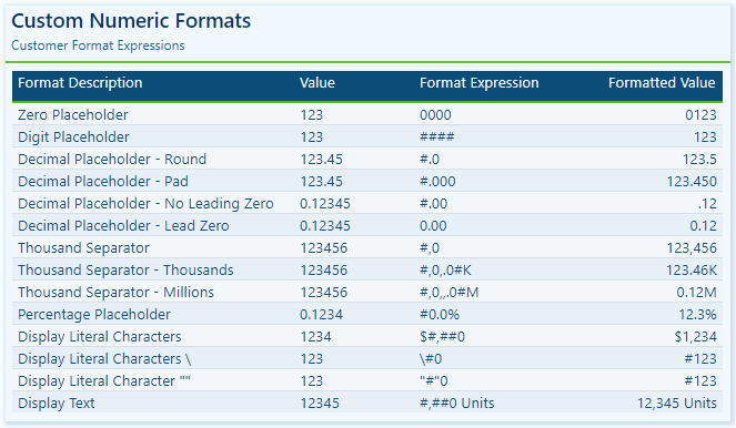
Visit the FORMAT function documentation for additional details on custom numeric formats.
Custom Numeric Format Characters
Learn more about: custom numeric format characters that can be specified in the format string argument
Custom numeric formats allow us to present numerical data according to specific reporting requirements. When utilizing custom numeric formats, it is typically best to use 0 for mandatory digits and # for optional digits, include , and . to improve readability, and combine with symbols such as $ or % for intuitive displays.
Date & Time Formats
Dates and times are often key elements in our Power BI reports as they form the basis for timelines, trends, and performance comparisons. The FORMAT function provides several predefined date and time formats to simplify the presentation of date and time values.
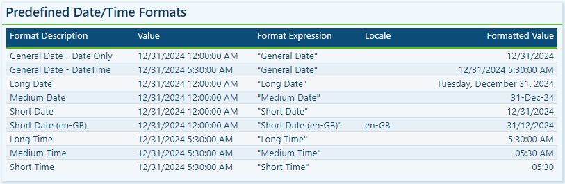
General Date: Displays a date and/or time, with the date display determined by the application’s current culture value.
Long Date: Displays the date according to the current culture’s long date format.
Medium Date: Displays the date according to the current culture’s medium date format.
Short Date: Displays the date according to the current culture’s short date format.
Long Time: Displays the time according to the current culture’s long-time format, typically including hours, minutes, and seconds.
Medium Time: Displays the time in a 12-hour format.
Short Time: Displays the time in a 24-hour format.
Predefined formats offer a quick and simple way to standardize date and time outputs that align with current cultural settings.
Custom Date & Time Formats
When the predefined date and time formats don’t meet our requirements, we can utilize custom formats to have complete control over how dates and times are displayed. The FORMAT function supports a wide range of custom date and time format strings.
d, dd, ddd, dddd Day in numeric or text format: single digit (d), with leading zero (dd), abbreviated name (ddd), or full name (dddd).
w Day of the week as a number (1 for Sunday through 7 for Saturday).
ww Week of the year as a number.
m, mm, mmm, mmmm Month in numeric or text format: single digit (m), with leading zero (mm), abbreviated name (mmm), or full name (mmmm).
q Quarter of the year as a number (1-4)
y Display the day of the year as a number.
yy, yyyy Display the year as a 2-digit (yy) number of a 4 digit (yyyy) number.
c Displays the complete date (ddddd) and time (ttttt).

Visit the FORMAT function documentation for additional details and format characters.
Learn more about: custom date/time format characters that can be specified in the format string
Practical Examples in Power BI
Dynamic elements elevate our Power BI visuals by making them context-aware and responsive to user selections. They guide users through the report and help shape the data narrative. The FORMAT function in DAX is one tool we can use to craft these dynamic elements, which allows us to combine formatted values with descriptive text.
Here are three examples where the FORMAT function can have a significant impact.
Enhancing Data Labels
At times, numbers alone do not effectively convey insights. Enhancing our labels with additional text features, such as arrows or symbols to indicate trends like growth or decline, can greatly improve their informative value.
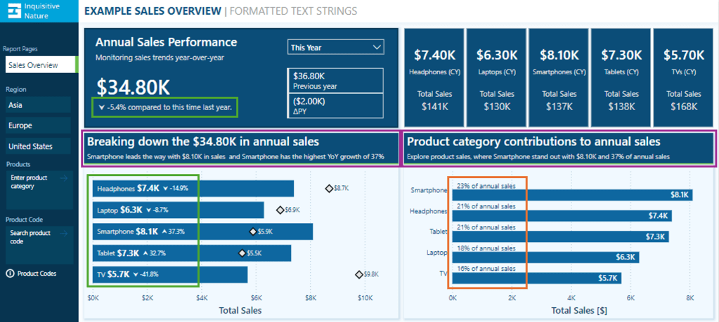
In this report, we have a card visual that presents both the annual performance and year-over-year (YoY) performance.

Let’s look at how the FORMAT function was used to achieve this.
The YoY Measure
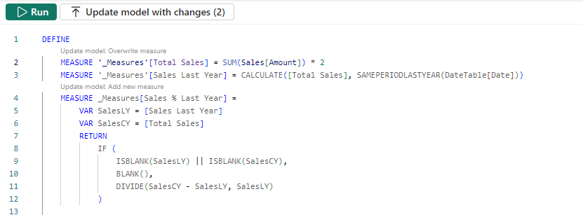
The Power BI data model includes a measure called Sales Metric YOY, which calculates the percentage change between the selected year and the previous year.
Sales Metric YOY =
VAR _cy = [Sales Metric (CY)]
VAR _ly = [Sales Metric (LY)]

RETURN
IF(
    ISBLANK(_cy) || ISBLANK(_ly),
    BLANK(),
    DIVIDE(_cy-_ly, _ly)
)
The measure is formatted as a percentage and displays as expected when added to our visuals.
We then use this measure to create an enhanced label. If the value is positive, we add an upward arrow to indicate growth, and if the value is negative, we include a downward arrow to signify decline.
Adding the arrow text elements to the label can be done with the following expression.
Sales Metric YOY Label No Format =
If(
 [Sales Metric YOY]>0,
    UNICHAR(11165) & " " & [Sales Metric YOY],
    UNICHAR(11167) & " " & [Sales Metric YOY]
)
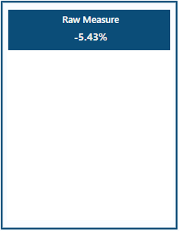
However, when we combine our Sales Metric YOY measure with textual elements, we lost the percentage formatting, making the value less user-friendly.
To address this, we can manually multiply the value by 100, round it to one decimal place, and add a % at the end.
Sales Metric YOY Label Manual =
If(
 [Sales Metric YOY]>0,
    UNICHAR(11165) & " " & ROUND([Sales Metric YOY]*100, 1)& "%",
    UNICHAR(11167) & " " & ROUND([Sales Metric YOY]*100 ,1) & "%"
)
This expression can be greatly improved by leveraging the power of the FORMAT function. The following expression uses FORMAT to create the enhanced label in a simpler manner for better clarity.
Sales Metric YOY Label =
If(
 [Sales Metric YOY]>0,
    UNICHAR(11165) & " " & FORMAT([Sales Metric YOY], "#0.0%"),
    UNICHAR(11167) & " " & FORMAT([Sales Metric YOY], "#0.0%")
)
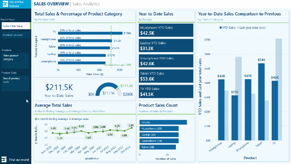
We can then use the Sales Metric YoY Label throughout our report, such as a data label detail in our bar chart displaying the annual sales by product category and each product’s YoY Label.
To finalize the label in our Annual Sales Performance card, we combine the Saless Metric YoY Label with additional context based on the user’s selected year.
Annual Sales Performance Label =
[Sales Metric YOY Label] &
If(SELECTEDVALUE(DateTable[Year Category]) = "This year",
    " compared to this time last year.",
    " compared to " & YEAR(MAX(DateTable[Date])) - 1 & " sales."
)
We now have a dynamic and informative label that we can use to create visuals packed with meaningful insights, improving the user experience for our report viewers.
Improving Data Label Clarity
Data labels in our Power BI visuals offer users additional details, provide context, and highlight key insights. By combining the FORMAT function with descriptive text, we can create clear and easy-to-understand labels. Let’s look at an example.

This visual displays the annual total sales for each product category. To provide viewers with more information, we include a label that indicates each product’s contribution to the annual total as a percentage. Instead of presenting a percentage value without context, we enhance the label’s clarity by incorporating additional descriptive text.
This data label uses the FORMAT function and the following expression.
Product Category Totals Sales Label =
VAR _percentage = DIVIDE([Sales Metric (CY)], [Sales Metric Annual Total])
RETURN
FORMAT(_percentage, "#0%") & " of annual sales"
We now have a clear and concise label for our visuals, allowing our viewers to quickly understand the value.
Building Dynamic Titles
Dynamic titles and subtitles in our Power BI reports can improve our report’s overall storytelling experience. They can summarize values or highlight key insights and trends, such as identifying top-performing products and year-over-year growth.

Let’s explore how to create dynamic titles and subtitles, focusing on the role of the FORMAT function in this process.
First, we need to create a measure for our visual title. The title should display the total annual sales values. Additionally, if the selected year is a previous year, the title should specify which year the annual sales data represents. To achieve this, we will use the following DAX expression.
Annual Sales Title =
"Breaking down the " & FORMAT([Sales Metric (CY)], "$#,.00K") &
IF(
    SELECTEDVALUE(DateTable[Year Category]) = "This Year",
    " in annual sales",
    " of annual sales in " & YEAR(MAX(DateTable[Date]))
)
The DAX measure first combines descriptive text with the formatted current year’s sales value. It then checks the selected year category from our visual slicer. If “This Year” is selected, it appends “in annual sales.” For other year selections, the title appends “of annual sales in” and explicitly includes the chosen year.
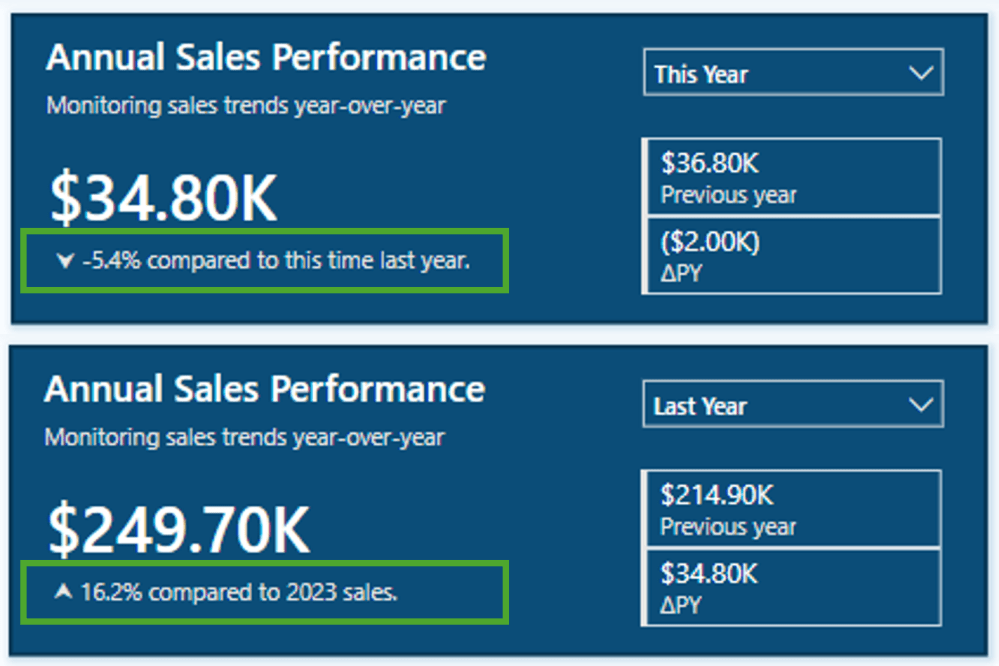
As a result, the final output will be titles such as Breaking down the $34.80K in annual sales for the current year and Breaking down the $214.90K of annual sales in 2023 when previous years are selected.
Additionally, we enhance this visual by including a dynamic subtitle that identifies top-performing products based on both annual sales and year-over-year growth.
Here is the DAX expression used to create this dynamic and informative subtitle.
Annual Sales SubTitle =
VAR _groupByProduct =
ADDCOLUMNS(
SUMMARIZE(Sales, Products[Product], "TotalSalesCY", [Sales Metric (CY)]),
"YOY", [Sales Metric YOY]
)
VAR _topProductBySales = TOPN(1, _groupByProduct, [TotalSalesCY],DESC)
VAR _topProductCategoryBySales = MAXX(_topProductBySales, Products[Product])
VAR _topProductSalesValueBySales = MAXX(_topProductBySales, [TotalSalesCY])
VAR _topProductByYOY = TOPN(1, _groupByProduct, [YOY], DESC)
VAR _topProductCategoryByYOY = MAXX(_topProductByYOY, Products[Product])
VAR _topProductYOYValueByYOY = MAXX(_topProductByYOY, [YOY])
VAR _topProductCheck = _topProductCategoryBySales=_topProductCategoryByYOY
RETURN
IF(
SELECTEDVALUE(DateTable[Year Category])="This Year",
_topProductCategoryBySales &
" leads the way with " &
FORMAT(_topProductSalesValueBySales, "$#,.00K") &
" in sales" &
IF(_topProductCheck, " and ", ", while ") &
_topProductCategoryByYOY &
" has the highest YoY growth of " &
FORMAT(_topProductYOYValueByYOY, "0%"),
_topProductCategoryBySales &
" led the " &
YEAR(MAX(DateTable[Date])) &
" with " &
FORMAT(_topProductSalesValueBySales, "$#,.00K") &
" in sales " &
IF(_topProductCheck, "and ", ", while ") &
_topProductCategoryByYOY &
" has the highest YoY growth of " &
FORMAT(_topProductYOYValueByYOY, "0%")
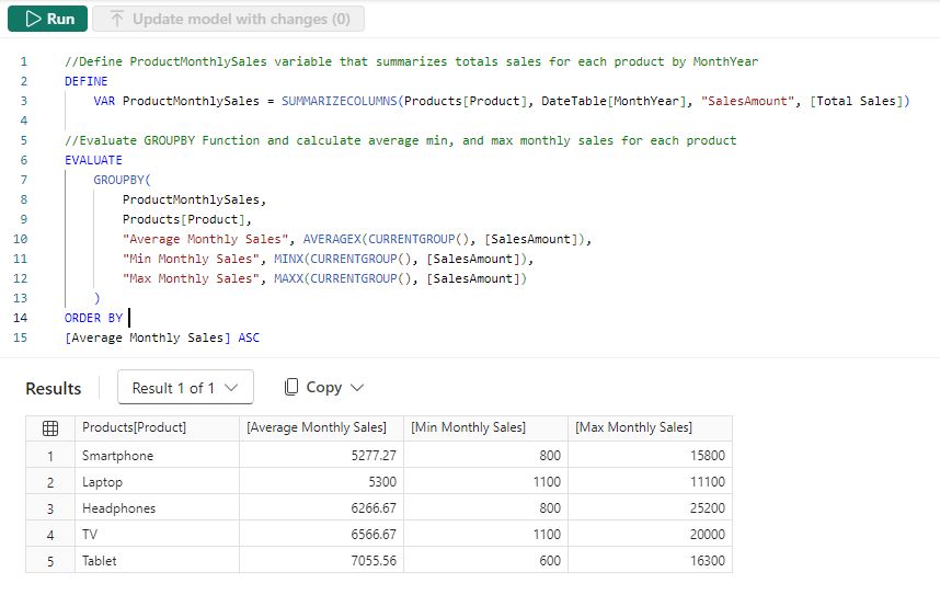
)The measure first creates a summary table that calculates the annual sales and year-over-year (YOY) values, grouped by product category. Next, it identifies the top item for both annual sales and YOY growth, extracting the corresponding values along with the associated product category.
Total Sales
VAR _topProductBySales = TOPN(1, _groupByProduct, [TotalSalesCY],DESC)
VAR _topProductCategoryBySales = MAXX(_topProductBySales, Products[Product])
VAR _topProductSalesValueBySales = MAXX(_topProductBySales, [TotalSalesCY])
YOY Growth
VAR _topProductByYOY = TOPN(1, _groupByProduct, [YOY], DESC)
VAR _topProductCategoryByYOY = MAXX(_topProductByYOY, Products[Product])
VAR _topProductYOYValueByYOY = MAXX(_topProductByYOY, [YOY])
Next, the measure evaluates whether the top performers, determined by total sales and YoY growth, are the same.
VAR _topProductCheck = _topProductCategoryBySales=_topProductCategoryByYOYFinally, we build the dynamic text based on the selected year and the value of _topProductCheck.
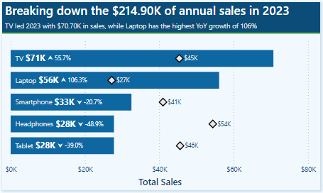
This results in subtitles like, Smartphone leads the way with $8.10K in sales and has the highest YoY growth of 37% for the current year. Alternatively, for previous, such as 2023, the subtitle reads, TV led 2023 with $70.70K in sales, while Laptop has the highest YoY growth of 106% .
BONUS: Dynamic Format Strings
Dynamic format strings are a useful preview feature in Power BI that allows us to change the formatting of a measure dynamically, depending on the context or user interaction.
One additional benefit of the dynamic format strings feature is that it preserves numeric data types. This means we can use the resulting value in situations where a numeric data type is required.
For instance, consider our report with a measure called Sales Metric (CY). Depending on the user’s selection, this measure calculates either the total annual sales or the number of annual transactions.
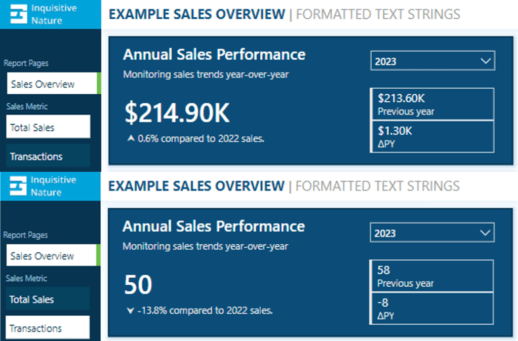
With dynamic format strings, if Total Sales is selected, the value is formatted as currency, and if Transactions is chosen, the value is displayed as a whole number.

With the format set to Dynamic and the format string condition defined, users can switch between the two metrics, and the values update and display dynamically.
Dynamic format strings unlock a new level of customization for our Power BI reports and allow us to deliver highly polished and interactive reports.
See Create dynamic format string for measures for more details on this feature.
Wrapping Up
The FORMAT function and dynamic formatting techniques are vital tools for improving the usability, clarity, and visual appeal of our Power BI reports. These techniques allow us to create dynamic titles, develop more informative labels, and utilize dynamic format strings. By incorporating these methods, we can create interactive reports that are more engaging and user-friendly for our audience.
Continue exploring the FORMAT function and download a copy of the example file (power-bi-format-function.pbix) from my Power BI DAX Function Series: Mastering Data Analysis repository.

GitHub – Power BI DAX Function Series: Mastering Data Analysis
This dynamic repository is the perfect place to enhance your learning journey.
Thank you for reading! Stay curious, and until next time, happy learning.

And, remember, as Albert Einstein once said, “Anyone who has never made a mistake has never tried anything new.” So, don’t be afraid of making mistakes, practice makes perfect. Continuously experiment and explore new DAX functions, and challenge yourself with real-world data scenarios.
If this sparked your curiosity, keep that spark alive and check back frequently. Better yet, be sure not to miss a post by subscribing! With each new post comes an opportunity to learn something new.


 Ethan Guyant